
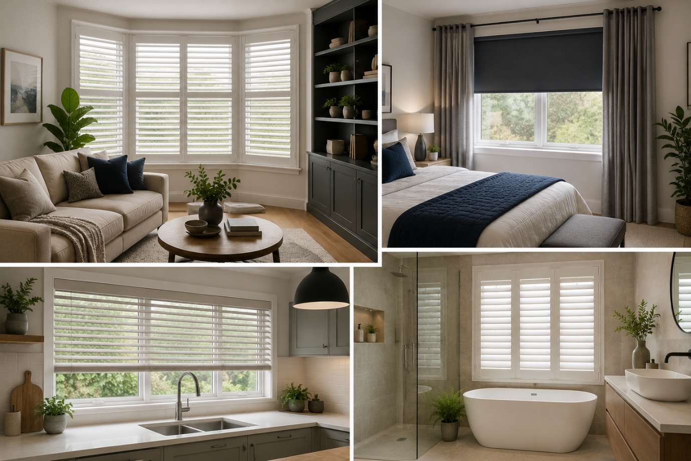
How to Choose the Perfect Window Coverings for Your Home
Window coverings are more than just decorative features. They influence


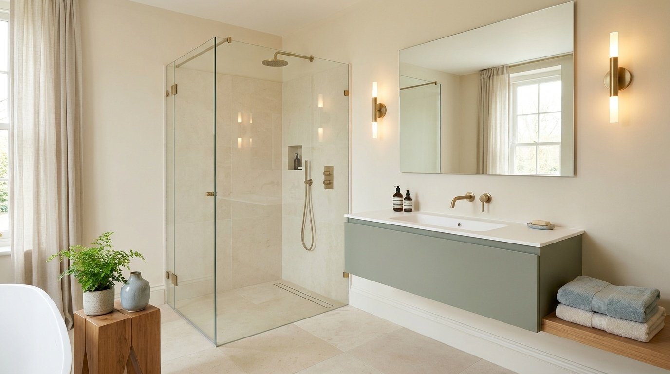
Picking the right bathroom colors is one of the fastest ways to change how a room feels without touching the layout. The same bathroom can look brighter and more spacious in one shade, or warmer and more dramatic in another, depending on the paint you choose.
This guide covers 21 bathroom colors, from soft neutrals to greens, blues, and bolder statement shades, so you can find one that fits your space.
Keep in mind that lighting, tile, your vanity, and your fixtures all influence how a color actually looks once it's on the wall. A chip that looks perfect under store lighting can shift noticeably once it's painted in your own bathroom. With that in mind, let's get into the list.
Ready to find the right shade for your bathroom? Explore these bathroom colors and see which one best fits your space, lighting, and style.

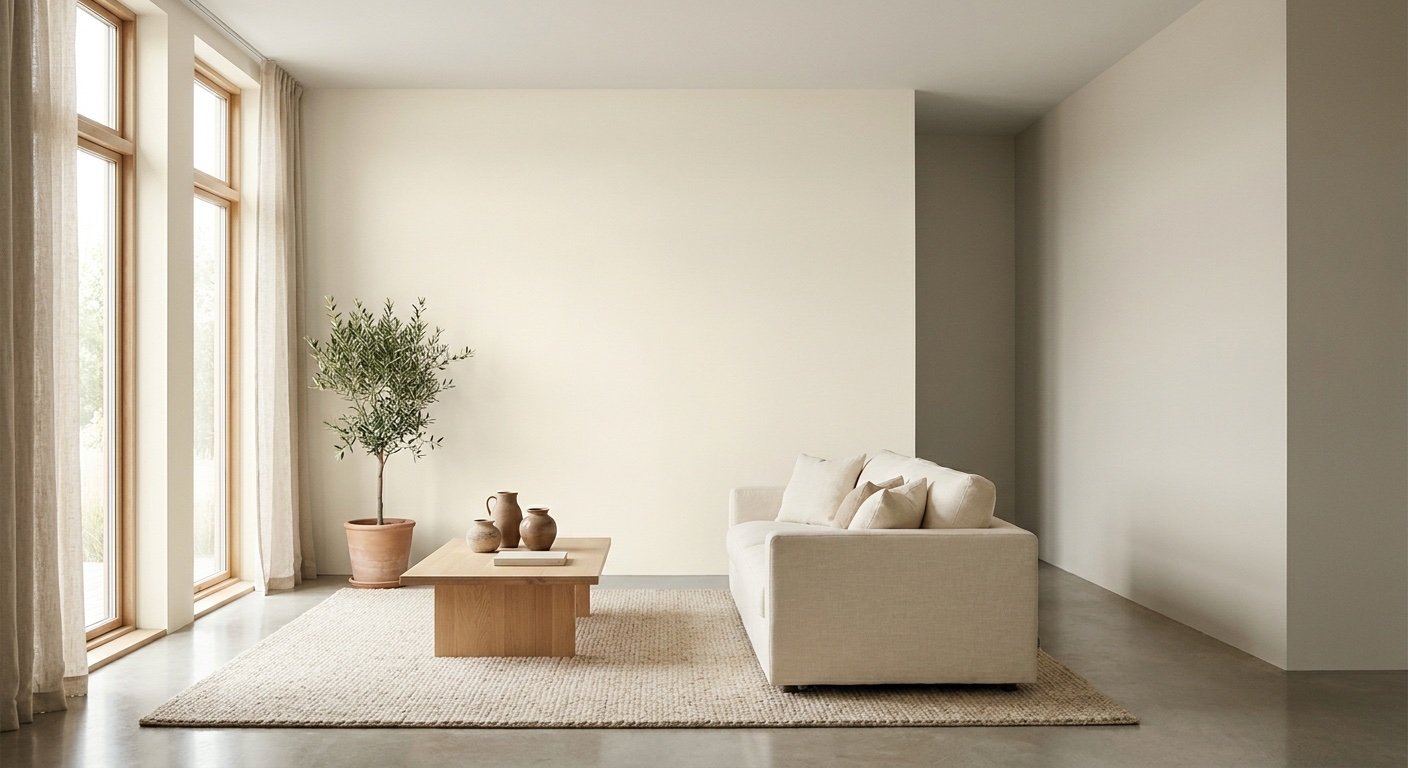
Soft white remains a go-to choice because it's flexible and rarely feels dated. Warm whites carry a slight yellow or cream tint, while cool whites lean toward blue or gray. This white bathroom color sits comfortably next to marble, natural wood, brass, chrome, or black fixtures without clashing.

Off-white carries a gentle warm undertone that softens a room instead of looking clinical the way stark white sometimes can. It suits traditional, transitional, and cozy bathrooms particularly well. When bright white feels too sharp for a space, creamy off-white offers a similar clean look with more warmth built in.

Beige is a dependable warm neutral that reads as inviting rather than harsh. It complements natural stone, wood cabinetry, and brass hardware, which makes it a natural fit for traditional and contemporary bathrooms that want warmth without committing to a stronger color.

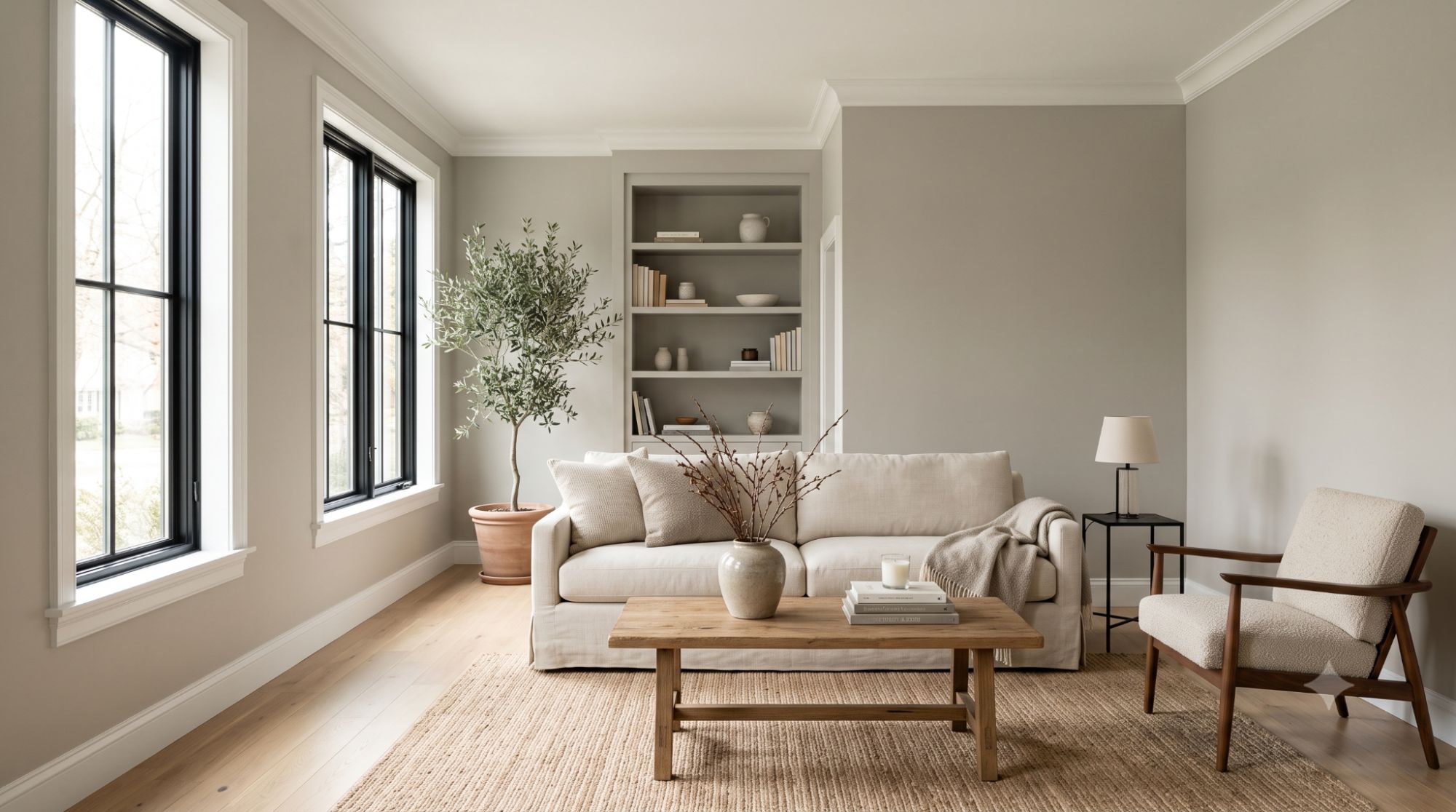
Greige blends gray and beige into one balanced neutral, which is why it adapts to nearly any bathroom style, from farmhouse to modern. As one of the more versatile neutral bathroom colors, it sits cleanly against white trim and holds up well next to natural wood or stone surfaces.

Light gray gives a bathroom a modern, understated look without feeling stark. Cool grays tend to read crisp and fresh, while warm grays feel a touch softer. Both versions hold up well against white fixtures or marble surfaces, making light gray one of the more adaptable modern bathroom colors.

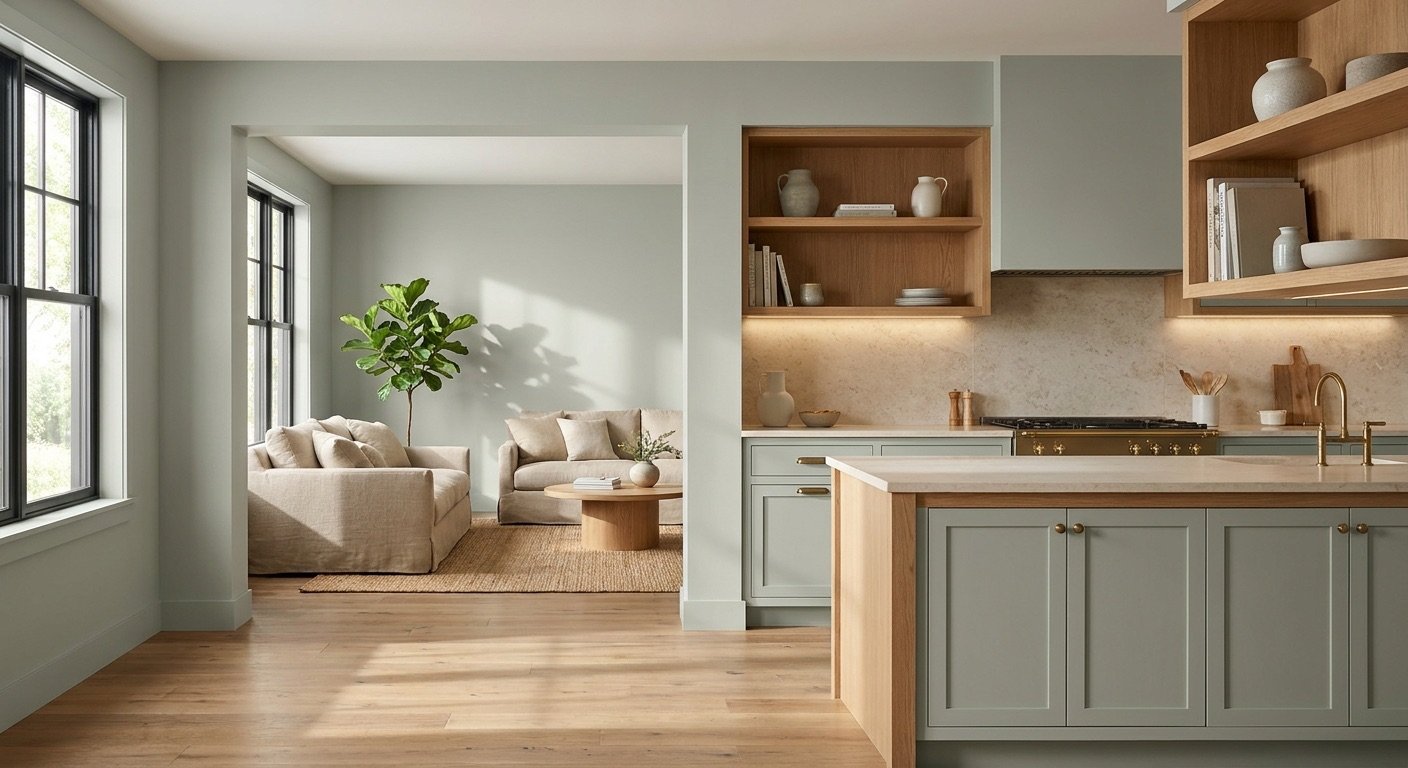
Sage green has a soft, nature-inspired quality that reads as gentle rather than bold. It sits well beside cream, white, natural wood, and brass accents, and it's a frequent pick for a spa-inspired sage green bathroom. As one of the more popular calming bathroom colors, it works in both small and larger rooms depending on how much natural light the space gets.

Olive green is deeper and earthier than sage, giving it a more grounded, sophisticated feel. It suits bathrooms built around wood, cream, brass, and stone finishes. Because it's a darker shade, lighting has a bigger impact here than with lighter greens—olive can look rich under good light or slightly flat in a dim room, so it's worth testing first.

Pale blue creates an airy, calming effect that reads as fresh right away. It's a longtime favorite in coastal and traditional bathrooms. White trim and light-colored tile keep the tone bright instead of letting it feel washed out.

Blue-gray carries more depth than a simple pale blue, giving the room a slightly more grounded, modern feel. It fits coastal, modern, and transitional styles equally well, and reads nicely against white, gray, or natural wood surfaces.

Navy is one of the boldest bathroom wall colors on this list, often reserved for powder rooms, vanities, or a single accent wall rather than every surface. It stands out against white tile with brass or chrome hardware. Because the shade is so deep, adequate lighting matters more here to keep the room from feeling closed in.

Dusty blue is softer and more muted than a standard blue, giving it a relaxed, slightly vintage character. It fits vintage, coastal, and generally low-key bathroom styles, and pairs comfortably with white, cream, and light wood tones.

A pale or blush pink can read as sophisticated rather than overly sweet when the rest of the room supports it. It shows up often in powder rooms and soft, spa-style spaces. Combining it with white, cream, brass, or even black keeps the overall look balanced instead of saccharine.

Terracotta brings warm, earthy energy into a bathroom and suits Mediterranean, Southwestern, and organic-inspired spaces particularly well. Balancing it with cream, white, wood, or stone keeps the intensity in check. Strong warm colors like this can shift under artificial lighting, so testing a sample before committing to the full room is worthwhile.

Taupe is a warm gray-brown neutral that feels understated rather than plain. It complements natural stone, wood tones, and brushed metal fixtures, making it a solid option for bathrooms that want warmth without leaning into a stronger, more saturated color.

Soft green is lighter and fresher than sage or olive, giving a bathroom a clean, airy quality instead of an earthy one. Set against white tile and other natural materials, it keeps a space feeling bright without adding much visual weight.

Teal sits between blue and green, giving it more visual presence than either shade alone. It shows up often on accent walls, vanities, or in powder rooms where a bit of contrast is welcome. Brass, white, and natural wood all complement its saturation without overwhelming it.

Forest green is deep and dramatic, and it holds up especially well in larger bathrooms or powder rooms designed to make a statement. Good lighting and lighter surrounding finishes keep the color reading rich instead of murky. A deep shade like this doesn't automatically make a room feel smaller—how it's balanced with light and nearby finishes matters more than the color itself.

Charcoal gray gives a bathroom a sophisticated, modern edge, especially in contemporary or industrial-style spaces. White fixtures, light tile, and metallic finishes keep the room from feeling too enclosed. As with other deep colors, planning for enough lighting helps the space stay open rather than heavy.

Deep brown offers a warmer alternative to charcoal gray while still adding real depth to the room. Paired with wood, stone, and cream tones, it creates a grounded, cozy bathroom that leans more toward a retreat than a strictly functional space.

Lavender is a soft purple that adds a gentle, slightly unexpected note to a bathroom. It fits spa-inspired, traditional, and even eclectic styles without feeling out of place. White, gray, and soft metallic accents keep the tone polished rather than overly sweet.

Black is about as dramatic as bathroom colors get, most often used in powder rooms, on accent walls, or on a vanity rather than across every wall. Balanced with white tile, mirrors, and sufficient lighting, it can look sleek and intentional instead of heavy. Room size isn't the deciding factor here—how the black is balanced with light and reflective surfaces matters far more.
With 21 options to consider, it helps to know how to choose bathroom colors that will actually hold up in your specific space rather than just look good on a swatch.
A bathroom's orientation affects how color reads over the course of the day. North-facing rooms tend to get cooler, flatter light, while south-facing rooms get warmer, brighter light, and east- or west-facing bathrooms shift depending on the time of day. Warm bulbs bring out yellow and orange undertones, while cool bulbs sharpen blues and grays. Testing paint directly in your bathroom, rather than relying on a store display, gives a more accurate picture.
This is especially useful when you're considering nuanced shades such as Sherwin-Williams Clary Sage, which can look different as the lighting and surrounding colors change.
A new wall color needs to work with what's already in the room. Check the undertones in your tile, countertop, and flooring, and consider how your vanity wood and your fixture finish—chrome, brass, or black—will sit next to the new shade before you commit.
The same principle applies to soft whites; a shade such as Sherwin-Williams Shoji White can read differently depending on the colors and materials surrounding it.
Different goals call for different shades. A calming feel tends to come from soft greens or blues, warmth from beige, cream, or terracotta, and a modern look from gray, greige, or charcoal. For drama, navy, forest green, or black tend to stand out, while whites and light neutrals generally keep a room feeling open and bright.
Finding the right bathroom colors for small bathrooms involves more than defaulting to "always pick light colors," though lighter shades do have real advantages. They reflect more light around the room, which can make a small space feel more open. Warm whites and soft neutrals are a flexible starting point, and pale blues or greens add some personality while keeping the room feeling airy.
Darker colors can still work in a small bathroom. The outcome depends less on the color itself and more on lighting, contrast, reflective surfaces like mirrors, and how the color is applied throughout the room. One practical approach in tight spaces is carrying the same color across both the walls and trim, which removes visual breaks and makes the room feel more continuous.
Bathrooms without windows depend entirely on artificial lighting, which changes how bathroom colors for dark bathrooms actually appear. Warm whites, cream, light beige, and soft greige tend to hold their warmth under artificial light instead of turning flat or gray. Muted greens and blues can also work well, particularly in softer, less saturated versions.
Because artificial lighting can shift undertones in ways that are hard to predict, it's worth viewing paint samples at different times of day and specifically under the bulbs you'll actually use in that bathroom. A shade that looks appealing under daylight can read quite differently under a single overhead fixture.
Choosing one wall color is only part of the picture—most well-planned bathrooms rely on full bathroom color schemes rather than a single shade in isolation. A few reliable bathroom color combinations include:
Bathrooms deal with more humidity and moisture than most other rooms, so the finish matters nearly as much as the color. Satin is often treated as a practical option for bathroom walls because it holds up to moisture and cleaning better than a flat finish, while semi-gloss is commonly recommended for trim, doors, and cabinets where extra durability and easy wipe-down count more.
No single finish is universally correct for every bathroom, since formulas and durability can vary by brand, so it's worth checking the specific manufacturer's recommendation for the product you're using.
There's no single best bathroom color that works for every space—the right pick depends on your lighting, existing tile and fixtures, room size, and the mood you're after.
Whether you're drawn to a soft neutral, a calming green or blue, or something bolder like navy or black, this list of 21 bathroom colors gives you a solid starting point for almost any style.
Before committing to a full gallon, test a few samples directly in your bathroom under real lighting conditions to see how the color actually behaves once it's on the wall.
It comes down to what shows on the color, not just the color itself. Very dark shades tend to show dust and water spots more readily, while very light shades can reveal grout stains, soap scum, and makeup residue. Mid-tone colors in a satin finish often hide everyday marks better than colors at either extreme.
Matching the ceiling to the walls can make a small bathroom feel taller and more unified, especially with lower ceilings. A lighter ceiling than the walls is the more traditional approach and suits most standard-height bathrooms. A contrasting ceiling color is a bolder move best reserved for bathrooms with higher ceilings, where it won't feel visually heavy.
A useful approach is one dominant color for the walls, one supporting neutral for trim or the ceiling, and one accent used sparingly, such as on a vanity or a single wall. This three-role structure keeps a small room from feeling visually crowded or competing with itself.
Matching the vanity to the walls creates a seamless look and tends to help a small bathroom feel larger. A contrasting vanity color turns it into a focal point instead, which works well if you want the vanity to stand out as a design feature rather than blend into the background.
Paint a sample board instead of applying color directly to the wall, then prop it up beside your tile, countertop, and vanity to see how they interact. Check the sample at different times of day and under your actual bathroom lighting, both natural and artificial, since the color can shift noticeably between the two.
Daniel Hartman is a color specialist with years of experience helping people make confident and thoughtful design decisions. He provides practical and approachable guidance while balancing creativity and functionality in every project. Daniel enjoys visiting art and design exhibits to study how different environments influence aesthetics, mood, and perception, bringing a rich perspective and insight into his work. His approach makes design decisions both simple and enjoyable.


No Comments