
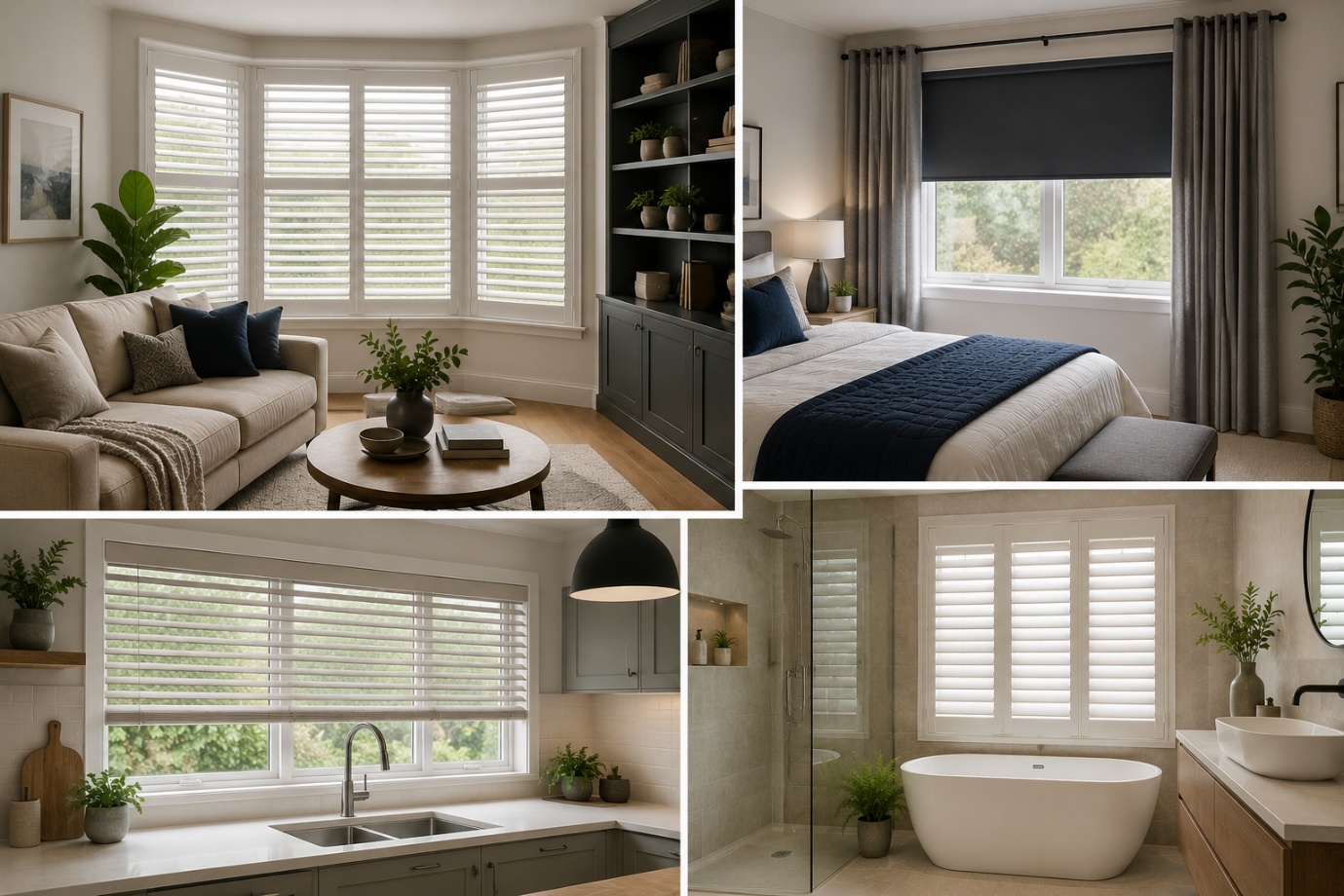
How to Choose the Perfect Window Coverings for Your Home
Window coverings are more than just decorative features. They influence


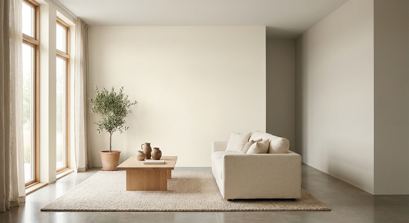
Sherwin Williams Shoji White SW 7042 is widely considered a warm off-white paint color. Despite the word "white" in its name, this is not a stark or pure white at all. It's a soft, warm off-white with beige and greige qualities that shift depending on the light around it.
That shifting quality is actually the whole story with this color. A wall that looks creamy and soft in one room can look almost neutral in another, just a few steps away.
In this guide, we'll cover the LRV, undertones, how lighting changes its look, the best rooms and trim pairings, exterior use, and how it stacks up against other popular Sherwin Williams whites.
Whether you're considering it for a single room or your entire home, these details can help you understand how Shoji White may work in your space before you pick up a brush.
Keep reading to see how Shoji White looks in different lighting and which colors pair best with it.
| Detail | Shoji White |
| Color | Warm off-white |
| Sherwin-Williams code | SW 7042 |
| LRV | ~74 |
| Undertones | Warm beige/greige with a subtle green influence |
| Best for | Walls, cabinets, interiors & exteriors |

Shoji White is an off-white paint color that leans warm rather than cool. In practical terms, it looks like a soft blend of white and beige, with just enough color underneath to keep it from reading as sterile or flat.
This is why designers often reach for it when a client wants "white walls" but doesn't want the room to feel cold. It has enough warmth to feel welcoming, but enough lightness to still function like a neutral background color.
The beige and greige influence in Shoji White means it can pull in slightly different directions depending on what's around it. Next to warm wood tones, it can look creamier. Next to cooler grays or whites, it can look a bit more neutral and balanced.
This is common with off-white paints in general. The finishes, furniture, and flooring in a room all bounce light back onto the walls, and that reflected light changes how the human eye reads the color. Shoji White is more sensitive to this than a true white would be, which is part of why testing it in your own space matters so much.
Shoji White is a warm white. The beige and subtle greige base give it a soft, cozy quality rather than a crisp, clean one.
Compare this to cooler whites, which usually contain blue or gray undertones and tend to feel more modern or clinical. Shoji White sits closer to the comforting side of the white paint spectrum, which is why it works so well in living spaces where people want to relax.
Understanding the technical side of Shoji White helps explain why it behaves the way it does on your walls.
LRV stands for Light Reflectance Value. It measures how much light a paint color bounces back into a room, on a scale from 0 (absolute black) to 100 (pure white).
Shoji White has an LRV of approximately 74. Sherwin-Williams' published data actually lists it more precisely at 74.345, but 74 is the number most people use in everyday conversation. An LRV around 74 puts Shoji White in the "light" category, but not the brightest possible white.
This matters because a color's LRV explains brightness separately from its color family. A paint can have a high LRV and still carry warmth, which is exactly what happens here. Shoji White feels bright enough to open up a room, without feeling flat or harsh the way a very high-LRV pure white sometimes can.
Shoji White carries warm undertones built from a mix of beige and greige. Some paint analysts also point out a faint green influence hiding underneath, which can become more noticeable in certain lighting conditions or next to certain materials.
Undertones are the subtle colors hiding inside a paint that only show up once the paint is on a large wall, rather than a tiny chip. Under warm lighting, the beige tones can step forward. Under cooler lighting or next to gray materials, the green hints may become slightly more visible.
This is why undertones matter so much when pairing Shoji White with flooring, countertops, or cabinets. A cool gray countertop next to a warm wall can sometimes create a visual mismatch that's hard to notice on a paint chip but obvious once it's all installed.
Not typically, though it can look creamy or warm depending on the room. Under warm artificial bulbs, the beige base can pull toward a soft yellow-cream look, especially in rooms with little natural daylight.

One of the biggest mistakes homeowners make is judging a paint color from a single photo online. Lighting changes everything, and Shoji White is more light-sensitive than a true white.
North-facing rooms get cooler, softer natural light throughout the day. In this kind of light, the warm characteristics of Shoji White tend to become more noticeable, since there's less competing warmth from direct sunlight.
South-facing rooms receive strong, warm natural light for much of the day. In these rooms, Shoji White often appears brighter and creamier, since the sunlight adds extra warmth on top of the paint's own base tone.
East-facing rooms get warm light in the morning, which can make Shoji White look softer and more golden early in the day. West-facing rooms get that same kind of warm light in the afternoon and evening instead.
Because of this, a west-facing room might look fairly neutral in the morning and much warmer once the sun starts setting. This kind of shift throughout the day is completely normal.
At night, or in rooms with limited windows, artificial lighting takes over. Warm-toned bulbs will push Shoji White toward a creamier, cozier look. Cooler LED bulbs can pull it back toward a more neutral, balanced appearance.
Shoji White works in nearly every room of the house, but it behaves a little differently depending on what's around it.

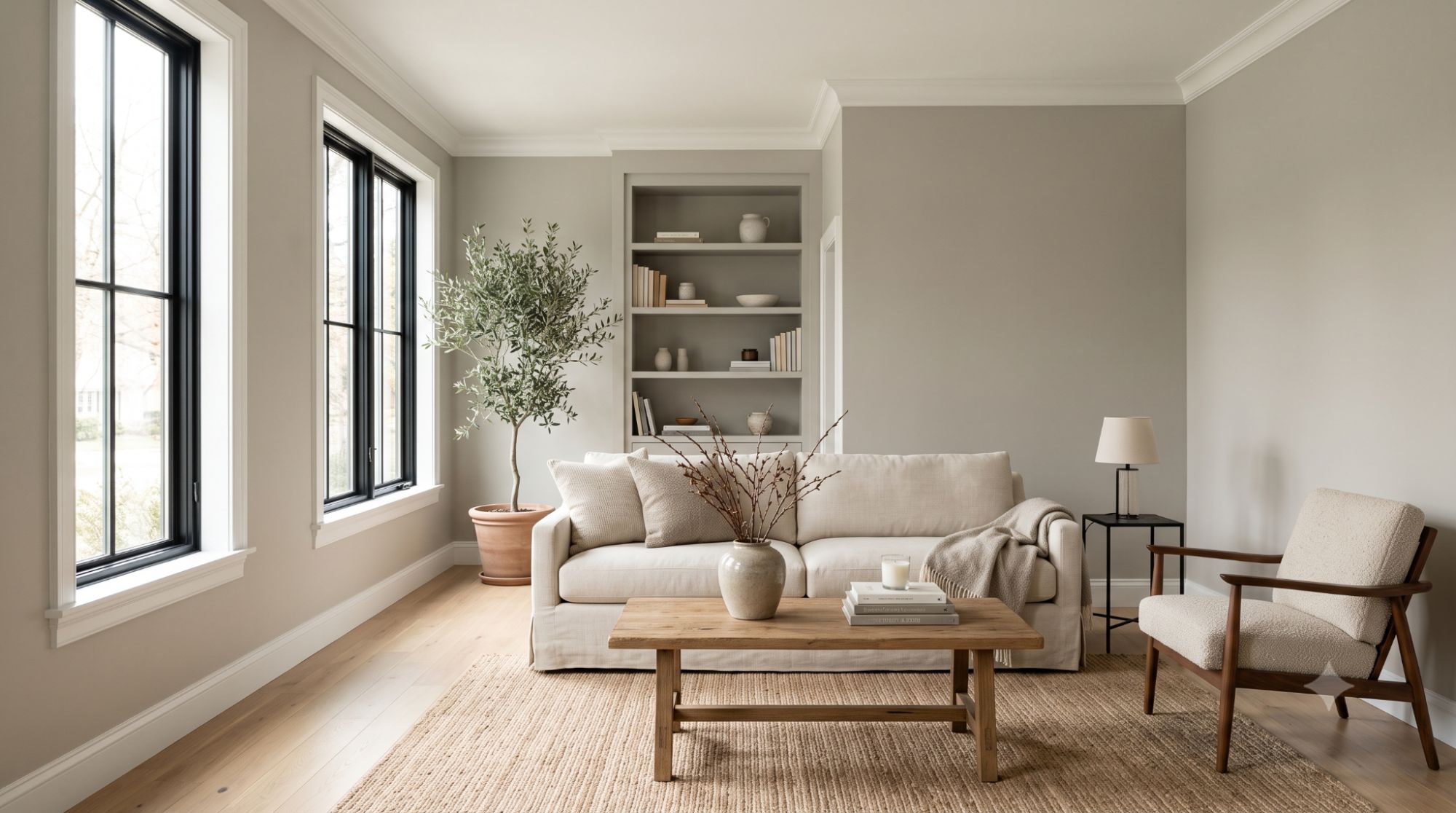
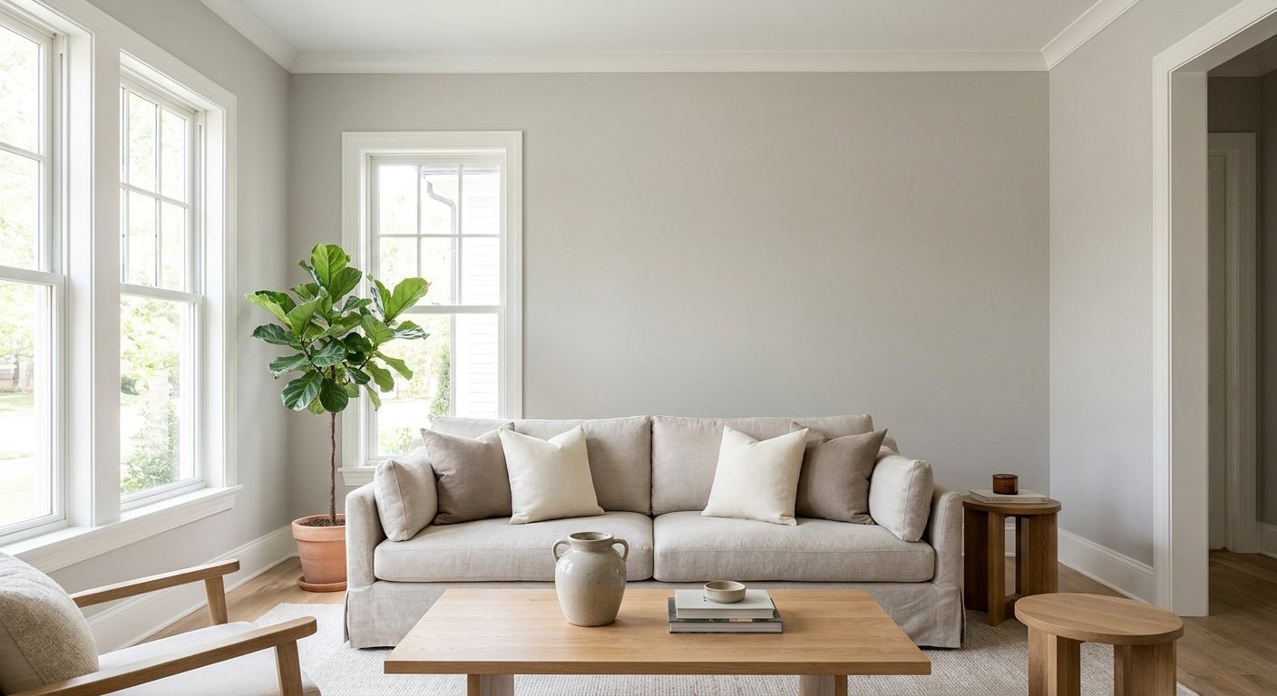
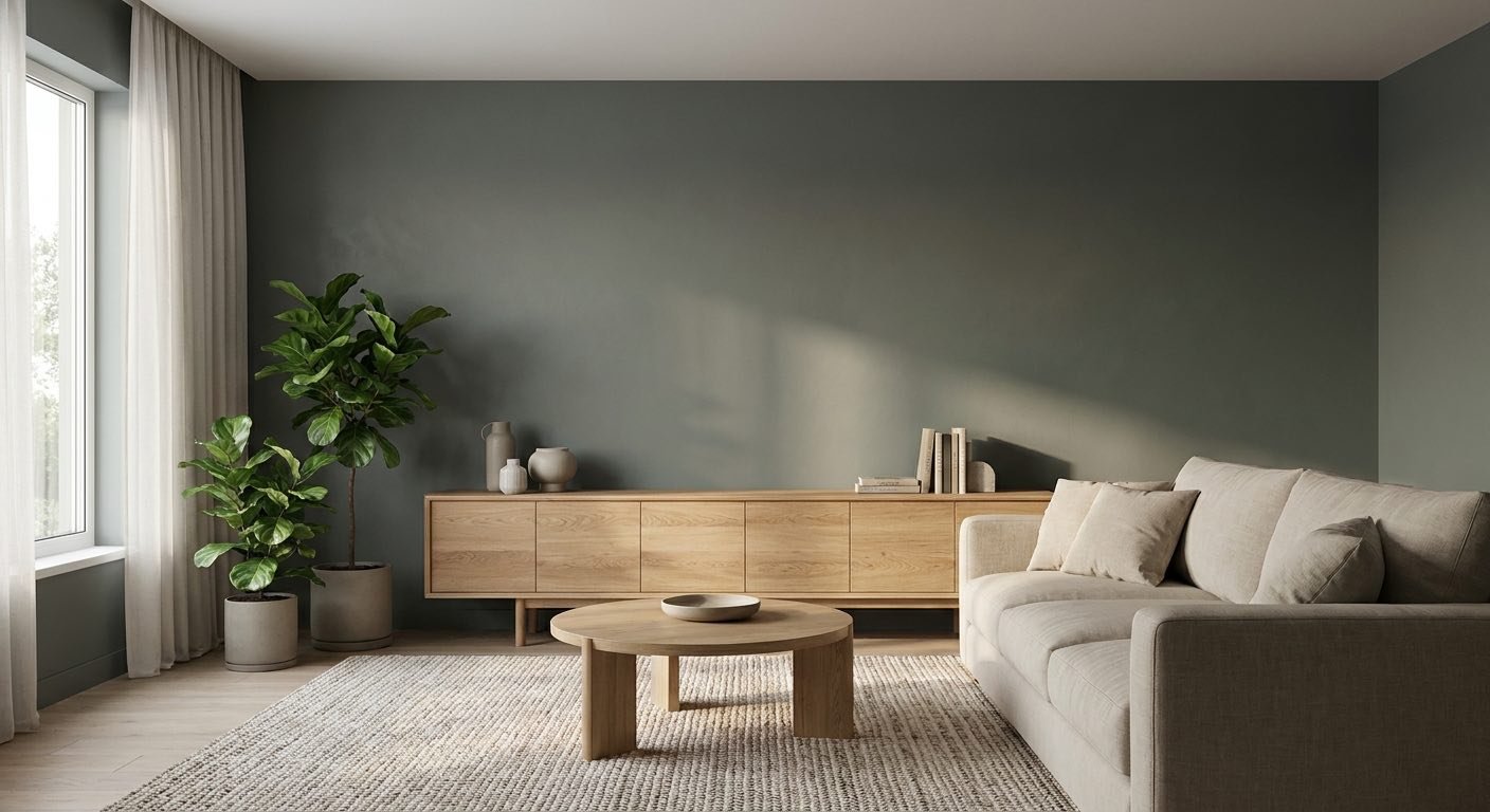
In a living room, Shoji White creates a warm, comfortable backdrop that pairs naturally with wood furniture and soft, neutral upholstery.Because living rooms often get a mix of natural and artificial light throughout the day, this color tends to feel welcoming from morning to evening rather than locked into one single look.
It also works well with woven textures, natural materials, and muted accent colors, making it easy to build a relaxed, layered space around the walls.

Bedrooms benefit from Shoji White's soft, calming quality. Paired with warm lighting and simple bedding in neutral tones, the color helps create a relaxed space that doesn't feel too bright or too plain.
Its warm undertones also work well with natural wood furniture, woven textures, and muted fabrics. In a bedroom with plenty of natural light, Shoji White can feel airy and comfortable, while warmer artificial lighting in the evening can bring out more of its creamy side.

Kitchens involve more decision points than most other rooms. Shoji White can work on walls, cabinets, or both, but it needs to be checked against countertops and backsplash materials before committing.
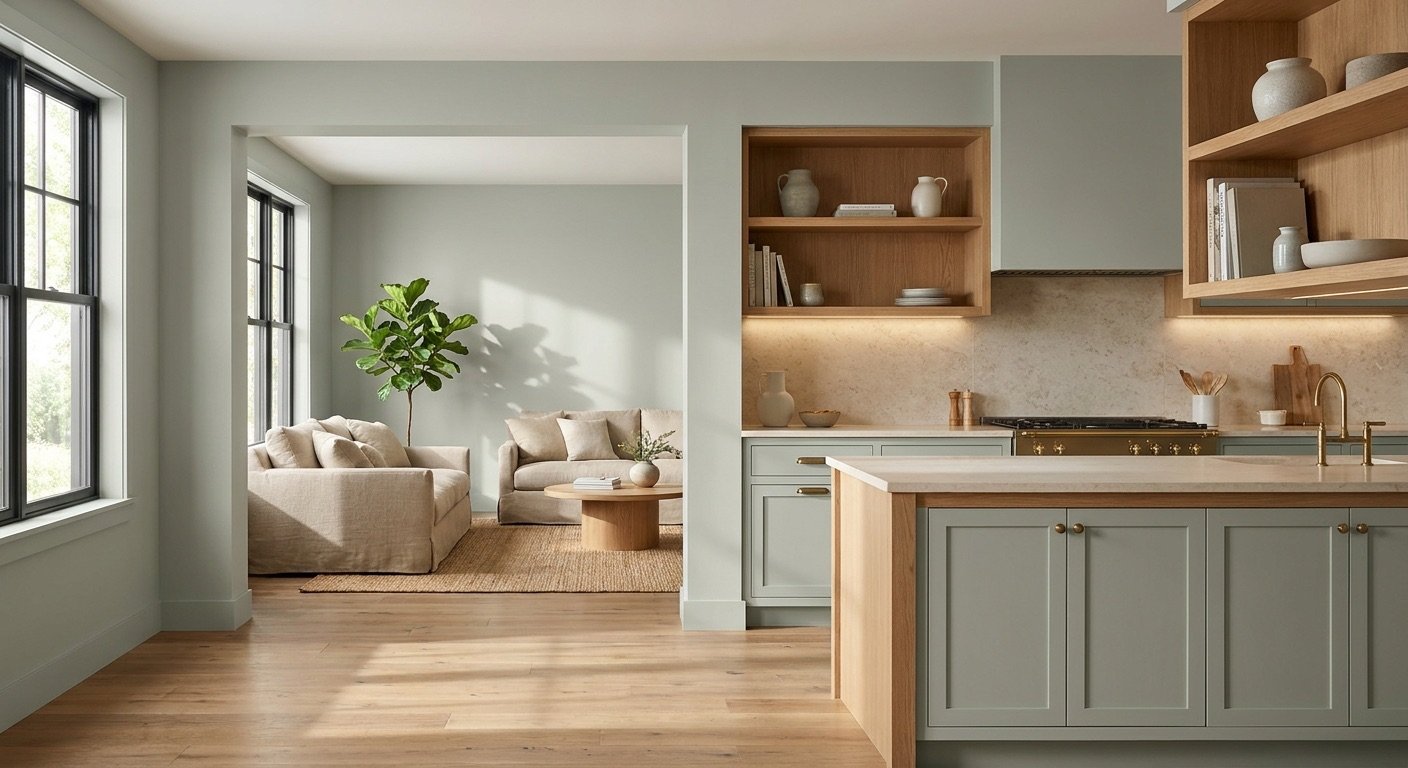
Wood cabinetry generally pairs well with the warmth in Shoji White, while stone countertops and tile backsplashes should be tested side by side with a paint sample first. If you're still comparing options, our guide to paint colors for kitchen cabinets covers other shades worth considering.

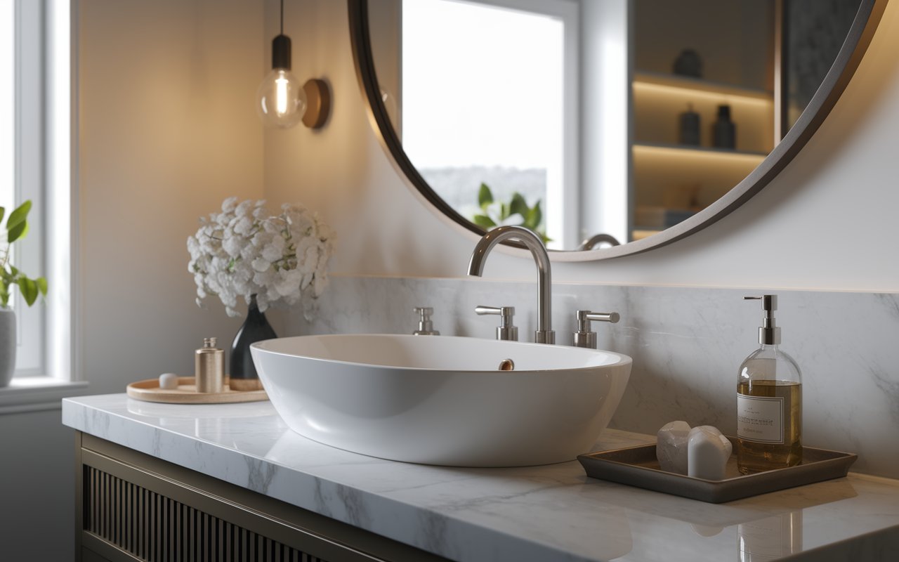
Bathrooms are tricky because lighting conditions can swing between strong natural light and harsh overhead bulbs. Shoji White generally holds up well here, especially alongside tile, stone, and white fixtures.
Warm metal finishes, like brushed brass or bronze, tend to complement its warmth rather than compete with it. The color can also soften the cooler appearance of some bathroom surfaces, but it's worth checking a sample beside your tile and countertop before painting.
Because Shoji White carries warmth, it pairs most naturally with colors and materials that share that same warm base.
These neutrals share a similar undertone family with Shoji White, which helps create a smooth, connected look across a room or an open floor plan.
Muted, sage-leaning greens tend to work well here. Since Shoji White has a faint green hint of its own, softer greens create a natural connection rather than a contrast.
Softer, slightly muted blues generally pair better than icy, cool-toned blues. A very crisp, cold blue can clash with the warmth in Shoji White, while a dustier blue tends to blend more smoothly.
Light woods, medium woods, and warm-toned woods all tend to work well with Shoji White. The key is checking the wood's own undertone — a wood with cool gray undertones may not blend as smoothly as one with warm honey or amber tones.
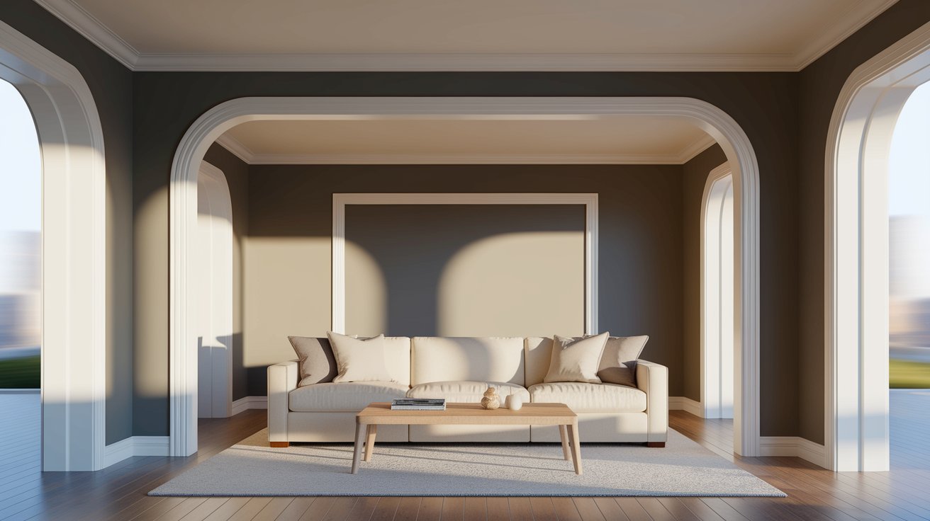
Trim choice matters more than people expect with a warm off-white like this one. Using Shoji White itself on the trim creates a soft, low-contrast look, which some homeowners like for a calm, blended feel.
For more separation between wall and trim, Pure White SW 7005 is a common choice, offering a cleaner, brighter contrast. Extra White SW 7006 is another option, but it leans cooler and cleaner, so it should be tested next to Shoji White before committing, since a strong temperature difference between the two can look unintentional.
A very creamy trim color paired with Shoji White walls may end up creating almost no visible separation, which is worth keeping in mind if you want your trim to stand out.

Shoji White can work well as an exterior body color, but sunlight changes paint far more dramatically outdoors than indoors. Direct sun tends to wash out and brighten a color, while shaded areas of the same house can look noticeably different.
Exterior lighting conditions are also less predictable than interior lighting, since sunlight angle changes with the time of day and season. Shoji White generally pairs well with brick, natural stone, and wood accents, and it can look sharp when paired with a darker trim color for contrast.
Because exterior mistakes are expensive and hard to undo, always test a sample patch on your actual home's exterior — ideally on more than one side of the house — before painting the whole structure.
Comparing Shoji White to other well-known Sherwin Williams shades can help you figure out which one actually fits your space.
Alabaster SW 7008 generally reads as a warm, soft off-white, while Shoji White can appear slightly more muted and beige/greige depending on the lighting. Both share a similar family of undertones, and Alabaster's higher LRV (around 82) means it typically shows up a touch brighter on the wall than Shoji White's roughly 74 — though how noticeable that difference is will depend on the room and the light hitting it.
White Duck SW 7010 generally reads a bit deeper and warmer than Shoji White. Shoji White has a higher LRV, so it typically looks lighter and airier on the wall, while White Duck leans into a more muted, dressed-down warmth.
Accessible Beige SW 7036 is a true beige rather than an off-white, and it reads considerably darker than Shoji White. If you want a soft neutral that still functions like a white, Shoji White is the lighter option; if you want a deeper, warmer wall color, Accessible Beige leans further in that direction.
| Color | LRV | General Look |
| Shoji White SW 7042 | ~74 | Warm off-white |
| Alabaster SW 7008 | ~82 | Softer, creamier warm white |
| White Duck SW 7010 | ~68 | Deeper, muted warm neutral |
| Accessible Beige SW 7036 | ~58 | True warm beige |
Pros
Cons
Testing a Shoji White sample this way will give you a much more accurate sense of how it will actually look once the whole room is painted.
Sherwin Williams Shoji White SW 7042 works well precisely because it doesn't try to be a stark white — its softness is the point.
Its warm off-white character makes it a versatile choice for walls, cabinets, bedrooms, kitchens, living rooms, and even exterior spaces.
At the same time, its beige and greige qualities can shift depending on the lighting, surrounding colors, and finishes in your home. That flexibility is part of what makes Shoji White appealing, but it also means the color may not look exactly the same from one room to another.
Before committing to a full room or exterior project, test a real sample alongside your flooring, trim, countertops, and other finishes.
How Shoji White looks on a small paint chip and how it looks on your walls can be very different, so let your own space make the final call.
Yes, though ceilings often receive different, more indirect lighting than walls. A ceiling painted the same color can sometimes look slightly flatter or cooler than the walls below it, so test a sample overhead before committing.
It can, but cool gray flooring may create a mild undertone conflict with Shoji White's warmth. Check the flooring's exact undertone against a paint sample in natural light before finalizing your choice.
Yes, using one consistent color across connected rooms can create a smooth, unified flow. Keep in mind that changing natural light from room to room can still make the same color look slightly different from space to space.
Yes, black hardware, faucets, and light fixtures tend to stand out nicely against the softness of Shoji White. The contrast between the dark black tones and the warm off-white background creates a clean, defined look.
Yes, though the stone's veining and base tone matter. Stone with warm gold, beige, or brown veining tends to blend smoothly with Shoji White, while stone with strong cool-gray or blue-gray veining can create a subtle undertone clash worth checking against a sample first.
Daniel Hartman is a color specialist with years of experience helping people make confident and thoughtful design decisions. He provides practical and approachable guidance while balancing creativity and functionality in every project. Daniel enjoys visiting art and design exhibits to study how different environments influence aesthetics, mood, and perception, bringing a rich perspective and insight into his work. His approach makes design decisions both simple and enjoyable.


No Comments