


12 Modern Christmas Decor Ideas Garland for Every Room
There's something magical about walking into a home decorated with


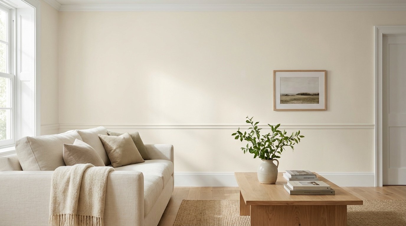
Sherwin Williams Kestrel White SW 7516 is a light, soft neutral that sits between a creamy off-white and a pale beige.
It feels warm and calm, but it is not a crisp, bright white. That surprises many people, so it helps to know what you are getting before you buy paint.
This guide covers undertones, LRV, lighting, trim, coordinating colors, room ideas, and comparisons with similar shades. You will also get a simple testing plan so you can decide if this color suits your home.
Thinking about using Kestrel White in your home? Read on to learn how it looks in different lighting, which colors pair well with it, and how to test a sample before making your final decision.

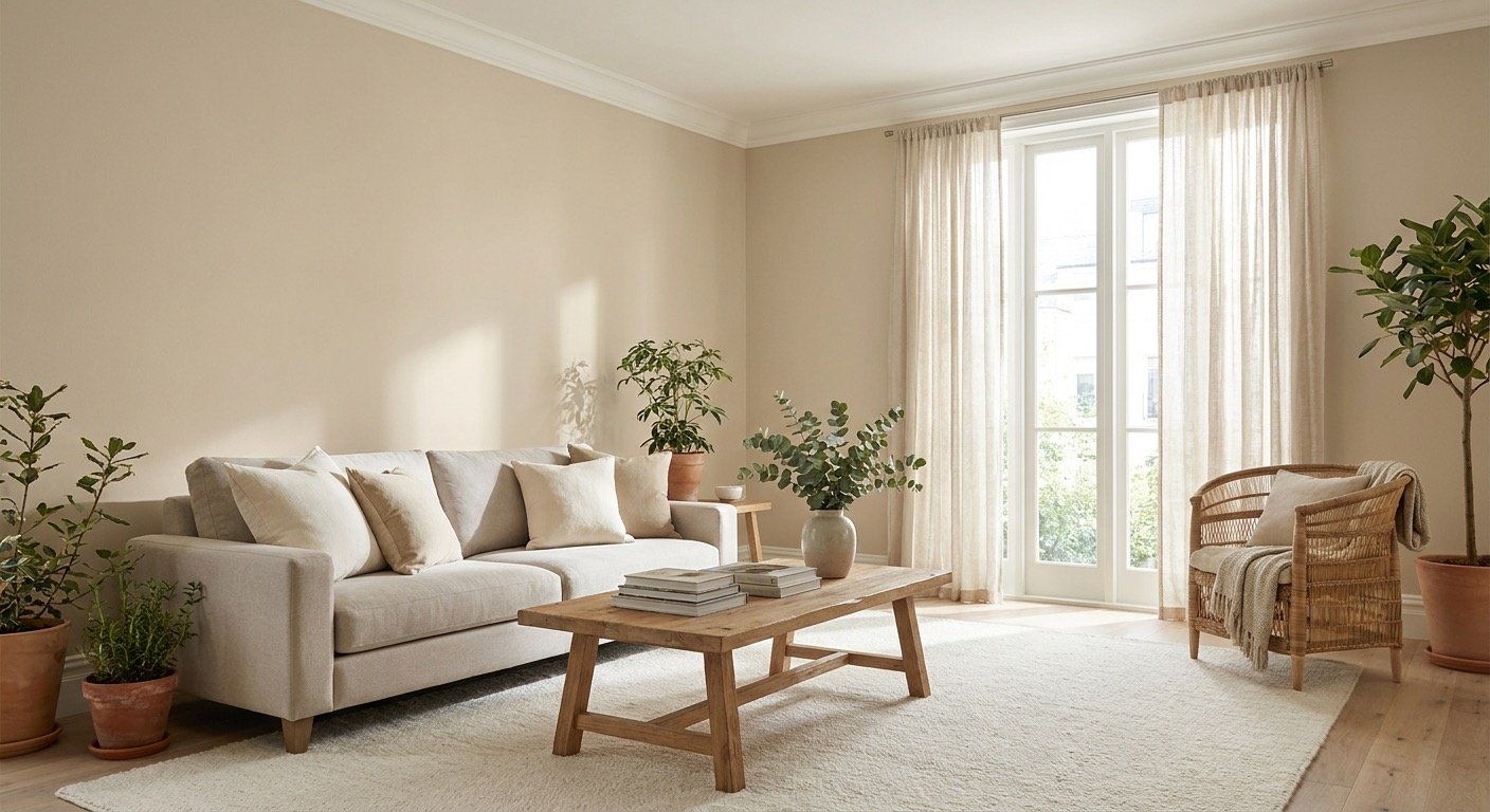
Kestrel White SW 7516 is a light, muted neutral with a warm beige and taupe feel. In a bright room, it can pass for a soft off-white. In a dimmer room, it often leans toward light taupe or greige.
The word "white" in the name can be misleading. Next to a clean, bright white, Kestrel White clearly looks like a tinted color. That is not a flaw. It gives the shade its relaxed, cozy feel.
Sherwin-Williams lists this color as SW 7516 in its catalog. You can check the details on the official Sherwin-Williams Kestrel White page.
| Specification | Information |
| Paint brand | Sherwin-Williams |
| Color name | Kestrel White |
| Color code | SW 7516 |
| General appearance | Light, muted warm neutral |
| LRV | Approximately 68.1 |
| HEX | #E0D6C8 |
Kestrel White undertones are best described as warm beige with a soft taupe feel. The main color is what you notice first. Undertones are the faint hints underneath, and they show up more when the paint sits beside other colors.
Some reviewers see a slight gray or purple tint in certain light. Others see only warm beige. Both can be true, because light, flooring, furniture, and nearby paint all change what your eyes pick up. Your room may show something different from someone else's.
The best check is a real sample. Hold it next to a bright white card and look at it at different times of day. A small online swatch cannot show you this.
| Setting | What to check for |
| Warm artificial lighting | Does the beige appear creamier or more golden? |
| Cooler natural daylight | Does the shade appear more muted or gray? |
| Next to a bright white | Does it read as beige/taupe rather than white? |
Kestrel White LRV is about 68.1 on the Sherwin-Williams listing (shown there as 68.102). LRV stands for light reflectance value. It is a score from 0 (black) to 100 (pure white) that shows how much light a color bounces back into a room.
A score near 68 puts this shade in the light range, but well below the brightest whites. It will feel soft, not glowing.
If you work with digital design tools, the same listing gives a HEX code and RGB values. Use them for rough comparisons only. A screen cannot copy real paint, which changes with sheen, light, and the surrounding surfaces.
| Technical detail | Value |
| LRV | Approximately 68.1 |
| HEX | #E0D6C8 |
| RGB | 224, 214, 200 |

Kestrel White in different lighting can look noticeably different, so plan to check it more than once. Nearby greenery, brick, wood floors, and white trim also change how your eyes read it.
Natural light shifts all day, and Kestrel White shifts with it. Bright daylight tends to look lighter and creamier, while shade can make the color look deeper and more muted. North- and south-facing rooms often differ, but window size, outdoor scenery, and room finishes matter too.
Warm lighting from soft white bulbs may bring out the cream and beige in this color. Cool lighting from daylight-style LED bulbs can make it look less golden and a bit more muted. Test your sample under the exact bulbs you use in the evening.
A quick three-sample check: bright white, Kestrel White, and a deeper beige. The fastest way to understand this color is to see it between two neighbors in the same light. Paint or place all three samples side by side, then look at them together.
| Sample | What you will likely notice | What to look for |
| Pure White (SW 7005), a bright white | Clean and very light (LRV about 84) | Does Kestrel White now look clearly beige or taupe beside it? |
| Kestrel White (SW 7516) | Light, soft, and warm (LRV about 68) | Does it turn creamier or grayer as the light changes? |
| Accessible Beige (SW 7036), a deeper beige | Visibly deeper, with more definition | Does Kestrel White now feel quiet and airy by comparison? |
If Kestrel White looks too close to the bright white, you may want more color. If it looks too close to the deeper beige, you may want something lighter. Judge all three at the same time of day, under the same bulbs.
Kestrel White can be considered for several areas of the home, but no color suits every room. For each space below, think about the effect you want and check the fixed finishes first.

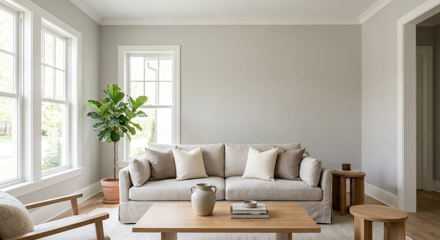
Kestrel White living room walls make a soft, quiet backdrop. Pair them with warm wood and cream or oatmeal upholstery for a cozy feel, or with lighter fabrics for an airier look. Test the sample beside your sofa and flooring before you commit.

A Kestrel White bedroom can feel calm and restful, since the shade is soft and muted. Check it beside your bed frame, curtains, and bedding, and look at it under the lamps you use at night. Evening bulbs may bring out more cream and beige than daylight does.

Kestrel White on kitchen walls has to work with your backsplash, countertops, and flooring, which often include several whites and neutrals. Check the color under the lights you use for cooking and evening meals. A sample taped near the stove and the window will show how much it shifts.

Kestrel White kitchen cabinets will be judged next to your countertops, backsplash, hardware, and flooring. If your counters are white, sample both together, because small differences between whites show up fast. Door sheen also changes the look, so sample the finish you plan to use.

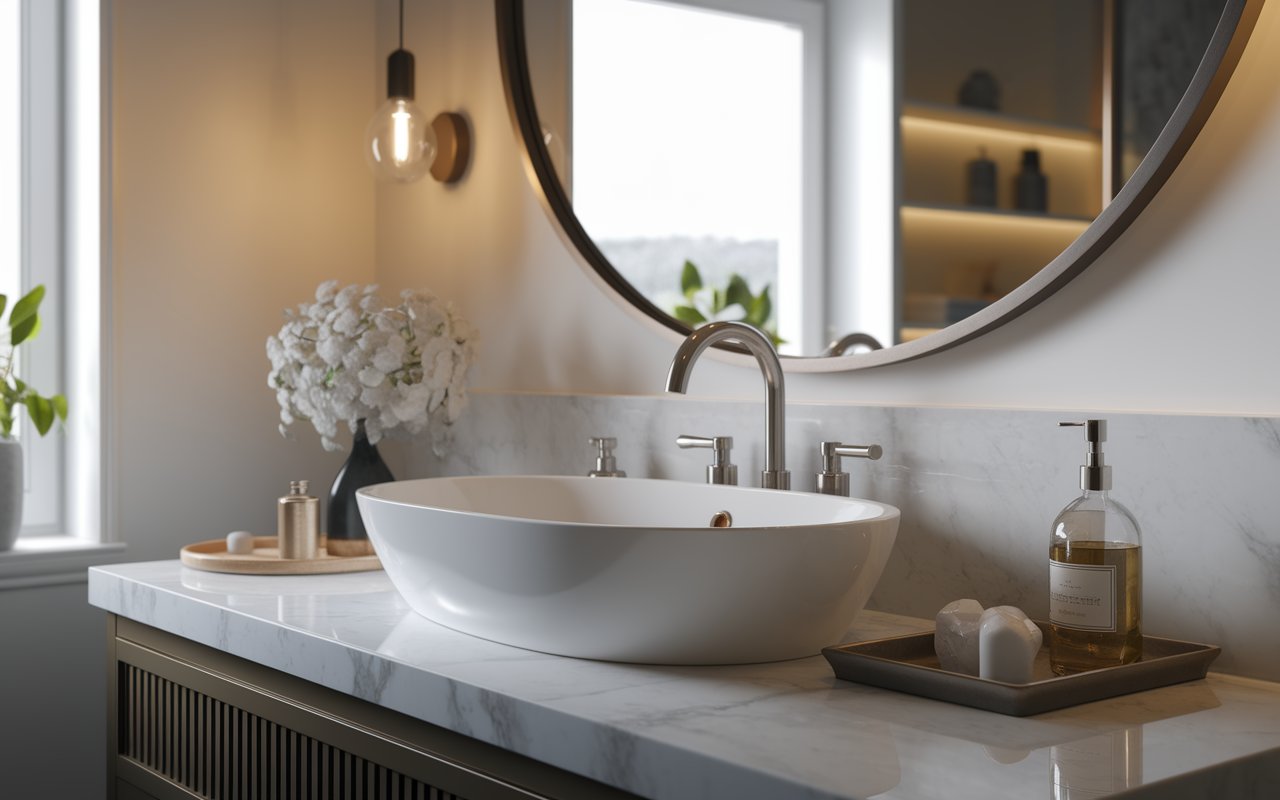
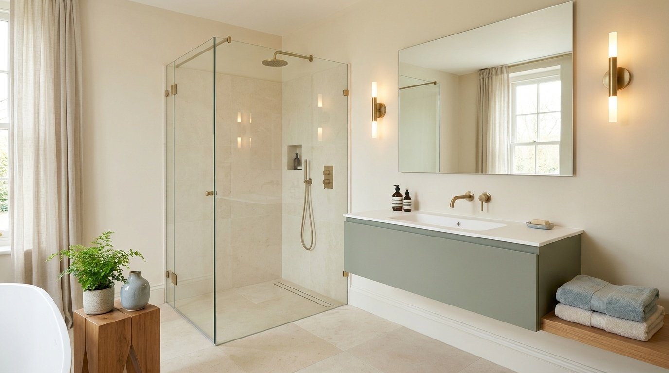
A Kestrel White bathroom depends heavily on light bulbs, since many bathrooms have few windows. Tile and white fixtures can make the paint look more beige by comparison. Test the sample beside your tile and vanity.

Hallways often get little direct light, so a hallway paint color can look deeper and more muted than it does in brighter rooms. Sherwin-Williams Kestrel White creates a warm, neutral backdrop that pairs well with white trim and wooden doors. Check the sample at both ends of the hall and beside door trim to see how the color changes with the light.

Kestrel White in smaller spaces, such as powder rooms or entryways, depends on window light and nearby white fixtures or trim. Do not expect it to make a small room look bigger. Test it in the real space before you paint.

The colors that go with Kestrel White usually fall into three groups: lighter whites for trim, deeper neutrals for definition, and a dark accent for contrast. Treat the list below as candidates to test, not guaranteed matches. Place samples where colors will actually meet, such as beside flooring, countertops, and trim. Each name links to its Sherwin-Williams page.
| Paint color | Suggested role | Why it may work |
| Greek Villa (SW 7551) | Softer white pairing | A warm white that sits comfortably with Kestrel White's warmth |
| Pure White (SW 7005) | Trim or doors | A clearer edge without an extremely stark look |
| High Reflective White (SW 7757) | Stronger white contrast | A cleaner, brighter contrast when you want one |
| Accessible Beige (SW 7036) | Coordinating neutral | A deeper beige-gray that adds definition, such as in an adjoining room |
| Urbane Bronze (SW 7048) | Dark accent | A deep neutral for cabinetry, doors, or selected features |
The best trim color for Kestrel White depends on the look you want. Some people want trim that blends in softly. Others want a clear, crisp line between wall and trim.
Pure White and High Reflective White are both worth testing. A creamy trim blends more gently. A cleaner white can make the wall look warmer by comparison.
Paint the trim and wall samples side by side, then check them in daylight and in the evening.
Sheen matters too. Trim is often painted in a glossier finish than walls, and a glossier surface reflects more light. That can make the same trim color look brighter.
| Desired look | Option to test |
| Softer transition | A compatible warm white, such as Greek Villa |
| More defined contrast | Pure White |
| Brighter, cleaner contrast | High Reflective White |
Two shades often come up when people compare options: Accessible Beige and Balboa Mist. Here is how they differ in broad terms.
| Color | Code | How it compares |
| Kestrel White (Sherwin-Williams) | SW 7516 | Light, warm beige/taupe, soft |
| Accessible Beige (Sherwin-Williams) | SW 7036 | Deeper warm beige-gray, more defined |
| Balboa Mist (Benjamin Moore) | OC-27 | Pale gray with a slightly warm cast, a little deeper than Kestrel White |
Kestrel White vs. Accessible Beige comes down to depth. Accessible Beige (SW 7036) is a deeper beige-gray, so it stands out more on the wall and gives a room more definition. Kestrel White is lighter and quieter. Both are warm, so both sit well with wood. Check the current LRVs on the official pages before you decide.
Kestrel White vs Balboa Mist is a choice between a warmer beige/taupe look and a paler gray with a warm cast. Balboa Mist is a Benjamin Moore color. Benjamin Moore lists its LRV at 65.53, a little below Kestrel White's 68.1. Compare dried physical samples side by side instead of trusting swatches on a screen.
Online photos and color codes are fine for narrowing your list, but they should not make the final call. Start with a Kestrel White paint sample from a paint store or a manufacturer-approved sample option. Then follow these five steps.
Sherwin Williams Kestrel White suits people who want a light, warm, muted neutral instead of a crisp white. Your floors, furniture, and lighting will shape the final result.
Consider it if:
Compare other shades if:
Whatever you decide, test a sample before buying paint for the whole room.
Kestrel White SW 7516 is a light, muted, warm neutral that can look different from room to room. Keep its beige/taupe undertones, LRV near 68, and the effects of lighting in mind when choosing this shade for your home.
Your choice of trim, flooring, and coordinating colors can also influence how the paint looks on the walls.Before you commit, test a physical sample beside your floors, counters, and trim, and judge it at different times of day.
Consider how it looks in both natural and artificial light, especially in darker spaces. Taking time to test the color will help you decide whether Kestrel White suits your room and the overall style you want to create.
Not quite. Sheen changes how light reflects off the surface, so the same color can look slightly different. Matte and flat finishes look softer, eggshell has a gentle glow, satin is smoother, and glossier finishes reflect the most light. Sample the finish you plan to use.
It may be considered for exterior use. The Sherwin-Williams color listing marks Kestrel White for both interior and exterior use. Outdoors, direct sun, shade, landscaping, roof color, and siding can all change how it looks. View a sample outside, and confirm the specific product you choose is made for exteriors.
A paint retailer can often try a cross-brand match, but pigments, bases, formulas, and sheen differ between brands, so results can vary. Do not rely on the name or HEX code alone. Compare dried physical samples before you buy a full can.
Using one color throughout can create a smooth flow from room to room. Still, the same color can look different in each space because of light and surrounding materials. Check a sample in every room, especially darker ones, before painting the whole home.
Measure each wall's length and height, multiply them, and add the totals. Subtract large openings if you like. Multiply by the number of coats, then divide by the coverage printed on your paint can. Round up to a quantity you can actually buy. For example, 400 square feet of wall with two coats is 800 square feet. At 350 square feet per gallon, that is about 2.3 gallons, so you would buy 3. Rough or porous surfaces use more paint, and coverage varies by product, so rely on the label.
Daniel Hartman is a color specialist with years of experience helping people make confident and thoughtful design decisions. He provides practical and approachable guidance while balancing creativity and functionality in every project. Daniel enjoys visiting art and design exhibits to study how different environments influence aesthetics, mood, and perception, bringing a rich perspective and insight into his work. His approach makes design decisions both simple and enjoyable.

No Comments