How to Choose the Perfect Window Coverings for Your Home
Window coverings are more than just decorative features. They influence


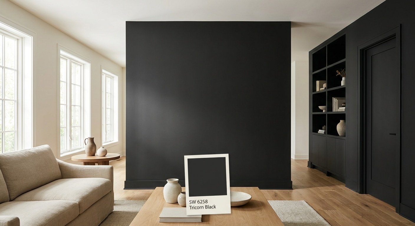
Sherwin Williams Tricorn Black is a near-true black paint color, officially cataloged as SW 6258, with an LRV of approximately 2.45, meaning it reflects very little light and reads as an exceptionally dark, near-true black. It has a very neutral undertone, which is why it doesn't consistently lean warm or cool the way some other dark colors do, and it's used across a wide range of interior and exterior applications, from cabinets and trim to front doors and siding.
This guide walks through what you need to know before using SW 6258 in your own home: its LRV, its undertones, how it behaves in different lighting, where it works well inside and out, which colors pair well with it, and how it compares to other popular black paints.
Before diving into the details, here's a quick snapshot of Tricorn Black SW 6258 and its basic properties.
| Property | Information |
| Color | Tricorn Black |
| Sherwin-Williams Number | SW 6258 |
| Color Family | Black |
| LRV | 2.45 |
| RGB | 47, 47, 48 |
| Hex | #2F2F30 |
| Undertones | Very subtle/neutral |
| Overall Appearance | Deep, near-true black |
That LRV number is the biggest clue to how this color behaves. Different color databases list Tricorn Black's LRV slightly differently, with figures ranging from about 2.45 to 3, but all of them place it firmly at the dark end of the scale, which is part of why it looks convincingly black in most settings.
Tricorn Black is about as close to a true black as you can get from a can of paint. It doesn't have the gray or blue cast that shows up in a lot of "black" paints once they're on the wall.
Technically, very few paints are a pure, 100% true black, and Tricorn Black is no exception. But in practical terms, it's about as dark and neutral as commercial paint gets, which is why so many people treat it as a true black.
The reason it doesn't read as charcoal gray comes down to how little light it reflects. Lighter blacks and dark grays bounce more light back at your eye, which softens their appearance, while a color with an LRV as low as Tricorn Black's reflects very little of the light that hits it, so it tends to hold onto that deep, saturated look even in a well-lit room. That said, the color around it, from flooring to furniture to nearby walls, can still shift how "black" it appears to the eye.
Tricorn Black undertones are about as minimal as you'll find in a black paint. It doesn't lean heavily warm or cool, which is one reason designers often describe it as a safe, flexible choice.
That said, "neutral" doesn't mean "invisible." In certain lighting, especially warm incandescent bulbs or strong afternoon sun, SW 6258 undertones can appear to shift ever so slightly warmer. Under cooler LED lighting or in a north-facing room, it can look a touch cooler and more graphite-like. This is normal behavior for almost any dark paint color, and it's one of the most common questions people ask when researching is Tricorn Black a true black or something with more personality hiding underneath.
Tricorn Black has an LRV of approximately 2.45, one of the lowest values in the Sherwin-Williams catalog, which is why it reads as such a deep, near-true black.
LRV stands for Light Reflectance Value, and it's simply a measure of how much light a paint color bounces back into a room versus how much it absorbs. The scale runs from 0, which would be a color that absorbs all light, to 100, which reflects nearly all of it.
Tricorn Black LRV sits at approximately 2.45, with some sources rounding it to 3. Either way, that places it near the very bottom of the scale, making it one of the darkest colors in the Sherwin-Williams lineup.
An LRV this low means the paint reflects very little light back into the room. That's a big part of why it reads as such a deep, saturated black rather than a soft charcoal.
Compare this to a typical dark gray, which might have an LRV in the 10 to 20 range. Those grays still bounce enough light around to feel like "dark" colors rather than true blacks, while Tricorn Black, with its much lower LRV, tends to hold onto a more consistently dark appearance. Because it reflects so little light, room lighting becomes especially important. A well-lit space can generally handle this color without feeling like a cave, while a dim room may end up feeling heavier than expected.

Lighting changes everything with a color this dark, so it helps to know what to expect in different conditions.
Tricorn Black is generally considered a neutral black rather than distinctly warm or cool. However, surrounding colors and lighting can make it appear slightly warmer or cooler depending on the room.
This is one of the most common questions people ask before committing to a dark color, and the reason for that neutral classification is that Tricorn Black isn't marketed or formulated as a warm black or a cool black.
That said, no paint color exists in a vacuum. The materials around it, whether that's warm wood floors, cool marble countertops, or brass versus chrome fixtures, can nudge the way this black is perceived. A room full of warm wood tones may make SW 6258 look a touch cozier, while a space full of cool stone and metal can make it feel crisper and more modern.
Because of this, it's worth avoiding the assumption that Tricorn Black will look identical in every home. The safest approach is always to test a sample directly in the room where it will be used, since lighting and surrounding finishes play such a big role in the final result.
Because Tricorn Black is such a deep, neutral shade, it works well both as a bold accent and, in select cases, across larger surfaces. The key is understanding where it tends to shine and where it can start to feel like too much.

Tricorn Black cabinets have become a popular choice in modern kitchen design, especially paired with white countertops and light-colored backsplashes. The contrast creates a clean, high-impact look without needing any other bold colors in the room.
Brass or gold hardware adds warmth against the black finish, while wood accents, like a butcher block island or open wood shelving, help keep the space from feeling cold. A kitchen with black cabinets on every wall can start to feel heavy, especially in a smaller space with limited natural light, so many homeowners choose to use Tricorn Black only on lower cabinets or a single wall of upper cabinetry.

Painting interior doors in Tricorn Black is one of the easiest ways to add contrast to a home without repainting entire walls. A single black door against white or light-colored trim creates a striking focal point that still feels intentional rather than overwhelming.
This approach works particularly well in hallways or entryways, where the door naturally draws the eye. It's a low-commitment way to introduce this color if you're not ready for a full black wall or room.

Pairing white walls with black trim has become a signature look in modern interior design, and Tricorn Black is a common choice for this application. The contrast outlines the architecture of a room, drawing attention to crown molding, door casings, and baseboards.
In more traditional homes, black trim can feel unexpected but still works if used thoughtfully, especially alongside classic moldings. Using black selectively, such as only on baseboards or only around windows, keeps the look from becoming too heavy in older, more ornate spaces.
Accent Walls

A Tricorn Black accent wall is one of the most popular ways to use this color without committing an entire room to it. In bedrooms, it can create a cozy, cocoon-like feel, especially behind a bed as a headboard wall.
In living rooms, it often works well behind a fireplace or built-in shelving, where the black helps items on display stand out. Home offices and media rooms also benefit from this treatment, since a darker wall can reduce glare on screens and create a more focused atmosphere. Natural light plays a big role here: a room with ample daylight can handle a full accent wall more easily than a dim space with only one small window.

A Tricorn Black bathroom vanity can anchor a space that might otherwise feel plain. It pairs especially well with white tile, marble countertops, and light-colored walls, creating the kind of contrast that makes a small bathroom feel more polished.
Brass hardware is a popular pairing here as well, adding a warm metallic touch against the deep black cabinetry. Because bathrooms are often smaller rooms, many homeowners choose to apply this color only to the vanity rather than the walls, keeping the space feeling open.

Beyond walls and cabinetry, Tricorn Black also works well on individual furniture pieces. Dressers, console tables, and built-in shelving painted in this color can serve as bold statement pieces in an otherwise neutral room.
This is a good option for anyone who wants to test out the color's impact before committing to a larger surface. A single black dresser or shelving unit gives a real sense of how the color behaves in your specific lighting without any long-term commitment.

Exterior applications are one of the biggest reasons people search for this color, and Tricorn Black has become a favorite for homeowners chasing a bold, modern curb appeal look.
Tricorn Black exterior siding shows up frequently on modern homes with clean lines and minimal trim detail, where the color emphasizes the architecture's simplicity. It also appears on farmhouse-style homes, often paired with white trim and a metal roof for that classic modern-farmhouse contrast.
Because of its very low LRV, large surfaces like full siding require some extra thought. Dark exterior colors absorb more heat from the sun, which can affect certain siding materials over time, so it's worth talking to a painting professional about the right products and preparation for your specific siding type and climate.
A Tricorn Black front door is one of the simplest ways to add curb appeal without repainting the whole house. It looks sharp against white or cream exteriors, brick, stone, and natural wood siding alike, which is part of why it's such a versatile choice.
Brass or bronze hardware tends to stand out beautifully against the black finish, adding a polished, upscale touch to the entryway.
Black shutters and window trim in Tricorn Black help frame windows and add definition to a home's exterior. This works especially well on lighter-colored homes, where the black creates crisp, clean lines that draw the eye across the facade.
A Tricorn Black garage door can work well when it complements the rest of the exterior color scheme, particularly on homes that already use black accents elsewhere, like the front door or window trim. On homes with little other black detailing, a solid black garage door can sometimes stand out more than intended, so it helps to plan it alongside the rest of the exterior palette.
Beyond doors and shutters, this color also shows up on fascia boards, soffits, railings, porch details, and pergolas. These smaller applications let homeowners bring in the drama of Tricorn Black exterior paint without covering the entire house, which is a popular middle-ground option for those who like the look but want to start small.
Because it's such a neutral, near-true black, Tricorn Black coordinating colors span a wide range of styles, from crisp whites to warm neutrals to bold statement shades.
Pairing this black with the right white can change the entire feel of a space, depending on how much contrast you want.
| White Color | Contrast With Tricorn Black | Overall Effect |
| Extra White | High | Crisp, cool, and modern |
| High to moderate | Clean and balanced | |
| Moderate | Softer, warmer, and more relaxed |
For a softer, more layered look, warm neutrals can balance out the intensity of the black.
| Warm Neutral | Contrast With Tricorn Black | Overall Effect |
| Moderate | Neutral and understated | |
| Repose Gray | Moderate | Balanced and calm |
| Accessible Beige | Moderate to soft | Warm and welcoming |
| Canvas Tan | Soft | Cozy and grounded |
Pairing this black with natural wood, whether that's oak, walnut, or another medium tone, helps prevent a space from feeling too stark or one-note. Wood introduces warmth and texture that pure black-and-white palettes sometimes lack, which is why so many kitchens and living rooms combine black cabinetry or trim with visible wood flooring or furniture.
For homeowners who want more personality, Tricorn Black also pairs well with deeper, richer hues. Deep green, navy, terracotta, and muted blue all read as sophisticated next to this black, since none of them compete with its near-true darkness.
Sherwin-Williams offers several near-black colors, and it helps to see how they stack up before making a final decision.
| Paint Color | Approx. LRV | General Character |
| Tricorn Black SW 6258 | 2.45 | Very deep, near-true black |
| Iron Ore SW 7069 | ~6 | Soft black/charcoal |
| Caviar SW 6990 | ~3 | Black with warmer/brown character |
| Black Magic SW 6991 | ~3 | Warm-leaning black |
Iron Ore has a noticeably higher LRV than Tricorn Black, which means it tends to read more like a soft, deep charcoal than a true black. In rooms with lots of natural light, Iron Ore can look almost gray, while Tricorn Black, with its lower LRV, tends to hold a more consistently dark, saturated appearance. Neither is objectively better; the choice comes down to whether you want the softer flexibility of a charcoal-leaning color or the deeper, more saturated look of a true black.
Caviar sits close to Tricorn Black in terms of darkness, but it tends to carry a slightly warmer, brownish undertone in certain light, while Tricorn Black stays more neutral across most lighting conditions. Both read as very dark, near-true blacks, so the decision often comes down to which undertone feels right in your specific space and against your other finishes.
Black Magic is another close competitor in terms of darkness, but it tends to lean warmer overall, especially under incandescent lighting. Tricorn Black remains the more neutral option of the two. Neither color is objectively better; it depends on whether you want a color that leans warm or one that stays as neutral as possible.
Beyond the Sherwin-Williams lineup, a few other black paints come up often in comparison searches, including Benjamin Moore Black, Benjamin Moore Wrought Iron, and Farrow & Ball Pitch Black. Each brand formulates its blacks differently, which means LRV values, undertones, and overall depth can vary even among colors that sound similar on paper.
Because of these differences, it's worth comparing actual paint samples side by side rather than relying on color names or online photos alone. Tricorn Black alternatives from other brands may look strikingly similar in pictures but behave differently once applied in your specific lighting.
Choosing a color this dark is a bigger decision than picking a typical neutral, so it helps to weigh the pros and things to consider before committing.
Because this color is so dark and lighting-sensitive, testing it properly matters more than it would with a lighter, more forgiving paint.
Sherwin Williams Tricorn Black stands out because of how genuinely dark and neutral it is, thanks to an LRV of just 2.45. That low number is what separates it from softer blacks and charcoal grays that can look washed out in bright rooms.
Inside the home, it works well on cabinets, doors, trim, accent walls, and vanities, while outside it shows up on siding, front doors, shutters, and garage doors. In every case, lighting plays a major role in how the color reads, which is why testing a sample in your actual space is always worth the extra step. Whether you're drawn to it for a single accent or a larger design statement, SW 6258 remains one of the most dependable near-true blacks available.
A very dark color like this can make walls feel closer, especially in a room with low ceilings or limited natural light. However, strong contrast, good lighting, and reflective surfaces like mirrors or glossy trim can offset that effect. Using black selectively, such as on one wall instead of all four, is a common way to add depth without shrinking the visual space.
A black ceiling can work in the right setting, particularly in rooms with high ceilings, strong architectural detail, or ample lighting to balance out the darkness. In a low-ceilinged room with little natural light, it can feel heavy and closed in. This treatment tends to work best in dining rooms, libraries, or moody bedrooms designed around a dramatic look.
Matte and eggshell finishes tend to hide imperfections better and give a softer, more sophisticated look, making them popular for walls. Satin holds up well on trim and doors, offering a bit more durability and sheen. Semi-gloss is often reserved for cabinetry, doors, and high-touch areas where extra durability and a bit of shine are useful.
Yes, natural wood tones like oak, walnut, and pine tend to pair well with this color, since the wood grain and warmth add texture and balance next to such a deep, flat black. This combination is especially common in kitchens and living rooms, where wood flooring or furniture keeps the space from feeling too stark.
It can work in a small room, particularly with good lighting and a thoughtful approach to how much of the space it covers. Limiting the color to one wall, the trim, doors, or a single piece of cabinetry allows you to enjoy the drama of Tricorn Black without overwhelming a compact space.
Daniel Hartman is a color specialist with years of experience helping people make confident and thoughtful design decisions. He provides practical and approachable guidance while balancing creativity and functionality in every project. Daniel enjoys visiting art and design exhibits to study how different environments influence aesthetics, mood, and perception, bringing a rich perspective and insight into his work. His approach makes design decisions both simple and enjoyable.


No Comments