

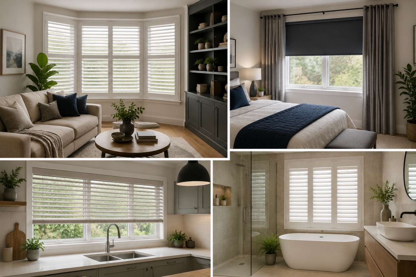
How to Choose the Perfect Window Coverings for Your Home
Window coverings are more than just decorative features. They influence


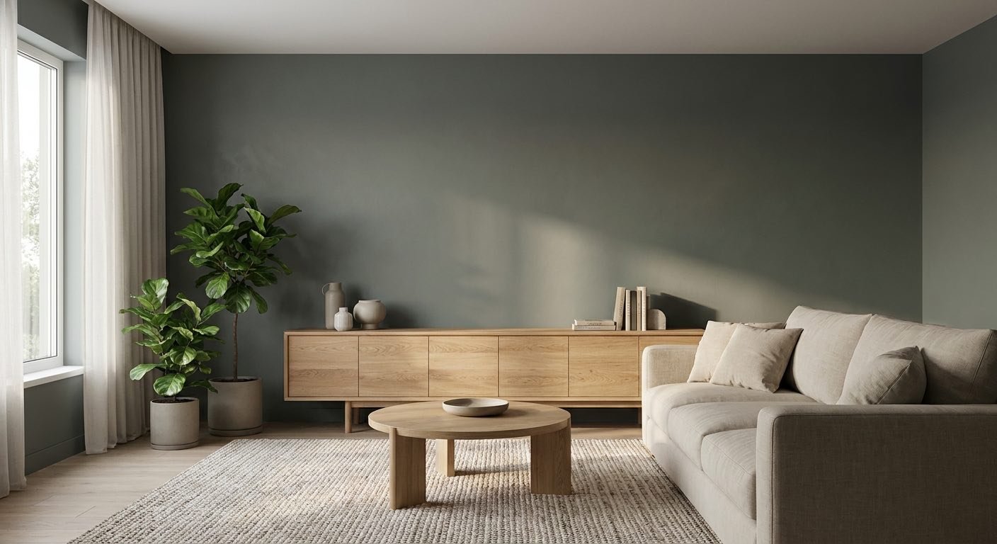
Sherwin Williams Rosemary is a deep, muted green with a strong gray backbone and a soft earthy quality that shifts depending on the light around it.
It reads as calm and grounded rather than bright or playful, which is why so many homeowners reach for it on cabinets, doors, and accent walls.
This color tends to suit people who want a moody, nature-leaning space without going full black or navy.One thing to know up front: Rosemary doesn't look the same in every room.
Natural light, nearby furniture, and even the finish you paint it in can push it toward gray, green, or something in between.
That's part of what makes it interesting, but it also means a little planning goes a long way before you commit to a full room.
Before getting into the details, here's a quick snapshot of what Sherwin Williams Rosemary brings to a room.
| Property | Details |
| Paint Color | Sherwin Williams Rosemary |
| Color Number | SW 6187 |
| Color Family | Green |
| LRV | 14 |
| Undertones | Gray with subtle olive influence |
| Overall Appearance | Deep, muted, earthy green |
| Best Uses | Cabinets, accent walls, bedrooms, bathrooms, doors, exteriors |
This table covers the basics. The sections below go deeper into what each of these points actually means for your home.

Sherwin Williams Rosemary is a dark, dusty green that leans more toward gray than a true grass or emerald green. It doesn't shout for attention. Instead, it sits quietly in a room, giving off a calm, grounded feeling that many people describe as restful.
The muted quality comes from how much gray is mixed into the base green. Rather than being vivid or saturated, SW Rosemary looks a bit smoky, almost like it's been softened on purpose. That softness is a big part of why the color feels more mature than a bold, punchy green would.
Because of that gray influence, Rosemary SW 6187 reads as understated rather than showy. It's the kind of green that fits into a room instead of demanding to be the loudest thing in it.
This quality also makes it flexible across design styles:
LRV stands for Light Reflectance Value. It's a simple scale from 0 to 100 that tells you how much light a paint color bounces back into a room. A value near 0 absorbs almost all light and looks close to black. A value near 100 reflects nearly all of it and looks close to white.
With an LRV of 14, Sherwin Williams Rosemary sits firmly on the dark end of that scale. It absorbs far more light than it reflects, which is why it can look deep and shadowy in certain settings. This is one of the most consistent facts you'll see mentioned about the color, and it's worth understanding rather than just noting the number.
In practical terms, a low LRV means the paint needs some help from its surroundings. Bright rooms with several windows will let the color show its green character. Rooms with little natural light may make it look closer to a very dark gray-green.
It can, and how much depends on the room rather than the paint alone. A large room with several windows keeps the color looking rich rather than gloomy. A small room with limited windows will feel the low LRV more strongly, which many people actually want in a bedroom or powder room.
A useful rule of thumb: if a room gets less than a few hours of direct sun and relies mostly on one small window, treat Rosemary as an accent-wall or cabinet color rather than a full-room commitment. Rooms with two or more exposures, or a skylight, can usually handle more coverage without feeling cave-like.
One detail that's easy to miss: overhead lighting alone isn't enough to keep a Rosemary room from feeling flat at night. Layer in a floor lamp or table lamp at eye level, since side lighting shows off the texture and undertone of a dark color far better than a single ceiling fixture does. The next section covers how orientation and bulb temperature shift the color specifically.
Undertones are the subtle colors hiding underneath the main color, and they're often what determines whether a paint color feels right in your space. For Sherwin Williams Rosemary, the undertones are the real story behind why this color behaves the way it does.
The dominant undertone is gray, which gives the color its calm, muted feel. Sitting underneath that gray is a soft olive or earthy quality that comes forward in the right lighting. Together, these two undertones are what keep Rosemary from looking like a plain, flat green.
Because of this gray-and-olive combination, Rosemary doesn't have the punch of a bright grass green. It's quieter and more layered, which is part of why designers reach for it when they want something that feels intentional rather than trendy.
Surrounding colors also change how these undertones show up. Next to warm wood tones, the olive quality tends to stand out more. Next to cool whites or grays, the gray undertone becomes more noticeable. Lighting plays a similar role, which is covered in more detail in the next section.
A few pairings are worth avoiding if you want Rosemary to look intentional rather than muddy:
There isn't a simple yes-or-no answer here, and that's actually useful to know before you paint. Rosemary has a real gray influence, which can make it read cooler in rooms with limited or north-facing light.
At the same time, natural and warm light tends to coax out the green and olive side of the color, making it feel a bit warmer and more organic. So the same paint can shift depending on the time of day or the direction your windows face.
The finishes around the paint matter too. Brass hardware, wood furniture, and warm-toned flooring will nudge the color toward feeling warmer. Cooler metals, white marble, or gray-toned wood can pull it back toward its gray side. This is why two rooms painted in the exact same color can feel noticeably different.

Lighting has a bigger effect on Rosemary in natural light than on lighter, more neutral colors. Since the base LRV is already low, small changes in light levels are easier to notice.
North-facing rooms get cooler, more indirect natural light throughout the day. In this kind of light, the gray undertones in Rosemary tend to become more noticeable, and the color can look darker and more subdued overall.
South-facing rooms receive strong, warm natural light for most of the day. This tends to bring out the green and olive character of the paint, making it look a bit softer and more alive compared to a north-facing space.
Morning light in east-facing rooms is soft and warm, which can make Rosemary look inviting early in the day. As the sun moves and afternoon light fades, the room can shift toward a cooler, more muted version of the same color.
West-facing rooms often start the day in shadow, so the color can look flatter and grayer in the morning. By late afternoon and into the evening, warm setting-sun light usually brings out more green and depth.
At night, or in rooms without much daylight, your light bulbs take over the job the sun was doing. Warm bulbs (often labeled around 2700K–3000K) tend to bring out the green and soften the gray. Cool or neutral bulbs (closer to 4000K and above) can make Rosemary look flatter and more gray.
If you're testing Rosemary in low light, it helps to check the room under both your daytime and evening lighting before deciding.
No. Sherwin Williams Rosemary is a deep green, not a black or near-black color, though its LRV of 14 (explained above) means it can look close to black in a poorly lit corner.
The clearest way to check is a side-by-side test. Hold a Rosemary sample next to a genuinely near-black green or a true black, such as a paint chip in the LRV 0–5 range. Near-black shades hold almost no visible color even in shade, while Rosemary usually keeps a hint of gray-green showing through, especially near a window or under a warm bulb.
A tiny paint chip is also easy to misread, since small samples don't absorb and bounce light the way a full wall does. Painting a large sample board, at least two feet square, and moving it around the room at different times of day gives a far more honest answer than a 2-inch chip ever will.
Rosemary works well anywhere you want a deep, grounding color that still feels calm rather than heavy. It's flexible enough to use on a small accent, a full wall, or even cabinetry, depending on how bold you want the room to feel.

Sherwin Williams Rosemary can give a living room a rich, grounded look without making the space feel overly formal. It works especially well in living rooms with plenty of natural light, where the green character remains visible throughout the day. Pairing Rosemary walls with lighter upholstery, warm wood furniture, and soft neutral accents can keep the room balanced.
If the living room has limited natural light, consider using Rosemary on one main wall rather than covering the entire room. Lighter trim and ceiling colors, along with a large mirror or other reflective surfaces, can help prevent the deep green from making the space feel too dark.

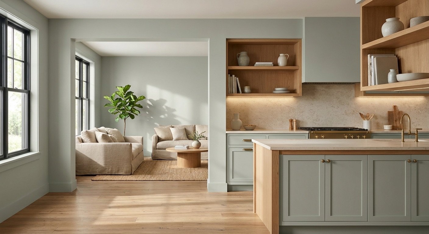
Rosemary is a popular pick for kitchen cabinets because it adds richness without feeling harsh. On full cabinetry, it creates a bold, restaurant-style look. Many homeowners prefer using it only on lower cabinets or a kitchen island, keeping upper cabinets in white to balance the weight of the color.
It pairs especially well with white countertops, marble, and quartz, since the light surface keeps the space from feeling too dark. Brass or gold hardware brings out the warmer, olive side of the paint, while natural wood accents add texture and softness next to the deep green.

An accent wall is one of the lowest-risk ways to try this color. It works nicely in living rooms behind a sofa or media console, in bedrooms behind the headboard, and in dining rooms where it can pair with a wood table.
Home offices also benefit from a Rosemary accent wall, since the color can help create a calmer, more focused feel. Board-and-batten walls painted in Rosemary add texture along with color, which is a popular combination in farmhouse and transitional spaces.

In a bedroom, Rosemary creates a moody, cozy atmosphere that many people find easier to relax in. It pairs well with warm bedding in cream, rust, or soft brown tones, and it looks especially good next to wood furniture like a bed frame or nightstands.
Lighting matters here too. A room with warm bedside lamps will keep the color feeling soft and inviting in the evening, rather than heavy.

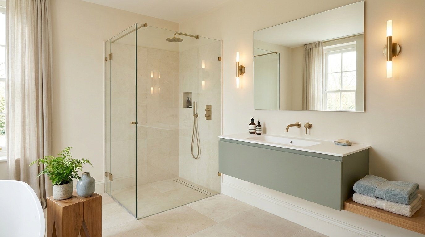
Rosemary is a strong choice for a bathroom vanity, giving the space a built-in, custom feel. It also works well on walls or built-in shelving when paired with white tile, which keeps the room from feeling cramped.
Brass fixtures bring out the color's warmer undertones and are a common pairing in bathrooms that use Rosemary.

A home office painted in Rosemary can feel more focused and grounded than a typical white or beige room. The deep, muted tone tends to reduce visual distraction, which some people find helpful for concentration during work hours.
Pair it with light wood furniture and warm lighting to create a comfortable, balanced workspace that feels inviting throughout the day.

As a front door color, Rosemary looks especially good against a white or cream exterior, where the contrast lets the green stand out clearly. It also pairs nicely with brick and natural stone, picking up the earthy tones already present in those materials. Black or brass hardware both work well here, depending on the style of the home.
Adding greenery or natural wood accents can make the entrance feel warm and welcoming while complementing Rosemary's earthy character beautifully.

On siding, Rosemary gives a home a grounded, natural look that tends to blend well with landscaping. It also works nicely on shutters or trim for homes that want a smaller pop of color rather than a full exterior commitment.
Outdoors, natural light plays a bigger role than indoors since there's no roof or walls limiting exposure. In full sun, the color will look more vibrant and green. In shaded areas, it can look noticeably darker and more gray.
Because Rosemary has both gray and olive undertones, it pairs well with colors that either calm those tones down or bring out their warmth. The right pairing really depends on the mood you're going for in the room.
Crisp whites make Rosemary look bolder and more defined, while warmer whites blend more smoothly with the paint's olive undertones.
Beige, greige, cream, and taupe all work well alongside Rosemary because they echo its earthy quality without competing with it. A few good examples include Accessible Beige, Balanced Beige, and Neutral Ground, all of which help soften the depth of the green.
Oak, walnut, and other medium wood tones pair especially well with Rosemary. These woods carry warm, earthy undertones that match the olive side of the paint, creating a cohesive, grounded look rather than a clash of cool and warm elements.
The clearest way to sort this: warm-toned woods with visible red, orange, or golden-brown grain (natural oak, walnut, cherry) tend to bring out Rosemary's olive side and feel the most cohesive. Cool-toned woods with an ashy, gray, or pinkish cast (whitewashed oak, some gray-stained woods) will push the pairing toward the gray side of the color instead, which can look intentional in a modern space but slightly flat in a traditional one. If you're working with a wood tone you already own and aren't sure which category it falls into, hold a Rosemary sample directly against it in daylight rather than guessing from memory.
Each metal changes the overall mood, so it's worth picking based on the style you're going for rather than just personal preference alone.
Layering Rosemary with other muted greens, rather than sticking to just one shade, can add depth to a room without making it feel like everything matches too perfectly. This works especially well in kitchens or built-ins where cabinetry and accents can use slightly different green tones.
Rather than a random list of colors, here are three palette directions built around Rosemary, each suited to a different kind of space.
Palette 1: Warm & Organic Rosemary + warm white + beige + natural wood
This combination works well in living rooms and kitchens that want a relaxed, nature-inspired feel without going too dark or too formal.
Palette 2: Moody & Rich Rosemary + dark brown + brass + cream
This palette suits bedrooms, dining rooms, and home offices where a deeper, more dramatic atmosphere is the goal.
Palette 3: Fresh & Balanced Rosemary + soft white + muted green + light wood
This is a good fit for bathrooms and smaller rooms that need Rosemary's depth balanced out with lighter tones to avoid feeling closed in.
Sherwin Williams Pewter Green (SW 6208) has a published LRV of around 12, just slightly darker than Rosemary's 14. The two colors sit close enough on paper that they're easy to confuse from a fan deck, but they read differently on a wall.
Pewter Green carries a more pronounced metallic gray base, and some describe a faint blue-gray cast underneath it. Rosemary's gray is paired with more olive and brown, giving it a warmer, earthier lean by comparison. In a shaded room, Pewter Green tends to go cooler and grayer, while Rosemary tends to hold onto more of a green-brown quality.
Choose Rosemary if you want a deep green with a warmer, earthier feel. Choose Pewter Green if you want a cooler, more metallic gray-green with a bit less warmth.
Evergreen Fog carries an LRV of around 30, more than double Rosemary's 14, which puts it in a medium-tone range rather than a genuinely dark one. It also leans toward a softer sage-gray with a faint sage-blue quality, compared to Rosemary's deeper olive-gray.
That LRV gap matters most in rooms with average or below-average natural light. Evergreen Fog is far more forgiving on all four walls in those conditions, while Rosemary is more likely to need the accent-wall or well-lit-room approach described earlier in this article.
Choose Rosemary if you want more depth, drama, and a genuine dark-green statement. Choose Evergreen Fog if you want an easier, medium-toned green that works in more rooms without much planning.
Ripe Olive sits at an LRV of around 6, well below Rosemary's 14, putting it in the same dark range as several near-black Sherwin Williams colors. That difference is significant in practice: Ripe Olive is far more likely to read as black in a dim room, while Rosemary generally holds onto a visible green-gray character even in low light.
Choose Rosemary if you want a deep green that still reads clearly as green in most lighting. Choose Ripe Olive if you want something closer to a black-green for maximum drama, and you have strong lighting to support it.
Retreat carries an LRV of around 21, noticeably lighter than Rosemary's 14, and its undertone leans more toward blue-gray rather than Rosemary's warmer olive-gray. Side by side, Retreat reads cooler and a shade less saturated.
Retreat tends to work well in rooms where you want a gentle, calming green without much drama, and it's more forgiving on full walls in average light. Rosemary is the better choice when you want a stronger, warmer, more grounded statement.

Despite the similar names, these two colors are not the same shade, and the gap is bigger than most people expect. Benjamin Moore Rosemary Sprig (2144-30) carries an LRV in the mid-30s, more than double Sherwin Williams Rosemary's 14. On a wall, that difference alone makes Rosemary Sprig look like a completely different color family.
The undertones also point in different directions. Rosemary Sprig tends to read as a warmer, khaki-olive green with less gray weighing it down, closer to a muted sage or dried-herb tone. Sherwin Williams Rosemary keeps a heavier gray base mixed with its olive character, which is what gives it that deeper, more subdued look.
In terms of application, Rosemary Sprig works well for those wanting a light, warm sage across a full room without worrying about a low LRV. Sherwin Williams Rosemary is the better pick for cabinets, accent walls, or spaces where a deeper, more grounded color is the goal. If you searched for one expecting the other, check the LRV first before ordering a sample.
Warm whites like Alabaster soften the contrast against Rosemary, while crisper whites like Pure White create a bolder, more defined edge. The choice mostly comes down to whether you want the trim to blend in or stand out.
Lighter colors generally balance out a deep color like Rosemary, keeping the room from feeling too heavy overhead. A soft white or very light neutral ceiling usually works best, especially in rooms with limited natural light.
You have a few solid options here. Matching the door to Rosemary creates a seamless, built-in look. Using white keeps things bright and traditional. A contrasting dark color, like black or deep charcoal, can add a bold design moment if that fits the style of the home.
Pros
Cons
Choose Rosemary if:
Consider another color if:
Before committing to a full room, it's worth testing a real sample in the space where you plan to use it. Check it in the morning, afternoon, and evening, since lighting changes can shift how the color reads throughout the day.
It can work, but it depends on the room. Larger rooms with good natural light and higher ceilings tend to handle it best. Smaller rooms with limited windows may feel more closed in, so an accent wall is often a safer starting point in those spaces.
Light oak and medium wood tones tend to pair nicely, keeping the room feeling balanced rather than too heavy. Walnut and warm stone flooring also work well, echoing the earthy undertones in the paint. Warm gray flooring can work too, though very cool-toned gray floors may clash slightly with Rosemary's olive undertone.
Yes, especially wood with warm or golden undertones, since these bring out the olive character in the paint. Wood with a very gray or ashy finish can sometimes clash slightly, making the paint's gray undertone feel more dominant than the green.
Eggshell is a common choice for walls, offering a soft look that hides minor imperfections. Satin is often used on cabinets and trim for extra durability. Semi-gloss works well on doors and high-touch surfaces, while matte or flat finishes are better suited to low-traffic areas like formal living rooms.
Get a real paint sample rather than relying on a small chip, and apply it to a larger poster-board-sized surface. Move that sample around the room and check it in the morning, afternoon, and evening. Hold it next to your trim, countertop, or flooring, and take a look under your regular light bulbs in the evening as well, since artificial light can change the color noticeably.
Daniel Hartman is a color specialist with years of experience helping people make confident and thoughtful design decisions. He provides practical and approachable guidance while balancing creativity and functionality in every project. Daniel enjoys visiting art and design exhibits to study how different environments influence aesthetics, mood, and perception, bringing a rich perspective and insight into his work. His approach makes design decisions both simple and enjoyable.




No Comments