

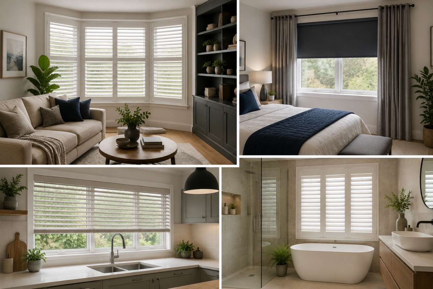
How to Choose the Perfect Window Coverings for Your Home
Window coverings are more than just decorative features. They influence

Yes, Benjamin Moore Revere Pewter is one of the safest, most versatile greige paint colors you can put on your walls — it reads as a warm, gray-beige neutral with a soft green undertone, and it flatters nearly every room as long as there's decent light. That said, "safe" doesn't mean "simple." This color shifts more than most, and knowing how it behaves before you buy a gallon will save you a repaint.
Revere Pewter (HC-172) has held its place as one of Benjamin Moore's most requested colors for roughly two decades, which is a long run in an industry where trends usually cycle every few years. It shows up in farmhouse kitchens, coastal living rooms, and craftsman exteriors alike, and it consistently ranks among the top color-consultant recommendations for whole-home neutrals.
In this guide, we'll unpack its real undertones, its LRV, how it reacts to different light sources, the rooms it flatters most, and the coordinating colors that bring out its best side. By the end, you'll know whether it deserves a spot on your walls — and if it does, how to use it without the trial-and-error most homeowners go through.
Quick Take: Revere Pewter is a warm, light-medium greige (LRV ~55) with hidden green undertones. It excels in well-lit rooms and pairs beautifully with warm whites, navy, charcoal, and wood tones. It struggles in dim, north-facing spaces and can clash with violet-toned grays like Balboa Mist.
| Detail | Information |
| Paint Number | HC-172 |
| Collection | Historical Collection |
| Color Family | Greige (Gray-Beige) |
| LRV (Light Reflectance Value) | Approximately 55 |
| RGB | 203, 197, 184 (approximate) |
| HEX | #CBC6B8 (approximate) |
| Undertones | Warm, with soft green and beige influences |
| Best Rooms | Living rooms, bedrooms, kitchens, entryways, open floor plans |
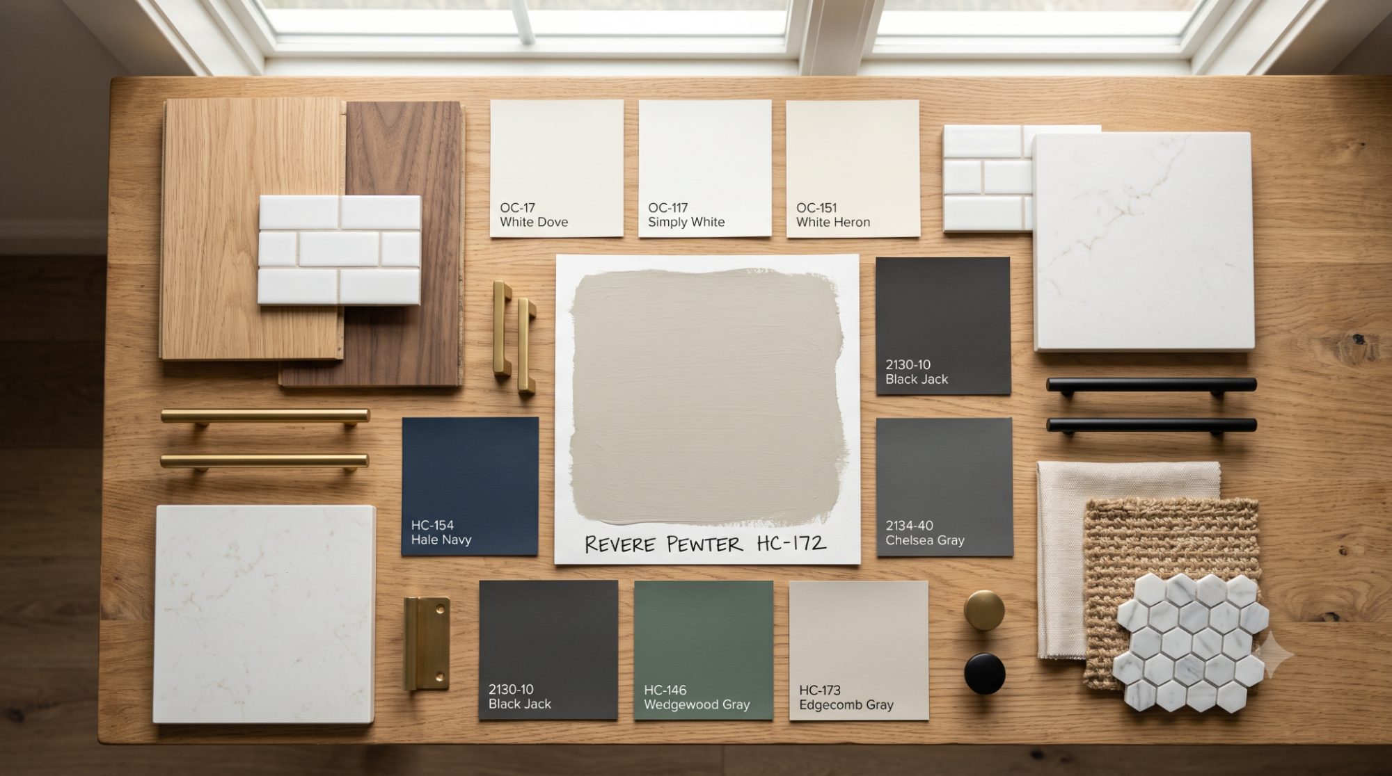
| Best Trim Colors | White Dove, Simply White, Chantilly Lace |
| Best Finish | Eggshell (walls), Satin (trim/cabinets) |
| Available Sheens | Flat, Eggshell, Satin, Semi-Gloss |
| Interior/Exterior | Both |
Revere Pewter sits right at the intersection of gray and beige, which is exactly why it's tricky to categorize at first glance. It belongs to Benjamin Moore's Historical Collection, a lineup of colors drawn from traditional American architecture, and it wears that heritage well — understated, warm, and built to age gracefully rather than date quickly.
Homeowners tend to land on Revere Pewter because it solves a specific decorating headache: how do you get the calm, grounded feel of gray without the coldness that some grays bring into a room? This color threads that needle. It reads current without feeling trendy, and warm without tipping into straight beige — which is why it plays nicely with both traditional furniture and more contemporary pieces.
Designer Tip: Ask any color consultant why they keep Revere Pewter in rotation, and you'll usually hear the same answer — it's forgiving. It rarely fights with existing wood tones, granite, or brick, which makes it a low-stress choice for partial renovations where you can't control every finish in the house.
Because it shifts gently with the light, Revere Pewter also works as a "whole house" color — a single shade that can carry through connected rooms without feeling monotonous, since natural light naturally varies the way it reads from space to space.
This color is a strong match if you:
Consider a different direction if you:
Key Takeaways
This is where most of the confusion around Revere Pewter starts, so it's worth slowing down.
Color analysts who've studied Revere Pewter's formula place it in the yellow hue family, which in plain terms means it reads as a warm, near-neutral gray under balanced, full-spectrum light. That's a different animal from a beige, which leans much more heavily yellow, and different again from a true gray, which carries almost no warmth at all.
Layered underneath that warm gray base is a soft, muted green undertone. It won't announce itself the way an actual sage or olive paint would, but it explains why Revere Pewter occasionally photographs with a faint green cast, particularly next to warm woods, brass hardware, or pink-toned finishes nearby.
There's also a gentle beige warmth working in tandem with the gray and green, and this is the ingredient that earns Revere Pewter its "greige" label in the first place. Strip that beige note out and you'd have a much cooler, flatter gray — the beige is what keeps the color feeling soft rather than clinical.
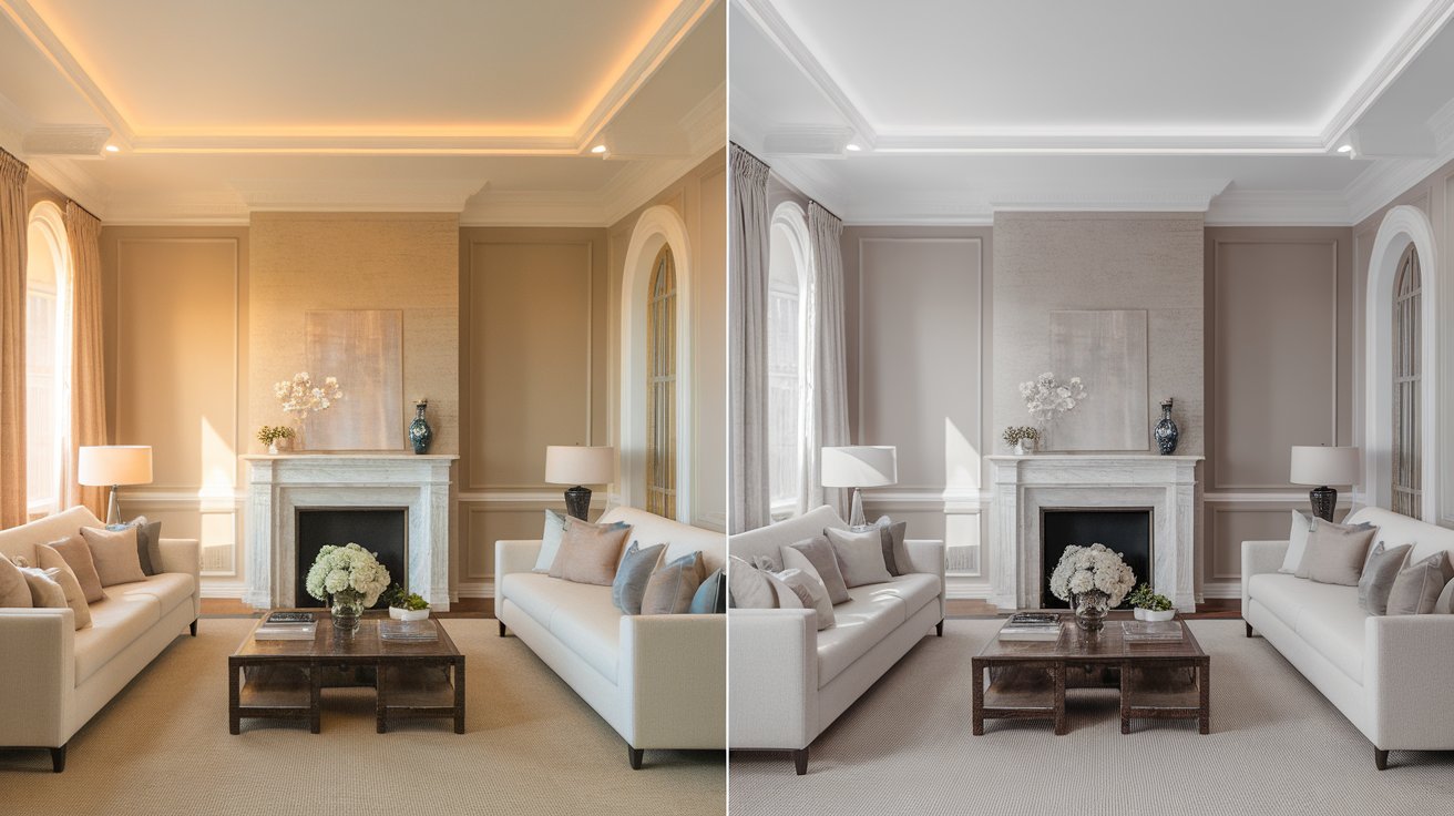
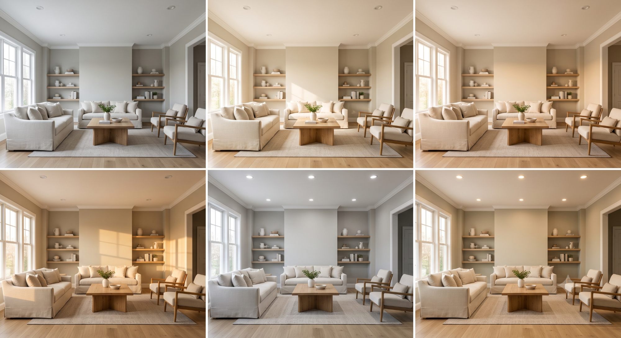
Paint experts describe Revere Pewter as "inconstant" — a technical term meaning the color visibly changes appearance depending on the light source hitting it. That's not a flaw or a sign of an unstable formula; it simply means Revere Pewter is more light-reactive than a flatter, more neutral color would be.
Here's how that plays out in real rooms:
Common Mistake: Judging Revere Pewter from a single glance under one light source. Because this color is genuinely inconstant, a five-minute look under a store's fluorescent lighting tells you almost nothing about how it will behave on your actual walls.
Pro Tip: Check your sample at three points in the day — morning, midday, and evening — under the exact bulbs you use at home, not just daylight from a window. This single step prevents the majority of "it looked different on the wall" complaints.
LRV, or Light Reflectance Value, measures how much light a paint color bounces back versus absorbs, on a scale from 0 (absolute black) to 100 (absolute white). It's one of the most reliable numbers for predicting how a color will behave in your specific space, especially if natural light is limited.
Revere Pewter carries an LRV of approximately 55, though the exact figure varies slightly depending on the source and testing method used. That places it in the light-to-medium range — not a pale, airy neutral, but not a heavy mid-tone color either. Think of it as sitting squarely in the middle of the LRV scale, which is part of why it reads so differently from room to room.
In sun-filled rooms, an LRV around 55 comes across as a soft, warm gray that never feels weighty. In rooms with limited natural light, that same LRV can look noticeably darker, sometimes drifting toward a flat gray-brown, simply because there isn't enough ambient light bouncing around to activate the warmth in the formula.
Why this works the way it does: LRV is essentially a measurement of how much a color relies on external light to look "correct." A high-LRV white can look decent in almost any lighting because it's already reflecting most of what hits it. A mid-LRV color like Revere Pewter depends much more heavily on the room's actual light levels, which is exactly why two homeowners with the "same" paint color can end up with two very different-looking rooms.
| Color | Approximate LRV | Undertone | How It Reads |
| Revere Pewter (HC-172) | ~55 | Warm, green-beige | Warm greige, light-medium |
| Classic Gray (OC-23) | ~74 | Very slight warm | Very light, airy gray |
| Pale Oak (OC-20) | ~69 | Warm, pinkish-beige | Light warm greige |
| Edgecomb Gray (HC-173) | ~63 | Warm, soft beige | Light warm greige |
| Balboa Mist (OC-27) | ~66 | Cool, slight violet | Light gray, cooler undertone |
| Collingwood (OC-28) | ~68 | Cool, slight violet | Light gray, cooler undertone |
| Agreeable Gray (SW 7029) | ~60 | Warm, balanced | Light warm greige |
| Accessible Beige (SW 7036) | ~58 | Warm, tan-leaning | Warm greige, slightly lighter |
| Manchester Tan (HC-81) | ~55 | Warm, tan | Warm tan-beige, similar depth |
Quick Take: Notice that most of Revere Pewter's closest LRV neighbors (Manchester Tan) lean warmer and more tan, while its closest undertone matches (Agreeable Gray, Accessible Beige) sit a few points lighter. That gap is exactly why Revere Pewter feels a shade more grounded than its popular rivals — it's giving up a little brightness in exchange for more visual depth.
Designer Tip: If a room already feels dim, resist the urge to abandon Revere Pewter entirely. Pair it with a higher-LRV white trim and add warmer, layered lighting first — this usually resolves the "too dark" complaint without sacrificing the warmth that made you like the color in the first place.
North-facing rooms receive cool, indirect light throughout the day, which tends to pull Revere Pewter toward gray and can occasionally leave it looking a touch flat or cool. It still works in these spaces, but it leans on warm-toned lighting fixtures and layered textiles to avoid feeling chilly.
South-facing rooms get the most consistent, warm natural light of any exposure, and this is where Revere Pewter looks its most flattering. Expect its beige and green warmth to come through clearly, especially around midday.
Morning sun in east-facing rooms draws out a soft, golden warmth in Revere Pewter. As the light cools and fades toward evening, the color settles back into a more neutral gray-beige.
West-facing rooms catch strong, warm light in the afternoon and evening, which tends to amplify Revere Pewter's beige undertone. Mornings in these same rooms typically look cooler and more muted by comparison.
Cool-toned LED bulbs (generally 4000K–5000K) sharpen the gray in Revere Pewter and can dampen its warmth, occasionally giving the color a flatter, more neutral gray appearance than intended.
Warm LEDs (2700K–3000K) enhance Revere Pewter's cozy, greige character and are typically the better pick if you want the color to read warm and welcoming rather than crisp and neutral.
Key Takeaways
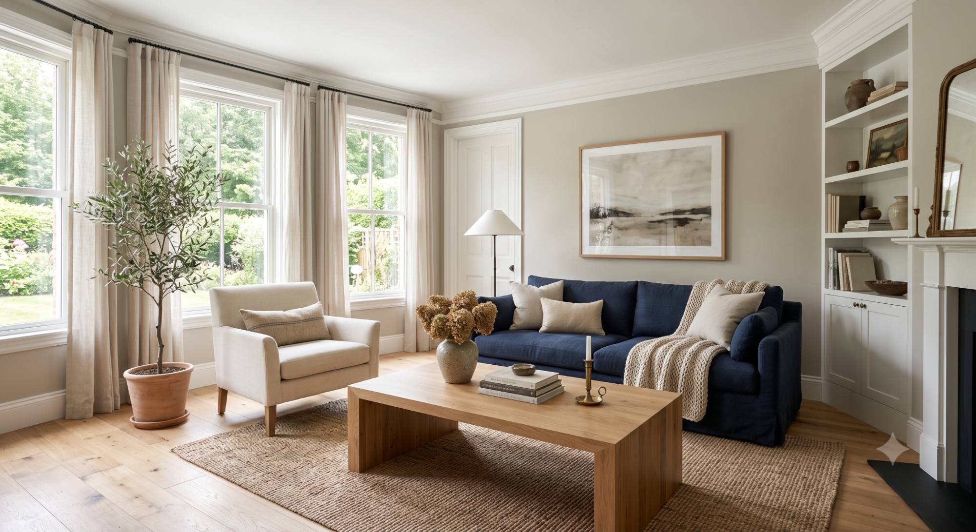
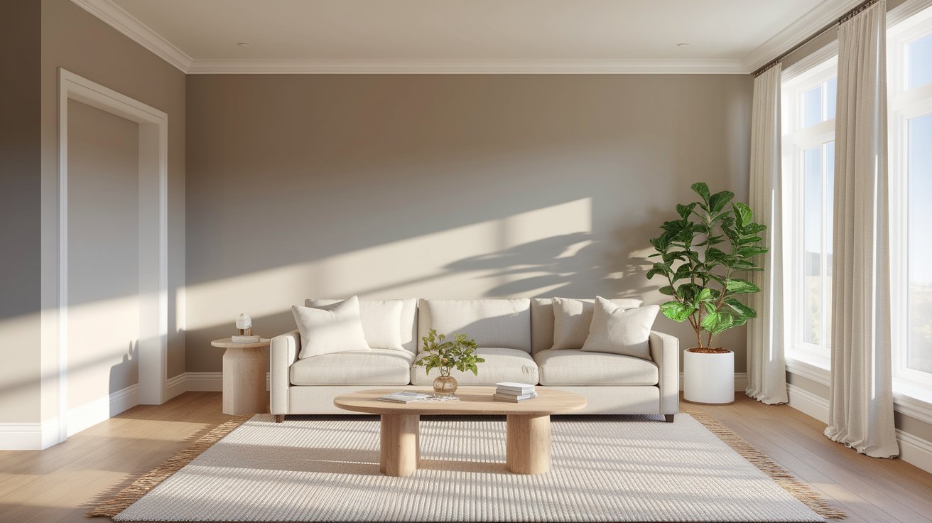
A natural fit for gathering spaces — it reads warm and collected next to both leather and fabric upholstery. For contrast, pair it with a navy sofa or a natural wood coffee table; the temperature difference keeps the room from feeling flat.
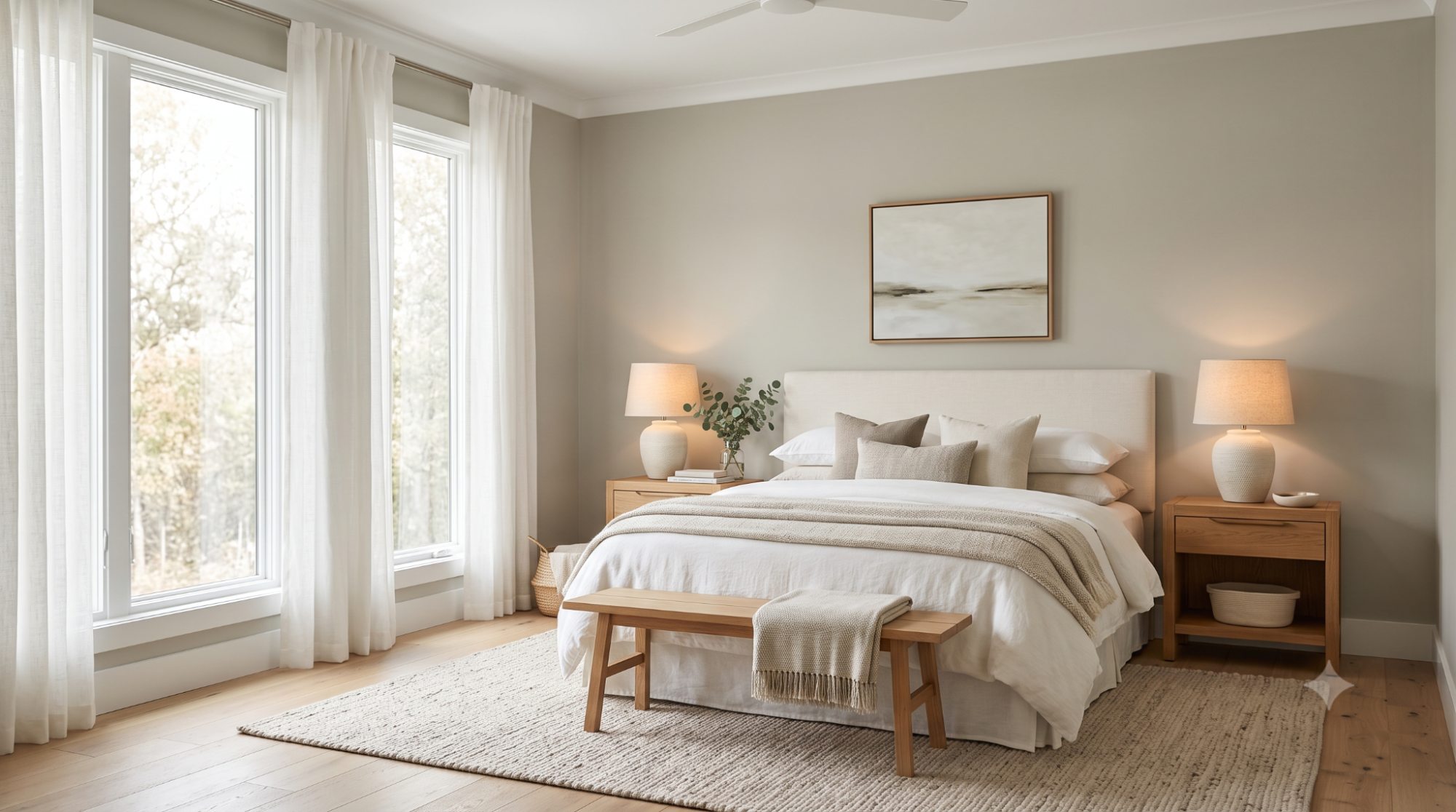
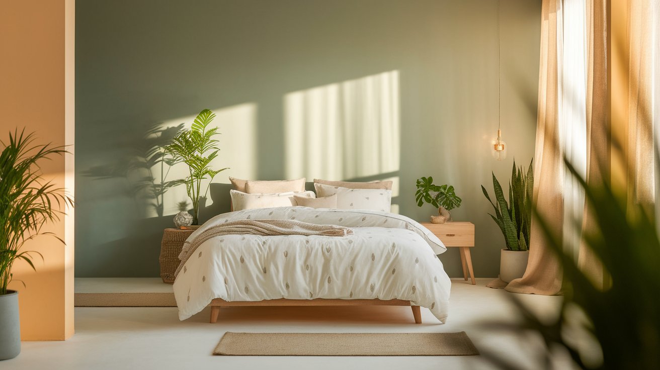
This is arguably Revere Pewter's most restful application. White or cream bedding keeps things soft, while warm wood nightstands prevent the room from tipping toward gray-brown, which is the main risk in bedrooms that don't get much daylight.
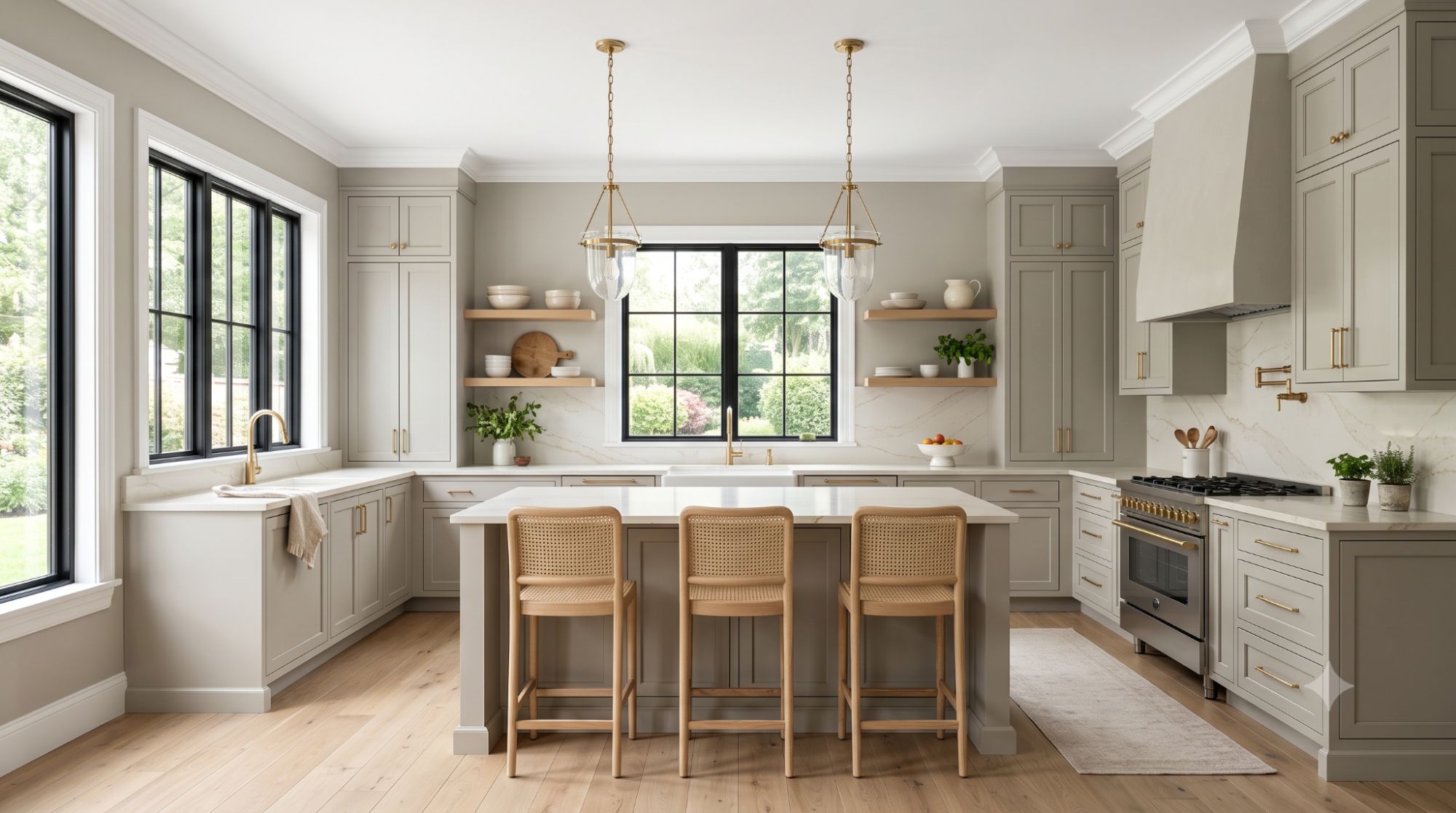
Revere Pewter earns its keep here on both walls and cabinetry, especially next to warm-toned countertops. One caveat worth knowing before you commit: its mid-range LRV means the contrast can flatten out if you pair it with equally light walls — see the Cabinets section below for how to avoid that.
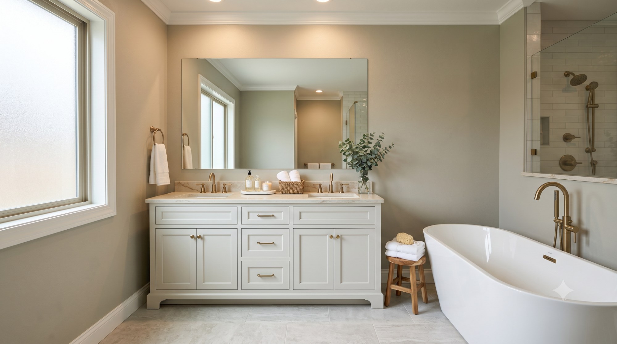
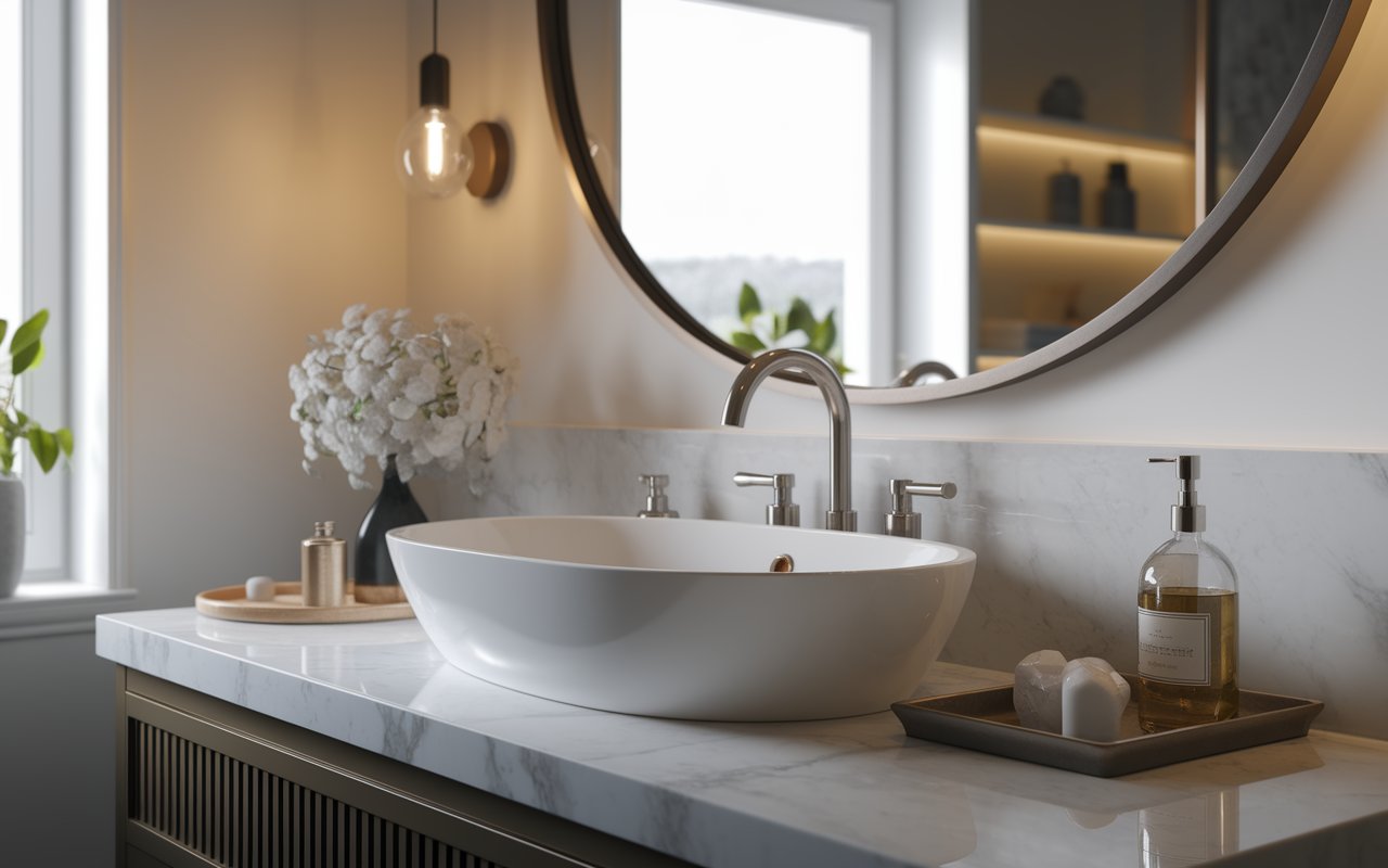
It brings welcome warmth to a space that's usually all cool tile and chrome. The catch is lighting — fluorescent bathroom fixtures flatten its warmth fast, so it's worth swapping in warmer bulbs if the color looks lifeless.
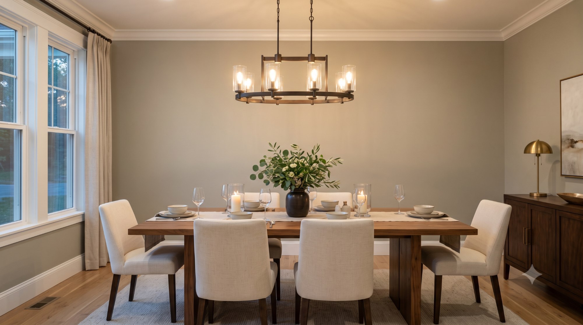
Sets a sophisticated, warm backdrop for both everyday dinners and entertaining. Candlelit or dimly lit dining rooms can make it look darker than expected, so a statement chandelier with warm bulbs helps it stay glowing after dark.
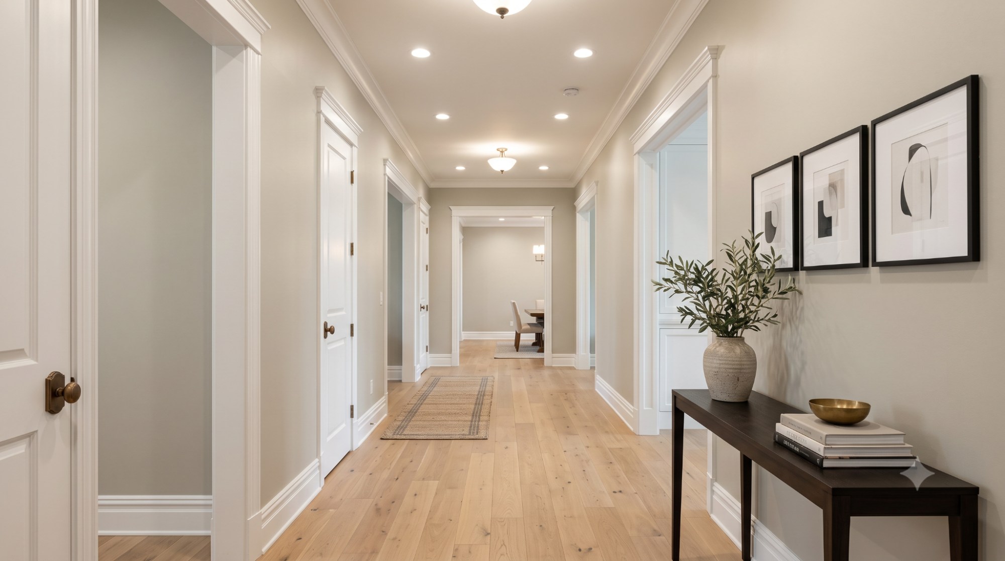
A dependable transitional color, since it doesn't compete with whatever's painted on either end of the hall. Windowless hallways need brighter overhead lighting to keep it from feeling closed-in.
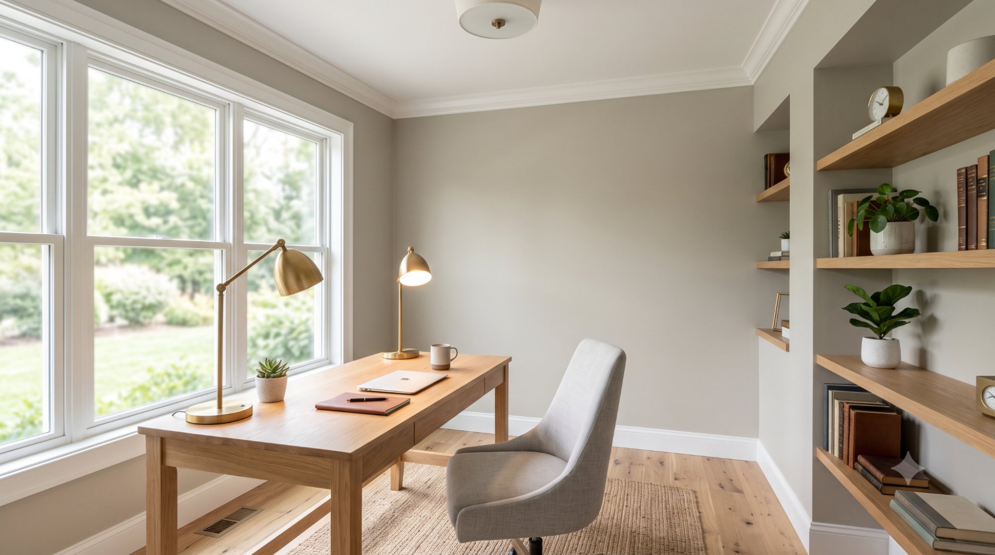
Calming enough to support focus without the sterility of a stark white. One thing to watch: it can look duller on video calls than in person, so positioning your desk near a window (or a warm desk lamp) pays off.
Quick tip: In every room, test your sample directly on the wall you'll be viewing most often — the color can look noticeably different on a wall that gets side light versus one that faces a window head-on.
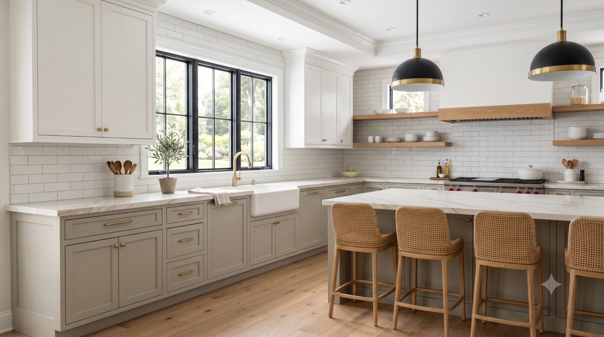
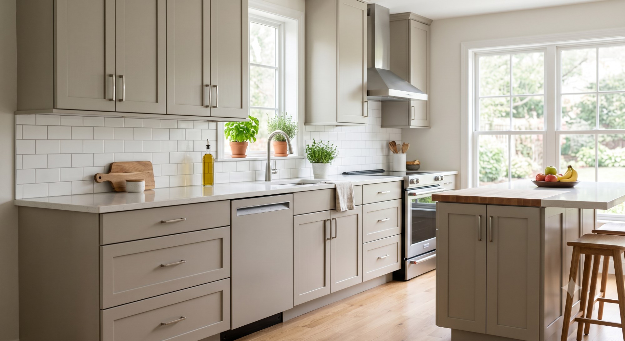
Revere Pewter has become a go-to for kitchen cabinetry because it offers a softer alternative to all-white cabinets without venturing as dark as charcoal or navy.
Cabinet styles: It suits both shaker-style and flat-panel doors, giving it flexibility across transitional and modern kitchens alike.
Hardware: Brushed brass and matte black hardware both work, though brass tends to amplify the warm undertones while black sharpens contrast against the cabinetry.
Countertops: Warm-toned quartz or granite with beige, taupe, or soft gold veining complements Revere Pewter especially well, since the countertop echoes the same undertone family instead of fighting it.
Backsplashes: White subway tile remains the most popular pairing, but a warm cream or soft green tile can pick up on the paint's hidden undertone for a more intentional, cohesive look.
Wood flooring: Medium and warm wood tones, such as oak or walnut, ground the cabinetry and keep the kitchen from feeling too monochromatic.
Modern kitchens: Pair with matte black fixtures and minimal hardware to keep the look current without drifting into traditional territory.
Traditional kitchens: Combine with white trim, crown molding, and brass hardware for a classic, timeless feel.
Farmhouse kitchens: Works beautifully with open shelving, apron sinks, and woven textures for a warm, lived-in atmosphere.
Designer Tip: Because Revere Pewter's LRV lands in the light-medium range, it pairs best against either bright white uppers or a noticeably darker accent — pairing it with another mid-tone color tends to flatten the contrast in the whole kitchen, making everything read as one indistinct block of color.
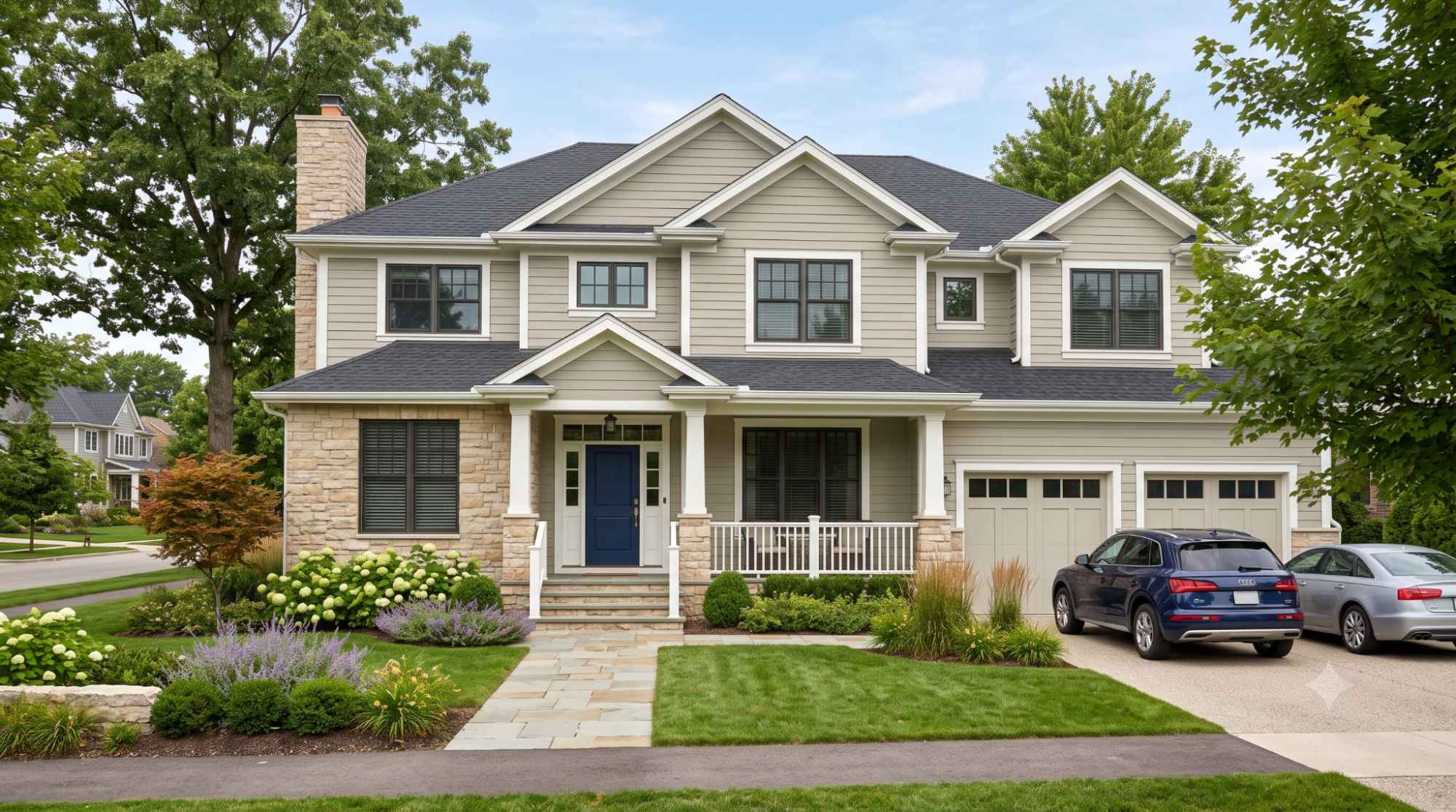
Revere Pewter isn't only an interior favorite — it's a popular exterior pick too, especially for homeowners who want a warm, understated neutral rather than a stark white or dramatic dark color.
Siding: Works well on vinyl, fiber cement, and wood siding with white or cream trim.
Brick: Complements red, orange, and tan brick, bridging the gap to cooler-toned trim.
Stone: Pairs naturally with warm-toned stone accents.
Garage doors: A slightly darker shade or a crisp white both create useful contrast.
Front doors: Navy, black, or forest green stand out beautifully against this muted backdrop.
Roof colors: Warm gray, brown, or charcoal roofing echoes the paint's own undertones.
Trim colors: Bright white offers the cleanest, most classic contrast.
Climate considerations: Intense, direct sunlight tends to wash exterior colors out lighter than they appear indoors — factor that in before ordering.
Pro Tip: Exterior light is far less forgiving than interior lighting. Always test a poster-sized sample board outdoors, viewed at different times of day, rather than relying on a small indoor paint chip to make your final decision.
| White Paint | Undertone | Contrast Level | When It Works Best | Why It Works |
| White Dove | Soft, warm white | Medium | Best all-around choice for most homes | Its gentle warmth mirrors Revere Pewter's own undertone, so the two colors feel related rather than mismatched |
| Simply White | Warm white, hint of yellow | Medium | Traditional and historical homes | The subtle yellow warmth complements Revere Pewter's beige note without overpowering it |
| Chantilly Lace | Clean, near-true white | High | When you want crisp, defined contrast | Its minimal undertone lets it read as a true white next to Revere Pewter's warmth, creating sharp definition |
| Decorator's White | Bright, slightly cool white | High | Bright, sunlit rooms that can handle more contrast | The added coolness balances rooms that get intense warm light, keeping the overall palette from feeling too golden |
| Swiss Coffee | Soft, creamy white | Low | A blended, low-contrast look | Its own warmth is close enough to Revere Pewter's that the trim nearly melts into the wall color for a monochromatic feel |
Common Mistake: Reaching for a trim white with a strong yellow undertone. It sounds like a safe "warm-on-warm" pairing, but in practice it competes with Revere Pewter's own warmth, and both colors can end up looking dull or muddy side by side instead of complementary.
Building a full palette around Revere Pewter comes down to picking colors that either echo its warmth or intentionally offset it. Here's how the major categories break down, along with the reasoning behind each pairing.
| Color | Category | Why It Works | Best Use |
| White Dove | White | Shares Revere Pewter's warm base, creating a soft, related contrast rather than a stark one | Trim, ceilings, adjoining walls |
| Simply White | White | Slight yellow warmth complements the beige note without clashing | Trim, historical-style homes |
| Chantilly Lace | White | Minimal undertone offers crisp definition against the warmth of the wall color | High-contrast trim, cabinetry |
| Hale Navy | Blue | Sits on the cool end of the spectrum, balancing Revere Pewter's warmth for visual tension | Doors, kitchen islands, accent walls |
| Kendall Charcoal | Dark neutral | Deep and warm-adjacent, so it reads as a natural extension rather than a jarring contrast | Exterior trim, accent walls |
| Chelsea Gray | Dark neutral | A cooler charcoal that adds drama while still relating to Revere Pewter's gray base | Front doors, statement walls |
| Boreal Forest | Green | Directly echoes Revere Pewter's hidden green undertone, reinforcing rather than introducing a new color story | Accent walls, cabinetry |
| Edgecomb Gray | Lighter greige | Same warm undertone family, just lighter, making it ideal for a tonal, monochromatic scheme | Adjoining rooms, ceilings |
| Oak and walnut tones | Wood | Share the same warm, earthy base as Revere Pewter's undertones | Flooring, furniture, cabinetry |
Quick Take: Notice the pattern — the most successful pairings either intensify Revere Pewter's warmth (whites, wood, warm charcoals) or deliberately contrast it with a cooler color (navy, black). The pairings that tend to disappoint are the in-between ones: colors that are neither clearly warm nor clearly cool, which just compete with Revere Pewter's own undertone instead of complementing it.
Pro Tip: If you're building a whole-home palette, limit yourself to two or three coordinating colors at most. Stacking too many competing neutrals in one sightline can make Revere Pewter's already-subtle undertones feel muddled rather than intentional.
Side-by-side comparisons are where Revere Pewter's identity becomes clearest, since undertones that are hard to spot in isolation become obvious next to a close competitor.
| Color | Approximate LRV | Undertone | Warmth Level | Best Rooms | Choose This Instead If… |
| Revere Pewter (HC-172) | ~55 | Warm, gray-beige with hidden green | Medium-warm | Living rooms, bedrooms, kitchens, exteriors | You want balanced warmth without leaning fully gray or beige |
| Accessible Beige (SW 7036) | ~58 | Warm, tan-leaning | Warmer than Revere Pewter | Traditional living spaces, warm-toned kitchens | You want a more classic beige look with less gray |
| Agreeable Gray (SW 7029) | ~60 | Warm, balanced | Slightly cooler and lighter | Whole-home neutral, open floor plans | You want a brighter, more universally neutral gray |
| Edgecomb Gray (HC-173) | ~63 | Warm, soft beige | Lighter, softer warmth | Small rooms needing a pale greige | You want a paler, airier version of the same warm family |
| Classic Gray (OC-23) | ~74 | Very slight warm | Much lighter, near-neutral | Trim, ceilings, whisper-of-color walls | You want a bright, barely-there wall color |
| Balboa Mist (OC-27) | ~66 | Cool, slight violet | Cooler than Revere Pewter | Cool-toned bathrooms, modern spaces | You want a lighter gray with no warm pull |
| Pale Oak (OC-20) | ~69 | Warm, pinkish-beige | Lighter, softer warmth | Bedrooms, nurseries, delicate palettes | You want something paler and slightly pink-leaning |
| Collingwood (OC-28) | ~68 | Cool, slight violet | Cooler than Revere Pewter | Cool, contemporary interiors | You want a light gray without any green or beige pull |
| Manchester Tan (HC-81) | ~55 | Warm, tan | Warmer, more tan-forward | Traditional dining rooms, dens | You want similar depth but a stronger beige presence |
If your trim, flooring, and furniture already skew warm and beige, Accessible Beige can look almost too matched — Revere Pewter's extra gray keeps the room from feeling monochromatic.
Agreeable Gray is the safer pick if you're wary of undertone shifts, since it's less light-reactive than Revere Pewter.
Don't combine these in the same sightline — Revere Pewter's warm green undertone actively fights their cooler violet undertone, and both colors end up looking slightly "off" rather than complementary.
Common Mistake: Assuming all popular Benjamin Moore grays coordinate with each other simply because they're all labeled "gray" or "greige." Check undertones, not just names, before combining colors.
Revere Pewter is adaptable, but it isn't the right fit for every space.
Very dark rooms: With an LRV around 55, Revere Pewter needs decent natural or artificial light to look its best. In consistently dim rooms, it can read flat or muddy instead of warm and inviting.
Ultra modern interiors: If you're aiming for a stark, minimalist, cool-toned modern look, Revere Pewter's warmth can feel out of place next to sharp lines and cool metal finishes.
Cool-toned homes: Homes built around cool grays, blues, and whites may find Revere Pewter's warmth clashes rather than complements.
Homes with blue flooring: Blue-toned tile or stone can fight visibly with Revere Pewter's warm undertone, creating an unintentional color clash.
Very low natural light: North-facing rooms with small windows are often better served by a lighter, higher-LRV color instead.
Alternatives worth considering: For darker or cooler spaces, Agreeable Gray, Repose Gray, or Classic Gray can deliver a similar neutral feel with less dependence on strong natural light.
Key Takeaways
| Pros | Cons |
| Extremely versatile, works in most rooms and design styles | Can look somewhat dark or flat in low-light spaces |
| Warm without feeling like straight beige | Undertones shift noticeably depending on lighting |
| Pairs well with both warm and cool accent colors | Can be fussy as a cabinet color when paired with equally light walls |
| Timeless rather than tied to a passing trend | Not ideal for cool, ultra-modern interiors |
| Works on interior and exterior surfaces alike | Clashes with violet-undertone grays like Balboa Mist and Collingwood |
Furniture colors: Neutral upholstery in cream, warm gray, or soft taupe keeps the room cohesive, while navy or forest green pieces introduce welcome contrast.
Curtains: Soft white or linen-toned panels complement Revere Pewter without competing with its undertones.
Rugs: Look for warm neutrals, muted blues, or soft greens — they echo the wall color's hidden undertones rather than fighting them.
Metal finishes beyond the kitchen: The brass-vs-black logic covered in the Cabinets section applies to the whole house — brass leans the room cozy, black keeps it crisp. Pick one deliberately rather than defaulting to whatever hardware came with the house.
Plants: Deep green foliage naturally plays up Revere Pewter's subtle green undertone.
Artwork: Warm-toned or earthy pieces blend into the palette, while bold, saturated pieces read as intentional focal points.
Designer Tip: When in doubt about a coordinating color, hold your fabric or paint swatch up against Revere Pewter under the same lighting you'll actually use in that room. Undertone mismatches are almost always easier to catch in person than from a photo or a color chip alone.
Using the wrong trim: Choosing a trim white with too much yellow can leave both colors looking dull instead of crisp.
Ignoring lighting: Skipping the step of testing your sample under your actual light bulbs is one of the most frequent — and most costly — mistakes homeowners make.
Skipping samples: Relying only on a small paint chip from the store rarely gives an accurate sense of how the color will behave across a full wall.
Wrong finish: A flat finish in high-traffic areas can make cleaning difficult, while too glossy a sheen can exaggerate wall imperfections.
Ignoring flooring: Overlooking how your existing flooring's undertone interacts with Revere Pewter can lead to unexpected clashes once the paint is dry.
Painting without testing: Committing to a full room without a multi-day sample test is the single biggest source of buyer's remorse with this particular color, precisely because it's so light-reactive.
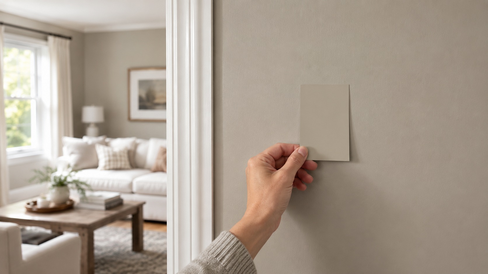
Sample boards: Paint a large poster board (at least 2 feet by 2 feet) so you can move it around the room and view it against different walls and lighting conditions.
Peel-and-stick samples: These let you test the actual paint color directly on your wall without committing to a full sample pot, and they're easy to reposition throughout the day as the light changes.
Different walls: Test the color on at least two different walls, since walls facing different directions will show the color differently from one another.
Morning: Check the sample first thing in the morning to see how it looks in cooler, early light.
Evening: Check again in the evening under your regular artificial lighting.
Artificial lighting: Don't skip viewing your sample after dark, under the exact bulbs you use daily — this is often the moment homeowners are caught off guard, since a color that looked great in daylight can shift considerably under lamp light.
Pro Tip: Take a photo of your sample at each lighting check-in (morning, midday, evening, after dark) on your phone. Comparing the photos side by side afterward often reveals shifts you didn't consciously notice in the moment.
Yes, Revere Pewter remains one of the most consistently recommended neutrals, even as overall trends drift toward warmer, richer wall colors. While some homeowners are gravitating toward deeper, more saturated shades, Revere Pewter's role as a foundational neutral means it continues to appear in new builds, renovations, and designer portfolios alike.
Timeless vs. trendy: Unlike trend-driven colors that fall out of favor within a few years, Revere Pewter has held steady in popularity for roughly two decades — a track record that speaks to broad appeal rather than a passing moment.
Designer opinions: Many professionals still treat it as a dependable, low-risk choice for clients who want warmth and flexibility without locking into one narrow style.
Who should still choose it: If you want a neutral that will still feel relevant five or ten years from now, and you value versatility over chasing the latest trend, Revere Pewter remains a sound choice in 2026.
Benjamin Moore Revere Pewter earns its reputation because it does something few paint colors manage: it balances warmth and coolness, gray and beige, traditional and modern, all within a single shade. It's an excellent option for a well-lit living room, bedroom, kitchen, or open floor plan, and it holds up just as well on exteriors and cabinetry.
It isn't the right fit everywhere, though. If your room lacks natural light, leans cool-toned, or already features violet-based grays, an alternative like Agreeable Gray or Edgecomb Gray may serve you better.
If you're still weighing the decision, the smartest next step is straightforward: order a large sample, tape it up in a few different spots around the room, and live with it for several days before committing. Revere Pewter has earned its popularity honestly, and with the right lighting and coordinating colors, there's a good chance it becomes a color you're happy with for years to come.
Yes. Most major paint retailers and brands, including Sherwin-Williams and Behr, can color-match Revere Pewter using its formula code. Matched colors can vary slightly in undertone from the original Benjamin Moore formula, so it's worth testing a sample before painting a full room.
Yes. Textured walls, like those with orange peel or knockdown finishes, create subtle shadows that can make the color look slightly darker and more muted compared to a smooth, flat wall.
Most painters recommend two coats for even, full coverage, especially over a significantly different existing color or a stark white wall. A quality primer beforehand can sometimes reduce this to a single finish coat.
Yes — it's frequently recommended for open floor plans because its adaptable undertones let it flow naturally between kitchen, living, and dining areas without feeling repetitive or mismatched.
Warm-toned hardwood, like oak or hickory, along with neutral-toned tile or stone, tend to pair most naturally. Cool-toned gray or blue-based flooring can sometimes clash with the paint's warm undertone.
Daniel Hartman is a color specialist with years of experience helping people make confident and thoughtful design decisions. He provides practical and approachable guidance while balancing creativity and functionality in every project. Daniel enjoys visiting art and design exhibits to study how different environments influence aesthetics, mood, and perception, bringing a rich perspective and insight into his work. His approach makes design decisions both simple and enjoyable.


No Comments