
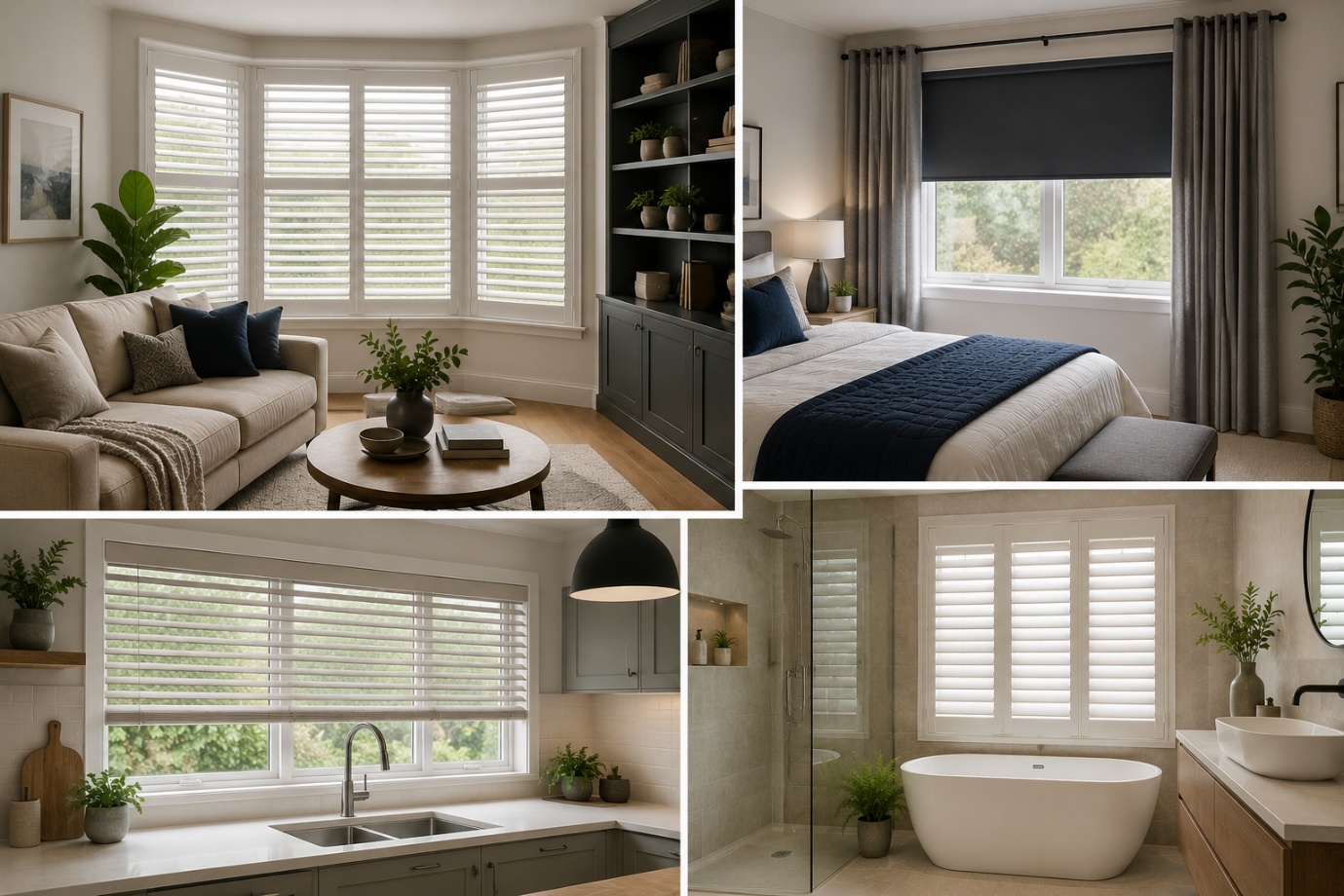
How to Choose the Perfect Window Coverings for Your Home
Window coverings are more than just decorative features. They influence


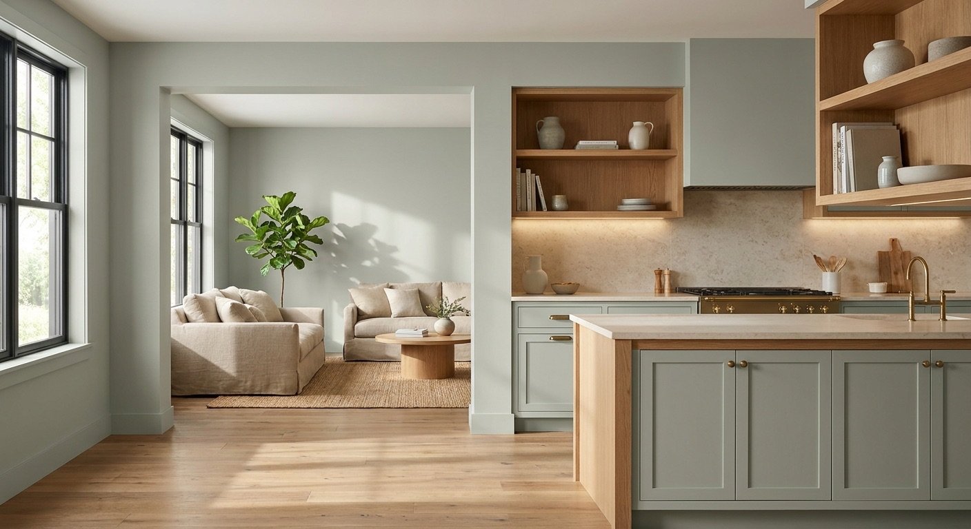
If you've been scrolling through paint samples and keep landing on Sherwin Williams Clary Sage, you're not alone. This muted sage green shows up again and again in kitchen renovations, bedroom refreshes, and exterior repaints, and once you understand how it behaves, it's easy to see why.
Clary Sage, officially known as SW 6178, is a gray-green with just enough warmth to keep it from feeling cold or flat. It reads as soft and grounded rather than bright or bold, which is exactly why so many homeowners choose it for walls, cabinets, and even exteriors. Lighting plays a huge role in how this color shows up in your space, and we'll walk through exactly what to expect.
In this guide, you'll learn what Clary Sage actually looks like, how its undertones behave, how it responds to different types of light, where it works best in a home, what colors pair well with it, and how it compares to similar sage greens like Evergreen Fog and Sea Salt.
Before diving into the details, here's a quick snapshot of the color's core facts.
| Property | Information |
| Paint Color | Clary Sage |
| Sherwin-Williams Code | SW 6178 |
| Color Family | Green |
| General Appearance | Muted sage / gray-green |
| LRV | 41 |
| Undertones | Gray with a subtle warm/yellow-olive influence |
| Best Uses | Walls, bedrooms, living rooms, kitchens, cabinets, bathrooms, accents |
| Overall Character | Soft, earthy and grounded |
Sherwin-Williams places SW 6178 in its green paint color family, and Clary Sage has an LRV of 41. LRV describes how much light a paint color reflects, but that number doesn't tell the whole story of how Clary Sage will look in your home. Lighting, surrounding finishes, and nearby colors can all influence how light or dark the color appears. The LRV itself stays the same, but its visual effect can change significantly from one room to another.

Think of a sage plant that's been left out in soft, overcast light. That's roughly what Clary Sage looks like. It's not a crisp, saturated green like you'd see on a bottle of green tea. Instead, it's dusty and muted, with a good amount of gray blended into the base color.
That gray is what gives Clary Sage its grounded, understated look. It also has a touch of warmth running underneath, so in the right light it can lean slightly olive or khaki rather than purely green. This combination is what separates it from a pale, airy sage — Clary Sage carries more depth and weight, which makes it feel more like a true wall color than a soft accent tone.
Overall, Clary Sage sits comfortably between green and neutral. It doesn't dominate a room, but it's also not so faint that it disappears into the background. For the manufacturer's official color information, see the Clary Sage SW 6178 color page from Sherwin-Williams.
Undertones are the hidden colors that quietly shape how a paint color behaves, and Clary Sage has two working together at once.
The gray in Clary Sage is what keeps this color from looking like a bright, saturated green. It mutes the overall tone, giving it a more restrained, versatile look. This gray base is also why Clary Sage pairs easily with neutrals — it already has one foot in neutral territory itself.
Underneath that gray sits a subtle warmth, coming from a touch of yellow. This is the quality that can make Clary Sage read as slightly olive in certain conditions, particularly under warm-toned light. We'll come back to exactly when this shows up most in the lighting section below.
Undertones don't act alone. They respond to everything around them, including:
This is why the same can of Clary Sage might look slightly different in your neighbor's living room than it does in yours. It's not inconsistent paint — it's the color doing exactly what all mid-tone paint colors do, which is reflect its environment.
This is one of the most common questions people ask, and the honest answer is: it depends. Clary Sage doesn't fall neatly into one camp.
The gray base gives it a cooler, more restrained quality, especially in rooms with lots of natural daylight or cooler-toned lighting. But the yellow-olive influence adds real warmth, which becomes more obvious under warm bulbs or golden afternoon sun.
In practice, Clary Sage can read as warm-neutral. It leans warm in warm light and settles into a cooler, more muted state in cool or overcast light. This flexibility is one of its more practical strengths, since it can adapt to different rooms without ever feeling out of place.
LRV stands for Light Reflectance Value. It's a scale from 0 (absolute black, no light reflected) to 100 (pure white, maximum light reflected) that tells you roughly how light or dark a paint color will appear.
As noted above, Clary Sage has an LRV of 41, which puts it in mid-tone territory. It's not a pale, airy green, and it's not a deep, moody one either — it sits right in the middle of the scale.
In practical terms, an LRV of 41 means:
LRV is a useful starting point, but it doesn't tell the whole story on its own. Two colors with the same LRV can still look different depending on their undertones, the room's lighting, and what's around them.
Not necessarily, but it depends on the room. In a large space with plenty of windows, Clary Sage tends to look soft and balanced rather than dark. In a small room with limited natural light, it can read noticeably deeper and more shadowed, especially in corners.
Dark flooring or heavy furniture can push the room further in that direction, while lighter floors and furnishings help keep things feeling open. If your room already runs dim, it's worth testing a sample before committing to full walls.

Lighting is the single biggest factor in how Clary Sage will actually look in your home. Here's what to expect based on your room's orientation.
North-facing rooms get soft, indirect light that tends to be cooler in tone. In this kind of light, Clary Sage's gray undertone becomes more noticeable, and the color can look more muted and cooler overall.
South-facing rooms get strong, warm light for much of the day. This tends to bring out the green and the yellow-olive warmth in Clary Sage, making it look more vibrant than it does elsewhere in the house.
Rooms that face east get warm, golden light in the morning, which can make Clary Sage look inviting and slightly warmer. As the day goes on and the light shifts away from the room, the color tends to cool down and mute out again.
West-facing rooms work in the opposite direction. Mornings tend to look cooler and more subdued, while afternoons and evenings bring warm, golden light that makes the green and olive tones stand out more.
At night, your light bulbs take over the job the sun was doing all day. Warm bulbs push Clary Sage toward its cozier, more olive side. Cool bulbs emphasize the gray and make it feel more restrained. Low, dim lighting tends to flatten the color and make it look darker and less detailed overall.
Because lighting has such a big impact, the most reliable approach is to test a physical sample in your actual room and check it at different times of day before you paint every wall.
Clary Sage is a flexible color, which is part of why it shows up in so many different spaces. It works well on:
Because it sits in the mid-tone range and pairs easily with neutrals and natural materials, it tends to look intentional wherever it's used, rather than like an afterthought.

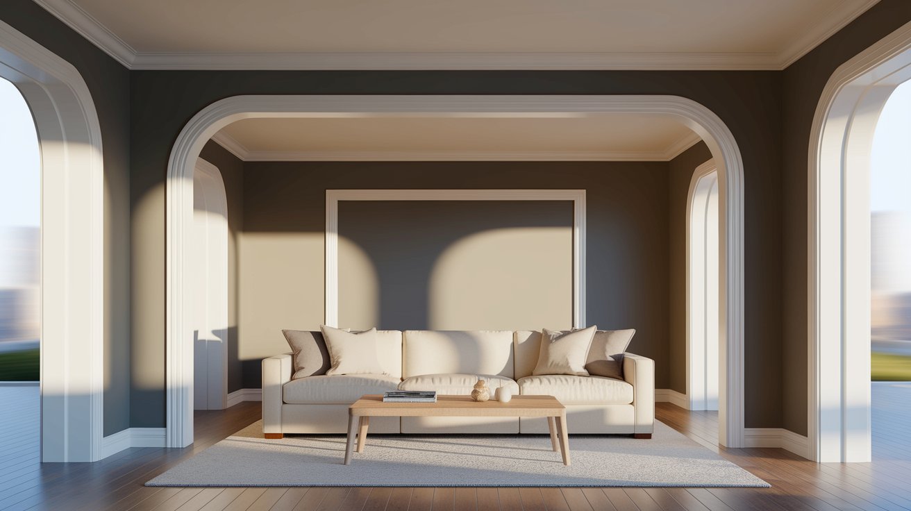
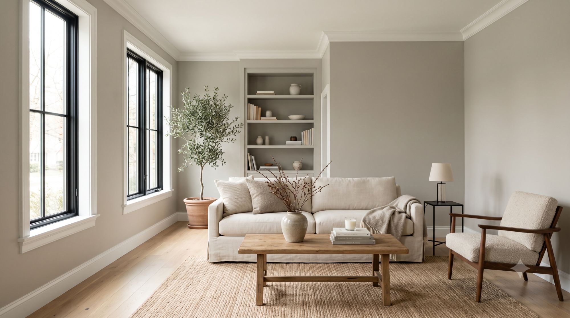
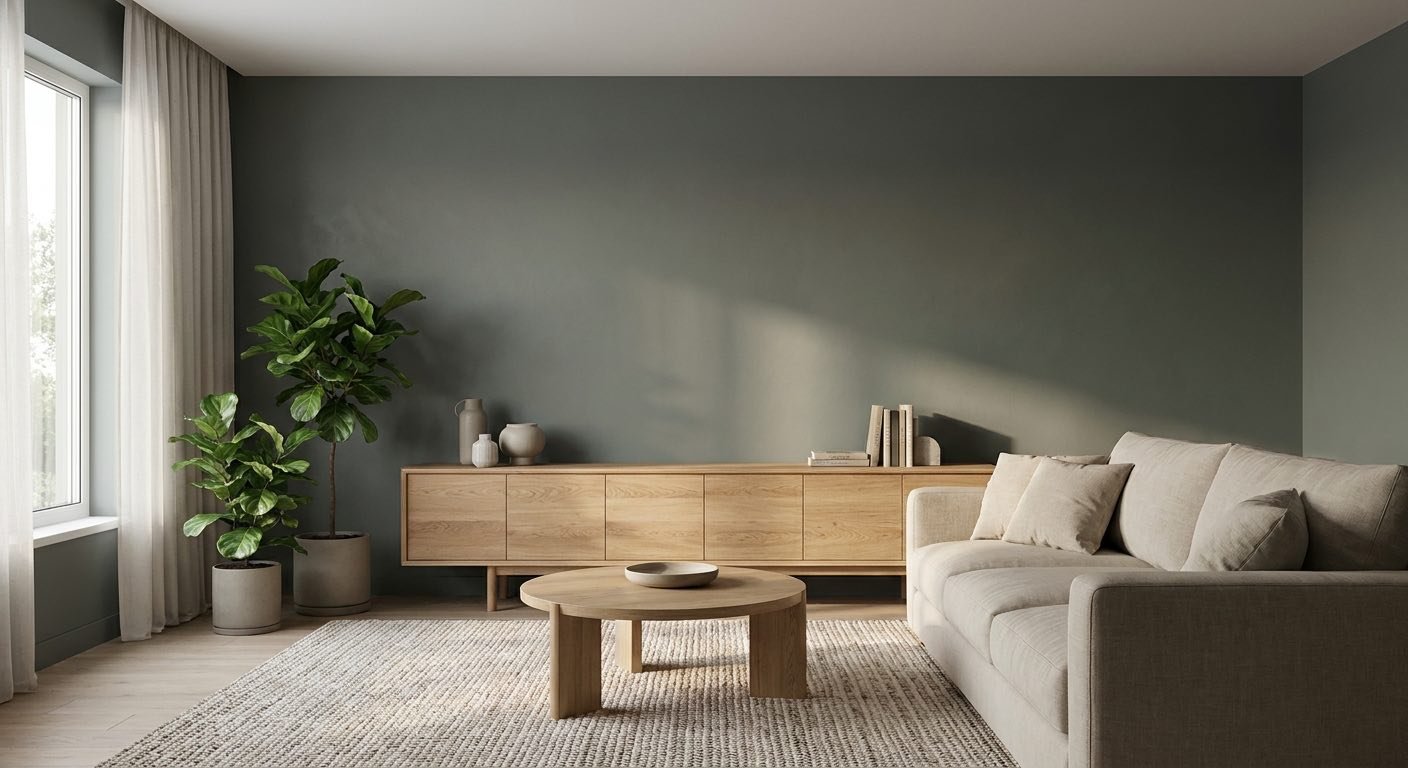
In a living room, Clary Sage works as either a full wall color or a single accent wall behind a sofa or fireplace. Natural wood furniture tends to complement the color well, since the two share a similar warm, organic quality.
Neutral furniture in cream, oatmeal, or soft gray keeps the room feeling calm, while warm metals like brass add a touch of polish. Clary Sage adapts to both traditional living rooms with millwork and trim, and more modern spaces with cleaner lines.

Clary Sage can work particularly well in bedrooms because its muted green-gray character creates a softer backdrop than a saturated green would. A color like this can help create a relaxed, natural-feeling atmosphere that suits a bedroom, without feeling as stark as a pure gray.
White or cream bedding keeps the room feeling light, while natural wood furniture and linen textiles reinforce the earthy feel. Since bedrooms are often used at night, keep in mind that warm lamp light will shift the color toward its warmer side, as covered in the lighting section above.

In the kitchen, Clary Sage can be used in several different ways depending on how bold you want to go. Some homeowners paint just the lower cabinets or a kitchen island in Clary Sage, keeping the upper cabinets white for contrast. Others use it on full cabinetry.
It also works as a wall color in kitchens that keep white or cream cabinetry, giving the space a grounding backdrop. Paired with wood cabinetry, Clary Sage walls create a farmhouse-style look that's popular in many renovation projects.

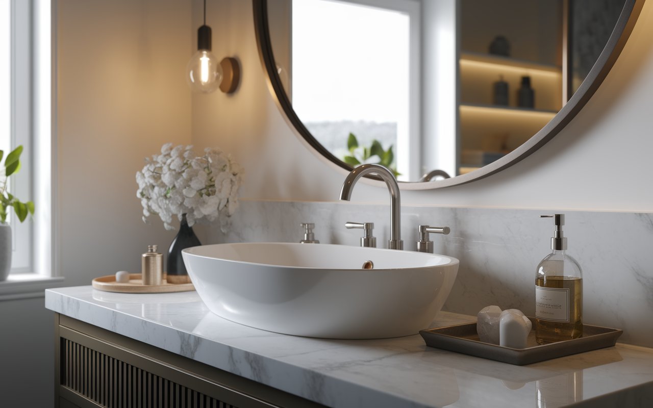
Bathrooms give Clary Sage a chance to feel like a small, spa-like retreat. It works on full walls or just on a vanity, paired with white tile for a clean, classic contrast. Natural stone tile adds more texture and reinforces the earthy tone.
For fixtures, brass adds warmth, while black fixtures create a bolder, more contemporary contrast. Since bathrooms are often smaller and can lack strong natural light, it's worth testing the color in your specific bathroom before committing to full walls.

A home office is a good candidate for a deeper, more grounded color like Clary Sage, since it can create a focused backdrop without feeling sterile. The mid-tone depth adds visual stability to the room, especially when paired with warm wood desks and shelving.
Cream or light-colored furniture can keep the office feeling open, while black or brass accents add subtle contrast. A few plants and simple décor can also complement Clary Sage’s natural character without making the workspace feel cluttered.

On the outside of a home, Clary Sage reads as an earthy, understated green that blends naturally with landscaping. It works as a full siding color, paired with crisp white or warm cream trim to keep the look defined.
It can also work on a front door alone, especially against a neutral siding color. Brick and stone exteriors pair well with Clary Sage too, particularly warmer-toned brick. Because exterior lighting changes throughout the day, it's worth viewing a sample outside at different times before making a final decision.

Clary Sage pairs easily with muted neutrals and natural materials, which help it feel grounded rather than isolated on a wall.
Not all whites work equally well with a warm-neutral green like Clary Sage. A few good options include:
Each of these whites has enough warmth to avoid clashing with Clary Sage's undertones, while still providing the contrast needed to define trim, ceilings, or millwork.
Trim color changes how much contrast Clary Sage has against the rest of the room, so it's worth thinking about separately from wall pairings. The same four whites covered above work well here, but each creates a different effect:
For ceilings, most homeowners keep a standard white like Pure White or Extra White to keep the room feeling open. If you want the ceiling to feel more enveloping, repeating Clary Sage overhead is an option covered in the FAQ section below — just know that it's a bolder choice than a white ceiling and works best with strong natural light or higher ceilings.
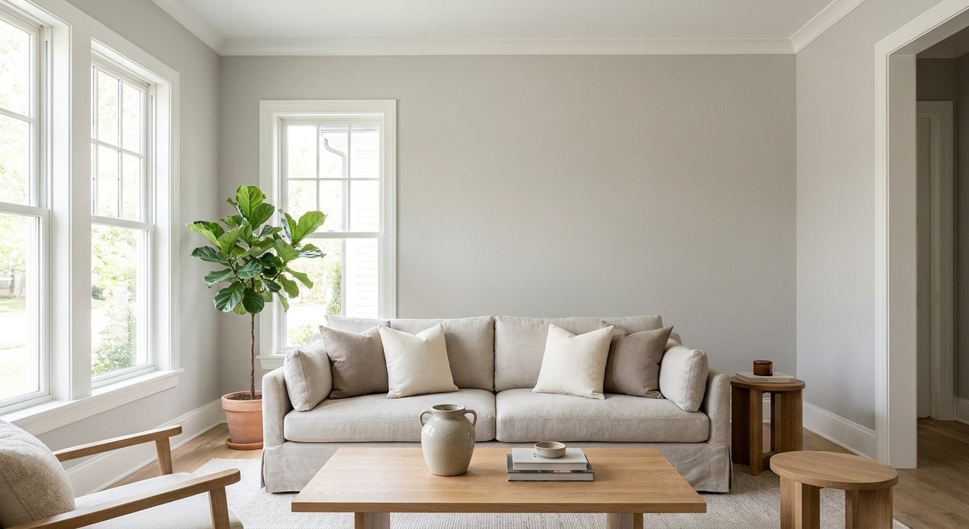
Beyond white, Clary Sage pairs with warm beige, greige, taupe, and soft gray. These neutrals let Clary Sage stay the focal point of the room while quietly supporting it in the background.
For contrast, darker colors can anchor a space that uses Clary Sage as a main wall color. Good options include navy, charcoal, deep green, and black. These work particularly well on doors, trim, or accent furniture, adding visual depth to the room.
Clary Sage pairs well with light oak, walnut, and other natural wood tones. Rattan and linen textiles add texture without competing with the wall color, and stone — whether on countertops, flooring, or fireplaces — reinforces the grounded feel established earlier in this guide.
For cabinet hardware, fixtures, and lighting, Clary Sage works with brass, matte black, brushed nickel, and copper. Brass and copper lean into the warmth of the color, while matte black and brushed nickel offer a cooler, more modern contrast.
A simple way to build a room around Clary Sage is to treat it as one piece of a small palette, rather than the only color in the room.
In practice, this might look like Clary Sage on the lower kitchen cabinets, a warm white on the upper cabinets and walls, greige stools at the island, and terracotta accents in the decor. The goal is to let Clary Sage lead, while the rest of the palette supports it without competing for attention.
| Color | Approx. LRV | Appearance | Undertone | How it differs from Clary Sage |
| Clary Sage (SW 6178) | 41 | Mid-tone sage green | Gray with warm/olive influence | — |
| Evergreen Fog (SW 9130) | ~30 | Deeper gray-green | Gray-dominant | Reads darker and moodier, with less visible green |
| Sea Salt (SW 6204) | ~63 | Light blue-green-gray | Blue/gray | Considerably lighter and cooler, with a blue lean instead of olive |
| Lower than Clary Sage | Olive-leaning green | Warm/olive | Different brand; heavier olive presence and a more traditional feel | |
| Soft Sage | Higher than Clary Sage | Pale, light sage | Gray with minimal warmth | Lighter and less saturated, with far less visible depth |
Evergreen Fog has a noticeably lower LRV than Clary Sage, which means it reads darker and moodier on the wall. Both colors share a soft, gray-green quality, but Evergreen Fog leans more gray overall, while Clary Sage carries more visible green. Clary Sage suits rooms that want a lighter, more everyday sage look, while Evergreen Fog suits spaces where a deeper, more dramatic statement is the goal.
Sea Salt is significantly lighter than Clary Sage, with a much higher LRV that puts it closer to a pale, airy tone. Where Clary Sage leans green with warm undertones, Sea Salt leans toward a cooler blue-green-gray. Sea Salt tends to suit bathrooms and bedrooms where a very soft, pale color is the goal, while Clary Sage fits rooms that can handle more depth.
October Mist is a Benjamin Moore color, while Clary Sage is a Sherwin-Williams color, so they come from different brand palettes but land in a similar green family. October Mist tends to read a touch more traditional and historic, with a heavier olive presence, while Clary Sage feels more contemporary and versatile across design styles.
Soft Sage sits lighter and paler than Clary Sage, with less visible depth. Clary Sage has noticeably more gray and body to it, making it feel more substantial on a wall. Soft Sage works well where you want just a hint of green, like a nursery or powder room, while Clary Sage suits rooms where the green should be a clear, defined presence.
If Clary Sage isn't quite right, a few other Sherwin-Williams greens are worth a look:
Before choosing any of these as an alternative, order samples of both and compare them side by side in your own lighting, since small differences in undertone can look bigger once they're on your walls.
Clary Sage is versatile, but it's not the right fit for every room. It's worth thinking twice about using it if:
None of these are hard rules — they're situations where it's especially important to test a sample first, since Clary Sage's appearance can shift more than a true neutral would.
Paint finish affects both the look and durability of Clary Sage, so it's worth matching the finish to the room.
For most walls in living rooms and bedrooms, eggshell is the most common and practical choice. Bathrooms benefit from satin or semi-gloss for moisture resistance, and cabinets almost always look best in satin or semi-gloss for durability.
Because lighting has such a strong effect on this color, testing before you commit is one of the most important steps.
This process takes a little patience, but it prevents the frustrating surprise of a color that looked perfect on the chip but feels completely different once it's on the wall.
Clary Sage may work well for you if you want:
You might want to consider another color if you're looking for a very light, pale green, a strong blue-green, a very dark green, or a neutral with barely any visible color at all. In those cases, some of the alternatives mentioned earlier in this guide may be a better starting point.
Pros
Cons
Sherwin Williams Clary Sage SW 6178 is a versatile, mid-tone sage green that blends a cool gray base with a subtle warm, olive undertone. That combination gives it a grounded character that avoids feeling either too bright or too flat. With an LRV of 41, it sits in the middle of the light-to-dark scale, which means it responds noticeably to the direction and type of light in your room.
It works in living rooms, bedrooms, kitchens, bathrooms, and on exteriors, especially when paired with warm whites, natural wood, and warm-toned hardware. Because its appearance can shift throughout the day, testing a sample in your own space, at different times, is the most reliable way to confirm it's the right fit for your home.
It can, but it takes some care. Honey oak has strong warm, orange-toned undertones, and Clary Sage's own warmth can either complement that or compete with it, depending on your lighting. Testing a sample directly next to your existing oak is the best way to see whether the pairing feels harmonious or if the two warm tones start to clash.
Yes, though it's a bolder choice than a typical white or off-white ceiling. Because it's a mid-tone color, it can make a room feel cozier and more enclosed, which works well in spaces with higher ceilings or plenty of natural light. In rooms with low ceilings or limited light, a painted ceiling in Clary Sage may feel heavier than intended, so it's worth testing first.
It can work well, but it helps to think about how it connects to neighboring spaces. Using a lighter, complementary neutral on adjoining walls or in transition areas like hallways can keep Clary Sage from feeling like an isolated pocket of color. Repeating small touches of green elsewhere in the open space, like in decor or accent pieces, also helps tie everything together.
Light oak and other pale wood tones tend to keep the space feeling bright and airy alongside Clary Sage. Medium wood tones bring out more warmth and coziness. Tile and stone flooring can work well too, though cooler-toned tile will emphasize the gray in Clary Sage, while warmer stone will bring out more of its olive character.
Yes, often more than homeowners expect. Cabinets are usually painted in a higher sheen, like satin or semi-gloss, which reflects more light and can make Clary Sage look slightly brighter and more saturated than the same color in a flat or eggshell finish on a wall. Cabinets also sit closer to countertops, backsplash tile, and hardware, so those surrounding materials influence the color more directly than a larger wall surface does. If you're planning to use Clary Sage on both cabinets and walls in the same room, it's worth sampling each separately rather than assuming they'll match exactly.
Daniel Hartman is a color specialist with years of experience helping people make confident and thoughtful design decisions. He provides practical and approachable guidance while balancing creativity and functionality in every project. Daniel enjoys visiting art and design exhibits to study how different environments influence aesthetics, mood, and perception, bringing a rich perspective and insight into his work. His approach makes design decisions both simple and enjoyable.


No Comments