

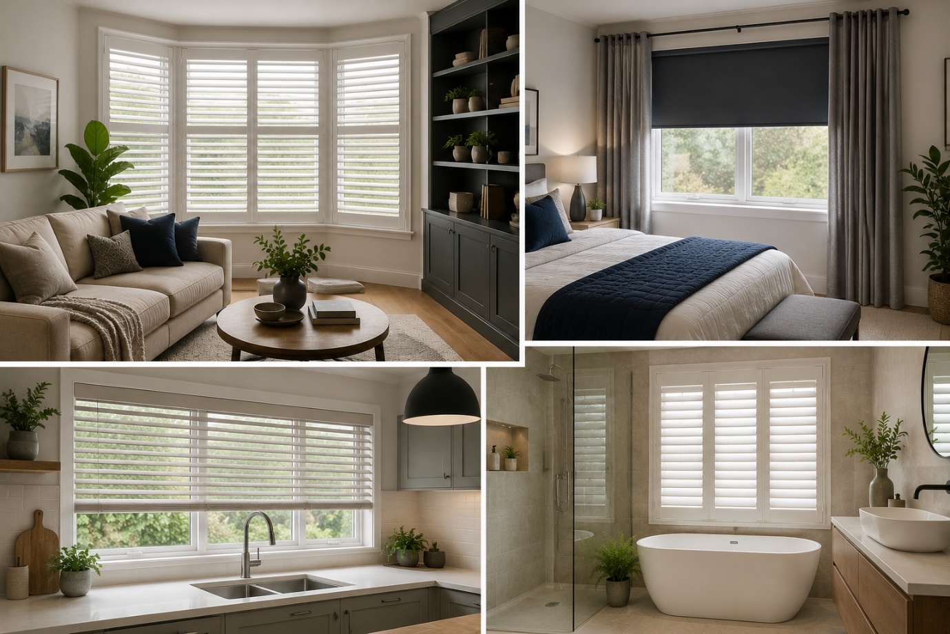
How to Choose the Perfect Window Coverings for Your Home
Window coverings are more than just decorative features. They influence

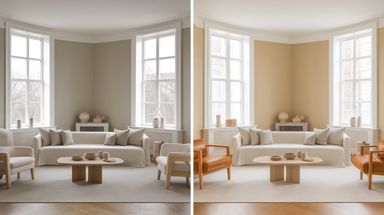
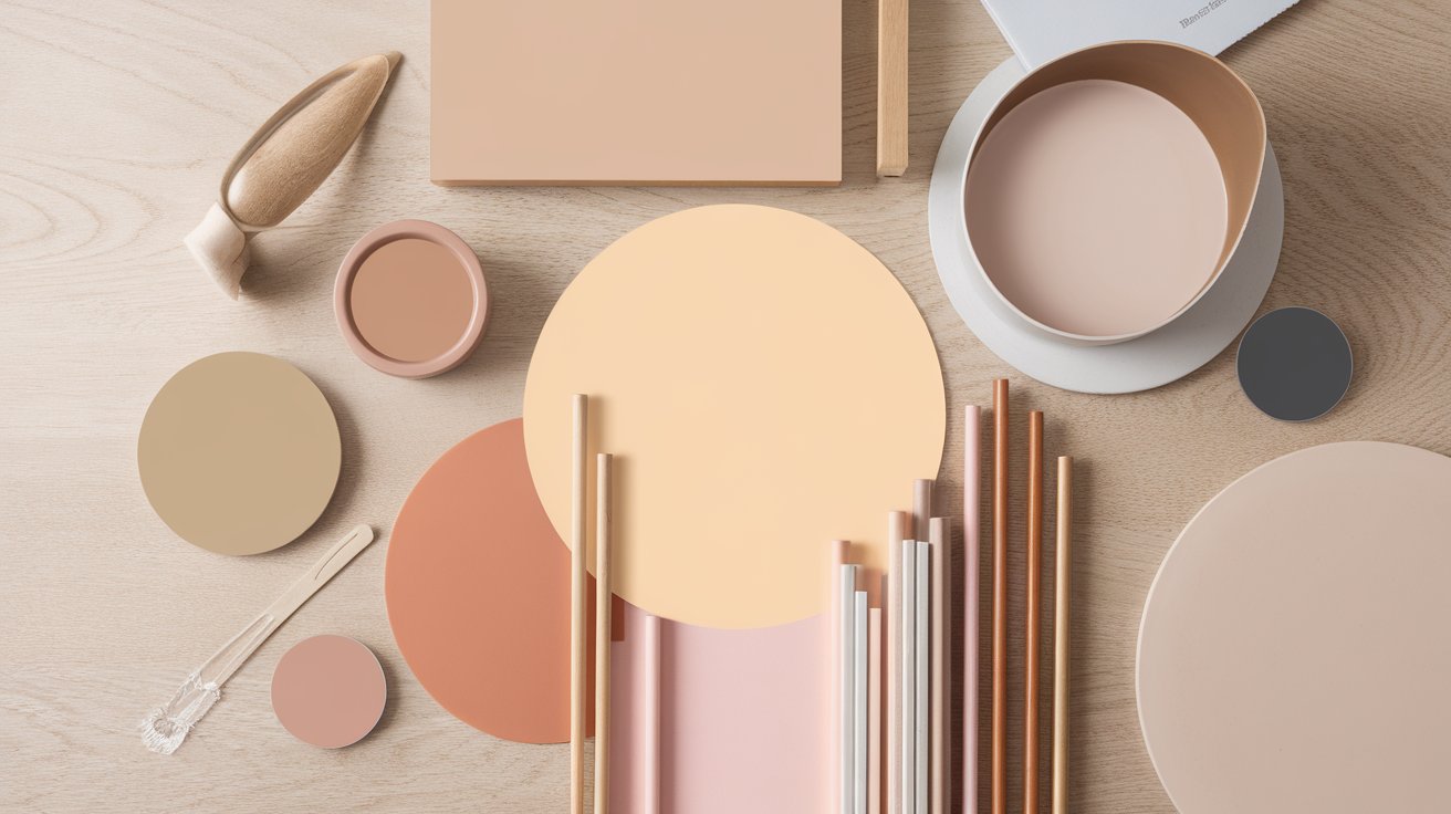
Benjamin Moore Pale Oak is a warm greige that reads differently depending on what light hits it and what's sitting next to it on the wall. That reactivity is exactly why designers reach for it so often — it adapts to a room instead of fighting it.
It shows up in modern farmhouse kitchens, traditional living rooms, and minimalist bedrooms alike, because its undertone shifts to match whatever's around it rather than staying fixed like a true beige or true gray.
This guide breaks down what actually drives those shifts: undertones, lighting exposure, coordinating colors, room-by-room performance, and how Pale Oak stacks up against the greiges it's most often confused with.
By the end, you'll know whether it's the right call for your space or whether a close cousin will serve you better.
| Detail | Info |
| Color Code | OC-20 |
| Collection | Off-White Collection |
| LRV | 69.55 |
| RGB | 234, 227, 217 |
| HEX | #EAE3D9 |
| Color Family | Greige (warm neutral) |
| Warm/Cool | Warm-leaning neutral |
| Best Uses | Walls, trim, cabinets, whole-home color schemes |
| Best Trim Color | White Dove (OC-17) |
Best for: Homeowners who want a soft warm greige that adapts to changing light rather than staying perfectly consistent from room to room.
Pale Oak sits on the narrow band of the color wheel where beige and gray overlap. Beige pulls toward yellow and brown pigment; gray pulls toward blue and green. Pale Oak's formula balances both, which is what lets it swing between the two depending on the room.
Pale Oak's low saturation allows neither its beige nor gray influences to dominate, which is why surrounding light and finishes have such a noticeable effect on its appearance. The color itself isn't deciding which way to lean — your room is.
That's the real reason it earns the "chameleon" reputation. Once you understand that the undertone stays genuinely unresolved until it hits your walls, you can predict how your specific room will pull it before you even open the lid.
Pale Oak's base is a soft, warm gray-beige, but four secondary undertones compete underneath it: pink, taupe, gray, and yellow. Which one wins depends on the light hitting the pigment and what that light bounces off first.
In other words, Pale Oak doesn't have one fixed undertone — it has four candidates, and your room's light source and reflective surfaces (floors, cabinets, nearby furniture) determine which one comes forward at any given time of day.
Designer Tip: Tape a large sample board to two different walls and view it at 9 a.m., 1 p.m., and after dark with your lamps on. If it holds steady across all three, it'll behave in your room.
Light Reflectance Value (LRV) measures how much light a color bounces back into a room, on a scale from 0 (absolute black) to 100 (pure white).
At 69.55, Pale Oak sits in a range that reflects enough light to keep a room feeling open without the flat, sterile look of a near-white. That's a meaningfully different effect than a color in the 80s or 90s LRV range, which can feel washed out under bright overhead lighting.
This makes Pale Oak a dependable choice for:
If brightness is your main concern, Pale Oak will deliver it — provided the room gets at least some daylight to activate that reflectance.
Orientation determines which of Pale Oak's undertones you'll live with most of the day.
North light is indirect and cool all day, which is the single most common trigger for Pale Oak's pink undertone. Mornings read dim and slightly cool; afternoons look muted; evening lamplight softens the pink but rarely eliminates it. Compensate with warm-white bulbs and warm wood accents.
Strong, direct light all day pushes Pale Oak toward its warmest, most beige expression. Mornings look soft and golden, afternoons look richly warm. This exposure produces the most consistent, flattering result with the least troubleshooting.
Morning brings warm, bright light that flatters the paint immediately. As direct sun fades after midday, the color cools and can drift toward gray. Artificial lighting in the evening restores some warmth.
Mornings can look flat or slightly cool without direct sun. Afternoon and evening sun bring a golden, taupe-leaning warmth that's often the room's best moment of the day.
Best lighting conditions for Pale Oak: South and west exposures produce the most reliably warm result. North-facing rooms need deliberate correction — warm bulbs, wood tones, or a warmer companion color — to avoid an unintended pink cast.
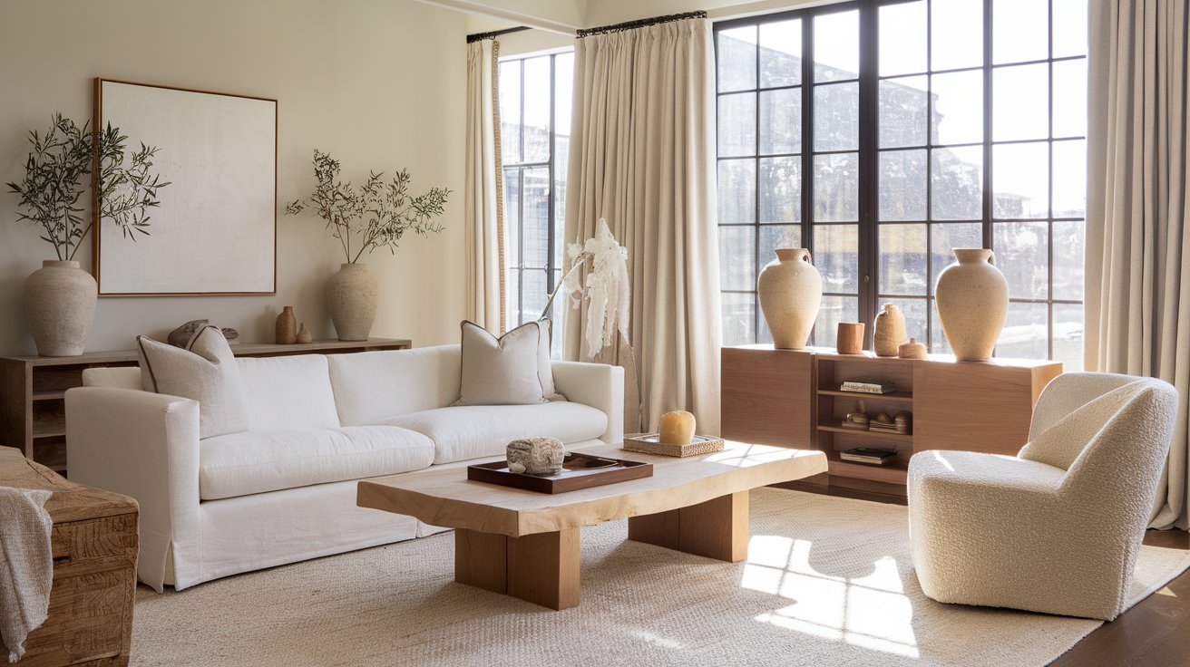
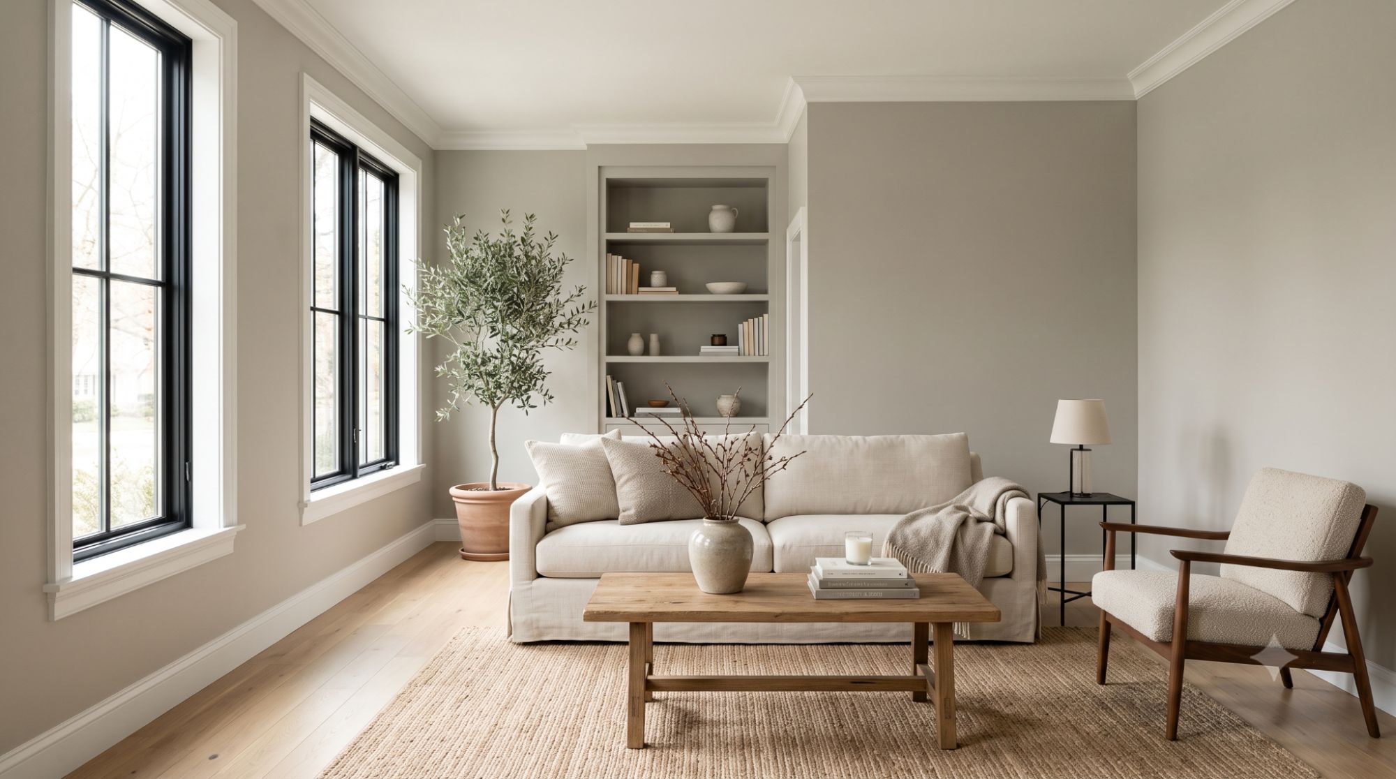
South or west light lets Pale Oak's warmth carry a room full of white oak or walnut furniture without looking flat. If your living room has large west-facing windows, test Pale Oak beside your sofa fabric before painting, since upholstery color can subtly pull its undertone warmer or cooler. Recommended trim: White Dove.
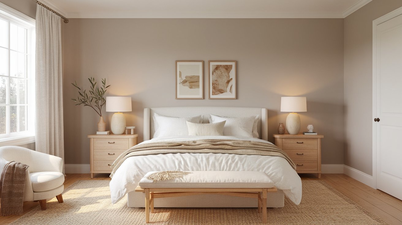
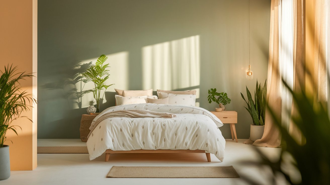
Because bedrooms are used most in evening lamplight, Pale Oak's taupe side tends to dominate here — a calming effect for rest. Layer in linen or cotton bedding rather than glossy synthetic fabrics, which can reflect too much cool light and flatten the warmth. Recommended trim: Simply White.
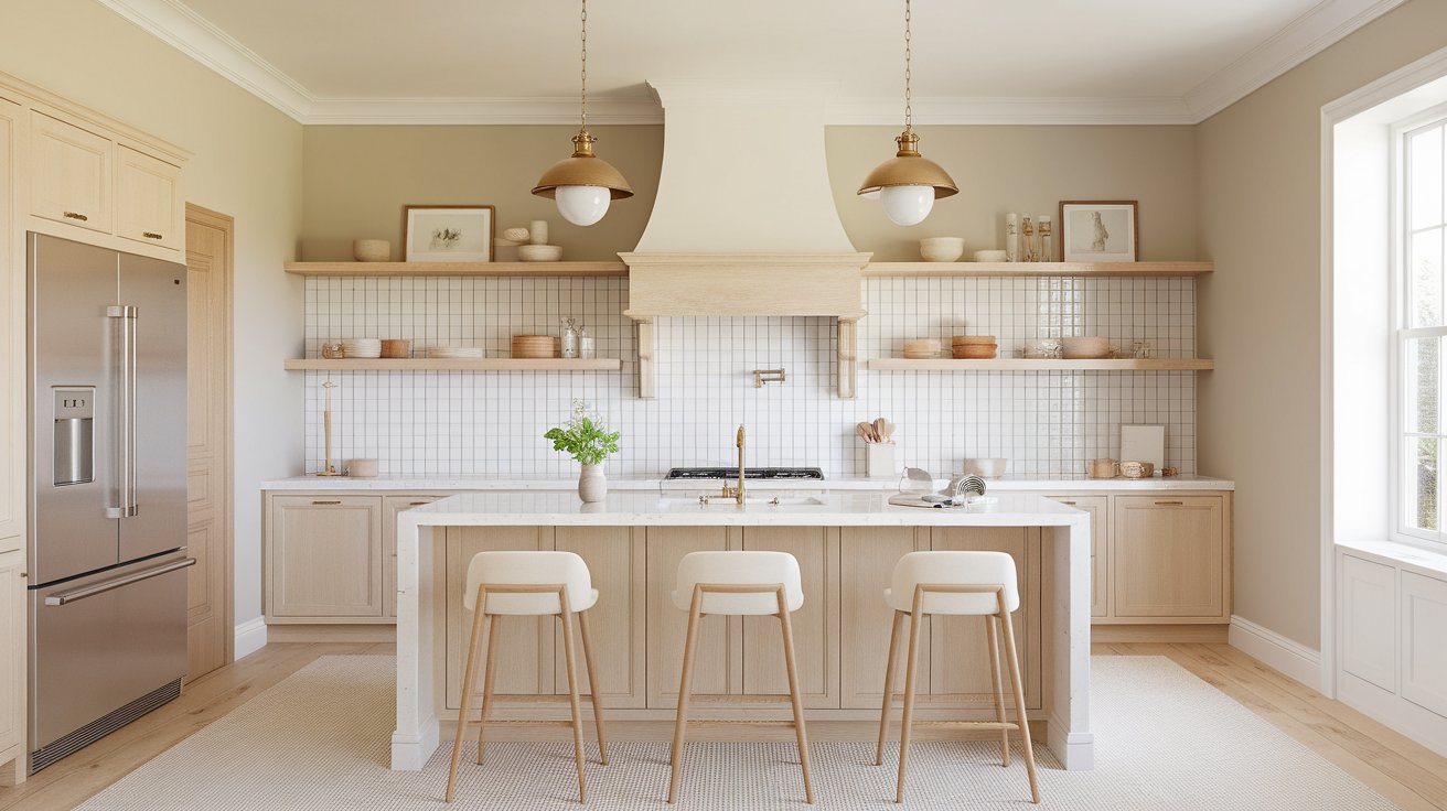
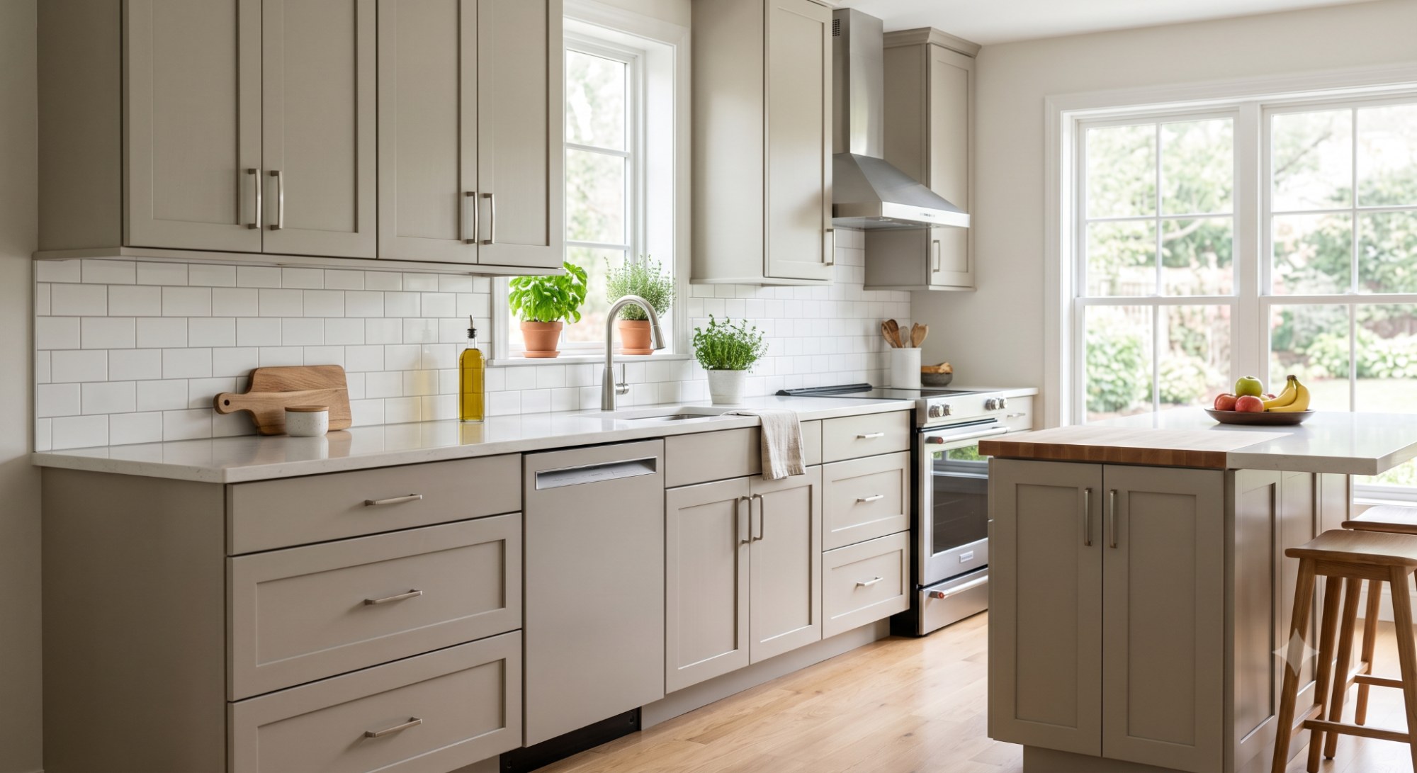
Cabinets and walls in Pale Oak hide daily smudges better than pure white, a practical win in a high-traffic room. If your kitchen leans heavily on stainless steel and cool LED task lighting, balance it with a warm-toned backsplash like a handmade subway tile. Recommended trim: White Dove.
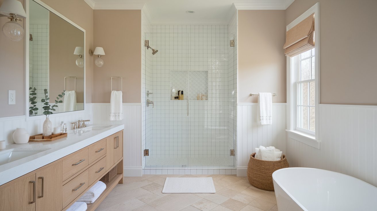
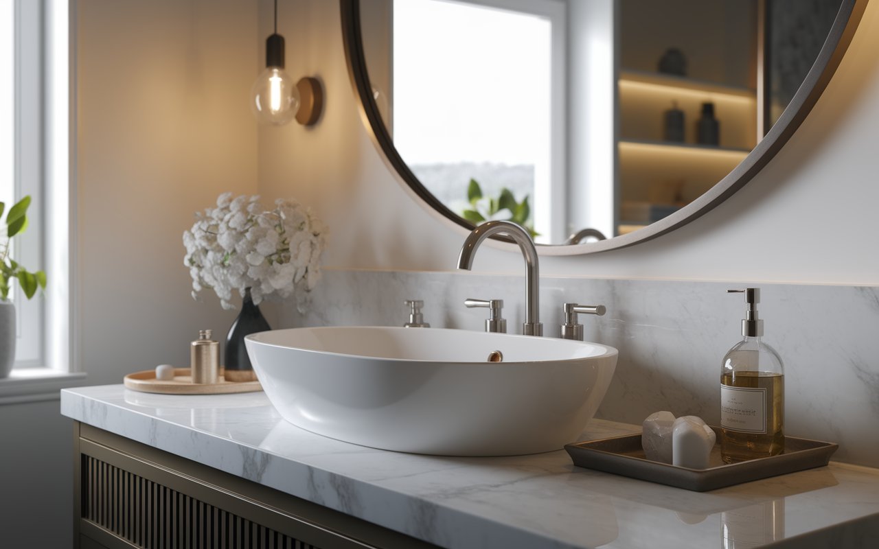
Tile-heavy bathrooms often feel cold; Pale Oak's warmth counters that without adding a strong color statement. In small, windowless bathrooms, swap in warm-white bulbs before painting, or the color reads flat and slightly gray under standard vanity lighting. Recommended trim: Chantilly Lace.
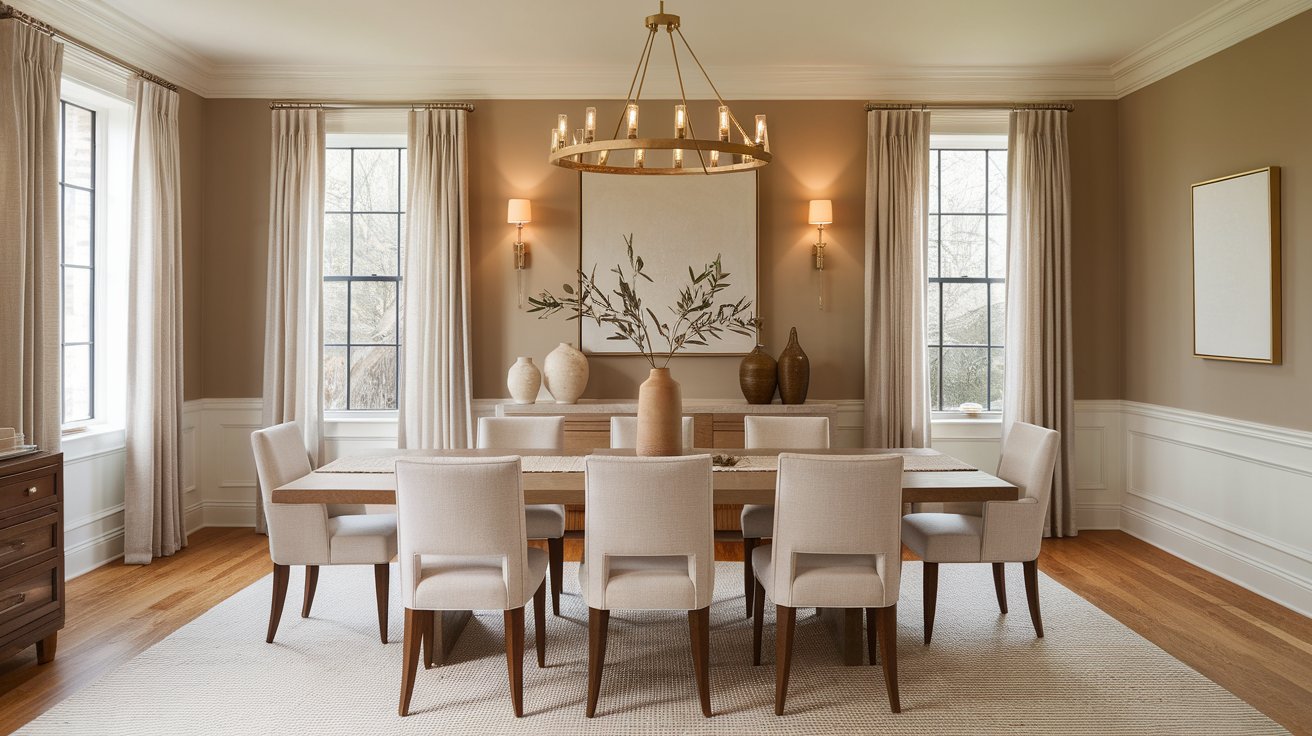
Dimmable, warm ambient lighting (chandeliers, sconces) is what makes Pale Oak sing here, deepening its taupe undertone during dinner hours. Pair it with a solid wood table rather than a glass or glossy-lacquer one, which won't reflect the same warmth back onto the walls. Recommended trim: White Dove.
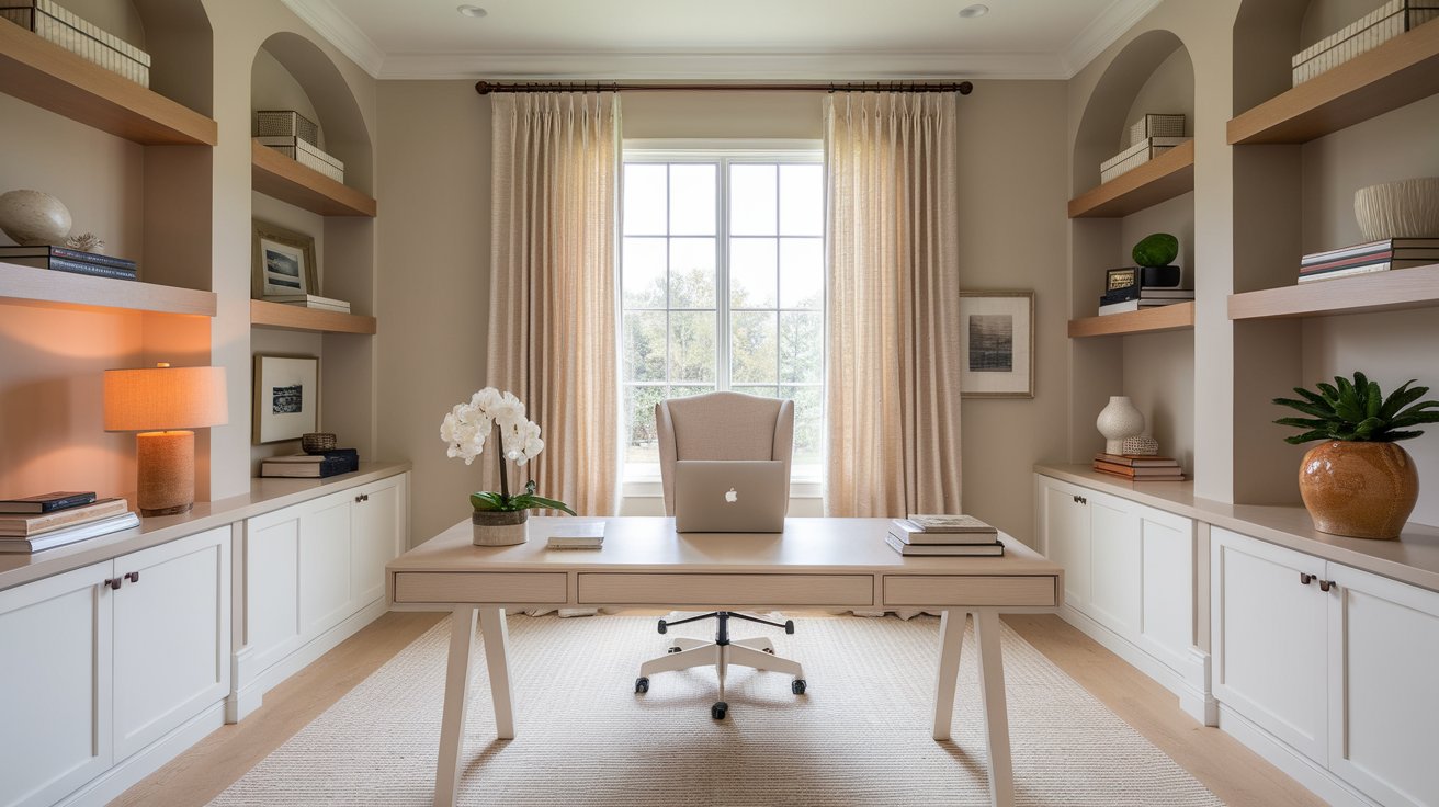
A muted backdrop that won't compete with screen glare or fight your concentration during long work sessions. If your desk sits under a cool-toned LED panel, add a warm desk lamp nearby — the fixture matters more here than in almost any other room. Recommended trim: Simply White.
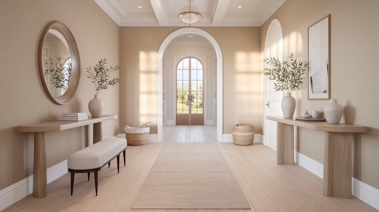
Sidelights or transom windows give entryways enough daylight variation to show Pale Oak at its most dynamic, shifting subtly through the day. If your entryway relies on a single overhead fixture, choose a warm-white bulb to keep the color from reading patchy near the corners. Recommended trim: White Dove.
Pale Oak's job in a palette is to act as connective tissue — a backdrop that lets bolder colors read cleanly instead of competing with them for attention.
Whites A warm white like White Dove shares enough pigment DNA with Pale Oak that the transition from wall to trim disappears, which is ideal when you want a seamless, low-contrast shell.
Warm Neutrals Revere Pewter and Manchester Tan reinforce Pale Oak's taupe side and deepen the room's warmth, useful on an accent wall where you want cohesion rather than contrast.
Charcoal Kendall Charcoal gives Pale Oak something to visually anchor against without the stark severity of true black — effective on a door or island where you want one grounding element.
Navy Hale Navy's cool depth contrasts just enough with Pale Oak's warmth to look intentional rather than mismatched, a reliable pairing for cabinetry that needs to feel classic, not trendy.
Sage Green October Mist shares Pale Oak's muted, earthy saturation level, so the two never fight for dominance — a soft option for bedrooms and living rooms.
Blue-Green A muted teal like Wythe Blue introduces coolness without clashing, because its grayed-down tone matches Pale Oak's own low saturation — good for a front door or bathroom accent.
| Coordinating Color | Best Use | Why It Works |
| White Dove | Trim, ceilings | Shares pigment base, creates seamless transition |
| Revere Pewter / Manchester Tan | Accent wall, furniture | Reinforces taupe undertone |
| Kendall Charcoal | Doors, island | Anchors without harsh contrast |
| Hale Navy | Cabinets, accent wall | Cool depth balances warm base |
| October Mist | Accent wall, textiles | Matches saturation level |
| Wythe Blue | Bathroom, front door | Grayed-down tone avoids clash |
White Dove shares enough warmth with Pale Oak that the wall-to-trim line softens rather than snaps, making it the default for traditional and transitional rooms.
Simply White runs slightly cleaner and brighter, useful when you want trim that reads crisp against a warm wall in farmhouse or coastal interiors.
Chantilly Lace is the coolest, highest-contrast option — choose it when you want trim that visibly separates from the wall in a modern space.
Swiss Coffee carries more cream than White Dove, a fit for traditional rooms that want maximum coziness.
Decorator's White stays neutral and slightly cool, best when trim needs to disappear into a minimalist scheme rather than announce itself.
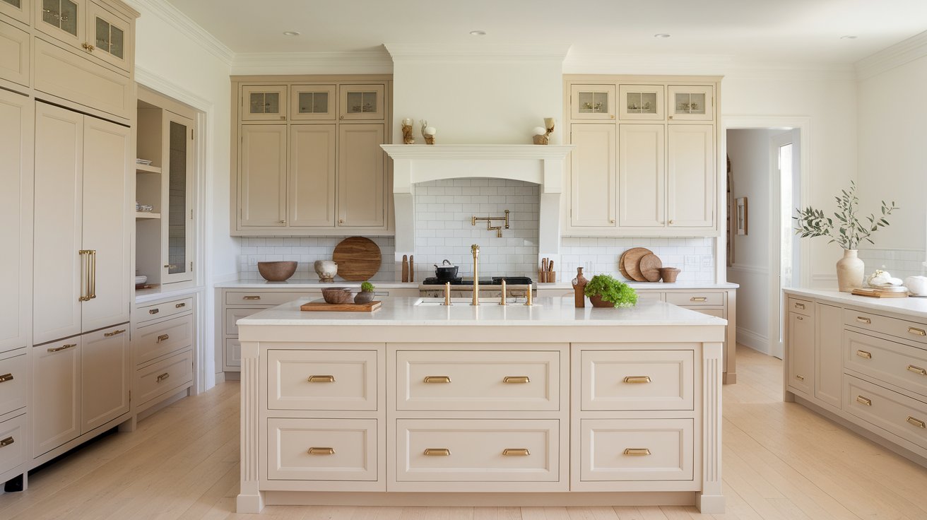
Pale Oak has become a go-to cabinet color because it splits the difference between the stark, high-maintenance look of pure white and the dated heaviness of oak-toned wood cabinetry.
Pros:
Cons:
Ideal finish: Satin or semi-gloss stands up to grease, moisture, and repeated wiping better than matte.
Hardware: Brushed brass warms the palette further; matte black sharpens the contrast.
Countertops: Warm white quartz, soft beige marble-look stone, or white oak butcher block all read as intentional pairings rather than accidents.
Backsplashes: Handmade-look subway tile or warm limestone keeps the warmth consistent from counter to ceiling.
Who should avoid it: Anyone set on a crisp, gallery-white kitchen will find Pale Oak too muted to deliver that look.
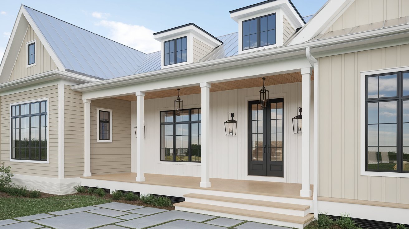
Exterior surfaces test Pale Oak harder than interior walls because sunlight is unfiltered and constant rather than diffused through glass.
Siding: Reads soft and welcoming against white trim, especially with a dark front door for contrast.
Brick: Better used as a trim or shutter color beside existing brick than painted over it, since brick's own warmth can clash with Pale Oak's undertone shifts.
Stone: Complements warm limestone or travertine accents without competing for attention.
Stucco: Performs best in strong-sun climates, where direct light keeps it from looking flat.
Front doors: Too light to serve as a statement color itself, but an effective neutral backdrop for a bold Hale Navy, black, or green door.
Climate considerations: In consistently overcast regions, Pale Oak can look gray and lifeless outdoors. In sun-heavy climates, it holds its warmest character.
When another color may be better: Homes without strong, direct sun exposure often do better with a more saturated greige that doesn't depend on sunlight to look intentional.
Undertone differences this subtle rarely translate from a screen or a paint chip in a store — always compare physical samples side by side in your own lighting before deciding.
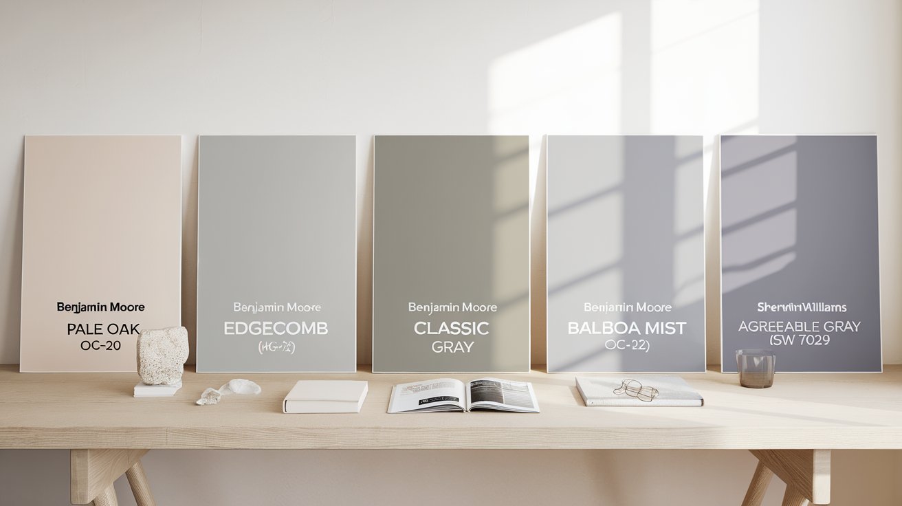
Pale Oak vs Edgecomb Gray Edgecomb Gray is warmer and leans more beige, with a stronger, more assertive undertone. Pale Oak is more balanced and slightly grayer. Choose Edgecomb Gray if you know you want warmth; choose Pale Oak if you want a neutral that can pivot cooler when needed.
Pale Oak vs Classic Gray Classic Gray is lighter, cooler, and closer to an off-white, with a much higher LRV and brighter overall effect. Pale Oak carries noticeably more warmth and depth. Choose Classic Gray for a crisp, airy room; choose Pale Oak for a cozier, more grounded feel.
Pale Oak vs Balboa Mist Balboa Mist is cooler and grayer, with a weaker warm undertone than Pale Oak's. Choose Balboa Mist for bright, sun-drenched rooms where you want a cooler palette; choose Pale Oak when the room needs more warmth to feel inviting.
Pale Oak vs Agreeable Gray Agreeable Gray (Sherwin-Williams) reads as a truer, more consistent warm gray with less risk of pink undertones. Pale Oak leans further toward beige and taupe. Choose Agreeable Gray if you want undertone consistency across every room; choose Pale Oak if you want more warmth and don't mind some shift by exposure.
| Color | Warmth | Undertone Strength | Brightness | Best Lighting | Best For |
| Pale Oak | Warm-neutral | Moderate | High | South/West | Flexible, warm greige look |
| Edgecomb Gray | Warmer | Moderate-strong | High | North rooms | Homeowners wanting more beige |
| Classic Gray | Cool-neutral | Subtle | Very high | Bright south | Bright, airy, minimal spaces |
| Balboa Mist | Cool-neutral | Subtle | High | Sunny rooms | Sunny rooms, cooler palettes |
| Warm-neutral | Moderate | High | Most exposures | True greige, less pink risk |
| Pros | Cons |
| Adapts to most decorating styles without clashing | Reveals pink undertones in cool, north-facing rooms |
| High LRV keeps rooms feeling open and bright | Can look washed out under intense, direct daylight |
| Deepens into a rich taupe in warm afternoon light | Undertone shifts noticeably room to room |
| Reads well against most wood flooring tones | Requires sample testing before committing |
| Pairs with both warm and cool trim choices | Too muted for buyers wanting bold contrast |
Pale Oak earns its reputation not because it's universally flattering, but because it responds to a room rather than overriding it — a quality that rewards homeowners willing to test it properly and can disappoint those who paint straight from the chip.
Choose it if your home gets decent daylight and you want one neutral that can carry multiple rooms without feeling repetitive. Skip it if you need predictability over adaptability, or if your rooms depend on cool artificial lighting. Its biggest strength is that responsiveness to light; its biggest limitation is the same trait left unmanaged, which is why sample testing matters more with this color than with most.
Benjamin Moore's Aura and Regal lines resist fading well indoors for years, but rooms with unfiltered afternoon sun through south or west windows will show gradual dulling sooner than shaded rooms. In rooms with intense sun exposure, UV-filtering window treatments may help reduce fading over time.
Bulbs in the 2700K–3000K range reinforce the taupe undertone and calm any pink cast, while 4000K+ bulbs push the color toward flat gray — if your fixtures are already cool white, switching bulbs is a cheaper fix than repainting.
Yes, and its undertone flexibility is precisely why designers choose it for whole-home schemes — but paint large sample boards in each distinct light zone first, since a north-facing kitchen and a south-facing living area under one open ceiling can visibly disagree on undertone.
Matching the ceiling to the walls removes the visual stopping point at the crown molding, making a room feel enveloping and taller in perception — a crisp white ceiling keeps the eye anchored and works better in rooms under 8-foot ceiling height.
Light and white oak keep the pairing airy and Scandinavian; walnut and other medium-dark browns pull out Pale Oak's warmest taupe register; gray-toned flooring pulls it cooler and flatter, so match your flooring undertone to the effect you actually want before choosing.
Daniel Hartman is a color specialist with years of experience helping people make confident and thoughtful design decisions. He provides practical and approachable guidance while balancing creativity and functionality in every project. Daniel enjoys visiting art and design exhibits to study how different environments influence aesthetics, mood, and perception, bringing a rich perspective and insight into his work. His approach makes design decisions both simple and enjoyable.


No Comments