

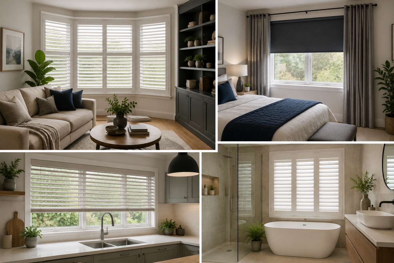
How to Choose the Perfect Window Coverings for Your Home
Window coverings are more than just decorative features. They influence


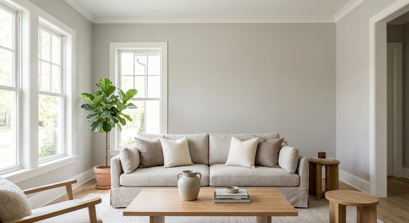
Sherwin Williams Repose Gray (SW 7015) is a warm gray with an LRV of 58 and soft green, violet, and brown undertones that shift depending on your lighting.
It's become one of the go-to neutrals for homeowners, designers, and painters because it works well in almost any room and even holds up on exteriors.
Part of the appeal is how flexible it is: Repose Gray can lean slightly warm or cool depending on the light hitting it, which lets it fit a lot of different homes and styles.
This guide covers its LRV, undertones, lighting behavior, coordinating colors, room-by-room use, and how it compares to other popular grays.
Keep in mind that paint color rarely looks the same in every home. Repose Gray can shift based on your lighting, flooring, and the colors around it, so sampling it in your own space is always a smart step before you commit.
| Feature | Details |
| Color | Repose Gray |
| SW Number | SW 7015 |
| LRV | 58 |
| Color family | Warm gray / greige |
| Undertones | Green, violet/purple, brown/taupe influences |
| Best for | Walls, cabinets, interiors & exteriors |
The SW number and LRV above come from Sherwin-Williams' official color information. The undertone and lighting descriptions further down are based on how designers, painters, and homeowners commonly describe the color in practice, since undertones aren't something a paint brand assigns an official number to.

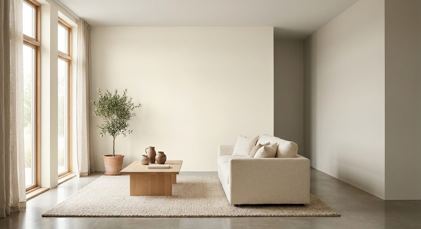
Sherwin Williams Repose Gray is generally described as a warm gray with greige characteristics, sitting between a true gray and a soft beige, with undertones that can read gray, purple, or brown depending on the light.
It's not a flat, cool gray, and it's not a true beige either — it's a soft blend of both, which is why it reads differently depending on where you use it. In a lot of lighting it looks like a gentle, warm gray with a touch of color underneath; in other conditions, that warmth fades and it looks closer to a classic gray.
Compared to a traditional cool gray, it feels softer and less stark; compared to a warmer greige, it feels more balanced and less tan. That middle-ground quality is why people reach for it when they want a neutral that won't feel too cold or too beige.
The LRV of Sherwin Williams Repose Gray is 58, according to Sherwin-Williams' official color data, placing it in the light-to-medium range on the gray and greige spectrum.
LRV stands for Light Reflectance Value, a number from 0 to 100 showing how much light a paint color reflects versus absorbs. A color near 0 is nearly black; a color near 100 is close to pure white. An LRV of 58 means Repose Gray reflects a moderate amount of light — light enough to avoid feeling heavy, but with enough depth to read as a true gray rather than an off-white. It tends to feel airier in bright rooms and moodier in dim ones.
LRV is a helpful guide, not a guarantee. Two rooms with the same paint and LRV can still look different because of window direction, bulb type, and nearby furniture or flooring.
Repose Gray carries three commonly reported undertones: green, violet/purple, and brown/taupe, none of which are dominant on their own.
Sherwin-Williams doesn't publish an official undertone breakdown, so the descriptions below reflect how designers and homeowners most commonly describe Repose Gray in practice, not a manufacturer specification.
Green undertone: Many people report that in cooler or artificial light, Repose Gray can pick up a faint green cast, especially in rooms with limited natural light or near green-toned flooring or furniture.
Violet/purple undertone: This is one of the more talked-about undertones. It's commonly noted to appear in north-facing rooms or under cooler daylight, where blue-toned light pulls out the violet in the paint.
Brown/taupe influence: In warmer light, particularly south-facing rooms or under warm artificial bulbs, Repose Gray is often described as leaning toward a soft brown or taupe feel, making it look more like a classic greige.
These undertones are subtle, not a color that shouts green or purple. It's also why two people can describe the same wall differently — one room catching more blue-toned daylight, another warmer and pulling out the brown. Since undertones are a matter of observation, not a fixed number, testing a sample in your own space is the only way to know how they'll show up.
Sherwin Williams Repose Gray is generally considered a warm gray, although it can appear cooler in north-facing rooms or under cool artificial lighting.
In warm, natural light, it leans into its greige side and feels cozy. Under cooler light — north-facing daylight or certain LED bulbs — it can shift toward a grayer, sometimes slightly purple, appearance. If you want a consistently warm feel, pay attention to window direction and bulb type.
Before the lighting and room-by-room detail, here's a quick read on whether Repose Gray suits your space.
Choose it if you:
Think twice if you:
If you prefer a more consistently warm or deeper gray, Agreeable Gray and Mindful Gray are also worth comparing.
A handful of factors bring out these undertones, and none are a flaw in the paint itself: natural light changing by time of day and window direction, artificial bulbs with their own color temperature, nearby colors reflecting onto the paint, flooring tone (cool floors pull toward gray/violet, warm floors pull toward brown), trim contrast, and how much natural light a room gets overall.
Repose Gray is responsive rather than unpredictable — it reacts to its environment more than a flat, single-tone paint would, which is why testing it in your own space matters.

Since lighting has such a big effect on this color, it helps to break things down by window direction.
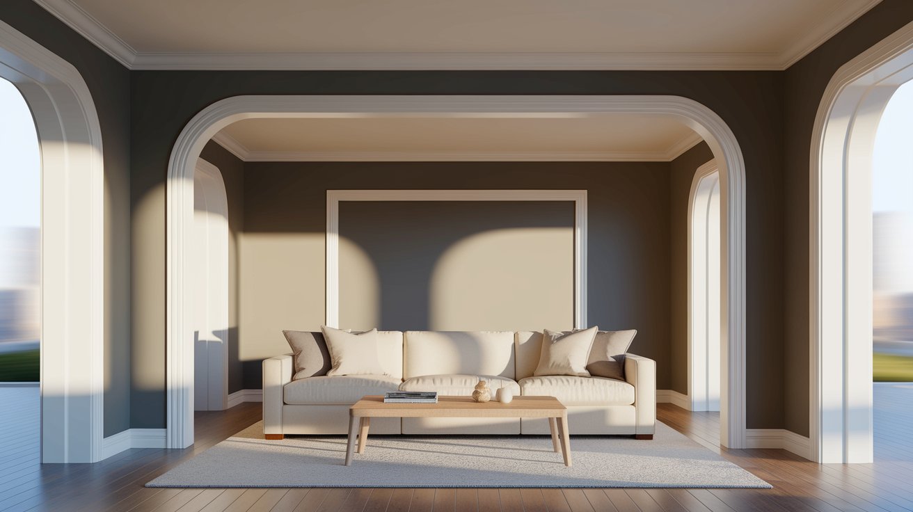
Cooler, softer light means Repose Gray tends to lean grayer here, and the violet undertone is more likely to show up. Test a large sample before painting the whole room.
Warmer, more direct light makes Repose Gray look warmer and more greige, with undertones fading into the background — often the easiest lighting to work with.
Warm morning light gives a softer look early on, settling into a more neutral tone as the day cools off.
The reverse of east-facing: cooler and more subdued in the morning, then warmer and golden as afternoon approaches.
Limited natural light tends to make Repose Gray look darker overall, with undertones more noticeable. Consider a lighter version of the color, or a lighter paint altogether, in these spaces.
Repose Gray's flexibility means it can work in almost any room in the house.

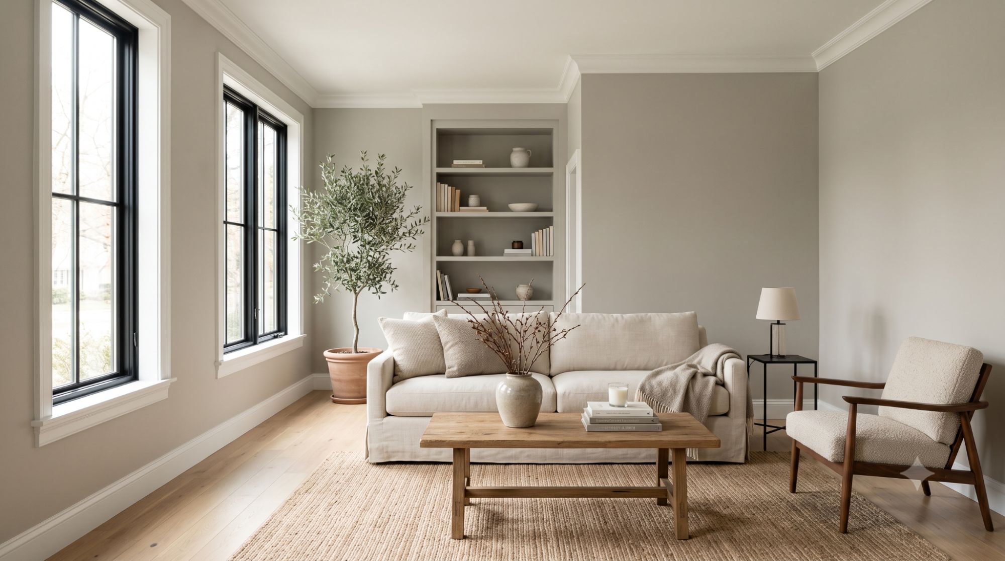
It works as a calm backdrop for any furniture or decor style, pairing easily with white trim and light or medium wood flooring. Whether your furniture leans warm or cool, it tends to blend in rather than clash.

It tends to feel calm and soft here. Bedding in warm neutrals, soft blues, or muted greens pairs nicely, and softer nighttime lighting can make the color feel cozier.

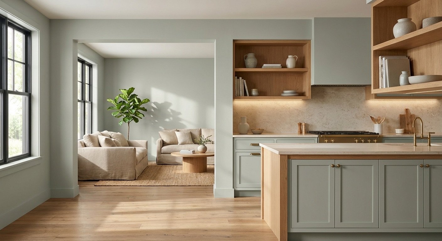
On kitchen walls, it generally works well alongside white cabinetry, warm wood cabinets, stone countertops, and most backsplash tile.

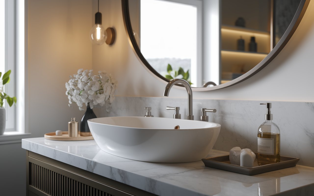
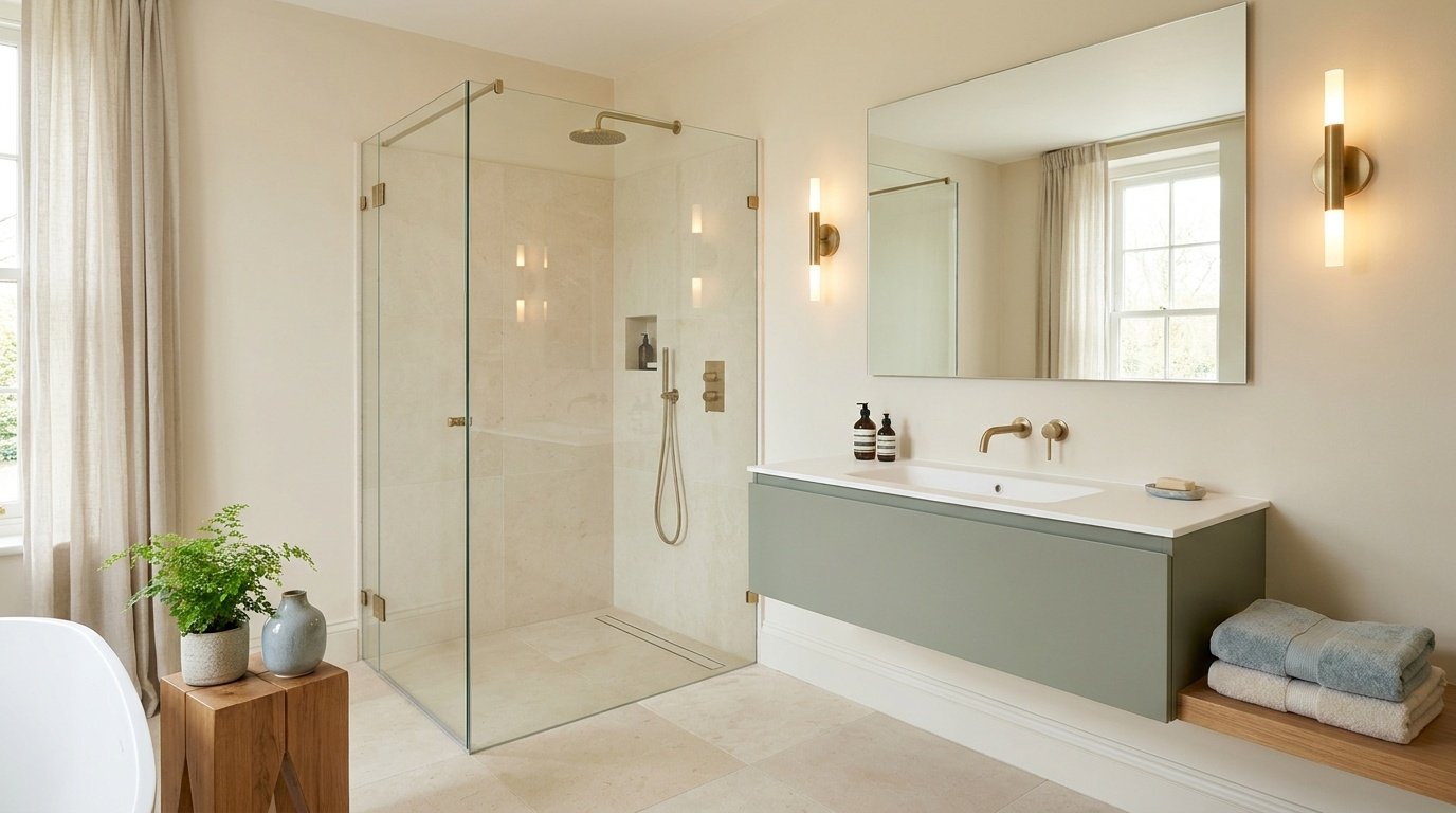
Bathrooms are often smaller with less natural light, so Repose Gray can appear a bit deeper. It still works well with white fixtures and most tile colors, and a lighter application can help very dim bathrooms feel more open.

These spaces often deal with changing light as they connect rooms with different window exposures. Repose Gray handles this reasonably well thanks to its balanced undertone, though the shift can still be noticeable between a sunlit entry and a darker hallway.

Repose Gray works well as an exterior color, though outdoor light and surface texture — siding, stucco, or brick — tend to make it read slightly deeper or more textured than indoors. On siding it reads as a soft, warm gray; on stucco, texture adds subtle shadowing; against brick, it usually creates a calm contrast. Wood accents and natural stone pair nicely, white trim keeps the look crisp, and dark accents like a front door add sharper contrast. Always view an exterior sample outdoors, in daylight, before committing to a full job.
Paint stores can mix a color at a percentage of its full strength, lightening it while keeping the same general undertone. This is a common option with Repose Gray.
Full strength shows the truest color and undertones, with more depth — a good fit for rooms with good natural light, where it reads clearly without looking flat.
At 50%, the color becomes noticeably lighter while keeping a similar undertone character, which can suit rooms with limited light where full-strength might look too deep. It's not automatically the better choice — it simply shifts intensity, so test an actual sample first.
Two commonly used Sherwin Williams whites alongside Repose Gray are Pure White, a soft, warm white that blends gently without harsh contrast, and Extra White, which is crisper and brighter for a clean, modern line between wall and trim. A crisp white emphasizes contrast, a warm white blends softly with Repose Gray's warmer moments, and an off-white sits in between.
White cabinets create a clean, bright contrast; natural wood leans into the warmer side of the wall color; darker painted cabinets add depth; blue or green cabinets can pick up on Repose Gray's subtle undertones.
Light wood keeps a space feeling bright and airy, medium tones create a balanced look, and dark wood adds contrast and can make walls feel lighter by comparison. Warmer flooring tends to pull out the warmer side of Repose Gray; cooler flooring pushes it toward its grayer moments.
| Paint Color | Compared With Repose Gray | Undertone/Appearance | Best For |
| Agreeable Gray | Warmer overall | More consistently beige, less shifting | Warm, consistent neutral |
| Mindful Gray | Darker | Stronger, more saturated gray | Rooms wanting more contrast |
| Accessible Beige | More beige-leaning | Warmer, less gray influence | Traditional interiors |
| Worldly Gray | Slightly deeper | Balanced gray-green feel | Grounded, slightly darker neutral |
| Revere Pewter | Warmer | Consistent greige, less shifting | Traditional or classic-style interiors |
| Edgecomb Gray | Lighter | Softer, more beige-leaning | Bright rooms wanting a light, warm neutral |
| Gossamer Veil | Cooler | Distinct green-gray | Spaces wanting a clearly green-toned neutral |
Sherwin Williams Agreeable Gray tends to read warmer and more consistently beige across lighting, while Repose Gray shifts more noticeably between warm and cool. Agreeable Gray suits those wanting one consistent tone; Repose Gray suits those who like a color that responds to its surroundings.
Sherwin Williams Mindful Gray is deeper and more saturated, giving rooms a bolder, more defined gray presence. Repose Gray is lighter and softer, making it a better fit for rooms wanting a gentler neutral rather than a strong, statement gray.
Accessible Beige leans clearly into beige territory with less gray influence, while Repose Gray keeps more of a gray base with warmer moments layered in. Choose Accessible Beige for a more traditional beige look, and Repose Gray for something closer to the middle of the gray-beige spectrum.
Worldly Gray sits a bit deeper with a more grounded, gray-green feel compared to Repose Gray's lighter, more balanced tone. Worldly Gray suits rooms wanting more depth; Repose Gray suits spaces wanting a softer overall look.
Revere Pewter is a well-known greige with warmer undertones that stay more consistent across lighting. Repose Gray shifts more visibly between warm and cool, so Revere Pewter suits homeowners wanting predictability, while Repose Gray suits those wanting more range.
Edgecomb Gray is lighter and leans further into beige, a soft, warm option for bright rooms. Repose Gray carries a bit more gray weight, giving it slightly more presence on the wall.
Gossamer Veil leans more clearly green-gray in most lighting, a more distinct color identity. Repose Gray keeps its undertones more subtle and balanced, a safer choice for those unsure about a stronger green cast.
Repose Gray can work well as a whole-house color, particularly in open-concept homes, though it's worth testing it in each major room since lighting exposure varies from space to space.
Its balanced undertone helps it transition well between rooms with different light — one of the trickier parts of a whole-house color. It generally works well alongside consistent white trim and flooring that carries through the house, tying rooms together even as the wall color shifts slightly. It may be less ideal if your home has an unusually large number of low-light rooms, since the color can appear noticeably darker there.
| Pros | Cons |
| Works with both warm and cool color palettes | Undertones can shift depending on lighting |
| Suits many decorating styles | Can look cooler in north-facing or low-light rooms |
| Works indoors and outdoors | Can appear darker in rooms with limited natural light |
| Pairs well with wood tones and white trim | May not suit those wanting a completely flat, undertone-free gray |
| Can work as a whole-house color | Benefits from careful sampling before full application |
Repose Gray remains a practical choice for many current interior styles because its neutral character works with a wide range of furniture, flooring, trim, and accent colors. Rather than tying a room to one specific trend, it can act as a flexible backdrop that changes with the surrounding design.
Whether it is currently among the most popular paint colors depends on the source and year, so popularity rankings should be treated separately from whether the color works well for a particular home. The surrounding trim, furniture, and accent colors usually shape how current a room feels more than the wall color itself.

Testing a paint color properly makes a real difference, especially with a shifting color like this one.
Repose Gray is a solid option for many homes, but not everyone.
Good choice if:
Consider another color if:
Overall, Sherwin Williams Repose Gray SW 7015 is a versatile warm gray that works especially well when you want a neutral that can bridge warm and cool finishes. Its changing appearance is both its strength and its main consideration, so test a large sample in your actual space before committing to a full room or whole-house application.
Not exactly. Finish affects how much light a surface reflects, which changes how a color looks even with an identical formula. Matte and flat finishes generally reflect less light, while higher-sheen finishes like eggshell, satin, and semi-gloss reflect more and can look brighter or slightly different depending on the viewing angle. If you're mixing finishes in one room, test them together.
Most paint stores can attempt a color match, but it isn't guaranteed to look identical to the original, since brands use different bases, pigments, and finish formulas. If you're relying on a match, get an actual dried sample from that brand rather than trusting the color name alone.
Yes, but bulb color temperature matters. Warm LEDs (roughly 2700K–3000K) bring out the greige side of the color; cooler or daylight LEDs (4000K and above) can emphasize the grayer or violet undertones. Check a sample under your actual fixtures at night, not just in daylight.
Yes. In rooms with taller ceilings and good light, full strength can add a cozy feel without shrinking the room visually. In rooms with lower ceilings or less light, a lighter version may keep the space feeling open. A crisp white trim against a painted ceiling adds a defined, intentional look.
There's no fixed number — coverage depends on your current wall color, surface condition, primer use, and the specific paint product. Painting over a similar light color usually needs fewer coats than a dark or bold one. Follow the coverage and recoat instructions on your specific product, since these vary between paint lines.
Daniel Hartman is a color specialist with years of experience helping people make confident and thoughtful design decisions. He provides practical and approachable guidance while balancing creativity and functionality in every project. Daniel enjoys visiting art and design exhibits to study how different environments influence aesthetics, mood, and perception, bringing a rich perspective and insight into his work. His approach makes design decisions both simple and enjoyable.


No Comments