
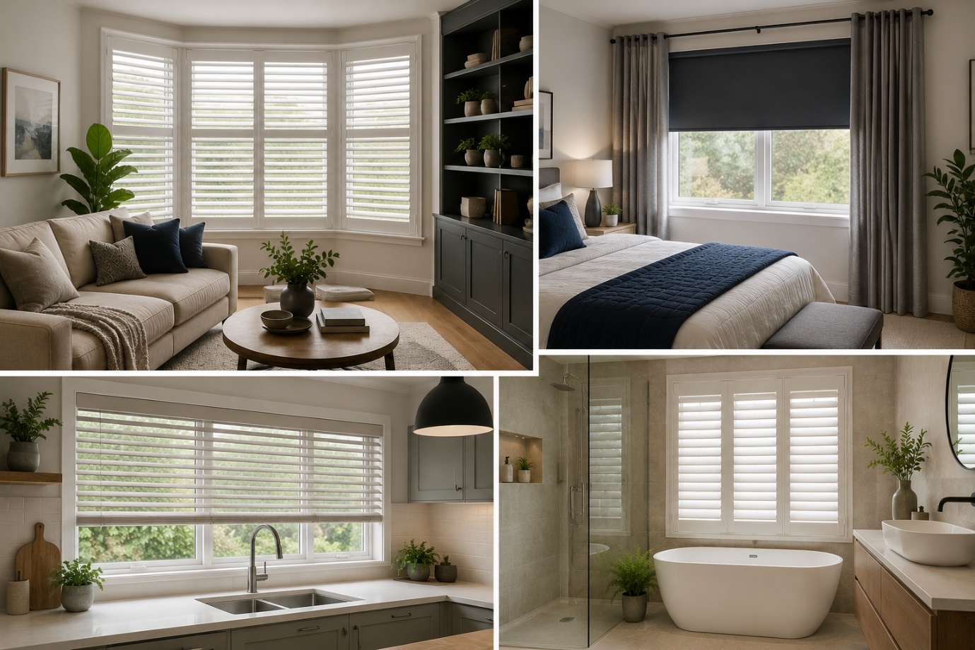
How to Choose the Perfect Window Coverings for Your Home
Window coverings are more than just decorative features. They influence

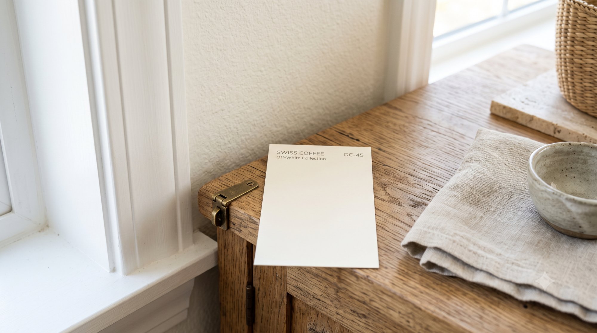
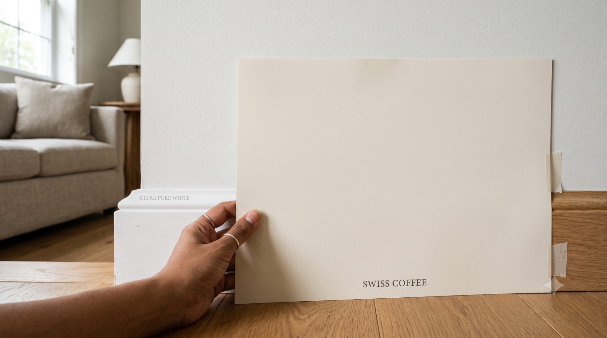
Swiss coffee paint color is a warm off-white that many homeowners choose when they want white walls without a cold or stark look. It's one of Benjamin Moore's most popular soft whites, and it's easy to see why. It feels softer than a bright white but cleaner than a deep cream, which makes it a comfortable middle-ground choice for almost any room in the house.
In this guide, we'll walk through everything you need to know before you commit to a can of Swiss Coffee. We'll cover its LRV, its undertones, whether it leans warm or cool, how it behaves in different lighting, and which rooms it works best in. We'll also look at cabinets, trim, exteriors, coordinating colors, and how it stacks up against other popular whites. By the end, you'll know exactly whether this color is right for your home.
Yes, Swiss Coffee is a good choice for most homes that want a warm, soft, creamy white. It works especially well in traditional, transitional, cottage, farmhouse, and warm modern interiors. If your home already leans warm — think wood floors, beige furniture, or brass fixtures — this color will feel right at home.
That said, it's not the best pick for every space. If your room has very cool finishes, icy white trim, or cool-toned marble countertops, Swiss Coffee can start to look yellow or dated instead of soft and inviting. It's also not the right choice if you're after a crisp, bright white with no warmth at all.
Here's a quick breakdown to help you decide:
| Best For | Be Careful With |
| Warm interiors | Cool marble |
| Wood floors | Blue-white trim |
| Kitchen cabinets | Very cool gray palettes |
| Cozy bedrooms | Rooms needing a crisp white |
| Hallways and living rooms | Spaces with very yellow lighting |
Before diving deeper, here's a simple reference table with the basic facts about Benjamin Moore Swiss Coffee OC-45. Keep this handy if you're comparing paint chips at the store.
| Detail | Swiss Coffee OC-45 |
| Brand | Benjamin Moore |
| Color Name | Swiss Coffee |
| Color Code | OC-45 |
| Collection | Off White Collection |
| LRV | 81.91 |
| HEX Code | #EEECE1 |
| RGB | 238, 236, 225 |
| Color Family | Warm off-white |
| Undertones | Creamy yellow with soft green/beige warmth |
| Best Uses | Walls, cabinets, trim, ceilings, some exteriors |
| Style Fit | Traditional, cottage, farmhouse, transitional, warm modern |
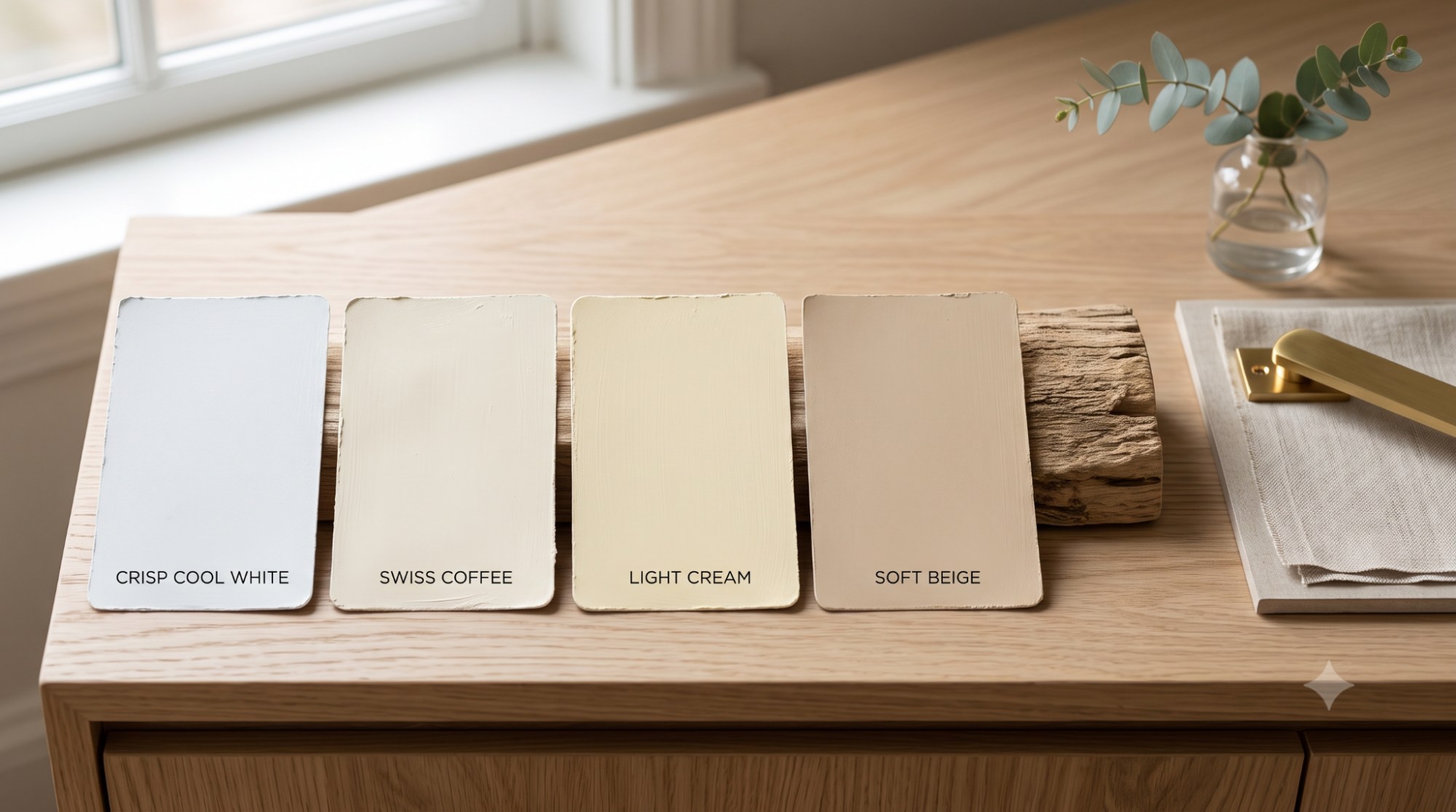
Swiss Coffee is not a pure white. It's a warm off-white with just enough depth to feel soft and cozy instead of flat or clinical. Think of it as sitting somewhere between a clean white and a light cream.
Here's what makes it unique:
If your home leans warm already, Swiss Coffee will blend in beautifully rather than fighting with the rest of your decor.
There's a reason Swiss Coffee shows up on so many "best white paint" lists. It gives homeowners a soft, white-ish look without the cold, sterile feeling that some bright whites bring into a room.
A few reasons it keeps showing up in homes across the country:
If you're looking for a warm white paint color or a creamy white paint color that won't feel trendy in five years, Swiss Coffee is a safe and popular bet.
LRV stands for Light Reflectance Value. In simple terms, it tells you how much light a paint color bounces back into a room. The scale runs from 0 (absolute black, absorbs all light) to 100 (pure white, reflects all light).
Swiss Coffee has an LRV of 81.91. That's high, which means it's a light color overall. But it's not the brightest white on the shelf. Colors like Chantilly Lace sit closer to the top of the scale, giving a crisper, cleaner brightness. Swiss Coffee, by comparison, still reflects plenty of light but keeps a touch of warmth and softness.
In practice, this means:
Here's how it compares to a few other popular whites:
| Paint Color | LRV | Warmth Level | Best Use |
| Chantilly Lace | 90.04 | Very cool/neutral | Modern, minimalist, high-contrast trim |
| White Dove | 83.16 | Soft warm | Whole-house neutral, cabinets, trim |
| Swiss Coffee | 81.91 | Warm | Cozy walls, cabinets, traditional homes |
| Alabaster | 82 | Warm, creamy | Farmhouse, cottage, warm-toned kitchens |
| Choose Swiss Coffee If… | Choose Another White If… |
| You want a warm, creamy off-white with softness | You want a crisp, true white with no warmth |
| Your home has wood floors, brass, or warm stone | Your home has cool marble, chrome, or blue-gray tile |
| You're decorating in a traditional or farmhouse style | You're going for a modern, minimalist, or coastal-cool look |
| You want a color that hides slight imperfections in light | You need a bright, gallery-style backdrop for art or photos |
| You're painting cabinets and want a classic warm look | You want cabinets that read bright white under any light |
Undertones are the hidden colors that show up in a paint once it's on the wall, especially next to other colors or under certain light. Swiss Coffee has a warm, creamy undertone with a touch of yellow, and sometimes a soft green-beige quality shows up depending on what's around it.
A few key things to know about its undertones:
It can, especially in warm lighting, in rooms with limited natural light, or when placed next to a cooler white. But in a room with balanced, natural light, it usually reads as a soft, warm white rather than a yellow paint color.
Some people do notice a subtle green-beige undertone, particularly next to certain countertops, tile, or cooler whites. It's not a dominant green tone, just a faint shift that shows up in specific settings.
No. Swiss Coffee is too warm and creamy to ever really look gray. If you're hoping for a gray-leaning white, this probably isn't the color for you.
Some homeowners like to tone down a color slightly by asking their paint store to mix it at 75% strength. This means the same formula is used, but in a slightly weaker concentration, which produces a lighter, softer version of the original color.
At 75% strength, Swiss Coffee becomes even paler and quieter. This can be useful for:
Keep in mind that a 75% strength mix will also have a slightly higher LRV than the full-strength version, so it will reflect a touch more light. Not every paint store handles custom tint reductions the same way, so ask for a sample first before ordering gallons. If you try this approach, always test a sample first, since diluted formulas can look noticeably different once they're dry on the wall rather than wet in the can.
Swiss Coffee is a warm white paint color, plain and simple. It feels soft, creamy, and inviting rather than crisp or icy.
Because it leans warm, it pairs more naturally with warm finishes like wood tones, brass, and beige than it does with cool, icy elements. If you want white walls but don't want that hospital-white feeling, Swiss Coffee gives you a gentler alternative.
This is one of the most important things to understand before painting an entire room. Paint color doesn't stay the same all day. It shifts depending on the direction your windows face, the time of day, and the type of light bulbs you use.
| Lighting | How Swiss Coffee May Look |
| North-facing rooms | Creamier, slightly muted, less bright |
| South-facing rooms | Warmer, brighter, softer white |
| East-facing rooms | Brighter in morning, softer later |
| West-facing rooms | Warmer and creamier in afternoon/evening |
| Artificial warm bulbs | More yellow/cream |
| Cool LED bulbs | Slightly cleaner but may clash with warmth |
North-facing rooms get cooler, more indirect light throughout the day. Swiss Coffee can help soften that cool light, but it may also look a bit more muted or creamy than it would in a sunnier room.
South-facing rooms usually get strong, warm light for most of the day. In these rooms, Swiss Coffee tends to look brighter and warmer, showing off its soft white side more than its creamy side.
East-facing rooms get warm morning light that fades into cooler, softer light later in the day. So Swiss Coffee may look brighter in the morning and gentler by afternoon. West-facing rooms work in reverse, staying more neutral in the morning and turning warmer and creamier as the sun moves toward evening.
Your light bulbs matter more than most people realize. Warm-toned bulbs will push Swiss Coffee toward a creamier, more yellow look. Cooler LED bulbs can make the paint look a touch cleaner, but they may also create more contrast between the paint's natural warmth and the bulb's cool tone, which isn't always a flattering combination.
Swiss Coffee is versatile enough to use throughout the house, but it shines in certain rooms more than others.
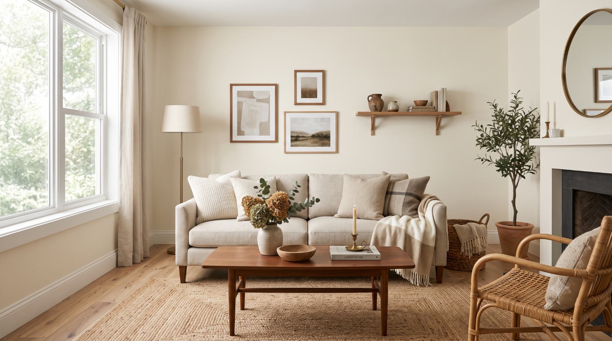
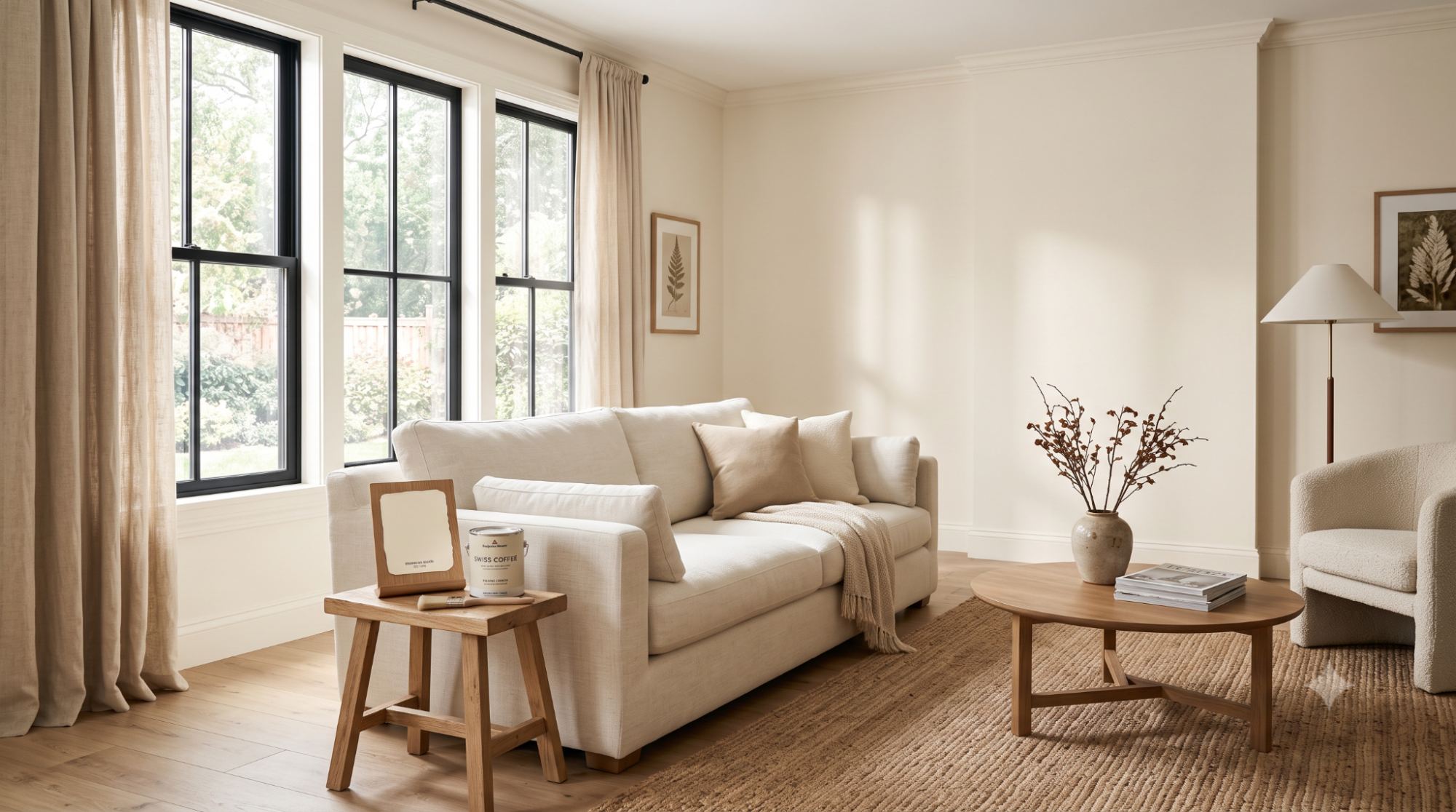
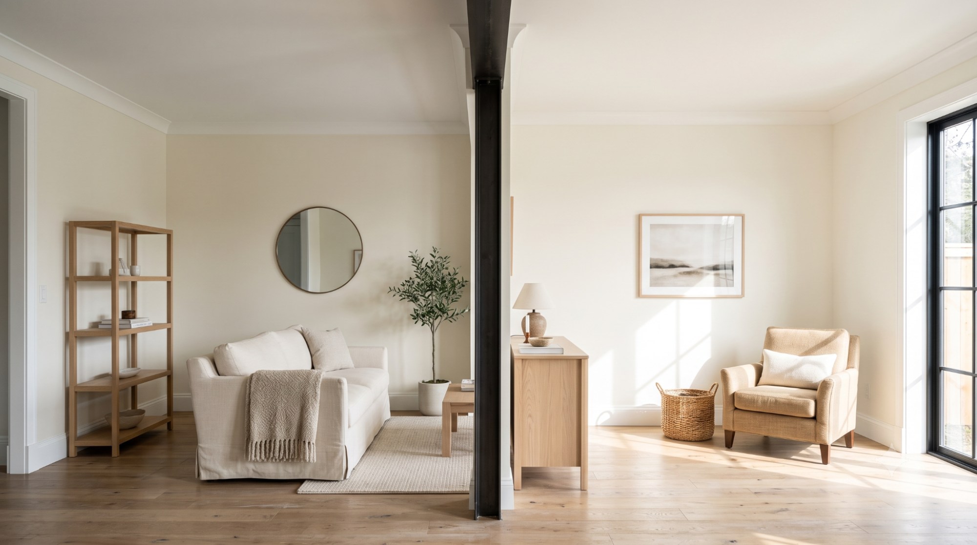
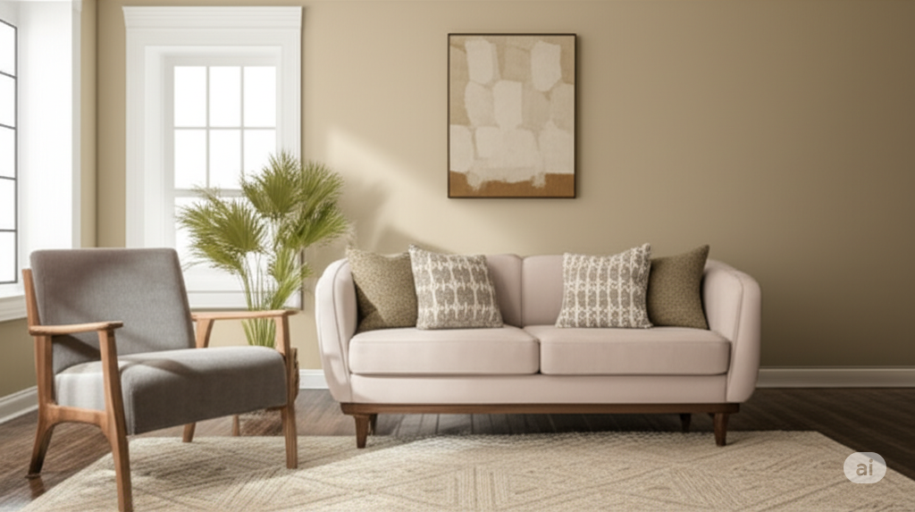
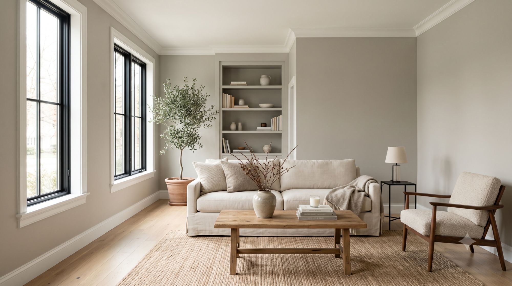
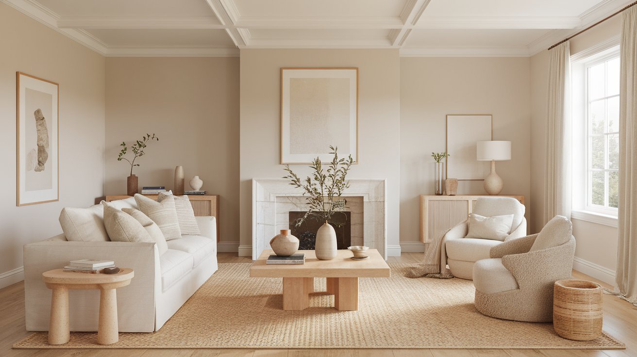
Swiss Coffee walls work beautifully in living rooms that include wood floors, beige sofas, woven textures, brass accents, and other warm decor touches. For example, a living room with a natural jute rug, a linen sofa in oatmeal or camel, and a walnut coffee table will let Swiss Coffee walls feel warm and grounded rather than plain.
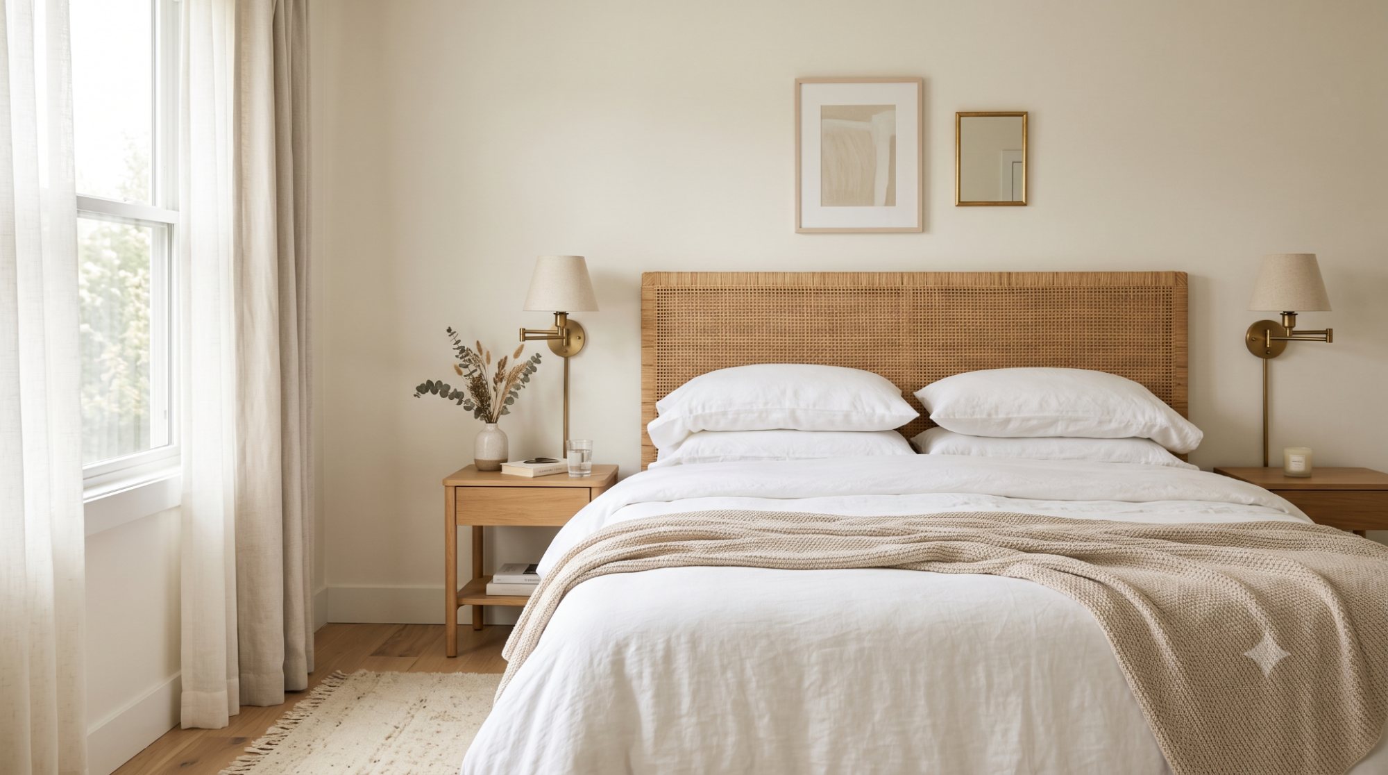
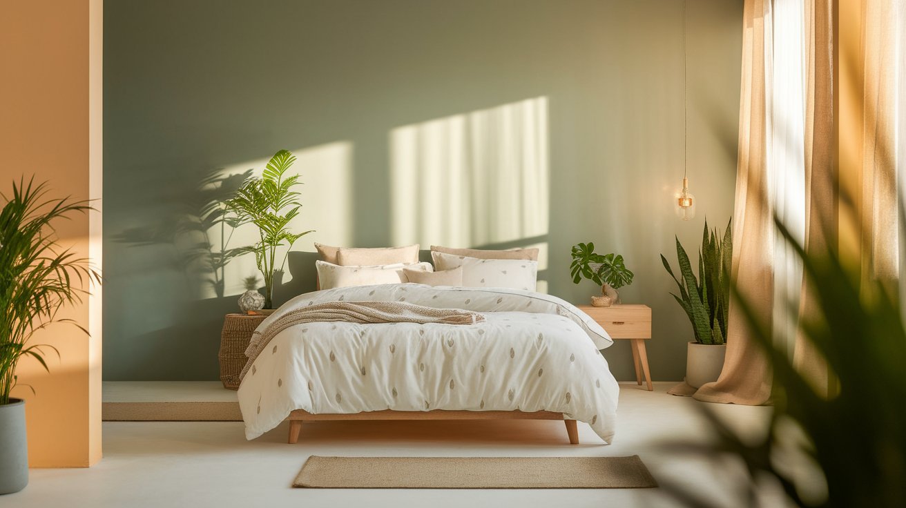
In bedrooms, Swiss Coffee creates a soft, calm, cozy atmosphere that's easy to fall asleep in. Picture a primary bedroom with white bedding, a woven headboard, and brass reading lamps — Swiss Coffee walls tie that warm, textural look together without overpowering it.
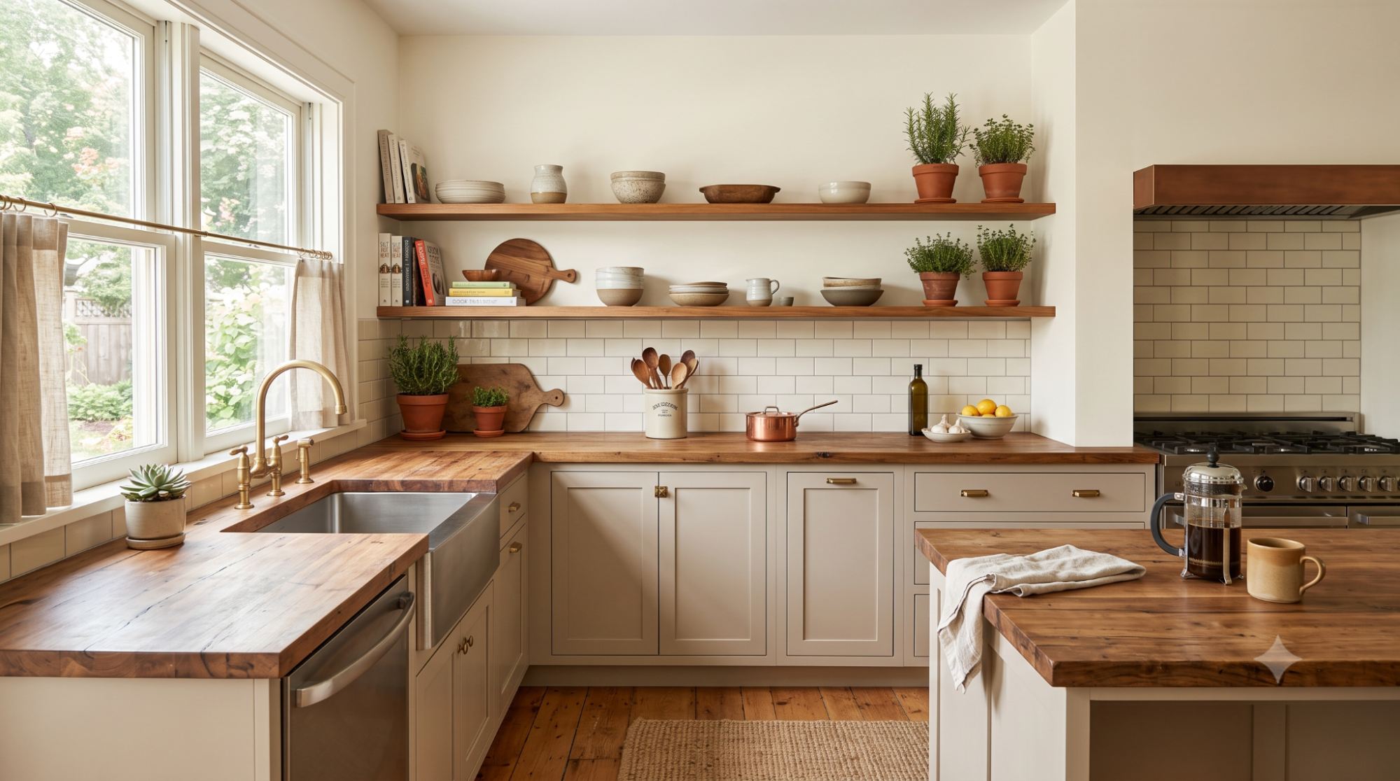
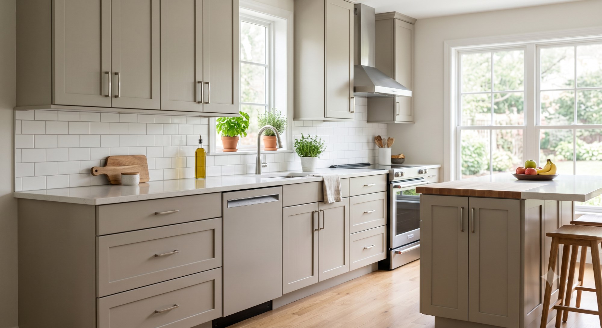
Swiss Coffee works well on kitchen walls, especially when your cabinets, countertops, and backsplash lean warm or neutral. A kitchen with butcher block counters, warm wood open shelving, and a cream subway tile backsplash is a great candidate for Swiss Coffee walls. If your kitchen already has cool marble or icy white finishes, you'll want to test carefully first.
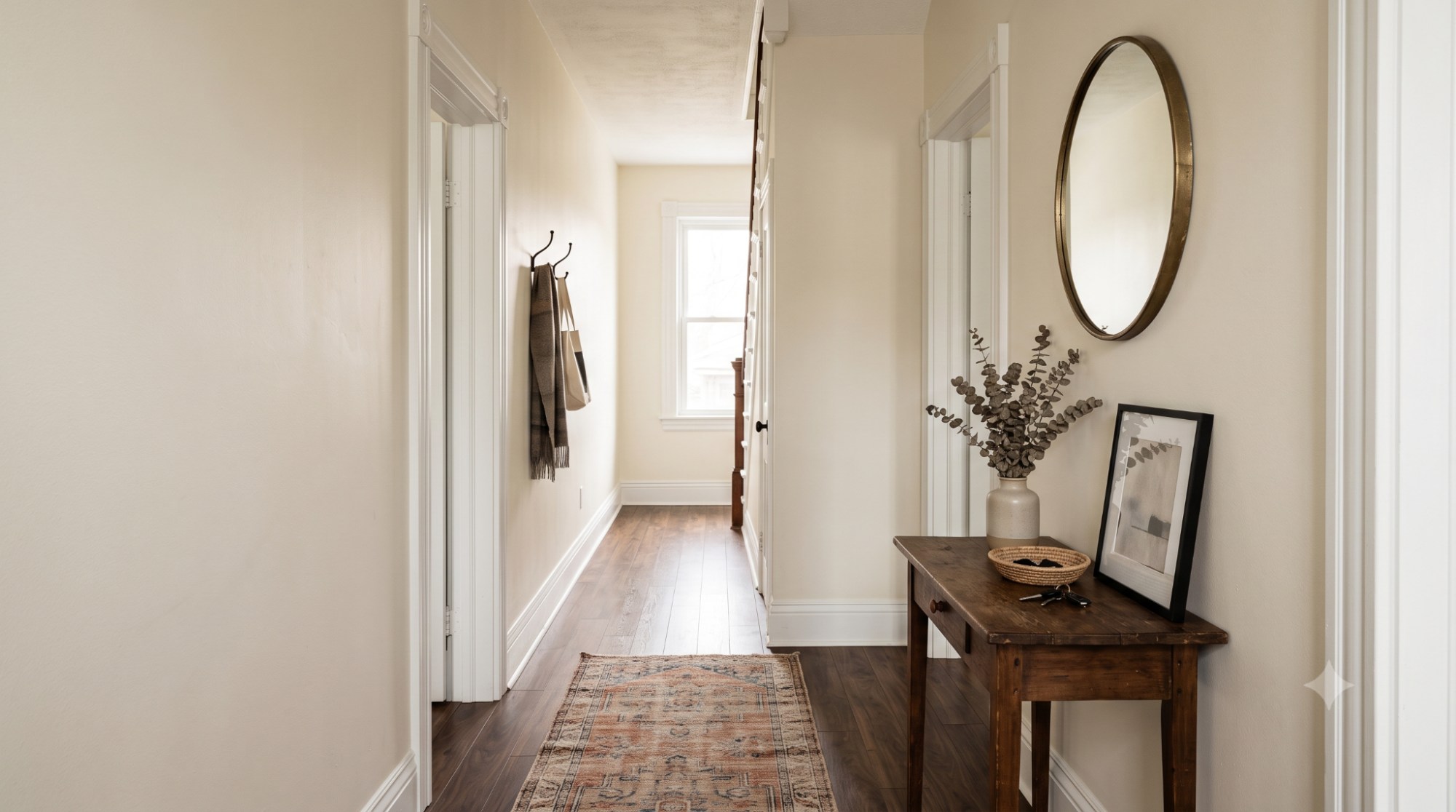
Hallways and entryways, especially darker ones with little natural light, can feel softened rather than cold when painted Swiss Coffee. A narrow entryway with dark wood flooring and a vintage runner rug is a good example of a space where this color helps warm things up.
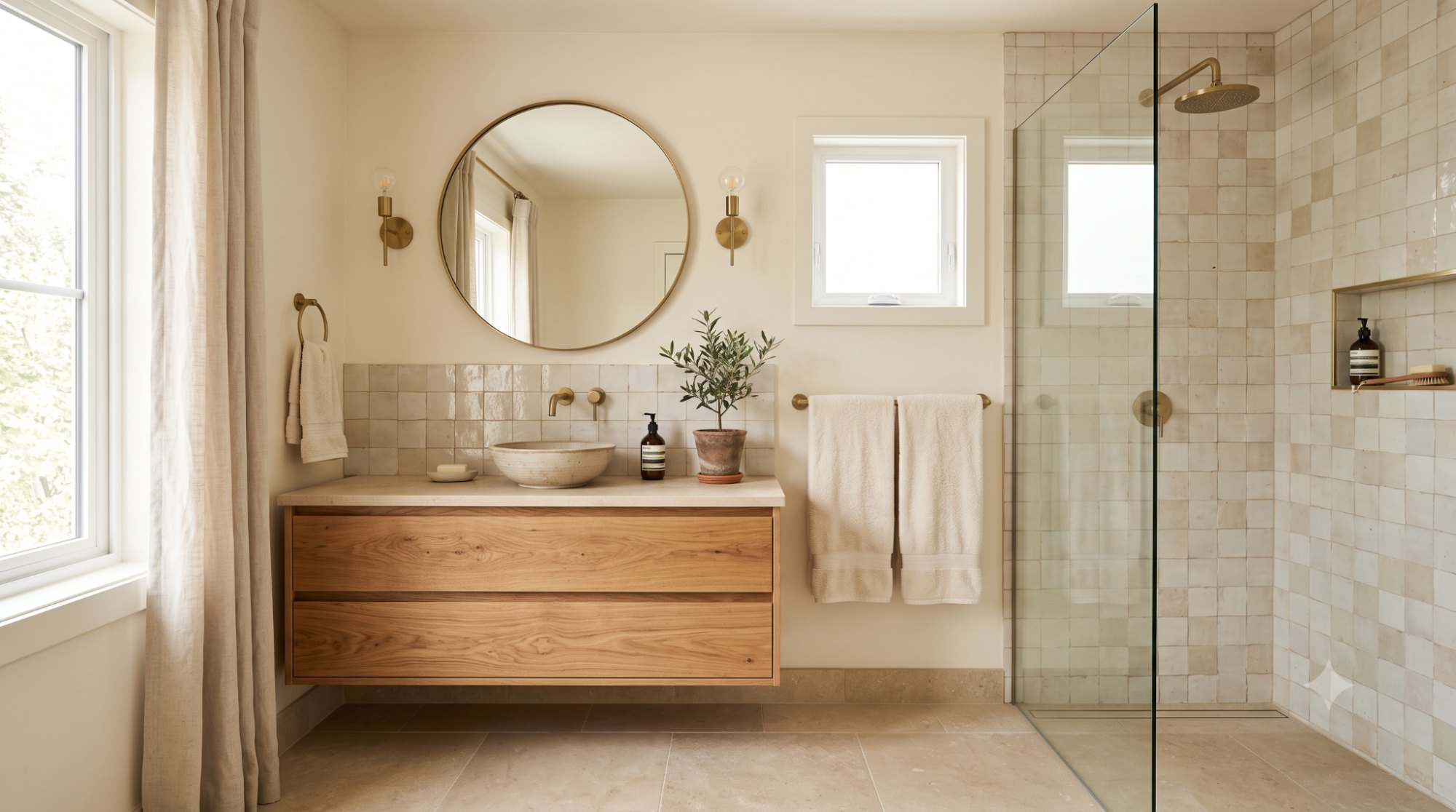
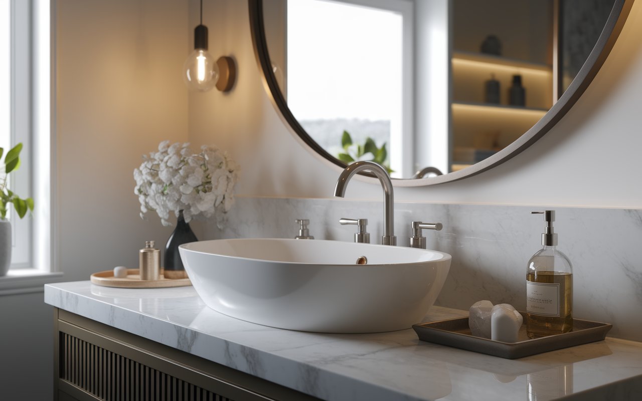
Swiss Coffee can work in bathrooms too, but proceed with a little more caution here. It tends to look best in bathrooms with warm wood vanities, brass fixtures, and beige or cream tile. Cool marble, blue-gray tile, or very bright white fixtures can clash with its warm undertone, so test a sample before committing.
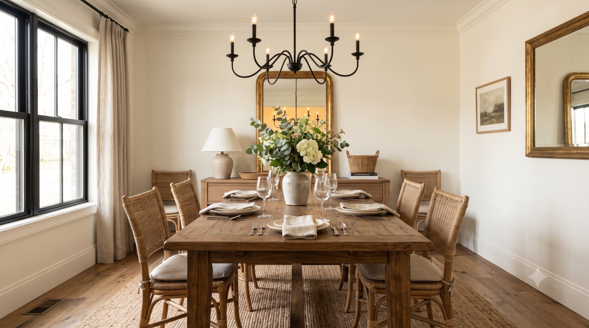
Dining rooms with wood tables, warm lighting, traditional decor, or dark accent colors tend to look wonderful with Swiss Coffee walls. Think of a dining room with a farmhouse table, wicker chairs, and a black iron chandelier — Swiss Coffee walls give that mix a soft, cohesive backdrop.
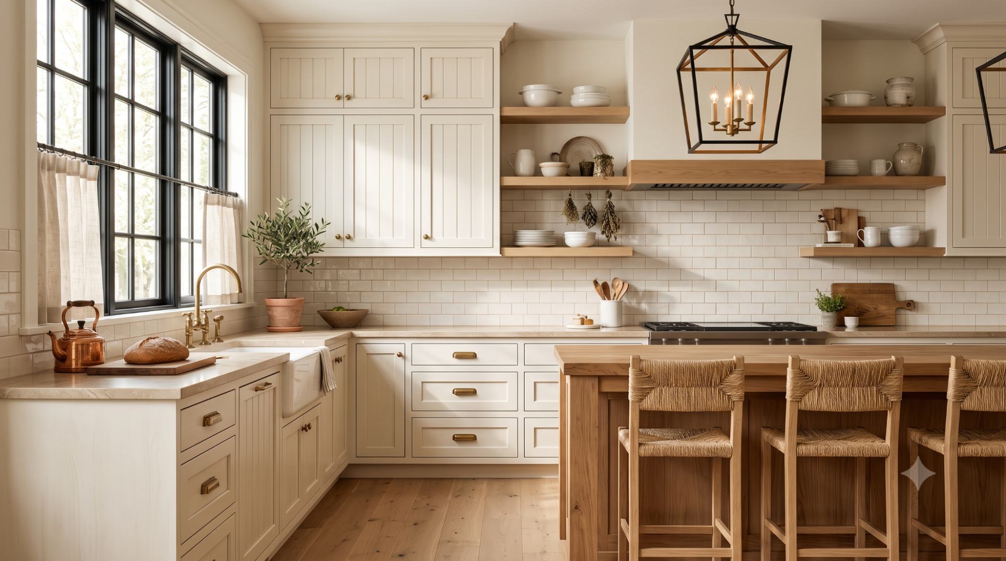
Swiss Coffee cabinets have become a favorite alternative to stark white cabinets, and for good reason. They bring a warm, classic look that feels softer and more livable than a bright white kitchen.
This color works especially well in traditional, cottage, farmhouse, and transitional kitchens. It pairs naturally with warm-toned hardware and warmer countertop and backsplash choices. For example, a farmhouse kitchen with Swiss Coffee shaker-style cabinets, a butcher block island, and antique brass cup pulls creates a warm, cohesive look. A cottage-style kitchen with Swiss Coffee beadboard cabinets, a beige quartz counter, and a woven pendant light is another strong pairing.
Be cautious pairing Swiss Coffee cabinets with cool marble, icy gray counters, or blue-white backsplash tile. These cooler finishes tend to bring out the yellow undertone in a way that can look mismatched rather than intentional.
Trim is one of the trickiest parts of decorating with Swiss Coffee, mainly because of how it interacts with other whites. You have two main paths to choose from.
Painting your walls and trim the same color creates a soft, seamless, monochromatic look. To keep some visual interest, vary the sheen instead of the color.
A simple sheen plan looks like this:
For example, a living room with Swiss Coffee walls in eggshell and Swiss Coffee baseboards in satin will look cohesive and softly layered, since the sheen change alone adds enough definition to see where the wall ends and the trim begins.
If you'd rather add contrast with a separate trim color, a few options tend to work well:
Not every white trim color works here, though. Very cool, icy blue-white trims can clash with Swiss Coffee and make the wall color look more yellow than intended. Always test the pairing before painting the whole room. As an example, a bedroom with Swiss Coffee walls and White Dove trim tends to look soft and cohesive, while the same room with a cool blue-white trim can make the walls suddenly look noticeably yellow by comparison.
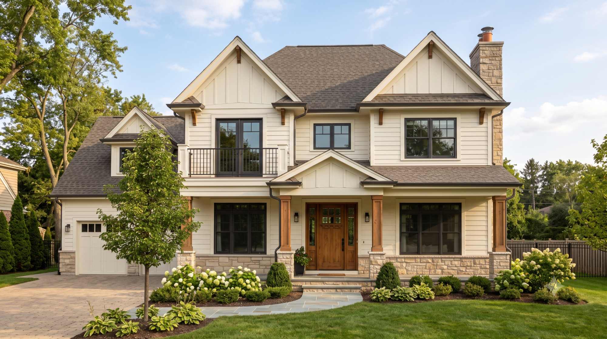
Swiss Coffee can absolutely work as an exterior paint color, but it depends heavily on your home's other finishes and how much sunlight the exterior gets.
It tends to work best on homes with warm stone, brick, wood accents, bronze windows, or earthy-toned roofing. Because natural sunlight intensifies paint color, Swiss Coffee often looks brighter outdoors than it does inside your home. Depending on your home's sun exposure, that can mean it looks either beautifully soft or a bit too bright and creamy.
For example, a craftsman-style home with Swiss Coffee siding, a stained wood front door, and black window frames tends to look warm and welcoming. A brick ranch home with red brick accents, Swiss Coffee trim, and a charcoal roof is another combination that lets the warmth of Swiss Coffee complement the brick rather than compete with it.
The safest approach is always to test large exterior samples in different areas of your home and check them at multiple times of day before committing to a full paint job.
Once you've settled on Swiss Coffee for your main color, you'll likely need accent colors for trim, furniture, or an accent wall. Here are some solid options organized by category.
Here's a quick reference table to keep things organized:
| Color Type | Best Pairings |
| Warm neutrals | Beige, greige, taupe-beige |
| Dark accents | Navy, charcoal, warm black |
| Natural tones | Wood, rattan, leather, linen |
| Greens | Sage, olive, deep green |
| Avoid | Icy white, cool gray, blue-white |
If you're choosing between a few warm whites, here's how Swiss Coffee stacks up against the most common alternatives.
White Dove tends to feel a bit softer and more balanced, while Swiss Coffee leans slightly creamier and warmer. If you want more warmth in the room, Swiss Coffee is the stronger choice. White Dove may be better if you want a warm white that still feels a little cleaner and more neutral.
Both are warm whites, but Alabaster from Sherwin-Williams can look more creamy or yellow in certain homes than Swiss Coffee does. If you are also considering this color, you can read my full Sherwin-Williams Alabaster paint color review for a closer look at its undertones, lighting, and best uses.
Greek Villa is another popular warm white, usually reading a touch cleaner than Swiss Coffee while still keeping a soft, warm quality. If Greek Villa is on your shortlist, you can also check my full Sherwin-Williams Greek Villa paint color review before choosing your final paint sample.
Simply White is brighter and cleaner overall. Swiss Coffee is the softer, creamier option if you want less brightness in the room. Simply White works better when you want a fresher white, while Swiss Coffee feels calmer and more relaxed.
Despite sharing the same name, these are not the same paint color. Benjamin Moore's version tends to be more muted, while Behr's Swiss Coffee carries a stronger, more noticeably buttery yellow undertone.
| Comparison | Choose Swiss Coffee If… | Choose the Other Color If… |
| Swiss Coffee vs White Dove | You want more warmth and creaminess | You want a softer, more balanced white |
| Swiss Coffee vs Alabaster | You want a Benjamin Moore warm white | You prefer Sherwin-Williams and a creamier feel |
| Swiss Coffee vs Greek Villa | You want a slightly more muted off-white | You want a cleaner warm white |
| Swiss Coffee vs Simply White | You want less brightness | You want a brighter white |
| BM Swiss Coffee vs Behr Swiss Coffee | You want softer muted warmth | You want a stronger creamy/yellow look |
Swiss Coffee isn't the right fit for every home, and it helps to know that upfront rather than finding out after the paint has dried.
Consider avoiding it, or at least testing it very carefully, if:
These conditions can push Swiss Coffee's natural warmth into an unflattering yellow or make the whole space feel mismatched rather than cohesive.
Paint color can look completely different in person than it does online or on a small chip, so testing properly matters more than most people expect.
Here's a simple checklist to follow:
| Pros | Cons |
| Warm and inviting | Can look creamy/yellow in some lighting |
| Softer than bright white | Not ideal with cool marble |
| Works with wood tones | May clash with icy white trim |
| Good for cabinets | Not the crispest white |
| Timeless and versatile | Needs careful sampling |
Swiss Coffee paint color is well worth considering if you're after a soft, warm, creamy off-white that feels livable rather than sterile. It performs best in homes with warm finishes, wood tones, brass hardware, beige accents, and natural textures, and it fits comfortably into cozy, traditional, farmhouse, and transitional design styles.
It's not the best pick if your home leans cool, icy, or ultra-modern, since the warmth that makes this color so likable elsewhere can feel out of place in those settings. As with any paint color, the smartest move is always to test a large sample in your actual space before painting every wall in the house.
Generally, yes. Warm off-whites like Swiss Coffee tend to feel neutral, clean, and easy to live with, which appeals to a wide range of buyers. It tends to shine brightest in homes with warm finishes already in place, while homes full of cool gray tones may not showcase it as well.
Yes, thanks to its high LRV, Swiss Coffee can help a small room feel open and light. Just keep in mind that rooms with limited natural light may show more of its creamy side, so it's worth testing a sample before painting the whole space.
Camera settings, photo editing, room lighting, flooring, and nearby furniture colors can all change how a paint color appears in pictures. What you see on a screen is rarely an exact match to how the color looks in person.
It usually works better with warm wood, beige tile, natural stone, and warm luxury vinyl. It can look less balanced beside cool gray flooring.
Swiss Coffee fits especially well with traditional, cottage, farmhouse, transitional, organic modern, and warm minimalist interiors. These styles tend to lean into natural textures and warm tones, which complement the color's creamy undertone.
Daniel Hartman is a color specialist with years of experience helping people make confident and thoughtful design decisions. He provides practical and approachable guidance while balancing creativity and functionality in every project. Daniel enjoys visiting art and design exhibits to study how different environments influence aesthetics, mood, and perception, bringing a rich perspective and insight into his work. His approach makes design decisions both simple and enjoyable.


No Comments