

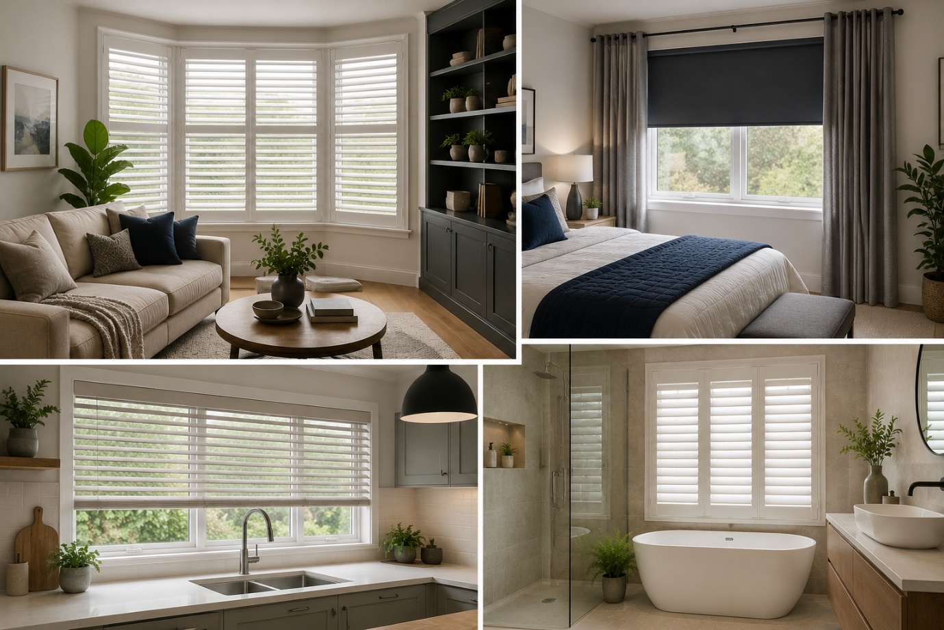
How to Choose the Perfect Window Coverings for Your Home
Window coverings are more than just decorative features. They influence

Are you searching for the perfect neutral paint color that works in nearly any room? Natural Cream Benjamin Moore OC-14 might be exactly what you need. This soft, warm greige has become one of the most popular choices for homeowners, interior designers, and DIY painters who want a versatile color that feels both cozy and fresh.
Natural Cream strikes a beautiful balance—it’s not too beige, not too gray, and definitely not boring. In this complete guide, we’ll explore everything about Natural Cream OC-14, including its undertones, light reflectance value (LRV), the best rooms to use it in, perfect trim pairings, and expert tips to help you decide if this color belongs in your home.
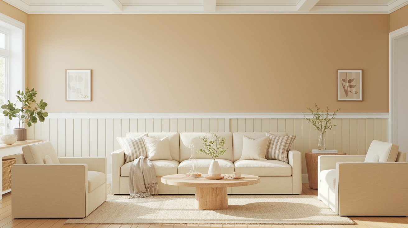
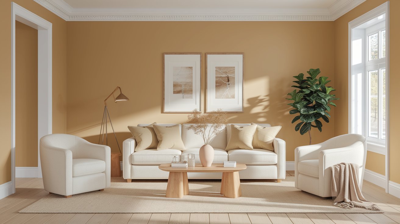
Natural Cream Benjamin Moore OC-14 is a warm greige paint color that beautifully blends soft beige with gentle gray tones. Think of it as the perfect middle ground between cream and gray—not too yellow, not too cold. This color gives walls a soft, creamy appearance that feels soothing and welcoming without overwhelming a space. Natural Cream belongs to the greige family, which combines the warmth of beige with the modern sophistication of gray.
Why is Natural Cream trending? In recent years, homeowners have moved away from stark whites and heavy beiges toward more balanced neutrals. Natural Cream delivers that “just right” feeling—warm enough to feel inviting but neutral enough to work with almost any décor style.
The Light Reflectance Value (LRV) of Natural Cream is 64.78. But what does that number actually mean for your walls?
LRV measures how much light a paint color reflects, on a scale from 0 (pure black) to 100 (pure white). With an LRV of 64.78, Natural Cream sits comfortably in the medium-light range. This means it reflects a good amount of light, making rooms feel bright and airy without being blindingly white.
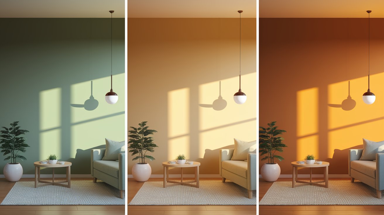
Understanding undertones is key to choosing the right paint color. Natural Cream has soft beige undertones with muted gray and very subtle green-gray hints. These undertones work together to create a color that shifts gently throughout the day.
North-facing light: In rooms that face north, Natural Cream appears cooler and more gray. The green undertones might become slightly more visible in this lighting, giving the color a soft, muted quality.
South-facing light: This is where Natural Cream truly shines. The abundant warm light brings out the creamy beige tones, making the color feel cozy and inviting. The gray takes a backseat, and the overall effect is warmer.
Evening and artificial light: Under warm LED or incandescent bulbs, Natural Cream leans warmer and creamier. It maintains its gentle nature without turning yellow or dingy.
Many people worry that Natural Cream will turn yellow over time or look too beige. The truth is, Natural Cream is carefully balanced to avoid that dated, yellow-beige look. The gray undertones keep it modern and fresh. Another misconception is that it’s too plain—but Natural Cream actually has beautiful depth that becomes more apparent when you live with it.
Let’s answer this question directly: Natural Cream is a warm neutral, but not overly warm. It sits beautifully in the middle of the temperature scale.
Compared to classic cream colors (which lean yellow and very warm), Natural Cream is more subdued and sophisticated. Compared to classic greige colors (which can sometimes feel cold), Natural Cream tips slightly warmer. This makes it incredibly versatile—it can work with both warm and cool accent colors, wood tones, and metal finishes.
If you’re looking for a neutral that won’t clash with your existing furniture or future décor changes, Natural Cream’s balanced warmth makes it an excellent choice.
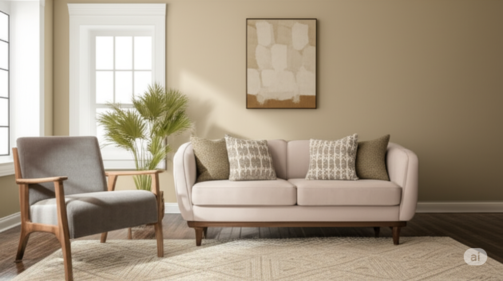
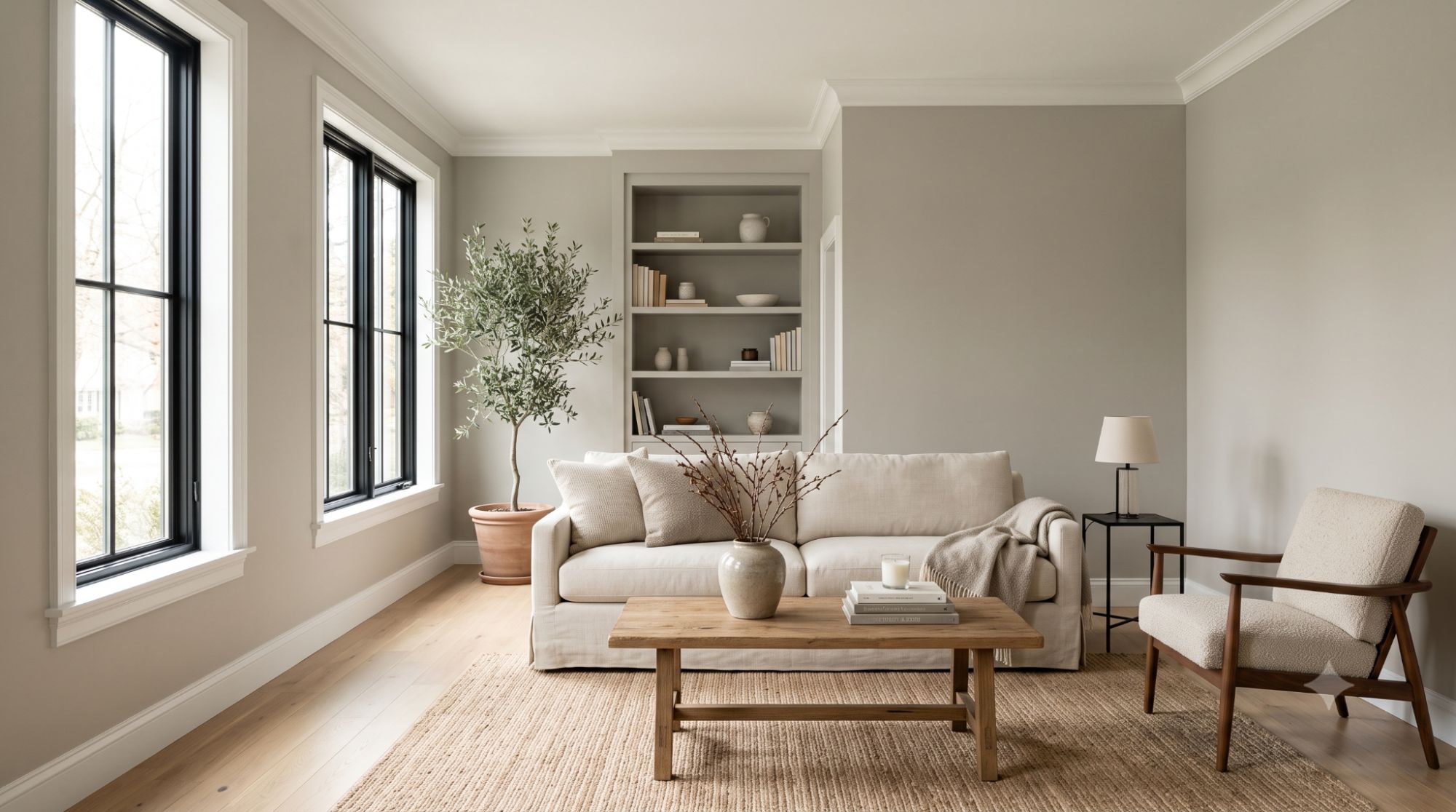
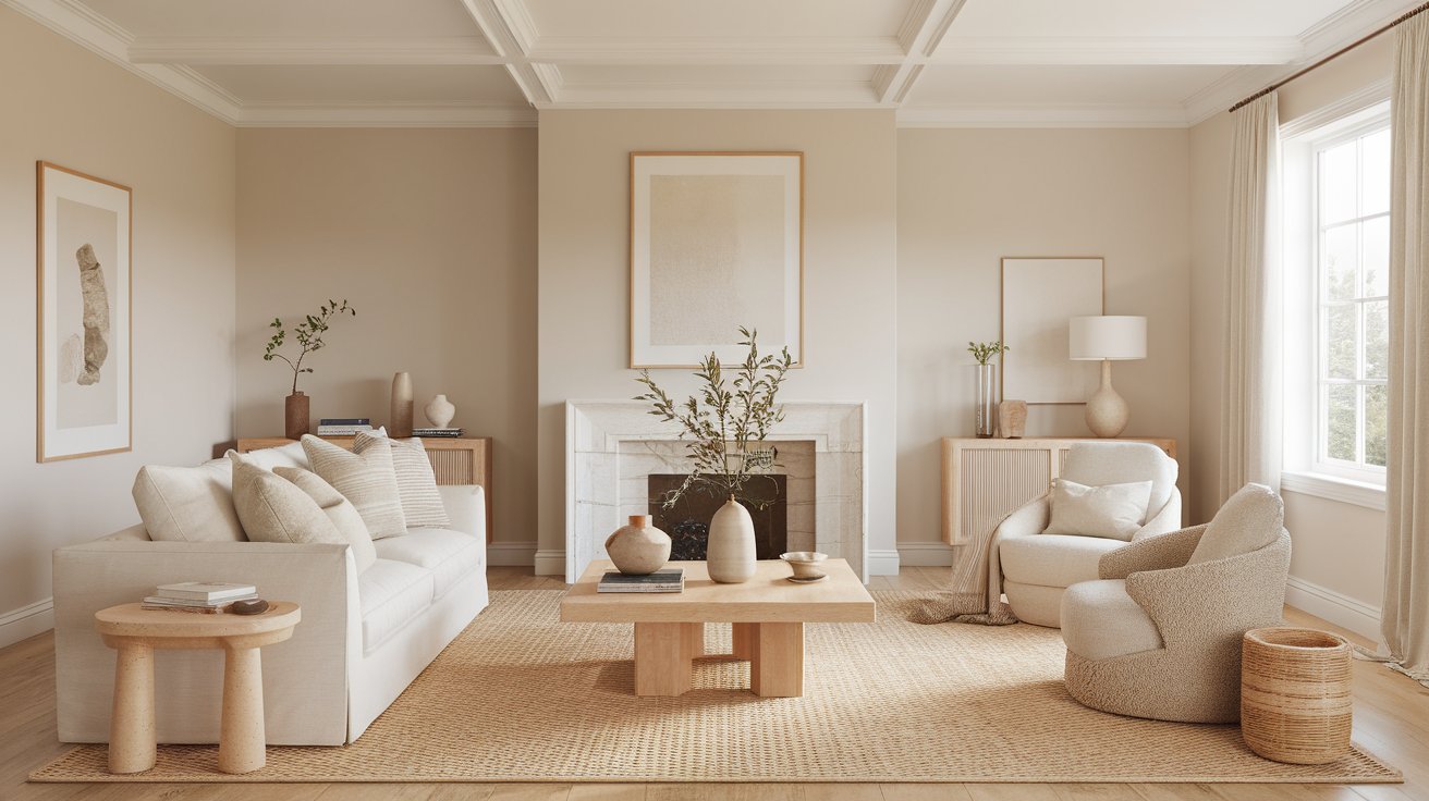
Natural Cream is incredibly versatile, but certain rooms really showcase its best qualities. Let’s explore where this beautiful neutral shines.
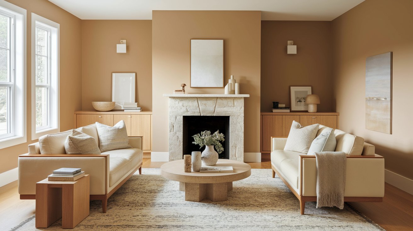
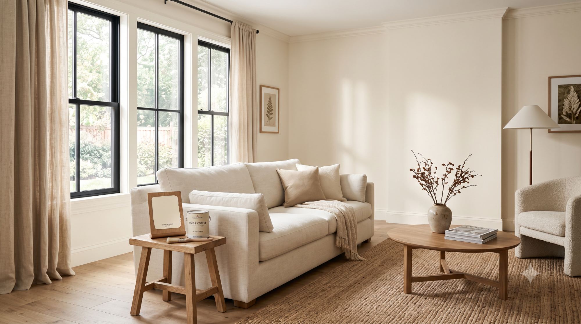
Natural Cream creates the perfect backdrop for living spaces where you want to relax and entertain. The color pairs beautifully with natural wood furniture, leather sofas, and stone fireplace surrounds. It works especially well in living rooms because it’s neutral enough to let your artwork, rugs, and throw pillows take center stage.
The warm undertones make the space feel cozy without being heavy. If your living room has large windows and good natural light, Natural Cream will look soft and creamy throughout the day. For living rooms with less light, consider adding warm-toned lamps to bring out the best in this color.
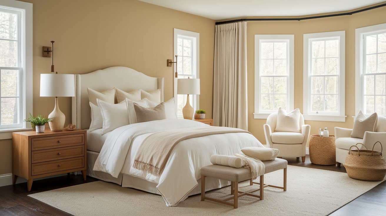
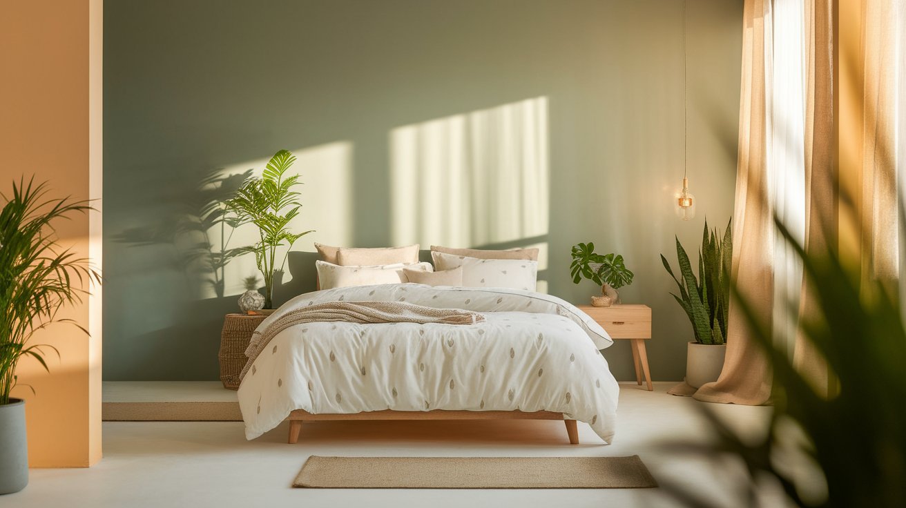
Bedrooms painted in Natural Cream feel calm, clean, and incredibly peaceful. This is the kind of color that helps you unwind at the end of a long day. The soft, neutral tone works beautifully with white or cream bedding, creating a hotel-like atmosphere in your own home.
Natural Cream is gentle enough for bedrooms because it doesn’t have jarring undertones that might bother you when you’re trying to relax. Pair it with soft textures like linen curtains, woven baskets, and wood nightstands for a serene retreat.
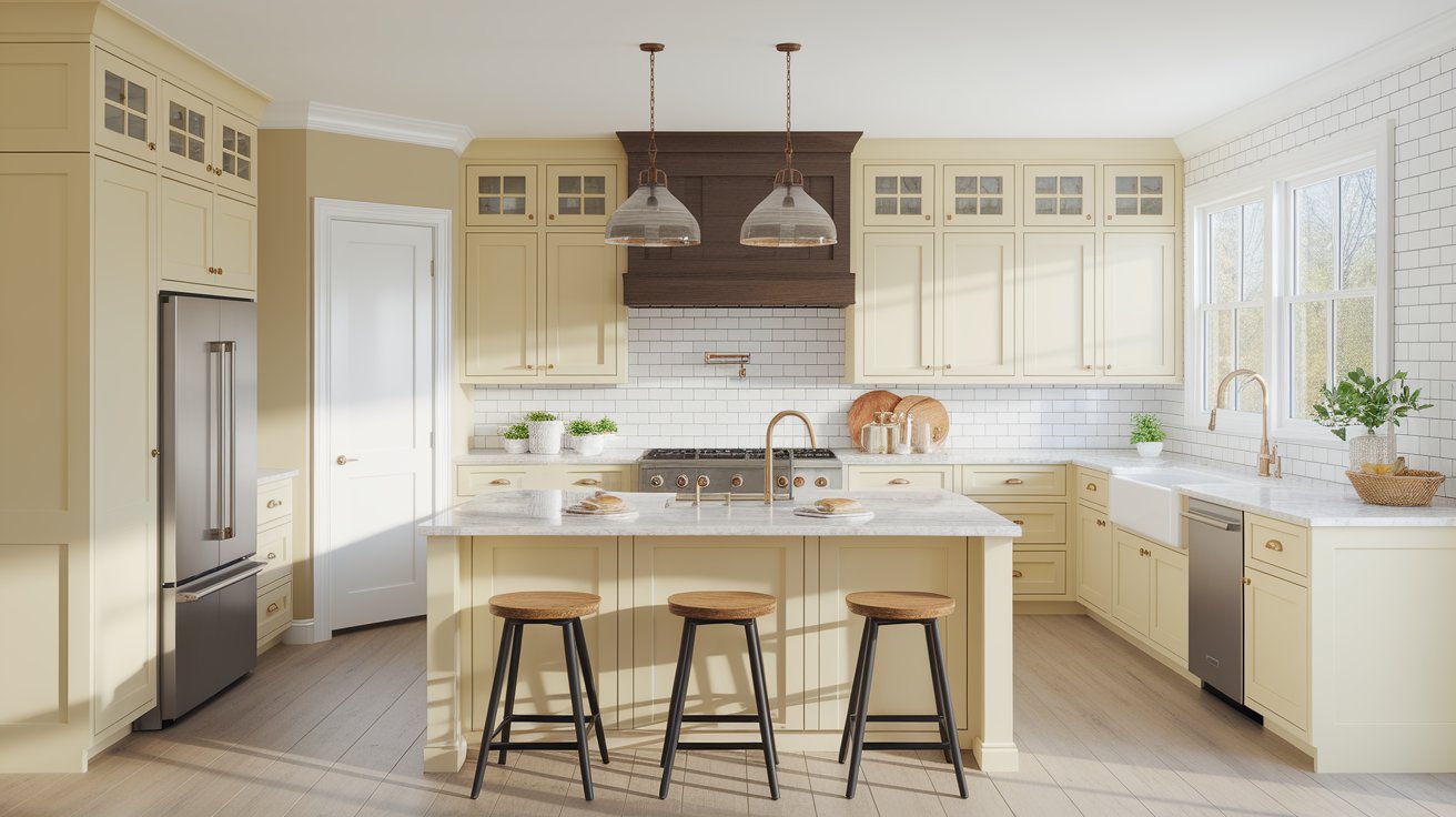
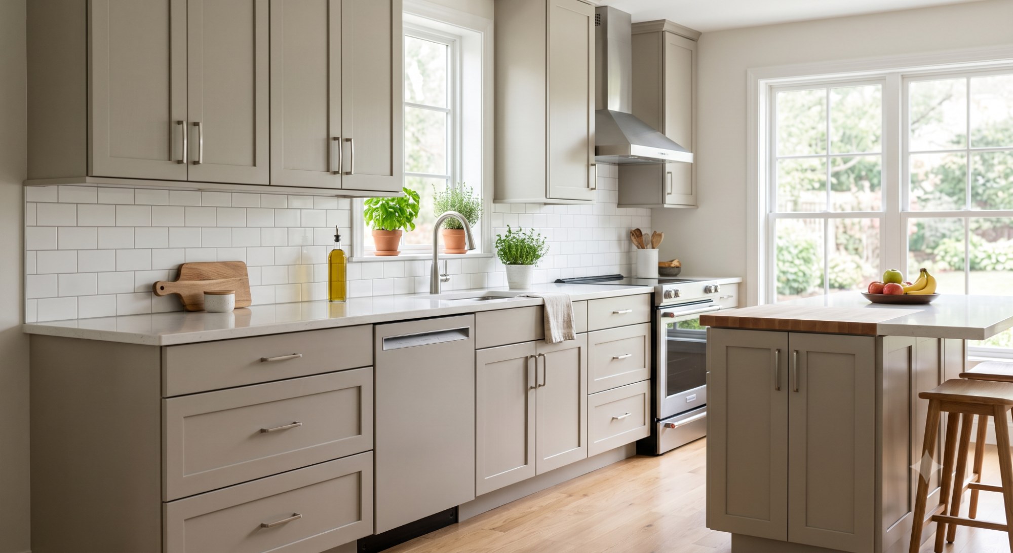
Natural Cream works wonderfully in kitchens, both on walls and cabinets. When used on kitchen cabinets, it creates a warm, inviting look that’s much more interesting than plain white but still feels clean and fresh.
This color pairs beautifully with:
The mid-range LRV means Natural Cream cabinets won’t show dirt as easily as bright white but still keep the kitchen feeling light and open.
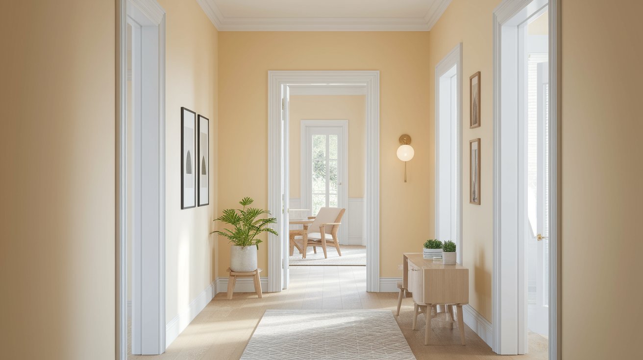
One of Natural Cream’s biggest advantages is how well it flows from room to room. Many homeowners choose it as their whole-home color because it provides continuity without feeling boring or monotonous.
In hallways, Natural Cream is particularly effective because:
Using Natural Cream throughout your home creates a cohesive look that makes your space feel larger and more intentional.
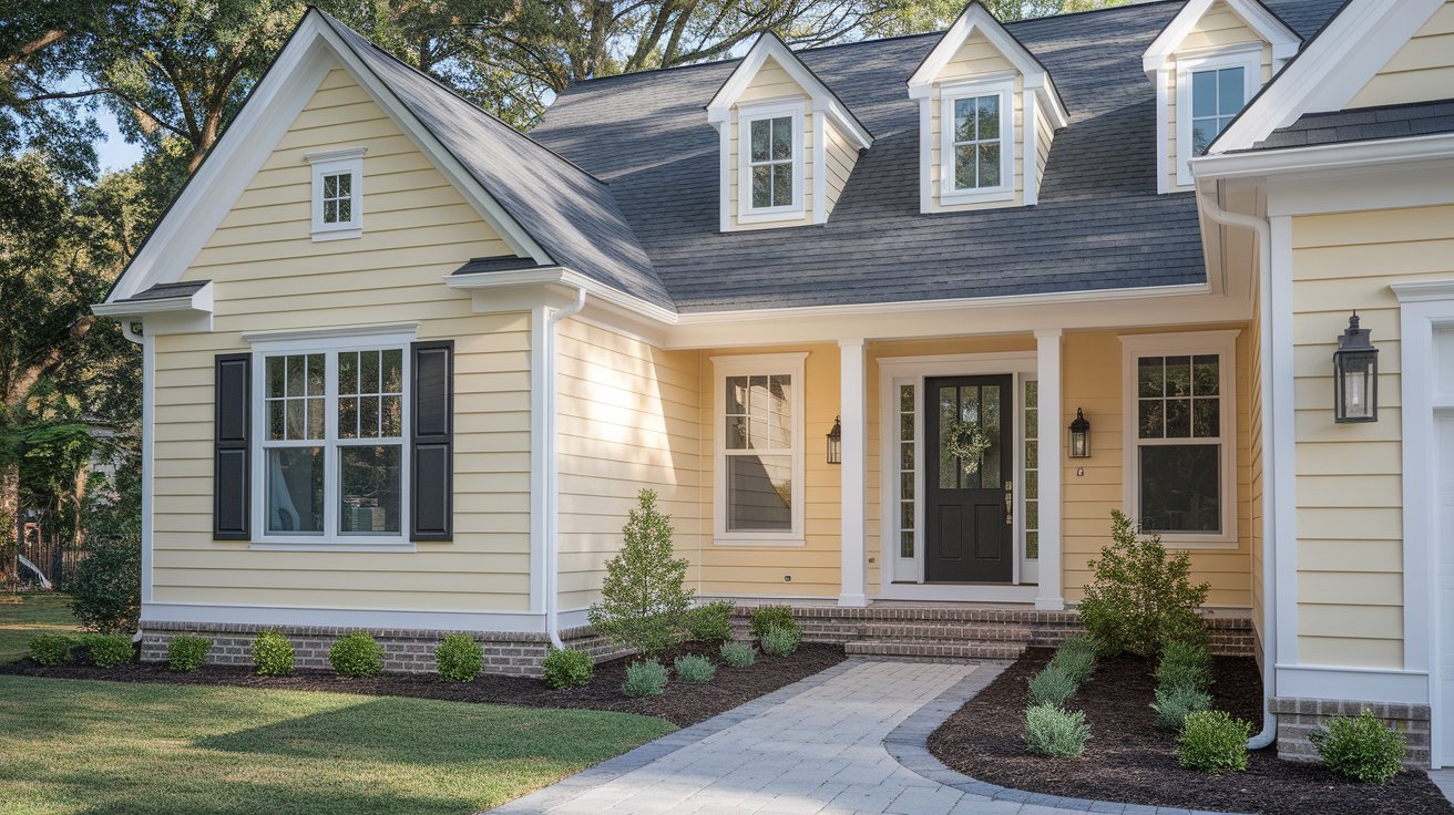
While Natural Cream is primarily used indoors, some homeowners choose it for exterior siding or trim. On exteriors, be aware that the subtle green undertones can become more apparent in natural outdoor light. This isn’t necessarily a problem—it can look quite beautiful—but it’s worth testing first.
Natural Cream works well on exteriors when paired with crisp white trim and dark accents like black shutters or a deep charcoal front door.
Choosing the right trim color is just as important as choosing your wall color. Natural Cream works best with certain whites and neutrals.
Stay away from whites with blue or cool gray undertones (like Benjamin Moore Paper White or Super White). These will clash with Natural Cream’s warm base and create an awkward, disjointed look.
Natural Cream is the perfect foundation for building beautiful color palettes. Here are several approaches depending on your style.
Create a serene, sophisticated space by layering Natural Cream with other neutrals:
This palette works beautifully in traditional, transitional, and Scandinavian-style homes.
Make Natural Cream walls pop by adding dramatic dark colors:
Add subtle color while keeping the overall feel calm:
These gentle colors complement Natural Cream’s warm undertones without overwhelming the space.
Wondering how Natural Cream compares to other popular neutrals? Here’s a helpful breakdown.
Similarities: Both are warm greiges with balanced undertones
Differences: Pale Oak is slightly lighter (LRV 69.82) and leans more gray
Best for: Pale Oak works better in very bright rooms where you want more gray; Natural Cream is better for rooms needing warmth
Similarities: Both are greige colors that work as whole-home neutrals
Differences: Balboa Mist is cooler and has stronger gray undertones (LRV 64.54)
Best for: Balboa Mist suits modern, contemporary spaces; Natural Cream fits traditional and transitional better
Similarities: Warm neutrals that avoid looking too beige
Differences: Edgecomb Gray is warmer and beigier (LRV 63.88)
Best for: Edgecomb Gray works in homes with warm wood tones; Natural Cream offers more versatility
Similarities: Both are popular, warm neutrals with gray influences Differences: Accessible Beige is warmer and more definitively beige (LRV 58) Best for: Accessible Beige in traditional, warm-toned homes; Natural Cream in spaces wanting more modern neutrality
Color | LRV | Warmth Level | Best Room Type |
Natural Cream | 64.78 | Medium-Warm | Any room, especially bedrooms and living areas |
Pale Oak | 69.82 | Medium | Bright, well-lit spaces |
Balboa Mist | 64.54 | Cool-Medium | Modern, minimalist rooms |
Edgecomb Gray | 63.88 | Warm | Traditional homes with wood tones |
Accessible Beige | 58 | Very Warm | Cozy, traditional spaces |
Every paint color has strengths and potential drawbacks. Here’s an honest look at Natural Cream.
Versatility: Works in almost any room and with most décor styles Warmth: Creates a cozy feeling without being too yellow or beige Light-Reflecting: The mid-range LRV keeps rooms feeling bright Timeless: Won’t look dated in a few years like trendy colors might Easy to Decorate: Complements both warm and cool accent colors Great Whole-Home Color: Flows beautifully from room to room Hides Imperfections: Better than bright whites at hiding wall flaws
Subtle Green Undertones: In certain lighting (especially north-facing rooms), green-gray tones can appear, which some people don’t prefer Not for Color Lovers: If you want bold, dramatic walls, Natural Cream might feel too safe Can Feel Flat: In rooms with very little natural light and no contrasting elements, it might lack visual interest Not Truly Neutral: While called a neutral, its warm lean means it won’t work with every single color scheme Requires Good Trim Contrast: Works best with bright white trim; similar-toned trim can make it look muddy
Natural Cream is ideal for you if:
Natural Cream might NOT be for you if:
The best candidates for Natural Cream are homeowners who describe their ideal paint color as “a color that never looks too warm or too gray”—that’s exactly what Natural Cream delivers.
Never commit to a paint color without testing it first. Here’s how to sample Natural Cream properly:
Order peel-and-stick samples (like Samplize) or paint at least two large poster boards with Natural Cream. Small paint chips from the store don’t give you enough information.
Paint affects walls differently depending on which direction they face. Test Natural Cream on at least two different walls—ideally one that gets morning light and one that gets afternoon light.
Look at your samples in the morning, midday, and evening. Notice how the color changes. Does it look too gray in the morning? Too warm at sunset? This tells you how you’ll experience the color every day.
Hold your samples next to your existing trim color and flooring. Do they work together? Natural Cream should complement, not clash.
Don’t make a quick decision. Look at the samples for at least three to five days in different weather conditions (sunny, cloudy, rainy). This gives you a true sense of the color’s behavior.
Sample Natural Cream next to 1-2 other colors you’re considering (like Pale Oak or Edgecomb Gray). Comparing them side by side makes the differences much clearer.
Natural Cream Benjamin Moore OC-14 stands out as one of the most versatile and beautiful warm neutral paint colors available today. Its balanced greige tone, mid-range LRV of 64.78, and subtle undertones make it work beautifully in living rooms, bedrooms, kitchens, and even as a whole-home color. While it leans slightly warm, Natural Cream avoids the dated yellow-beige look and instead offers a sophisticated, modern neutral that complements almost any décor style.
Whether you’re renovating your entire home or just refreshing one room, Natural Cream provides the perfect backdrop for your life. It’s warm enough to feel cozy, neutral enough to be versatile, and timeless enough to love for years to come. If you’re searching for that “just right” neutral that works with everything, Natural Cream Benjamin Moore OC-14 deserves serious consideration.
Yes. It pairs softly with light oak, contrasts beautifully with dark woods, harmonizes with gray floors, and works with most tile colors. Very flexible for mixed flooring homes.
Absolutely. Green feels harmonious, blue pops without clashing, and terracotta looks warm and earthy. Natural Cream lets colorful pieces stand out.
Yes—it’s universally appealing, hides small imperfections better than white, needs fewer touch-ups, and works with any tenant’s décor. Ideal for both landlords and renters.
Yes. It’s warm and minimal enough for Scandinavian, perfect for natural textures in organic modern, and aligns beautifully with Japandi’s calm, simple aesthetic.
It adds warmth and depth without feeling heavy. Off-whites can look stark; Natural Cream feels cozier, still bright enough, and more inviting in low-light small rooms.
Daniel Hartman is a color specialist with years of experience helping people make confident and thoughtful design decisions. He provides practical and approachable guidance while balancing creativity and functionality in every project. Daniel enjoys visiting art and design exhibits to study how different environments influence aesthetics, mood, and perception, bringing a rich perspective and insight into his work. His approach makes design decisions both simple and enjoyable.


No Comments