
Sherwin Williams Mindful Gray (SW 7016) has become one of the most loved paint colors for good reason. This warm gray color works well in almost any room and fits many different home styles.
What makes this color so special? Unlike cool grays that can feel cold, Mindful Gray brings warmth to any space. Its greige blend creates a cozy atmosphere while still looking modern.
The color works with both traditional and contemporary furniture styles. Many homeowners choose it because it’s truly versatile and adapts to different lighting conditions.
Mindful Gray has gained popularity on social media and home design shows. But don’t let trends fool you – this balanced neutral has real staying power.
But should you paint your whole house with it? Let’s find out if Mindful Gray is the right color for your home.
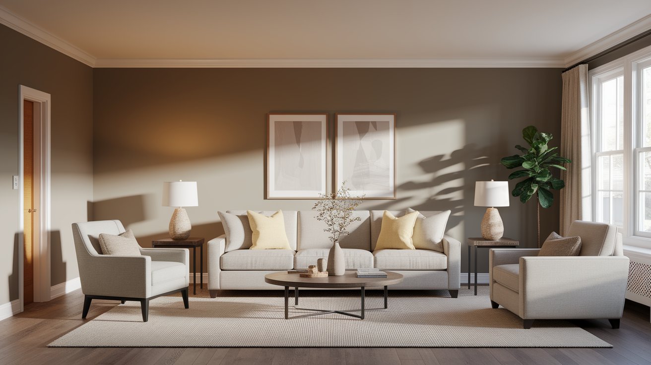
Mindful Gray is what paint experts call a “greige” color. This means it mixes gray and beige together. The result is a warm, friendly gray that doesn’t feel cold or boring.
Mindful Gray has soft taupe undertones that make it feel cozy and welcoming. It appears darker than popular light grays but lighter than deep charcoal colors.Such balance makes it work well in both bright and dim rooms.
People love Mindful Gray because it gives a modern look while still feeling warm and homey.
Every paint color has undertones – these are the hidden colors you see when light hits the paint. Mindful Gray’s main undertones are beige and taupe, but you might also notice a tiny bit of green in certain lights.
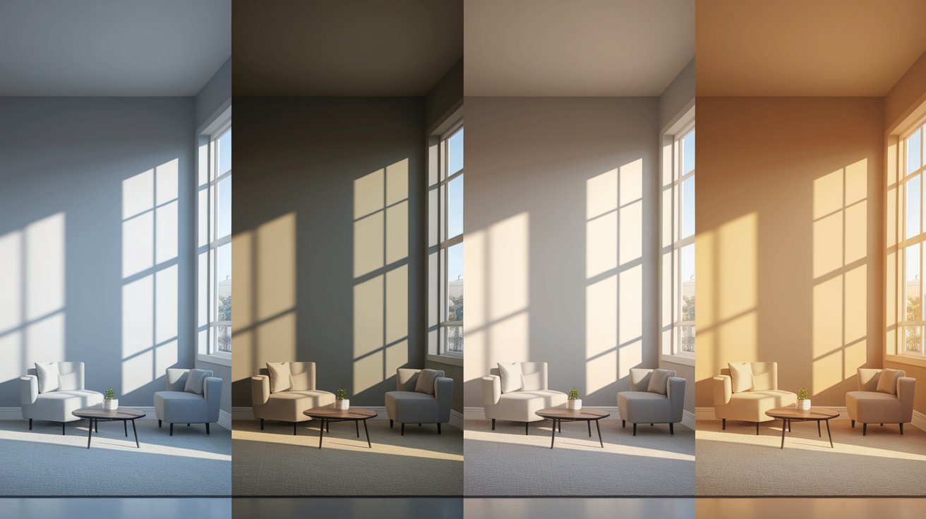
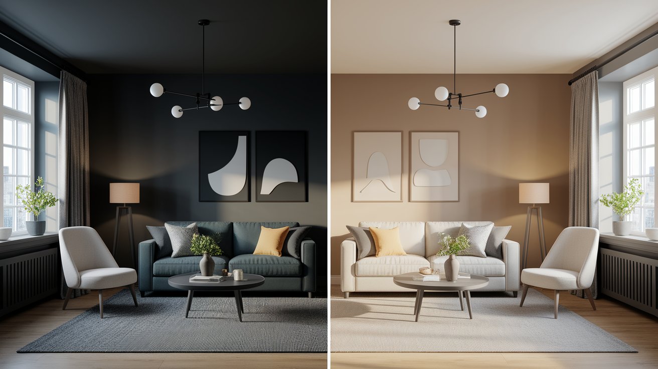
North-facing rooms: The color looks more gray and cool. Natural light from the north is cooler, so the gray parts of the color show up more.
South-facing rooms: The color looks warmer and more beige. Southern light is warm and brings out the cozy beige undertones.
East and west-facing rooms: The color changes throughout the day as the light shifts from cool morning light to warm afternoon sun.
Always test paint colors in your own space before buying gallons. Paint a large sample on different walls and watch how it looks at different times of day.
Mindful Gray has an LRV of 48. LRV stands for Light Reflectance Value, which tells you how much light a color reflects back.
Here’s what you need to know about LRV 48:
This middle-ground LRV makes Mindful Gray flexible. It won’t make bright rooms feel too dark, and it won’t get washed out in dimmer spaces.
Color Name | SW Code | LRV | Light/Dark Level | Notes / Comparison to Mindful Gray |
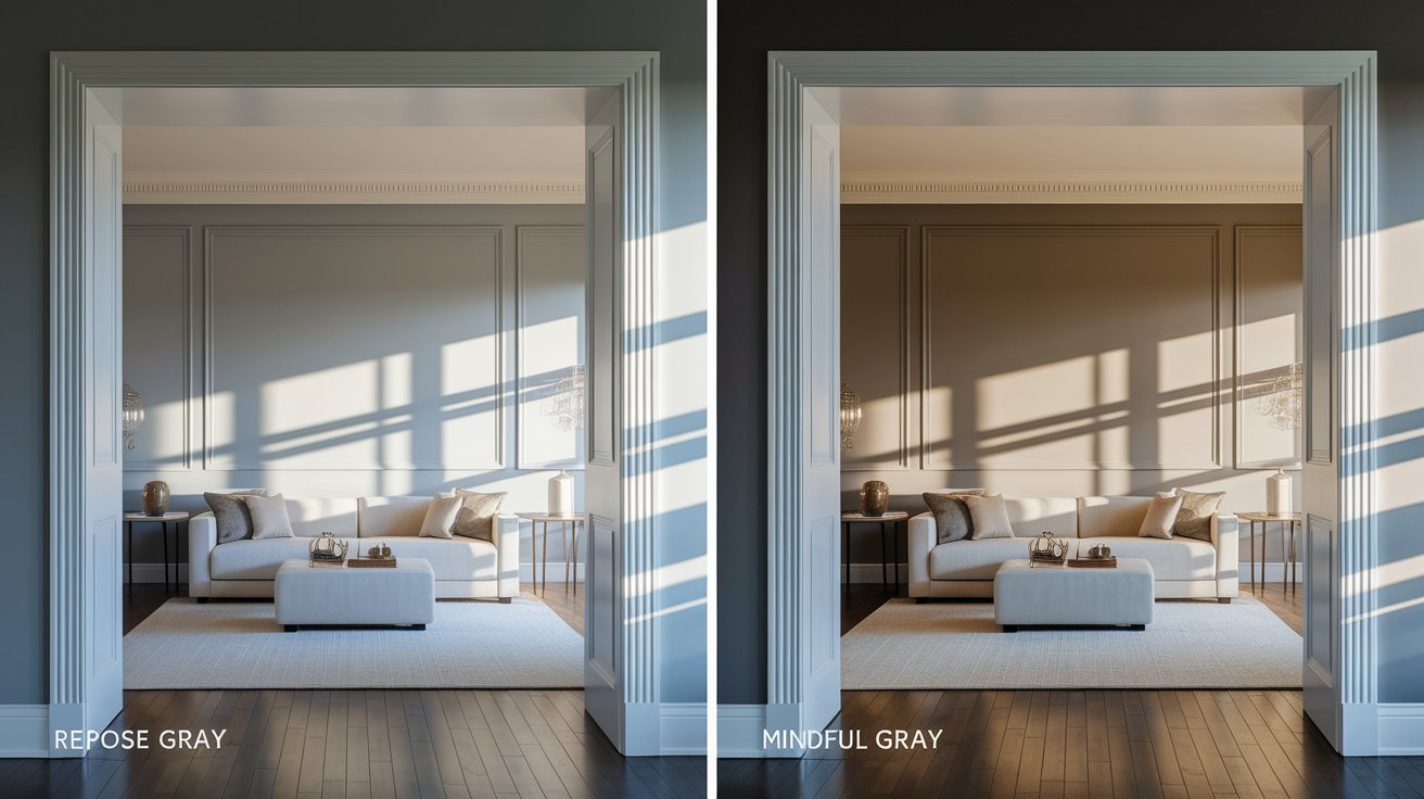
Repose Gray | SW 7015 | 58 | Lighter | Cooler, brighter, more modern; choose if you want brighter rooms |
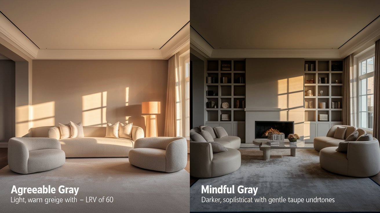
Agreeable Gray | SW 7029 | 60 | Lighter | Warmer, more beige; works well in darker rooms |
Mindful Gray | SW 7016 | 48 | Mid | Warm greige, balanced; versatile for most rooms |
Dorian Gray | SW 7017 | 39 | Dark | Much darker, moody; better for accent walls |
Let’s see how Mindful Gray compares to other favorite Sherwin Williams colors:
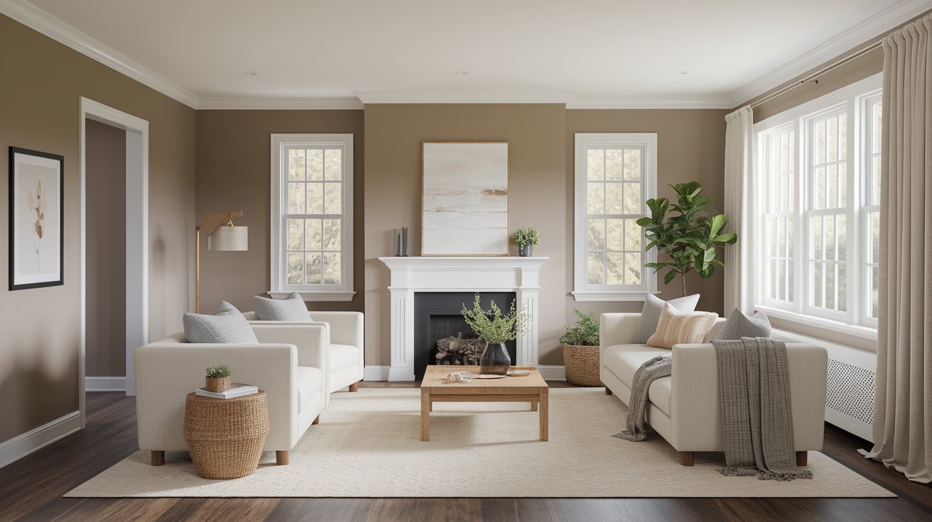
Mindful Gray creates a perfect backdrop for family time. It’s neutral enough to work with any furniture colors but warm enough to feel inviting. The color works especially well with white trim and wood furniture.
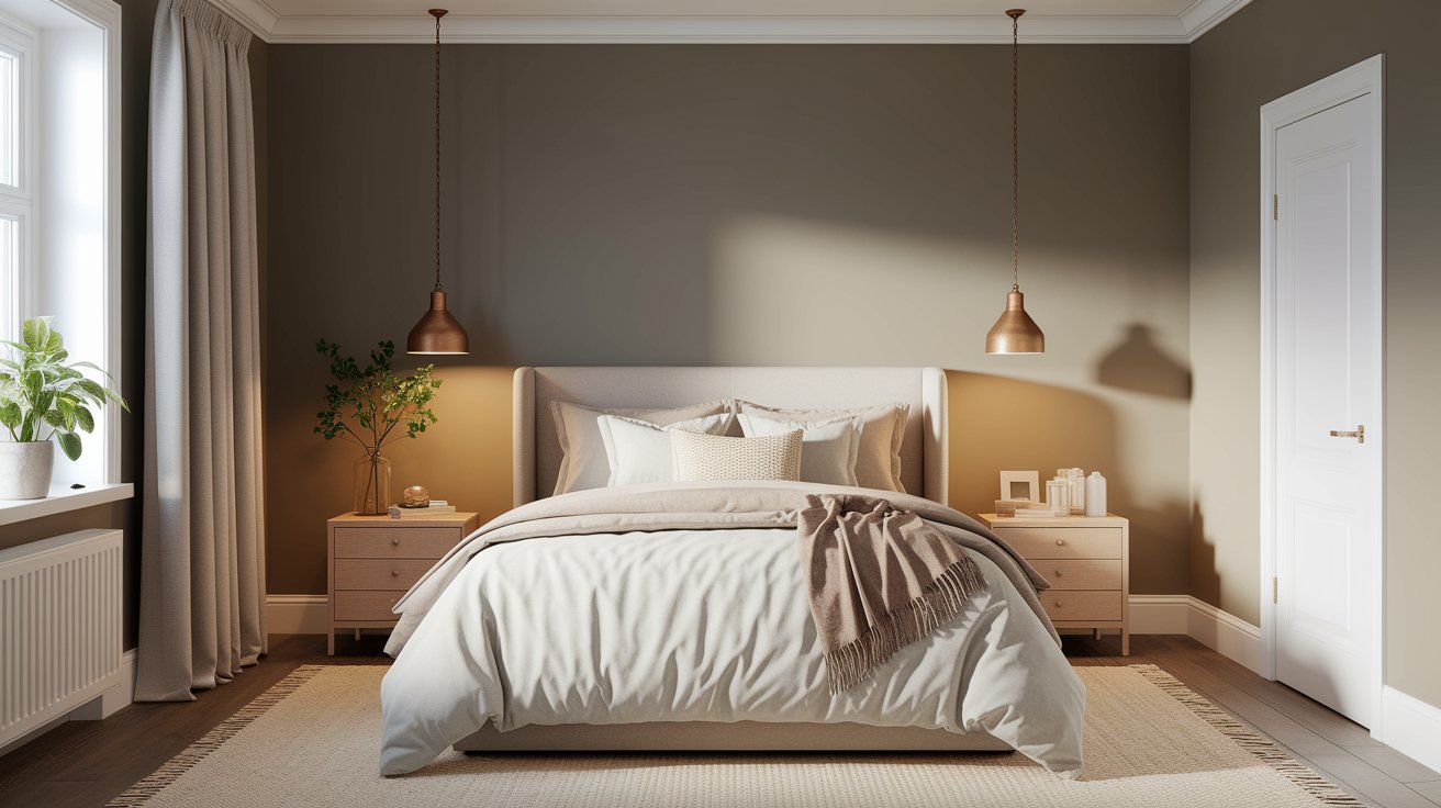
This calming gray helps create a peaceful sleeping space. It’s not too dark to feel heavy, but not so light that it feels cold at night.
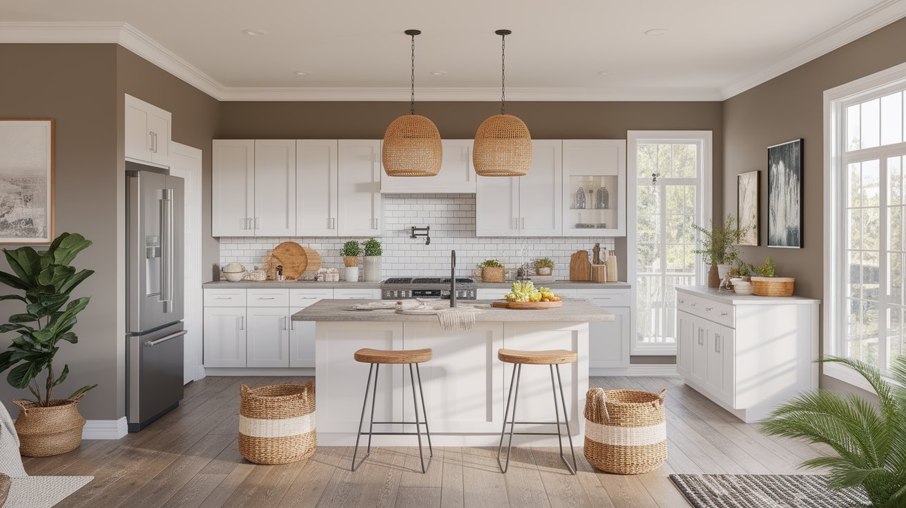
Mindful Gray pairs beautifully with white cabinets and stainless steel appliances. It also looks great with wood cutting boards and natural textures.
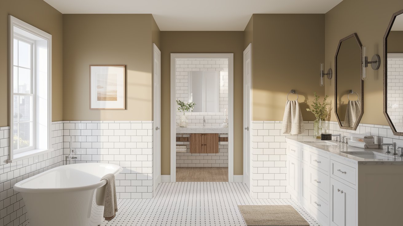
The color works well with white tiles, marble counters, and chrome fixtures. It feels spa-like and clean without being stark.
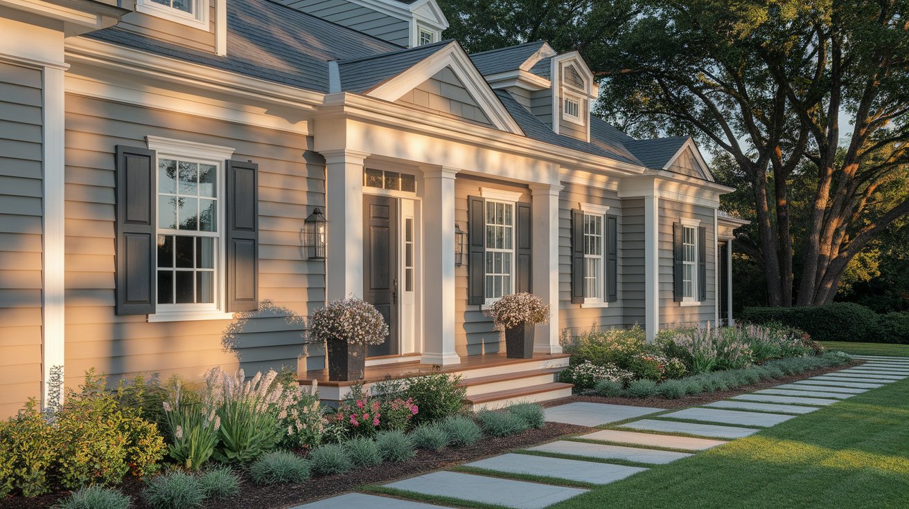
Many homeowners use Mindful Gray on their home’s siding with white trim. It creates a classic, timeless look that works with both traditional and modern home styles.
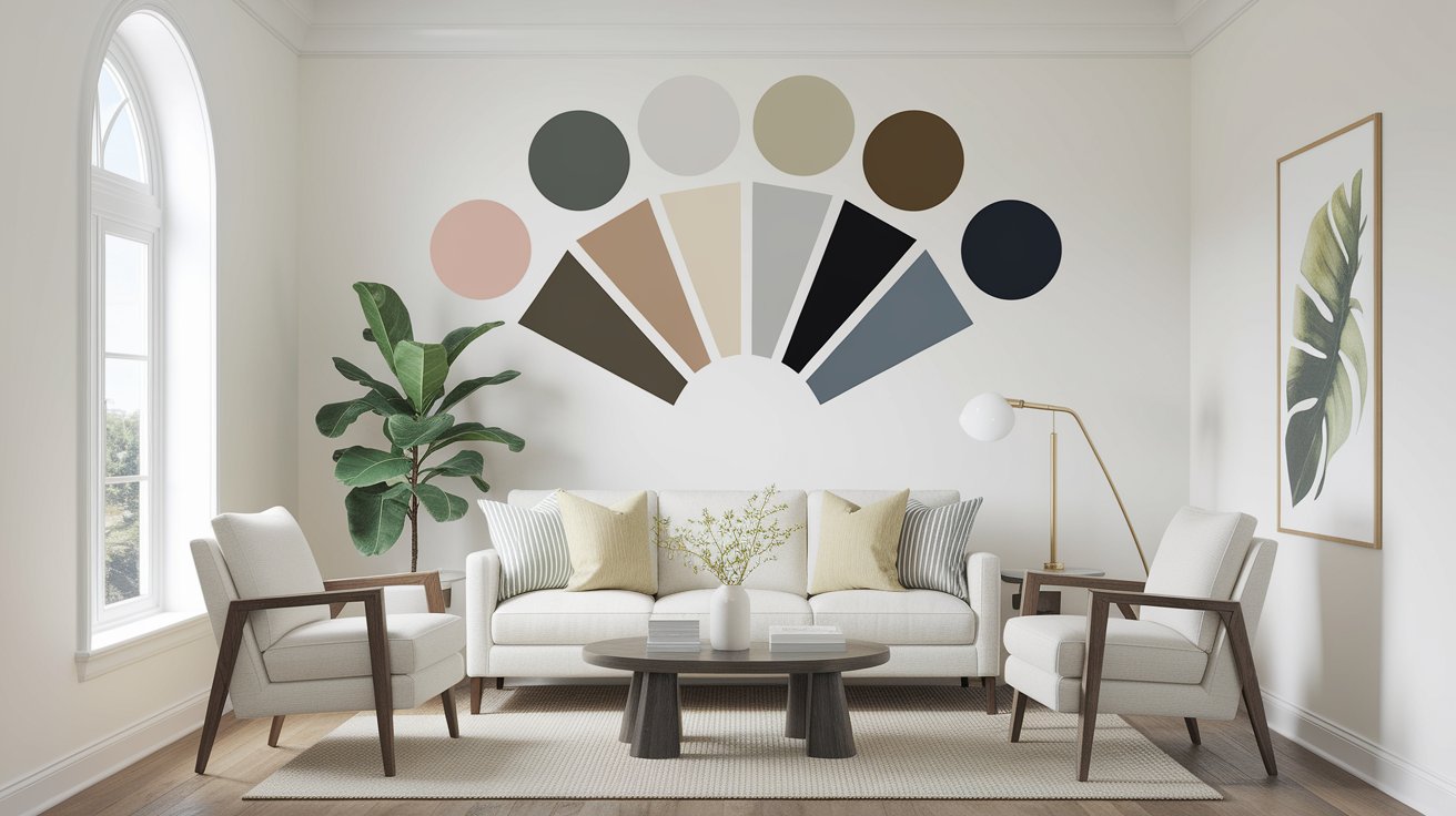
The best part about Mindful Gray is how well it plays with other colors:
You can use Mindful Gray throughout your home, but add variety with:
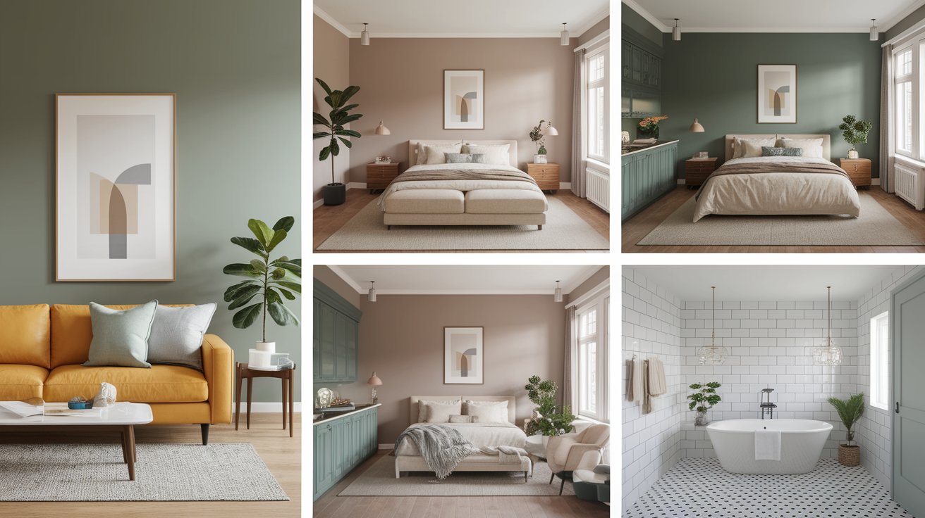
Seeing Mindful Gray in real homes helps you picture how it might look in yours. Notice how the color changes based on:
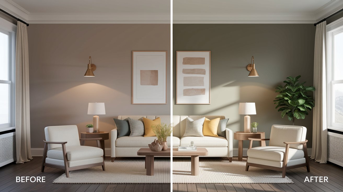
Mindful Gray is perfect if you want:
Skip Mindful Gray if you want:
Sherwin Williams Mindful Gray is a reliable choice for homeowners who want a sophisticated neutral that feels warm and welcoming. It works well in most rooms and pairs beautifully with white trim and natural wood.
While it might not be right for every space (especially small, dark rooms), it’s earned its popularity by being versatile and timeless. The key to success with any paint color is testing it in your own space and lighting.
Remember, the best paint color is one that makes you happy every time you walk into the room. If Mindful Gray does that for you, it’s the right choice.
Ready to try Mindful Gray? Start with a sample size and test it on your walls. Take your time to see how it looks throughout the day before making your final decision.
Mindful Gray is a warm gray. It has beige and taupe undertones that make it feel cozy rather than cold.
Pure White and Extra White are the most popular choices. They create a clean, fresh contrast that makes both colors look their best.
Yes! Mindful Gray is a popular exterior color. It looks great with white trim and black shutters or doors.
Yes, Mindful Gray remains popular because it’s a timeless neutral. Unlike trendy colors that come and go, this balanced gray works for many years.
In rooms with good light, Mindful Gray won’t make the space feel smaller. In very small, dark rooms, you might want to choose something lighter.
Mindful Gray is warmer than most grays because of its beige undertones. It’s also right in the middle for darkness – not too light, not too dark.
Daniel Hartman is a color specialist with years of experience helping people make confident and thoughtful design decisions. He provides practical and approachable guidance while balancing creativity and functionality in every project. Daniel enjoys visiting art and design exhibits to study how different environments influence aesthetics, mood, and perception, bringing a rich perspective and insight into his work. His approach makes design decisions both simple and enjoyable.
At Cozy Home Touch, we specialize in transforming your living spaces into cozy, stylish retreats. Whether you’re looking to refresh a single room or undertake a complete home makeover, our expert team is here to bring your vision to life.
Copyright © 2025 Cozy Home Touch.
[…] you enjoy deep, moody neutrals, you might also like how Black Fox compares to Sherwin Williams Mindful Gray, which offers a lighter […]
[…] Warm grays and beiges like Accessible Beige or Mindful Gray […]