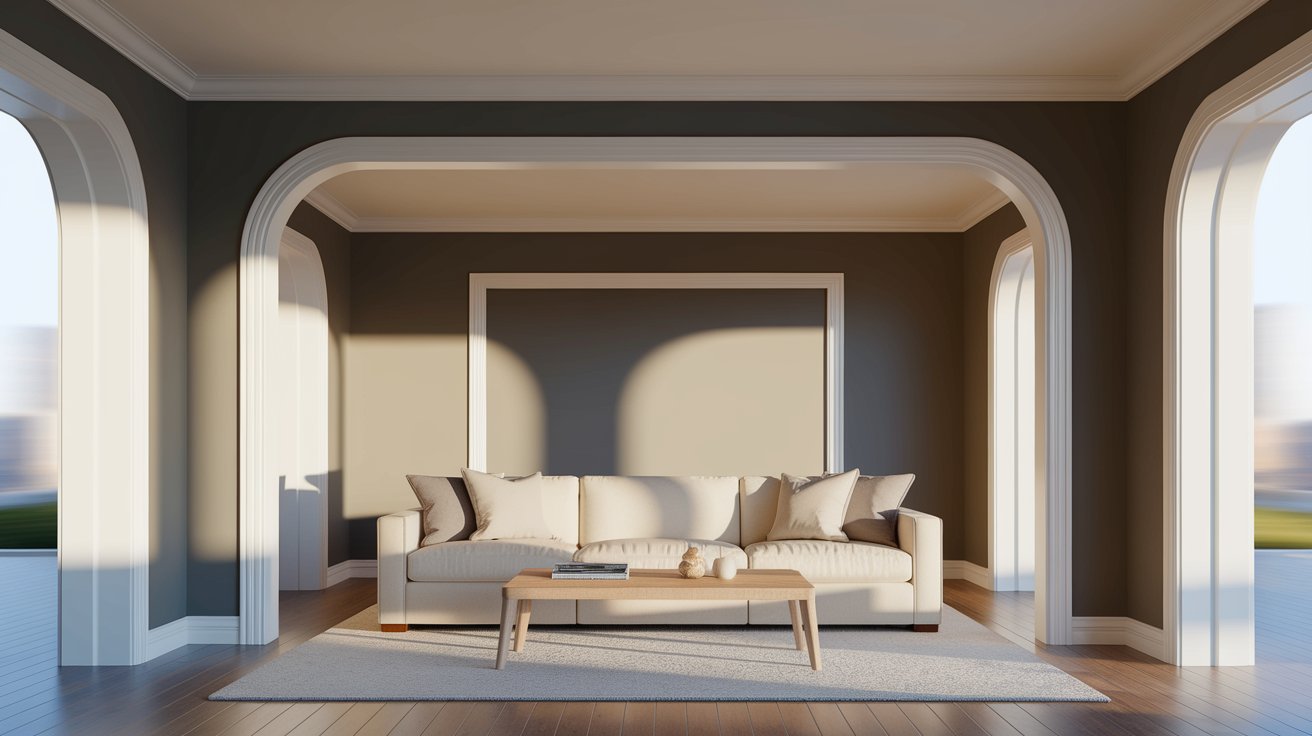
Choosing the right paint color can feel overwhelming. You want something that looks good now and won’t feel dated in a few years. That’s where Sherwin Williams Dorian Gray (SW 7017) comes in. This warm gray has become a favorite for homeowners who want a neutral that’s not too light, not too dark, and works beautifully in almost any room.
In this guide, we’ll walk you through everything you need to know about Dorian Gray. You’ll learn about its undertones, how lighting changes its appearance, what colors pair well with it, and see real examples of how it looks in different spaces.
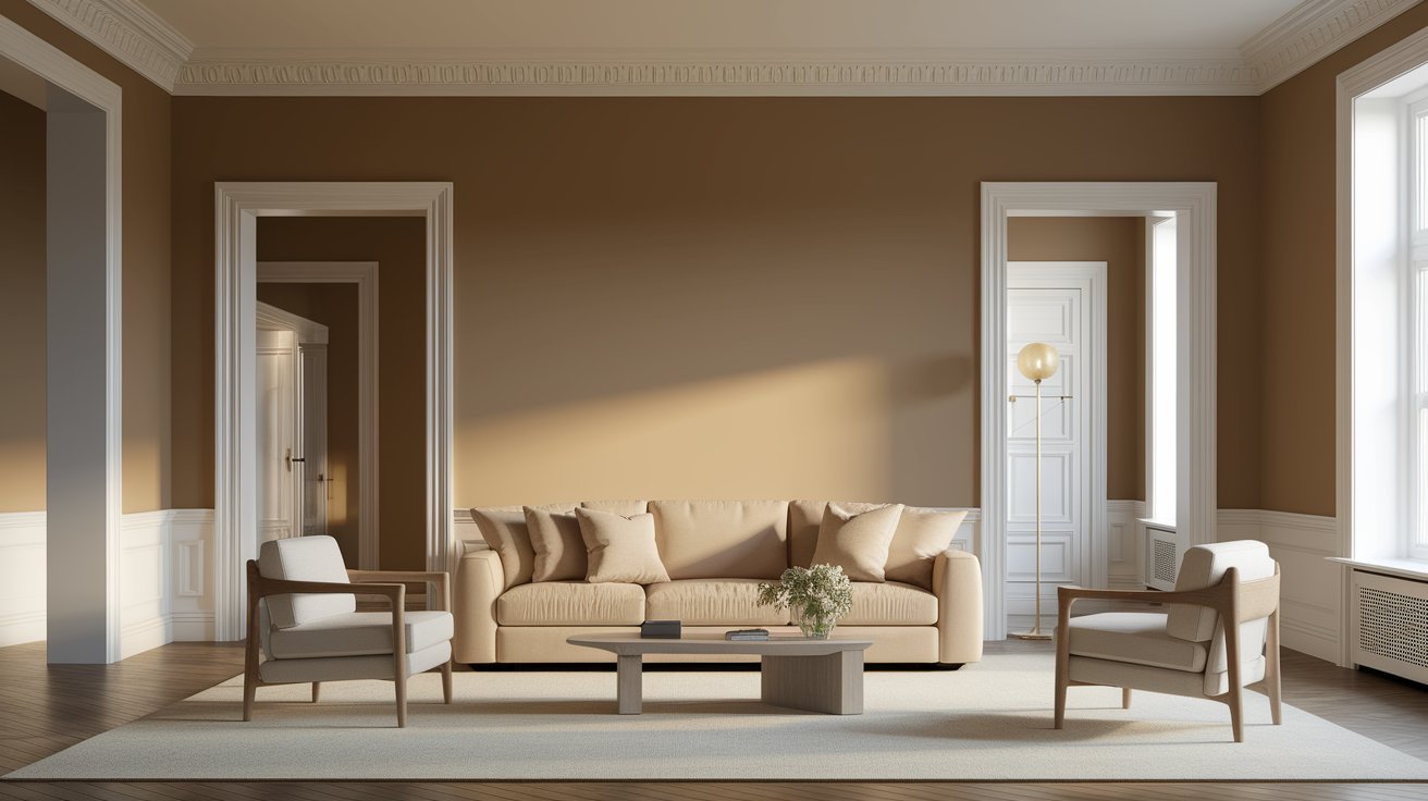
Dorian Gray is a medium-toned warm gray with greige undertones. If you’re not familiar with “greige,” it’s simply a mix of gray and beige. This makes Dorian Gray warmer than pure gray paint colors, which can sometimes feel cold or sterile.
The beauty of this shade is its versatility. It fits perfectly in modern homes with clean lines, farmhouse kitchens with shiplap walls, and traditional spaces that need a fresh update. Unlike trendy colors that come and go, Dorian Gray has a timeless quality that works year after year.
When you look at a swatch of Dorian Gray, you’ll notice it has depth. It’s not a flat, boring gray. There’s warmth and character to it, which is why it photographs so well and looks inviting in person.
Understanding undertones is key to picking the right paint color. Dorian Gray has warm greige undertones with hints of violet and brown. These subtle undertones keep it from looking flat or dingy.
Here’s how lighting affects Dorian Gray:
Natural Light: In rooms with plenty of windows, Dorian Gray shows its true warm gray nature. South-facing rooms with lots of sunlight make it look lighter and more beige. North-facing rooms bring out slightly cooler tones, but it still maintains its warmth.
Artificial Light: Under warm LED bulbs or incandescent lighting, Dorian Gray leans more beige and cozy. With cool white bulbs, it appears more gray. Most people find it looks best with warm white lighting, which enhances its greige qualities.
The time of day also matters. Morning light might make it look softer and lighter, while evening shadows can make it appear richer and deeper.
LRV stands for Light Reflectance Value. It’s a number between 0 (pure black) and 100 (pure white) that tells you how much light a paint color reflects.
Dorian Gray has an LRV of 47, which puts it right in the middle range. This means it’s a true medium-tone color. It’s not light enough to make small rooms feel bigger, but it’s not so dark that it makes spaces feel closed in.
Rooms with good natural light work beautifully with Dorian Gray on all walls. The medium tone adds coziness without feeling heavy. In rooms with limited windows, consider using Dorian Gray on accent walls or in spaces with plenty of artificial lighting. Pairing it with lighter trim colors helps balance the depth.
If you have very small rooms or spaces with no windows, you might want to test it carefully. While it can work, lighter grays might be a safer choice for those areas.
One of the best things about Dorian Gray is how well it plays with other colors. Here are some winning combinations:
For Trim and Ceilings:
For Accent Walls or Coordinating Rooms:
For Cabinets and Built-ins:
The key is creating enough contrast so spaces don’t look flat. Dorian Gray sits perfectly between light and dark, making it easy to pair with both.
Let’s look at how Dorian Gray performs in various spaces throughout your home:
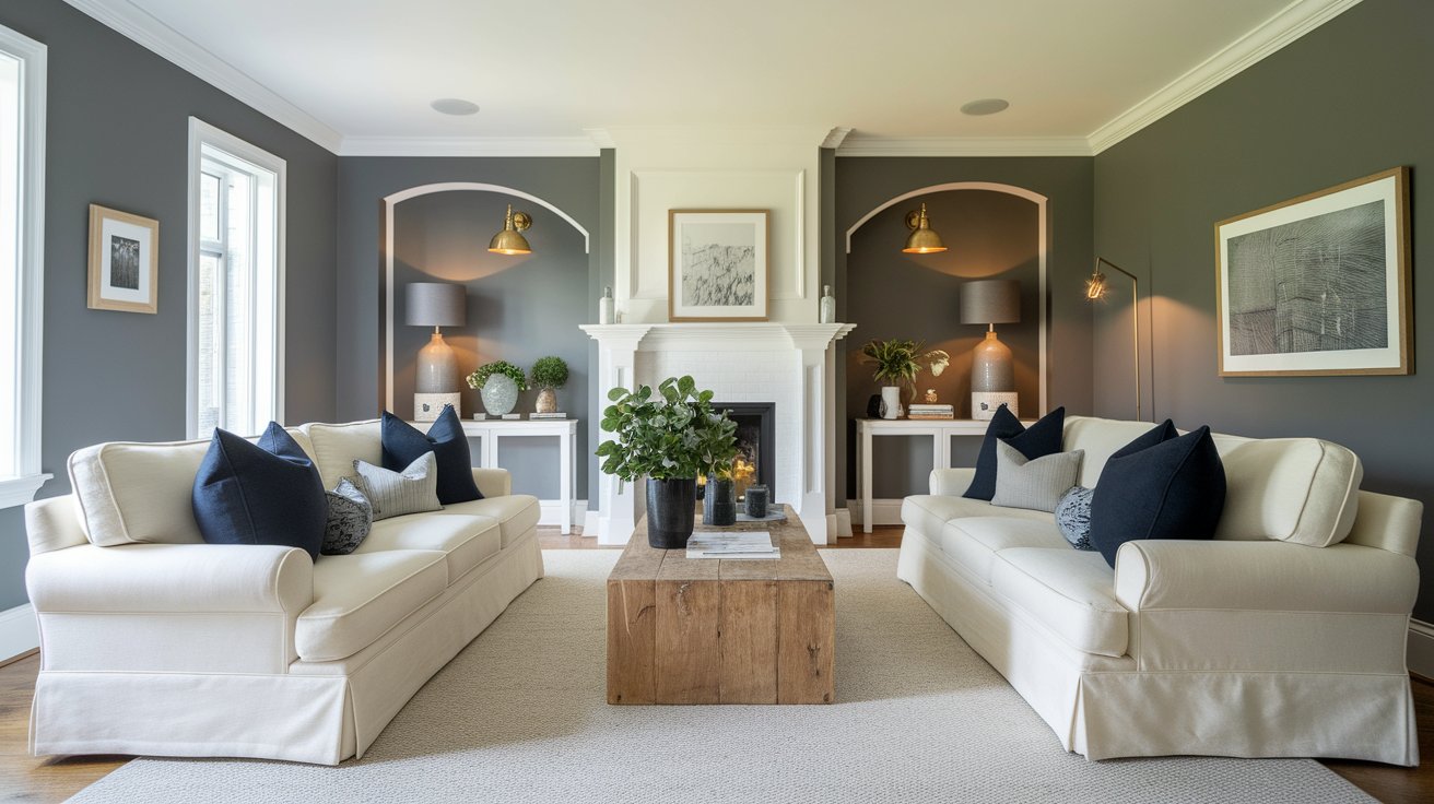
Dorian Gray creates a sophisticated backdrop in living rooms. It’s warm enough to feel inviting but neutral enough to let your furniture and decor shine. The color works especially well with white trim, wooden furniture, and pops of color in pillows and artwork.
Pair it with cream sofas, brass lighting, and natural wood tones for a modern farmhouse feel. Or go bold with navy accents and black picture frames for a more contemporary look.
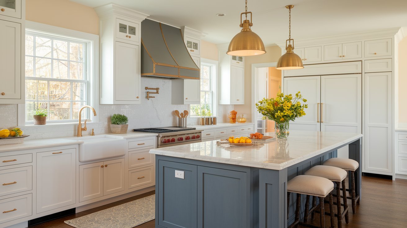
In kitchens, Dorian Gray works beautifully on lower cabinets. The two-tone kitchen trend pairs Dorian Gray base cabinets with white or cream upper cabinets. This creates visual interest without overwhelming the space.
It also looks great on kitchen islands, especially with marble or quartz countertops and gold or brass hardware. The warm gray complements stainless steel appliances better than stark white cabinets do.

Bedrooms feel restful and cozy with Dorian Gray on the walls. The medium tone creates a cocoon-like feeling that’s perfect for sleeping spaces. Layer in soft bedding, warm wood nightstands, and plenty of lamps to create a relaxing retreat.
This color works equally well in master bedrooms and guest rooms. It’s neutral enough that guests with different tastes will find it appealing.
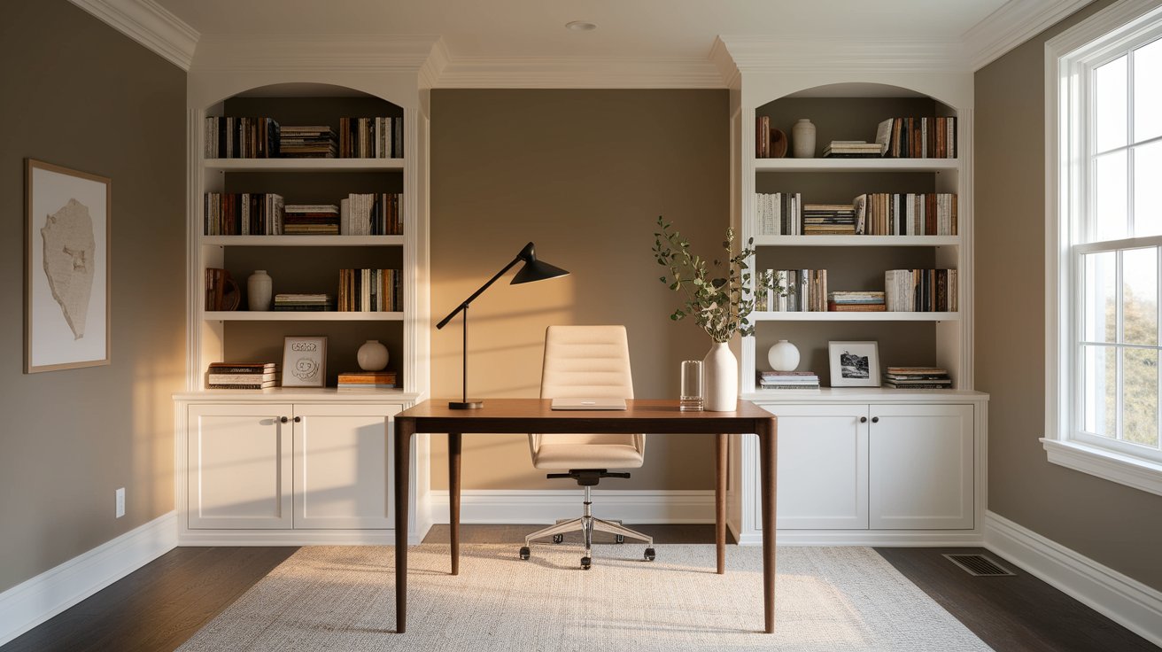
For home offices, Dorian Gray provides a professional backdrop that’s not boring. It helps you focus without being distracting. The warm undertones keep the space from feeling cold or institutional.
Add white built-in shelving, a wooden desk, and good lighting for a productive workspace that looks great on video calls too.
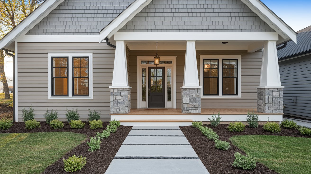
Yes, Dorian Gray works on home exteriors too! It pairs beautifully with white trim, stone accents, and black or bronze hardware. The color has good fade resistance, though like all darker colors, it may show fading over time in intense sun.
It’s particularly stunning on modern farmhouse exteriors, craftsman homes, and contemporary designs.
Wondering how Dorian Gray stacks up against other popular grays? Here’s a quick comparison:
Dorian Gray vs Repose Gray: Repose Gray is lighter (LRV 58) and cooler. Dorian Gray has more depth and warmth. Choose Repose for smaller spaces or when you want a barely-there gray. Pick Dorian Gray when you want more presence and coziness.
Dorian Gray vs Agreeable Gray:Agreeable Gray is lighter and warmer, leaning more beige. Dorian Gray is darker and reads more as gray. Agreeable works better in low-light rooms, while Dorian Gray shines in spaces with good lighting where you want a bolder neutral.
Dorian Gray vs Mindful Gray: Mindful Gray is similar in depth but cooler in tone. Dorian Gray’s greige undertones make it more versatile for pairing with both warm and cool accents. Mindful Gray works better in modern, minimalist spaces, while Dorian Gray adapts to more design styles.
Dorian Gray vs Edgecomb Gray: Edgecomb Gray is lighter and much warmer, almost reading as beige in some lights. Dorian Gray is truer to gray with just a hint of warmth. If you want something that clearly reads as gray, Dorian is your choice.
This is one of the most common questions about Dorian Gray. The answer: it’s a warm gray.
The greige undertones (that blend of gray and beige) make it sit firmly on the warm side of the gray family. However, it’s not so warm that it looks beige. That’s the sweet spot that makes it so popular.
Because it’s warm, Dorian Gray pairs beautifully with:
It can also work with cooler accents because it’s not overly warm. This flexibility is what makes it such a versatile choice.
In spaces with cool northern light, Dorian Gray might show slightly cooler tones, but it never looks cold or sterile like some pure grays can. The warm base always comes through.
Now that you understand Dorian Gray, where should you use it? Here are the best applications:
Interior Walls:
Cabinets and Built-ins:
Exterior Applications:
Furniture and Accents:
Pro Tip: Always test paint colors before committing. Buy a sample of Dorian Gray and paint large swatches on different walls in your room. Look at them in morning light, afternoon light, and evening light. Live with them for a few days before making your final decision.
You can use the Sherwin-Williams ColorSnap Visualizer to see how Dorian Gray might look in your space, but nothing beats real paint samples.
Sherwin Williams Dorian Gray is a winner for anyone looking for a versatile, warm gray that won’t go out of style. With its medium LRV of 47, greige undertones, and ability to work in multiple design styles, it’s easy to see why this color remains so popular.
It’s warm enough to feel inviting, gray enough to be truly neutral, and deep enough to make a statement without being overwhelming. Whether you’re painting your whole house, updating a single room, or refinishing cabinets, Dorian Gray deserves a spot on your short list.
The key to success with this color is understanding your lighting and testing it in your specific space. What looks perfect in one home might need adjustment in another, depending on your natural light and existing finishes.
Ready to try it? Grab a sample from Sherwin-Williams and see how it transforms your space.
Yes! It’s excellent for kitchen cabinets, especially in two-tone designs with white uppers. Pair it with brass hardware and ensure good lighting in your kitchen.
Absolutely. It looks beautiful on exteriors with white trim and stone accents. Perfect for farmhouse and craftsman homes, though it may fade slightly in direct sun over time.
Alabaster (SW 7008) is the best choice for gentle contrast. Pure White (SW 7005) works if you want crisper contrast.
Dorian Gray is darker and reads as true gray with warmth. Edgecomb Gray is lighter and leans more beige. Pick Dorian Gray for warm gray, Edgecomb for beige-neutral.
Still very popular. Its warm greige tone fits perfectly with current trends toward cozy, natural spaces. It’s a timeless choice that won’t look dated.
Daniel Hartman is a color specialist with years of experience helping people make confident and thoughtful design decisions. He provides practical and approachable guidance while balancing creativity and functionality in every project. Daniel enjoys visiting art and design exhibits to study how different environments influence aesthetics, mood, and perception, bringing a rich perspective and insight into his work. His approach makes design decisions both simple and enjoyable.
At Cozy Home Touch, we specialize in transforming your living spaces into cozy, stylish retreats. Whether you’re looking to refresh a single room or undertake a complete home makeover, our expert team is here to bring your vision to life.
Copyright © 2025 Cozy Home Touch.
No Comments