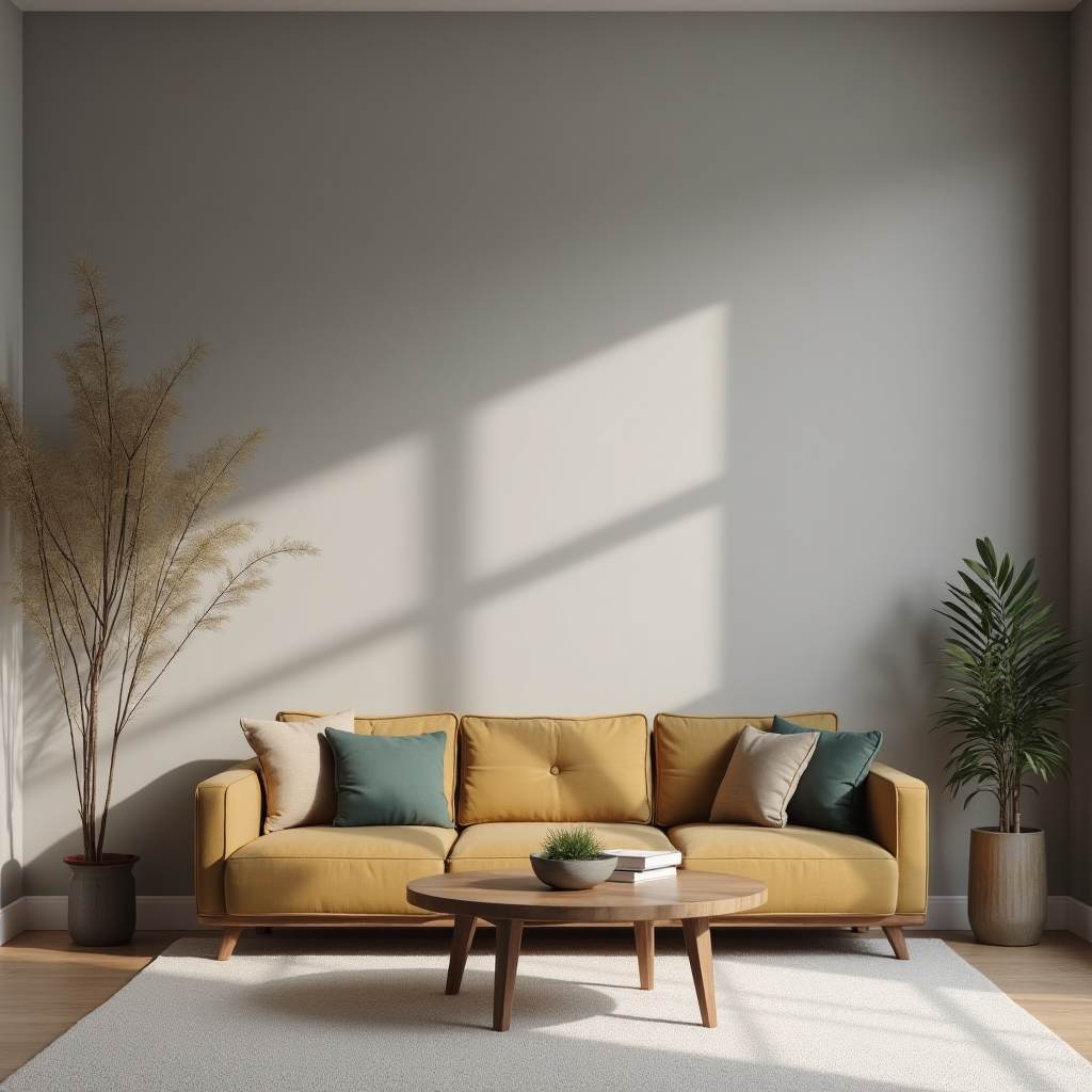
Sherwin Williams Agreeable Gray has become a favorite choice for countless homes across America.
This smart color sits perfectly between gray and beige, creating what people call “greige.” It’s warm enough to feel cozy but cool enough to stay modern.
What makes this color special is how well it works everywhere. Whether you’re painting a living room, bedroom, or kitchen, Agreeable Gray adapts to your space.
It looks great with both warm wood tones and sleek white trim. The color changes beautifully throughout the day as natural light shifts.
Even as paint trends come and go, Agreeable Gray stays popular. It’s not too bold or too boring.
Instead, it gives you a clean backdrop that lets your furniture and art shine. Many designers pick it because it makes rooms feel bigger and brighter without being stark white.
This reliable color has earned its spot as one of the most trusted paint choices for good reason.
Agreeable Gray is the perfect greige paint color. This means it blends gray and beige to create a warm neutral shade.
The color has an LRV of 60, which means it reflects good light and makes rooms feel bright. Its HEX code is #D1CBC1, with RGB values of 209/203/193.
This paint belongs to the yellow hue family, giving it warm beige undertones.
The color has a value of 8 and chroma of 0.74, making it light and soft. In most lighting, it looks like a mid-tone warm gray.
However, it can sometimes shift and look slightly purple in certain light conditions.
Agreeable Gray works as a near neutral color with an average warm temperature, making it perfect for any room in your home.
Agreeable Gray has warm beige undertones that make it feel cozy and welcoming. These warm hints keep the color from feeling cold or sterile like some gray paints can.
The color looks different depending on your room’s light. In south-facing rooms with lots of sunshine, the beige shows up more and the paint looks warmer.
North-facing rooms with cooler light make it appear more gray and less warm.
Sometimes Agreeable Gray can surprise you by looking purple in certain lights. This happens because of how light bounces around your room and hits the paint.
Before painting your whole room, always test samples on all four walls. Paint a few patches and watch how they look throughout the day.
Morning light, afternoon sun, and evening lamps all change how the color appears. This simple step helps you avoid any surprises later.
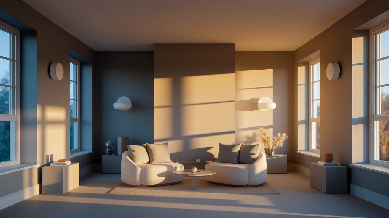
Morning light tends to be cooler and makes Agreeable Gray look more gray than beige.
As the day goes on, afternoon light becomes warmer and brings out those cozy beige tones.
East-facing rooms get cool morning light, while west-facing rooms glow with warm afternoon sunshine.
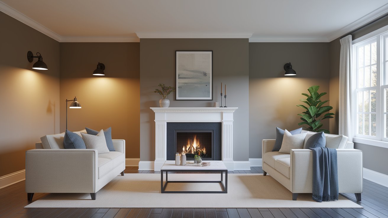
Under warm incandescent bulbs, Agreeable Gray shows its beige side and feels cozy. Cool LED lights make it look more gray and less warm.
On cloudy days, the color can appear darker and more muted throughout your home.
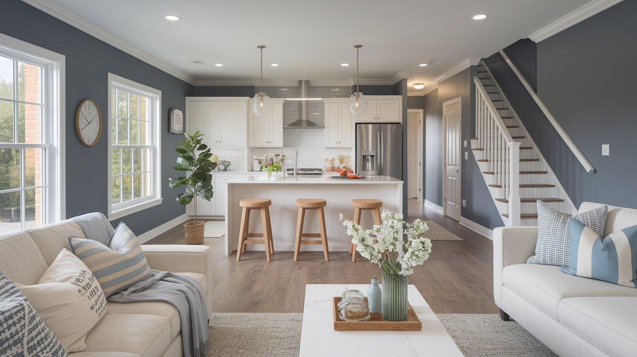
In bright kitchens and living rooms, Agreeable Gray stays light and welcoming.
However, hallways and stairways without much natural light can look darker and muddy.
Many homeowners love it in living spaces but switch to brighter whites in dim areas.
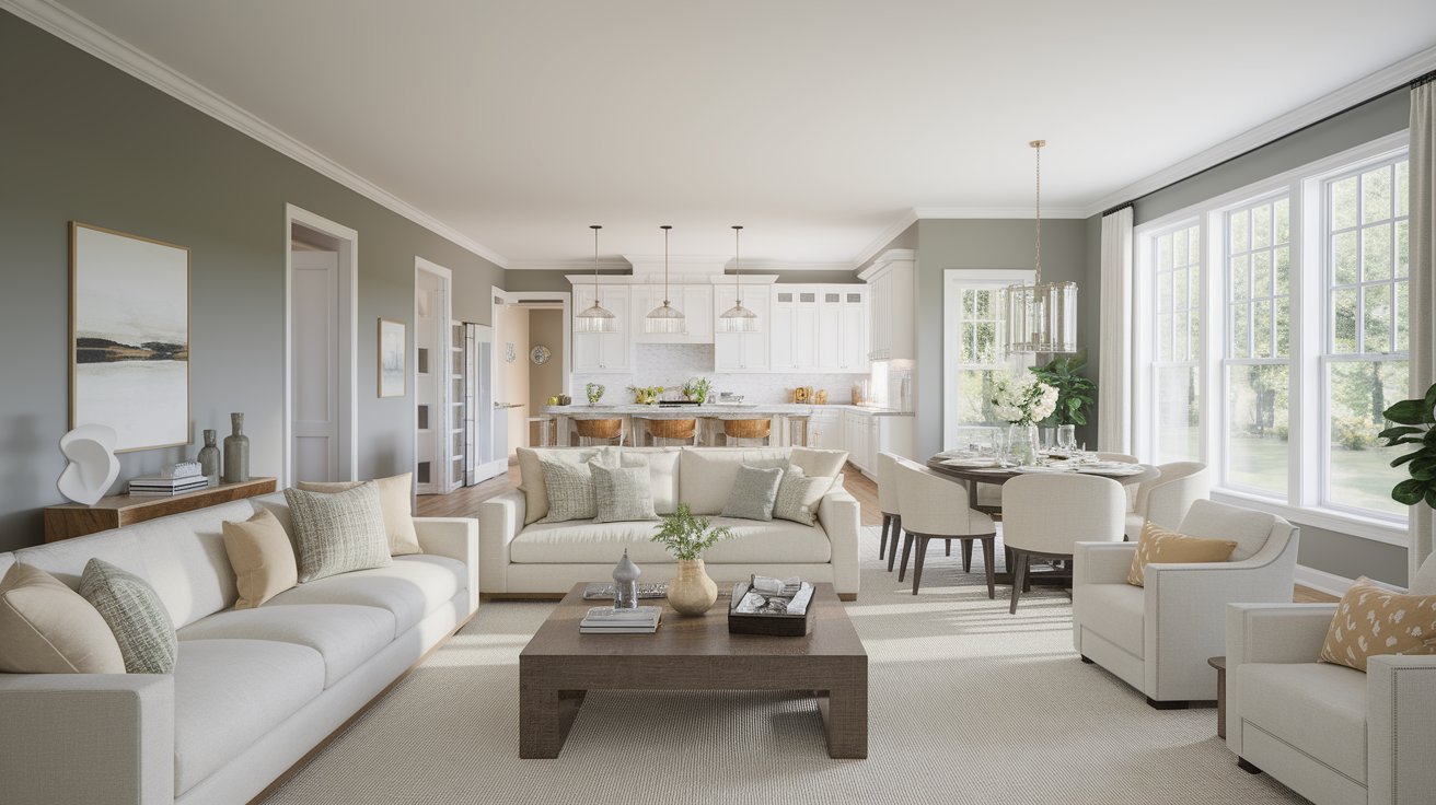
Agreeable Gray creates a calm, peaceful backdrop for your main living spaces, making it an ideal choice for creating a serene atmosphere where family and friends can gather comfortably.
It works great in open floor plans because it flows smoothly from room to room without feeling choppy, ensuring visual continuity that makes your home feel larger and more cohesive.
The color’s versatile nature allows it to complement both contemporary and traditional furniture styles, while its subtle warmth prevents the space from feeling cold or sterile.
Whether you’re hosting dinner parties or enjoying quiet family time, this sophisticated neutral provides the perfect foundation that won’t compete with your decor or artwork.
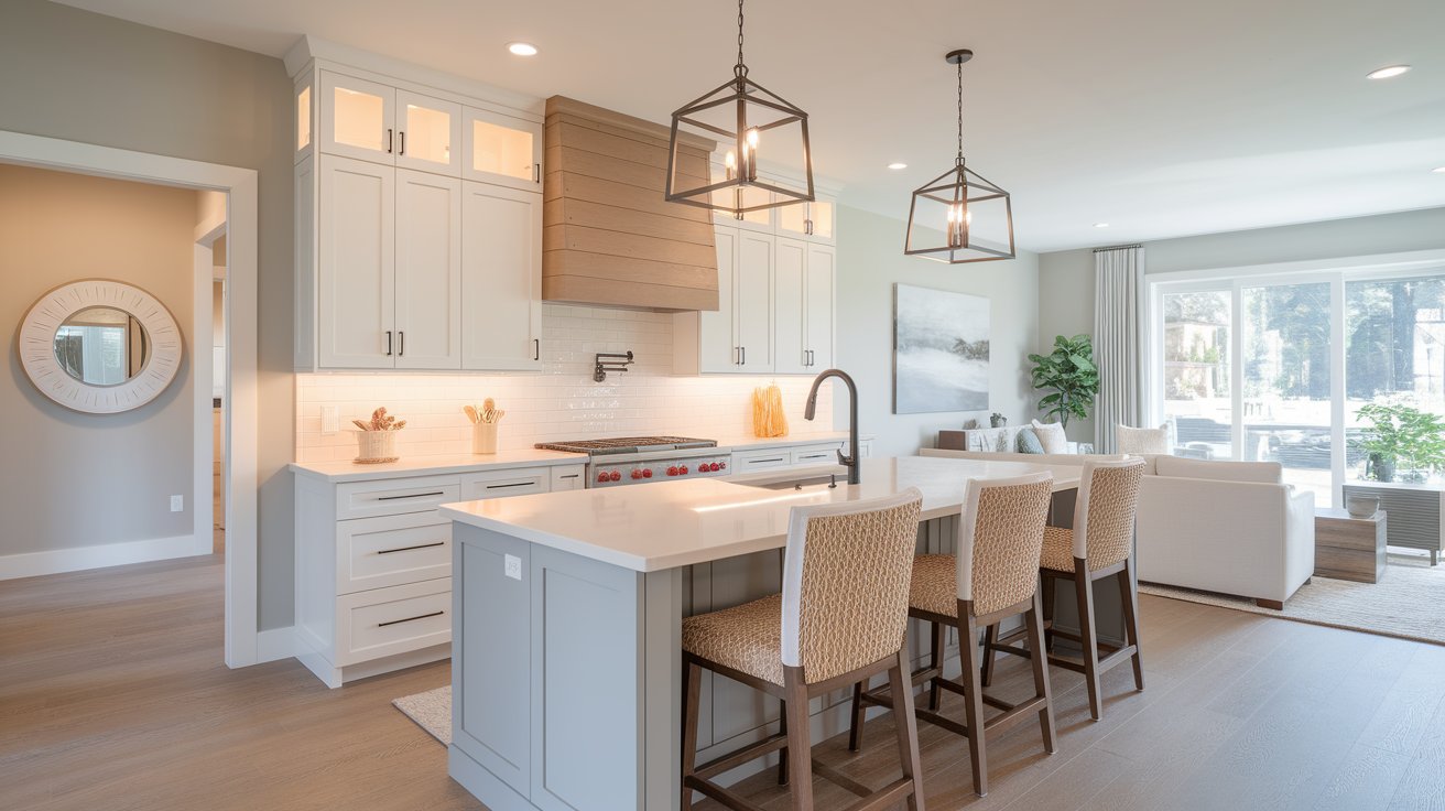
This color pairs beautifully with white cabinets and natural wood accents, creating a timeless combination that feels both fresh and grounding.
It also looks stunning as kitchen cabinet color itself, especially for the trendy mushroom cabinet look that’s popular right now, offering a sophisticated alternative to stark white cabinetry.
The neutral tone works exceptionally well with stainless steel appliances and marble countertops, while also complementing warmer elements like brass hardware and butcher block islands.
In kitchen settings, Agreeable Gray provides enough depth to hide everyday wear and tear while maintaining an elegant, clean appearance that makes meal preparation and entertaining a pleasure.
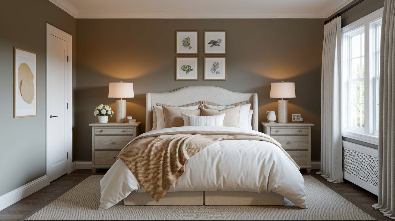
The warm yet neutral tone makes bedrooms feel restful and cozy, creating an environment that naturally promotes relaxation and better sleep quality.
It’s not too bold or distracting, which helps create a peaceful sleeping space that allows your mind to unwind after busy days.
This versatile shade works beautifully with both light and dark bedding, from crisp white linens to rich navy or charcoal accents.
The color’s ability to appear slightly different throughout the day—cooler in morning light and warmer in evening lamplight—adds visual interest while maintaining its calming properties that make it perfect for master suites, guest rooms, and children’s bedrooms alike.
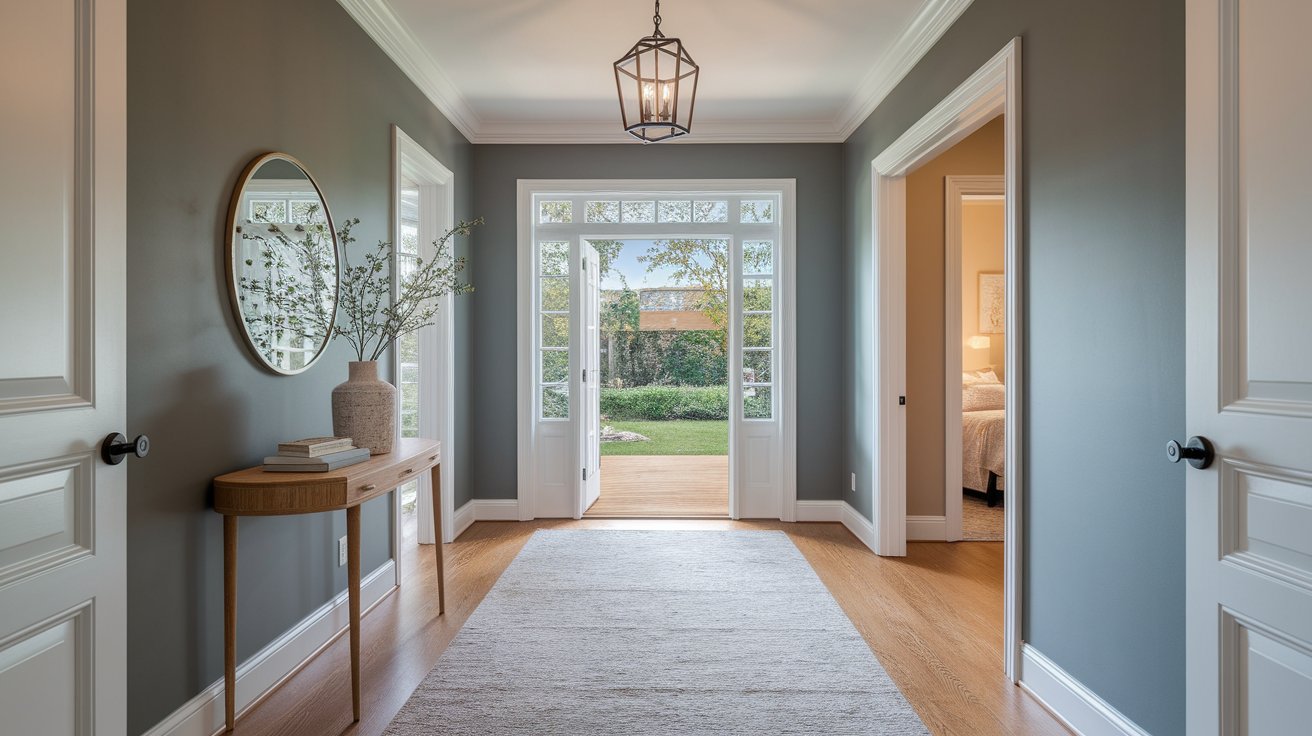
Agreeable Gray helps connect different rooms and creates a unified look throughout your home, acting as a sophisticated thread that weaves your interior design story together seamlessly.
It sets a welcoming tone right when people walk in, making guests feel immediately comfortable while establishing the overall aesthetic of your home.
The color works particularly well in areas with limited natural light, as it reflects available light beautifully without appearing washed out or dull.
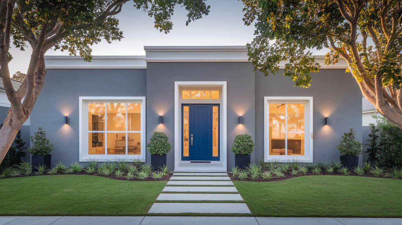
On house exteriors, it looks clean and modern when paired with crisp white trim and a bold colored front door, creating striking curb appeal that feels both contemporary and timeless.
The color photographs beautifully and maintains its sophisticated appearance across different seasons and lighting conditions throughout the day.
It works exceptionally well with natural materials like stone, brick, or cedar siding, while also complementing modern elements such as black window frames or metal roofing.
Whether your home is a cozy cottage, contemporary farmhouse, or sleek modern design, Agreeable Gray provides a versatile foundation that allows architectural features and landscaping to shine while creating a polished, cohesive exterior that neighbors will admire.
Clean, bright whites like SW Alabaster and SW Extra White create a fresh, modern look with Agreeable Gray walls.
These whites make the gray stand out beautifully and give your trim work a sharp, clean finish.
For a softer, more gentle contrast, warm off-whites work wonderfully with Agreeable Gray.
These colors blend together smoothly without creating harsh lines between your walls and trim.
High-LRV whites reflect lots of light, which helps make Agreeable Gray look brighter and more spacious.
When you pair a medium-tone gray with very light whites, it creates the perfect balance that makes rooms feel open and airy.
Agreeable Gray works beautifully with other neutral colors like Accessible Beige, taupe, and ivory.
These soft colors create a layered, cozy look that feels calm and put-together throughout your home.
For a bold, dramatic look, pair Agreeable Gray with deep blues, rich greens, or charcoal grays.
These darker colors make the gray pop and add interest to your space without being too loud.
Warm Accents
Soft blush tones, natural wood finishes, and warm metals like brass or bronze bring out the cozy side of Agreeable Gray.
These warm touches make rooms feel welcoming and add just the right amount of color without overwhelming the space.
If you like Agreeable Gray, try SW Repose Gray, Colonnade Gray, Alpaca, Mindful Gray, or Gossamer Veil.
These colors are all similar warm neutrals that work well in most homes.
Benjamin Moore Revere Pewter and Classic Gray offer similar looks to Agreeable Gray.
Valspar Heritage Gray and Behr Toasty Gray are exact matches that give you the same color from different paint brands.
Test samples of a few colors next to each other on your wall.
Some may look lighter or darker, while others might feel warmer or cooler in your specific room.
Pick the one that looks best in your lighting and feels right for your space.
Sherwin Williams Agreeable Gray truly lives up to its name as the paint color that goes with everything.
This warm Sherwin Williams neutral works in any room of your home, from cozy bedrooms to busy kitchens.
It pairs well with almost any decorating style and color scheme you can imagine.
The secret to this Sherwin Williams color’s popularity is simple – it’s not too warm, not too cool, but just right.
Whether you’re selling your home or planning to stay for years, Sherwin Williams Agreeable Gray creates a timeless backdrop that won’t go out of style.
Before you commit to painting your entire home, grab some Sherwin Williams samples and test them in your space.
Watch how the color looks in different lights throughout the day. This small step will help you feel confident that Sherwin Williams Agreeable Gray is the right choice for your home.
Daniel Hartman is a color specialist with years of experience helping people make confident and thoughtful design decisions. He provides practical and approachable guidance while balancing creativity and functionality in every project. Daniel enjoys visiting art and design exhibits to study how different environments influence aesthetics, mood, and perception, bringing a rich perspective and insight into his work. His approach makes design decisions both simple and enjoyable.
At Cozy Home Touch, we specialize in transforming your living spaces into cozy, stylish retreats. Whether you’re looking to refresh a single room or undertake a complete home makeover, our expert team is here to bring your vision to life.
Copyright © 2025 Cozy Home Touch.
[…] Agreeable Gray (SW 7029): Adds subtle depth without competing […]
[…] Agreeable Gray (SW 7029): Another warm neutral that pairs nicely if you want a lighter option in connected spaces. […]