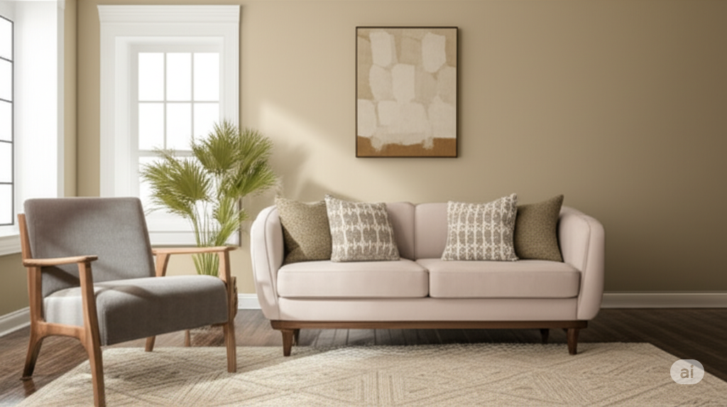
When it comes to finding the perfect neutral paint color, Sherwin Williams Accessible Beige (SW 7036) consistently tops the list for homeowners and interior designers alike.
This sophisticated beige offers the ideal balance of warmth and versatility, featuring subtle gray undertones that prevent it from looking too yellow or dated.
What sets Accessible Beige apart is its remarkable adaptability.
Whether you’re designing a cozy farmhouse kitchen, a modern living room, or a serene bathroom retreat, this greige (gray-beige blend) seamlessly complements both contemporary and traditional design styles.
Its Light Reflectance Value of 58 makes it light enough to feel airy while providing enough depth for beautiful contrast with white trim.
From kitchen cabinets to whole-house color schemes, Accessible Beige has proven itself as a timeless choice that grows with changing trends while maintaining its classic
Sherwin Williams Accessible Beige is a warm, neutral greige that masterfully blends beige and gray to create an incredibly versatile paint color.
Its subtle gray undertones prevent it from appearing too yellow or traditional, making it perfect for contemporary and classic design styles alike.
One of Accessible Beige’s most remarkable qualities is its chameleon-like ability to adapt to different lighting conditions.
In southern-facing rooms with abundant natural light, it maintains its beautiful neutral warmth, while in northern-facing spaces with cooler light, it takes on more taupe or greige characteristics.
With an LRV of 58, Accessible Beige sits perfectly between light and medium tones—bright enough to feel airy and welcoming, yet grounded enough to provide beautiful contrast against white trim.
This soft, sophisticated hue creates cozy yet refined atmospheres in kitchens, living rooms, bathrooms, and beyond, making it an ideal choice for any space seeking timeless elegance.
Accessible Beige’s incredible versatility stems from its balanced composition, making it equally at home in modern farmhouse kitchens, traditional living rooms, and contemporary bathrooms.
This adaptability allows it to work seamlessly across different rooms and lighting conditions throughout your home.
Like a true chameleon, Accessible Beige transforms based on your room’s lighting.
In northern-facing rooms with cooler, bluish light, it leans more toward taupe or greige tones.
Southern-facing spaces with warm, abundant natural light bring out its classic beige personality, while western rooms enhance its cozy warmth.
Compared to Sherwin Williams Agreeable Gray, Accessible Beige offers more warmth—where Agreeable Gray is a cool gray with beige undertones, Accessible Beige reverses this as a warm beige with gray undertones.
Balanced Beige appears darker and more saturated, while Benjamin Moore’s Edgecomb Gray reads lighter and slightly cooler than Accessible Beige’s grounded warmth.
Color Name | Use Case | Best Pairing |
Sherwin Williams Alabaster | Great for trim, ceilings, and cabinetry | Complements Accessible Beige perfectly |
Benjamin Moore Hale Navy | Accent color for depth and contrast | Pairs with Accessible Beige for a bold look |
Sherwin Williams Urbane Bronze | Accent walls or doors | Creates a striking contrast |
Benjamin Moore Chelsea Gray | Used in accent walls or cabinetry | Pairs beautifully with Accessible Beige for warmth |
This versatile neutral shines in every room of your home, adapting beautifully to different functions and design styles.
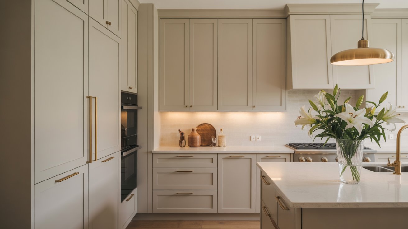
Accessible Beige excels as a cabinet color, creating sophisticated depth while maintaining brightness.
It pairs beautifully with white oak floors and satin brass hardware, as seen in many designer kitchens.
Whether used on cabinetry or walls, it complements natural wood tones and metallic accents effortlessly.
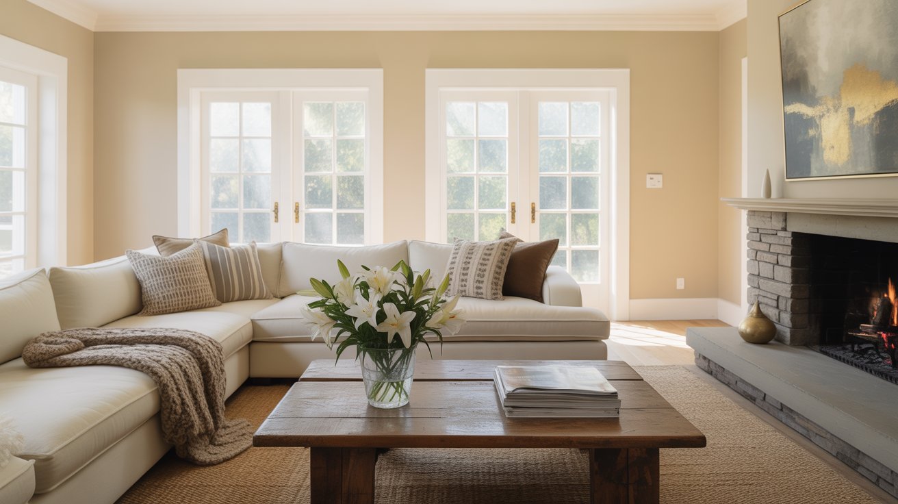
As a wall color, Accessible Beige provides a cozy, neutral backdrop that works with both warm and cool furnishings.
It creates inviting spaces while allowing your décor and artwork to shine, making it perfect for family gathering areas.
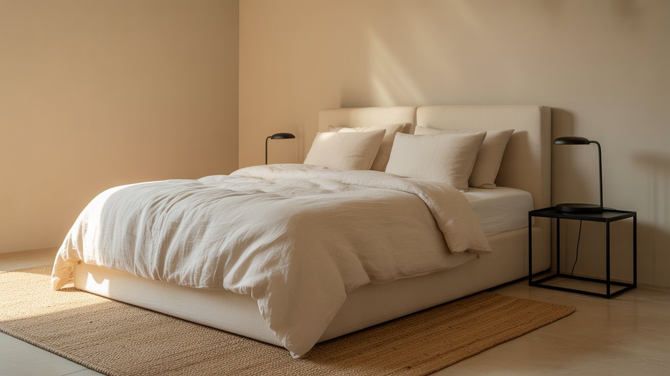
The soft, calming nature of Accessible Beige makes it ideal for bedrooms, creating a restful retreat.
It pairs beautifully with warm white bedding, natural textures, and subtle contrasts like black metal accents for a serene yet stylish atmosphere.
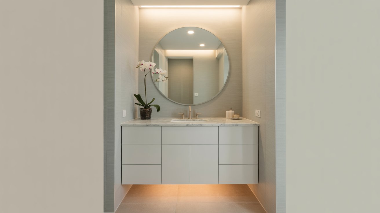
This elegant neutral works wonderfully on vanities and walls, complementing various tile choices and hardware finishes from brushed brass to black and nickel.
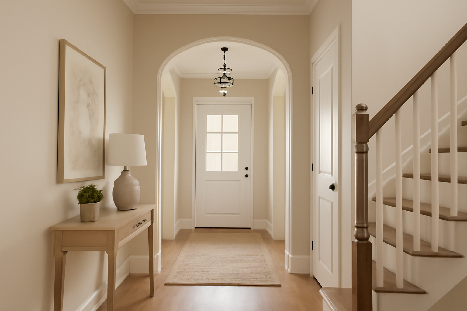
Accessible Beige creates a welcoming first impression, flowing seamlessly throughout your home as a sophisticated whole-house color.
Category | Color Pairings | Description |
|---|---|---|
Whites | Pure White, Alabaster, Dover White | These whites create a clean, fresh contrast with Accessible Beige for trim and ceilings. |
Accent Colors | Muted navy, sage green, brass, nickel hardware | These accent colors add depth and character, complementing Accessible Beige without overpowering it. |
Wood Tones | White oak, walnut, and other natural wood finishes | Pairs beautifully with Accessible Beige, bringing warmth and a natural touch to the space. |
Sherwin Williams Accessible Beige stands out as one of those rare neutral paint colors that truly delivers on versatility and timeless appeal.
Its sophisticated blend of warm beige with subtle gray undertones makes it adaptable to virtually any home style—from modern farmhouse to traditional, coastal to contemporary.
What makes Accessible Beige particularly special is its remarkable flexibility across different rooms and design aesthetics.
Whether you’re updating kitchen cabinets, creating a cozy living room retreat, or designing a serene bathroom sanctuary, this color seamlessly adapts while maintaining its elegant character.
However, like any paint color, lighting matters significantly. Before committing to Accessible Beige, test it in your specific space by grabbing a large sample and observing how it shifts throughout the day.
Consider your room’s orientation—northern-facing rooms will bring out cooler undertones, while southern exposure enhances its warmth.
This simple step ensures you’ll love how Accessible Beige looks in your unique environment, making it the perfect neutral foundation for your home.
Daniel Hartman is a color specialist with years of experience helping people make confident and thoughtful design decisions. He provides practical and approachable guidance while balancing creativity and functionality in every project. Daniel enjoys visiting art and design exhibits to study how different environments influence aesthetics, mood, and perception, bringing a rich perspective and insight into his work. His approach makes design decisions both simple and enjoyable.
At Cozy Home Touch, we specialize in transforming your living spaces into cozy, stylish retreats. Whether you’re looking to refresh a single room or undertake a complete home makeover, our expert team is here to bring your vision to life.
Copyright © 2025 Cozy Home Touch.
[…] case of the rooms where you desire a light and free color, then you can combine the Green Bay with Sherwin Williams Accessible Beige. This warm neutral gives a comfortable backdrop that balances out the boldness of Green Bay and […]
[…] grays and beiges like Accessible Beige or Mindful […]