
Color Type: Muted gray-green sage
LRV: 45.46 (mid-tone)
Undertones: Soft green with gray, subtle warmth in certain lights
Best Rooms: Living rooms, kitchens, bedrooms, bathrooms
Perfect Trim Colors: Simply White, White Dove, Decorator’s White
Style Match: Modern farmhouse, transitional, organic modern, traditional
There’s something special about finding the perfect green paint color. Saybrook Sage Benjamin Moore HC-114 has become one of the most loved colors in 2025, and for good reason. This beautiful sage green brings a calm, earthy feeling to any room without being too bold or too quiet.
If you’re thinking about using Saybrook Sage in your home, you’re in the right place. This guide will help you understand everything about this color—from how it looks in different rooms to which colors work best with it.
Saybrook Sage Benjamin Moore is a soft gray-green paint that sits right in the middle—not too light, not too dark. It comes from Benjamin Moore’s Historical Collection, which means it has a classic, timeless quality that never goes out of style.
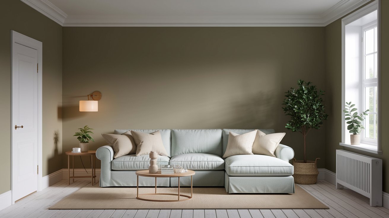
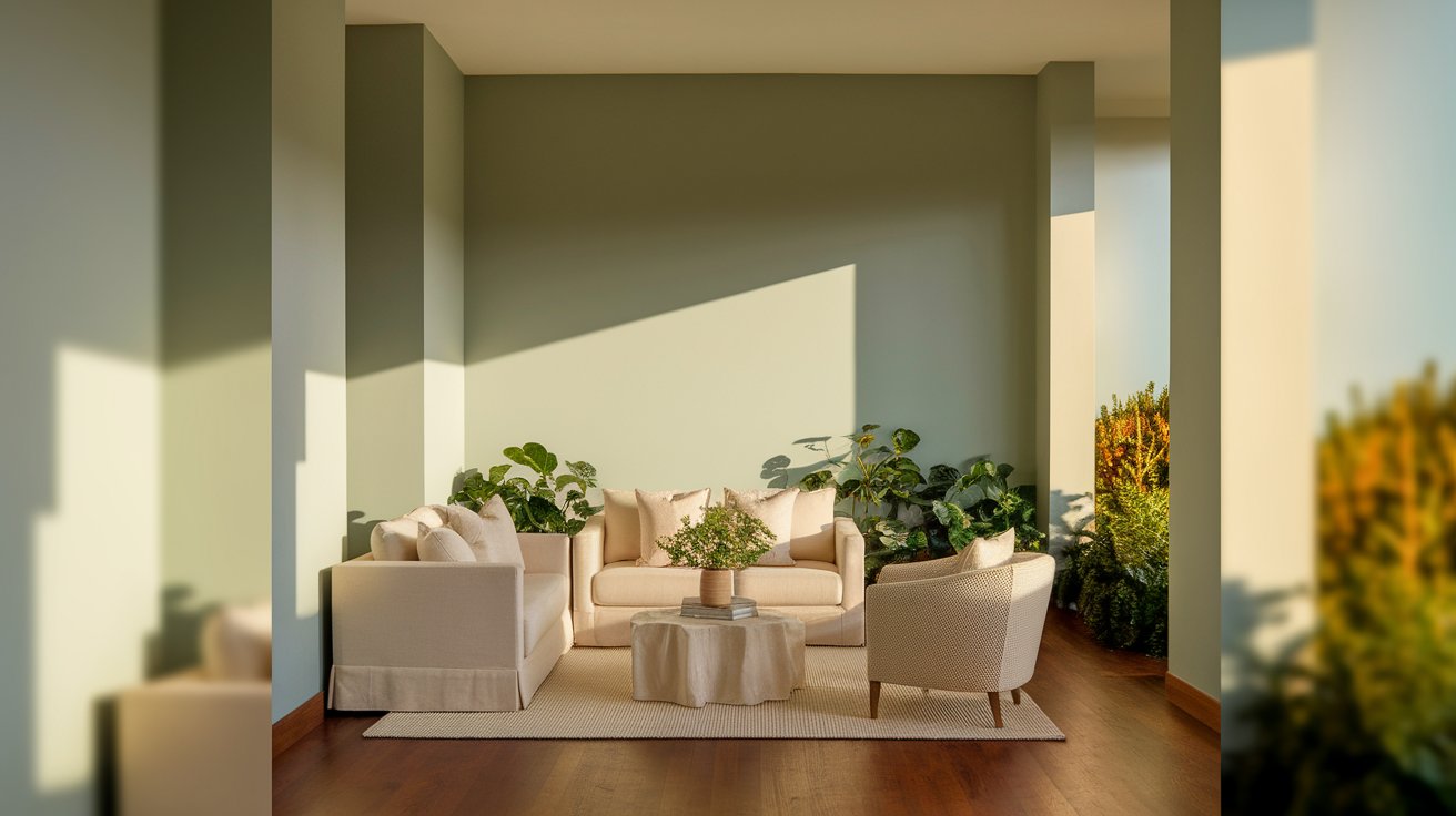
This sage green paint color has a muted, earthy look that feels peaceful and grounded. It’s become popular because it works well in modern farmhouse homes, traditional spaces, and even contemporary designs. Think of it as that perfect in-between color that brings nature indoors without feeling too colorful.
Specification | Details |
Color Number | HC-114 |
Collection | Benjamin Moore Historical Collection |
LRV | 45.46 |
Color Family | Gray-Green Sage |
Undertones | Green, gray, subtle warmth |
Best Finish | Eggshell or matte for walls |
Coordinating Whites | Simply White, White Dove, Chantilly Lace |
The LRV (Light Reflectance Value) of Saybrook Sage is 45.46. Don’t worry—this just means it reflects about 45% of the light that hits it.
Here’s why this matters: colors with mid-range LRVs like Saybrook Sage create spaces that feel calm and cozy without being too dark. They work well in most rooms because they’re balanced. The color won’t disappear like very light colors do, and it won’t make your room feel small like very dark colors can.
This LRV makes Saybrook Sage perfect for creating peaceful spaces that still feel grounded and real.
Understanding undertones is the most important part of choosing any paint color. The undertones of Saybrook Sage are what make it so special and versatile.
The main undertone is a muted, soft green. But here’s where it gets interesting—Saybrook Sage also has gray undertones that keep it from looking too bright or garden-like. In warm lighting, you might notice a tiny hint of yellow-beige that makes it feel cozy.
These Saybrook Sage undertones change throughout the day. In the morning, it might look more gray. By afternoon, the green comes forward. In the evening with warm lights on, it can feel softer and more neutral.
Don’t be surprised if the color looks different at the paint store than it does at home. This is totally normal with sage green colors. The undertones shift based on your lighting, your furniture, and even your flooring.
This is one of the most common questions people ask, and the answer is: Saybrook Sage is a warm-leaning neutral.
While it has gray in it (which usually feels cool), the green and subtle beige undertones give it warmth. It’s not a cold, stark color at all. Think of it as a cozy, muted green rather than a crisp, cool sage.
In north-facing rooms with cooler light, it can appear more neutral or slightly cool. But in most lighting situations—especially with warm bulbs or natural sunlight—it leans warm and inviting.
This makes it easier to decorate with than truly cool grays or greens. You can pair it with warm wood tones, brass fixtures, and cozy textiles without everything clashing. If you prefer cooler paint colors, you might want to explore ourBenjamin Moore Classic Gray review instead.
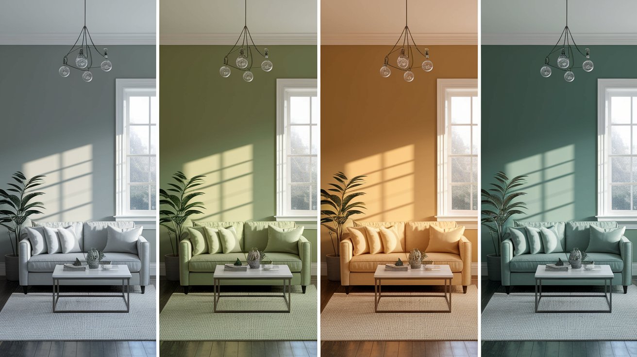
Light changes everything with paint colors. Here’s what to expect with Saybrook Sage in lighting situations:
North light is cooler and softer. In these rooms, Saybrook Sage will look more gray and muted. The green takes a back seat, and you’ll see more of the gray undertones. This can look really beautiful and sophisticated, but if you want it to feel warmer, add plenty of warm lighting.
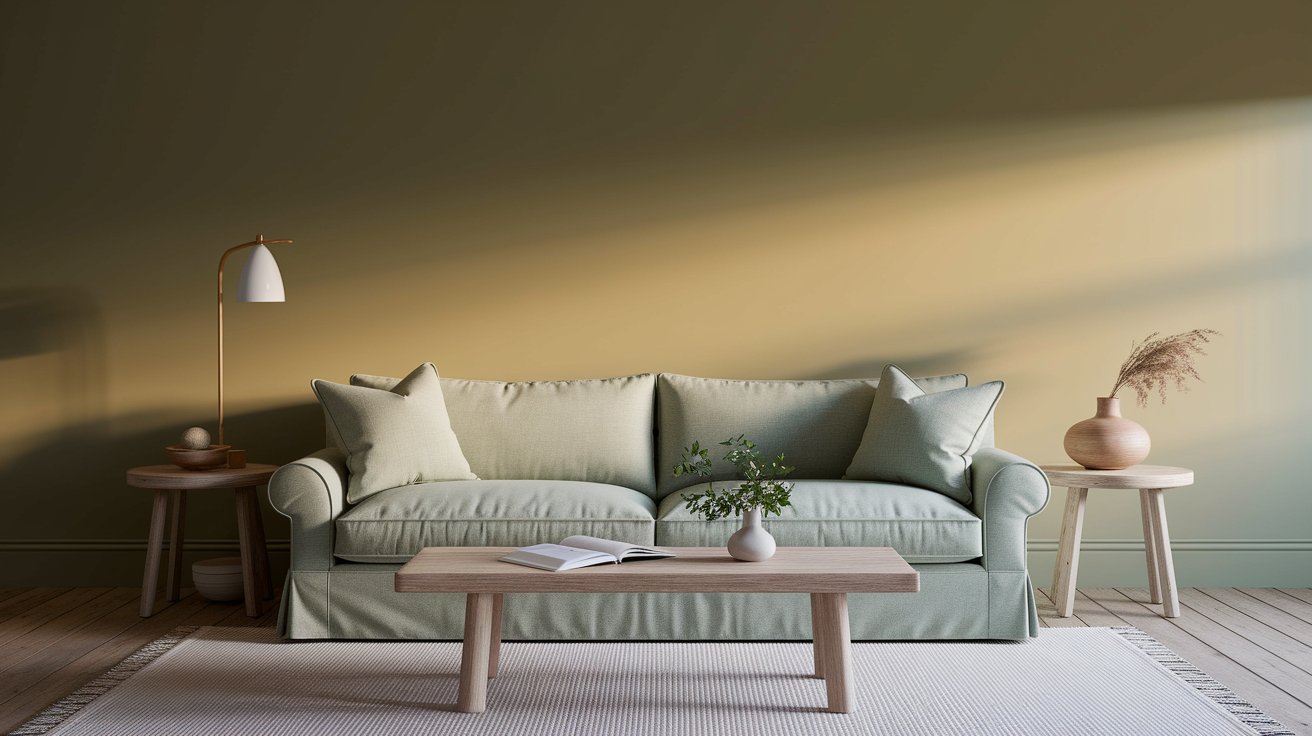
This is where Saybrook Sage really shines. South-facing rooms get warm, bright light all day. Here, the color looks warmer, greener, and more vibrant. The sage quality really comes through, making your space feel fresh and lively.
Morning light in east-facing rooms brings out a soft, warm green in Saybrook Sage. It looks gentle and welcoming. By afternoon, when the direct sunlight moves away, the color becomes more neutral and balanced.
West-facing rooms get beautiful golden light in the evening. Saybrook Sage looks richer and deeper during these hours. The color becomes more saturated and dramatic, which creates a cozy evening atmosphere.
Your light bulbs matter too. Warm white bulbs (2700K-3000K) will make Saybrook Sage feel cozier and bring out the subtle warmth. Cool white bulbs (4000K+) will emphasize the gray and make it feel more modern and crisp.
Saybrook Sage works beautifully in almost any room. Here’s how to use it in different spaces:
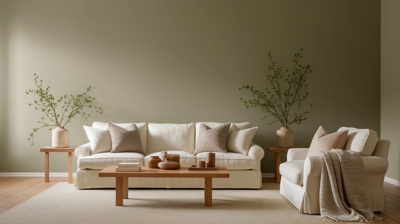
A Saybrook Sage living room feels calm and grounded. This color creates the perfect backdrop for family time and relaxation. It’s sophisticated enough for adult spaces but gentle enough to feel welcoming. Pair it with cream sofas, natural wood furniture, and warm textiles.
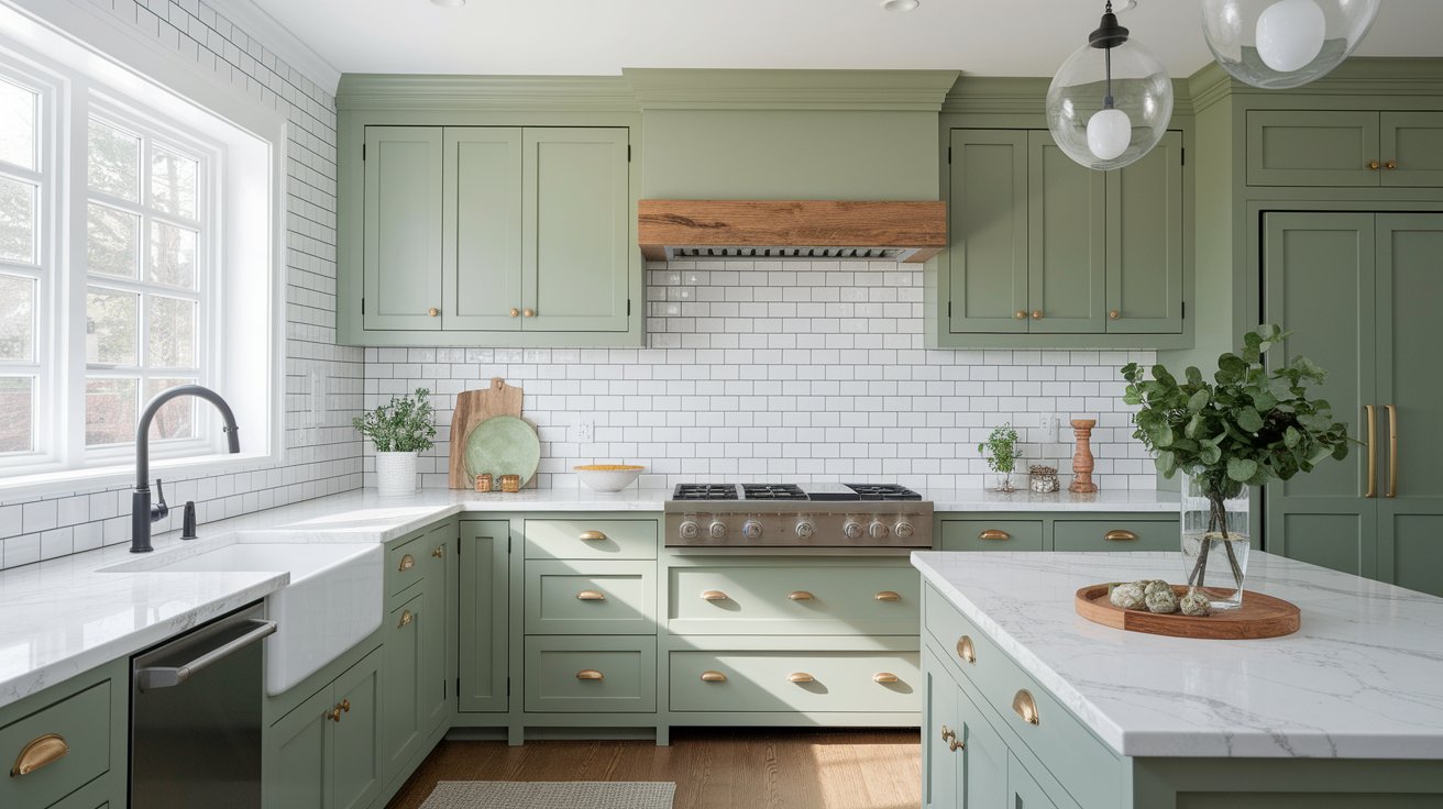
Saybrook Sage in kitchen cabinets is trending right now. The muted green looks stunning with brass hardware, marble countertops, and white subway tiles. It also works beautifully with matte black fixtures for a modern look. If you want to see more cabinet color ideas, check out our guide onBenjamin Moore Classic Gray for another versatile option.
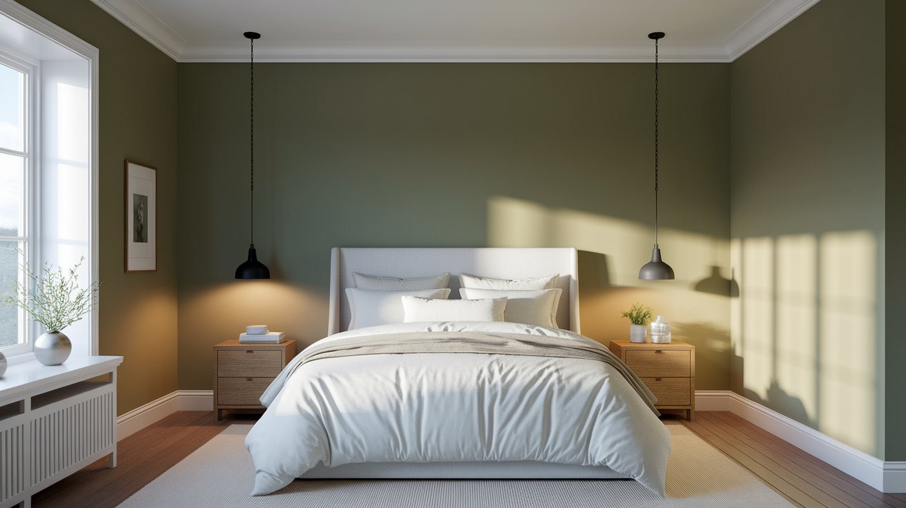
This color creates the perfect bedroom atmosphere. Saybrook Sage feels peaceful and restful—exactly what you want in a sleeping space. The muted green tones help your mind relax. Add white bedding, natural wood furniture, and soft lighting for a spa-like retreat.
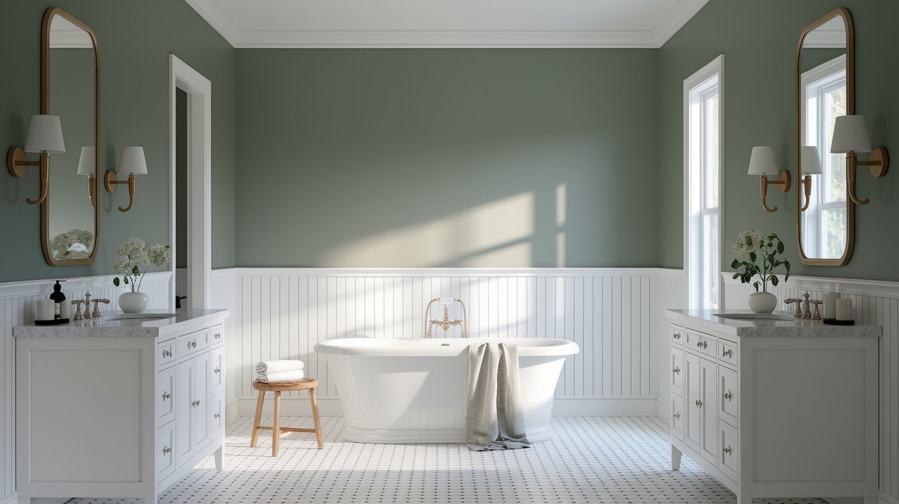
A Saybrook Sage bathroom feels like a spa. The color pairs beautifully with white fixtures, natural stone, and chrome or brass hardware. It works especially well in bathrooms with good natural light.
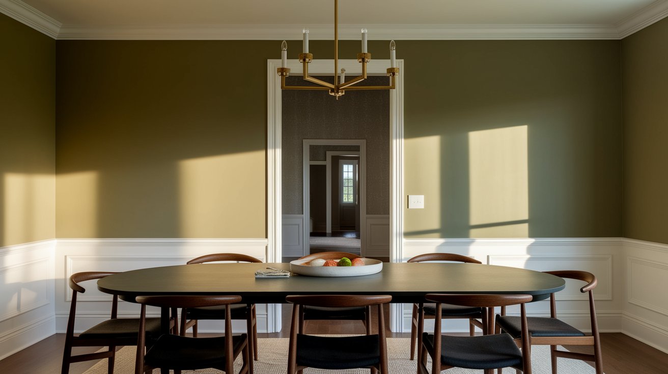
Dining rooms painted in Saybrook Sage look rich and classic. The color creates an elegant backdrop for dinner parties and family meals. It pairs beautifully with dark wood tables and traditional lighting.
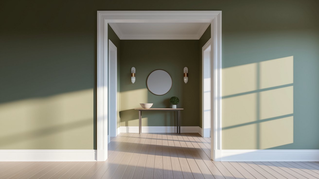
First impressions matter. Saybrook Sage in an entryway adds sophistication without making the space feel dark or closed in. It’s welcoming and sets a calm tone for the rest of your home.
Working in a Saybrook Sage home office can actually improve your focus. Green tones are known to be easy on the eyes and help with concentration. The muted quality keeps it from being distracting.
One reason people love Saybrook Sage is how well it works with other colors. Here are the best complementary colors for Saybrook Sage:
Your trim color choice makes a big difference. Cool white trims (like Benjamin Moore Simply White) create crisp, modern contrast. Warm white trims (like White Dove) feel softer and more traditional. Both work—it depends on the look you want. For more trim pairing ideas, ourBenjamin Moore Hale Navy article shows how trim colors change everything.
Want to add some personality? These accent colors look beautiful with Saybrook Sage:
Wondering how Saybrook Sage compares to other popular greens? Here’s the breakdown:
October Mist is lighter and cooler than Saybrook Sage. While Saybrook Sage has more visible green and warmth, October Mist leans heavily gray with just a whisper of green. If you want something more neutral and airy, October Mist might be better. For a full comparison, read our detailedOctober Mist review.
Quiet Moments is softer and more blue-gray than Saybrook Sage. It’s lighter overall and feels more spa-like and serene. Saybrook Sage has more personality and warmth, while Quiet Moments is more subtle and receding.
Salisbury Green is darker and more traditional than Saybrook Sage. It has stronger green tones and works well in formal spaces. Saybrook Sage is more versatile and modern, while Salisbury Green feels classic and rich. For a completely different deep tone option, consider our guide toBenjamin Moore Hale Navy.
Creating a beautiful space with Saybrook Sage inspiration is easy when you know what works:
Light neutral sofas and chairs work beautifully. Think cream, beige, soft gray, or even white. Natural wood pieces add warmth without competing with the wall color. Avoid furniture that’s too dark or it might make the room feel heavy.
Choose rugs in cream, beige, or soft patterns. Curtains in natural linen or light cotton work well. Throw pillows can include rust, cream, olive, or soft pink. The key is keeping things natural and not too busy.
Want it to feel warm? Add brass fixtures, warm wood tones, and soft yellow lighting.
Want it modern? Use black accents, clean lines, and cool white trim.
Want it classic? Choose rich wood furniture, traditional lighting, and layered textiles.
Is Saybrook Sage a good color for your home? Let’s be honest about both sides:
The finish you choose affects how the color looks. Here’s the best finish for Saybrook Sage in different situations:
Eggshell or Matte: These finishes look most natural on walls. Eggshell is slightly easier to clean, while matte gives the most true-to-sample color.
Satin or Semi-Gloss: These finishes stand up to wear and are easy to clean. Semi-gloss reflects more light and creates more contrast with the walls.
Satin: This finish is durable enough for kitchen use but doesn’t look too shiny. It’s easy to wipe clean and shows the color beautifully.
Pearl or Satin: Both resist moisture well. Pearl adds a subtle glow, while satin is more understated.
These tips for choosing Saybrook Sage will save you from costly mistakes:
Saybrook Sage HC-114 deserves its popularity. This is one of the best sage green paint colors from Benjamin Moore for good reason. It’s balanced, versatile, and timeless.
If you want a color that feels fresh but not trendy, calm but not boring, and sophisticated but not stuffy—Saybrook Sage checks all the boxes. It works in multiple rooms, pairs well with most decor styles, and creates spaces that feel both peaceful and grounded.
Just remember to test it in your specific lighting and make sure you have enough natural or warm artificial light to bring out its beautiful qualities.
Yes. Saybrook Sage holds up well outdoors, resists fading, and pairs beautifully with stone, white brick, and wood. It’s especially great for farmhouse-style homes.
Absolutely. The muted green creates a striking yet balanced contrast with black windows, working well in both modern exteriors and interiors.
No. Its gray undertones keep it soft and neutral, making it ideal for minimalist spaces without feeling bold or overwhelming.
Yes. It looks elegant on trim or doors, especially for a monochromatic or modern look. It also works beautifully on front doors.
It’s renter-friendly. The muted tone adds character without being too bold and is easy to repaint if needed.
Daniel Hartman is a color specialist with years of experience helping people make confident and thoughtful design decisions. He provides practical and approachable guidance while balancing creativity and functionality in every project. Daniel enjoys visiting art and design exhibits to study how different environments influence aesthetics, mood, and perception, bringing a rich perspective and insight into his work. His approach makes design decisions both simple and enjoyable.


No Comments