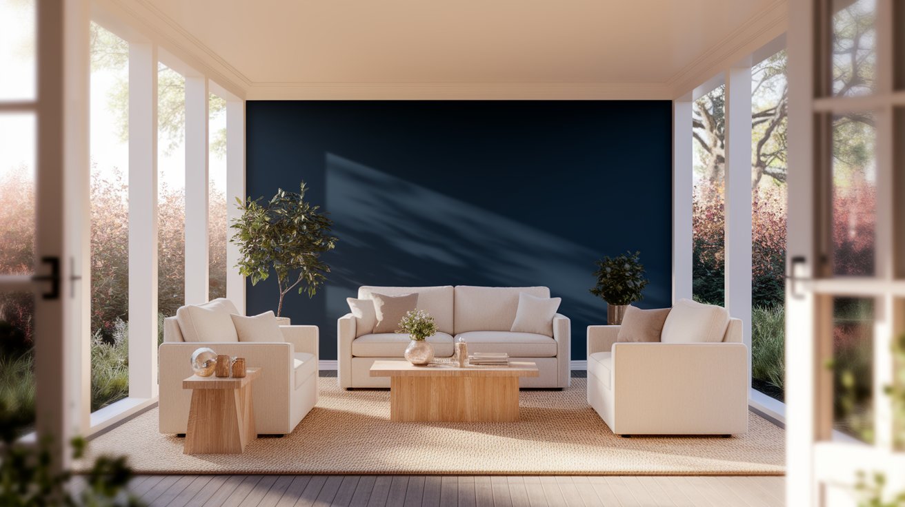
If you’re looking for a paint color that never goes out of style, Benjamin Moore Hale Navy (HC-154) might be exactly what you need. This beautiful blue works in almost any room and matches many different styles. Whether you want to paint your living room walls or kitchen cabinets, Hale Navy brings a calm, classic look that people love.
This navy blue comes from Benjamin Moore’s Historical Colors collection. That means it’s been around for years and has stood the test of time. According to Benjamin Moore’s recent reports, Hale Navy remains one of their top 10 most requested deep blues year after year.
In this guide, you’ll learn about its hidden color tones, what colors look great with it, how real people use it in their homes, and helpful tips to make it work in your space.
Pro Tip from Interior Designer Maria Chen: “Hale Navy is my go-to recommendation for clients who want drama without commitment issues. Unlike trendier colors, this navy has been beautiful for decades and will still look amazing in ten years. I always tell homeowners: if you’re going to invest in painting one room dark, make it this one.”
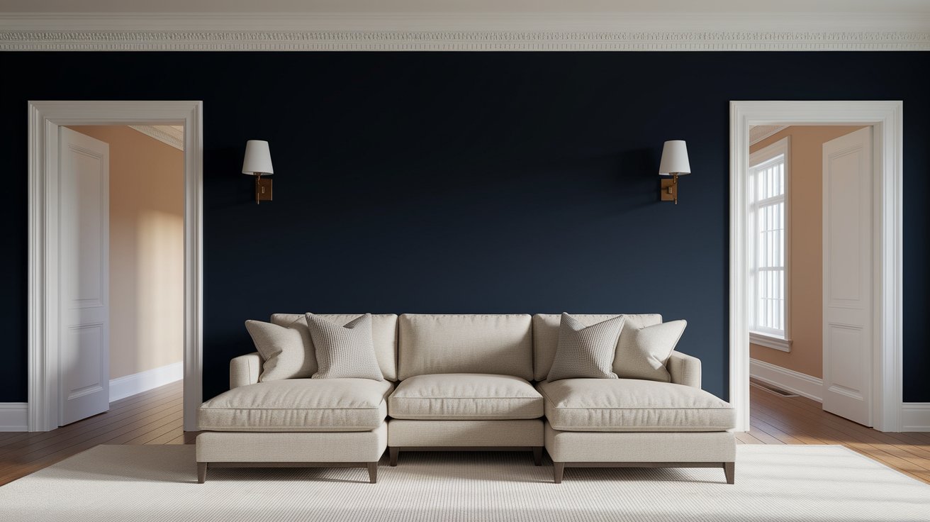
Hale Navy HC-154 is a deep, rich blue from Benjamin Moore. Here’s everything you need to know at a glance:
Attribute | Details |
Brand | Benjamin Moore |
Color Code | HC-154 |
Collection | Historical Colors |
LRV | 8.3 |
Undertones | Gray, Green |
Best Rooms | Living Rooms, Kitchens, Cabinets, Exteriors |
Finish Options | Eggshell, Satin, Semi-Gloss |
The LRV number tells you how much light the color reflects. Since Hale Navy has an LRV of 8.3, it absorbs most light and appears quite dark. This makes rooms feel cozy and dramatic. You can use it on walls with any finish, though many people choose eggshell or satin. For cabinets, a satin or semi-gloss finish works best because it’s easier to clean.
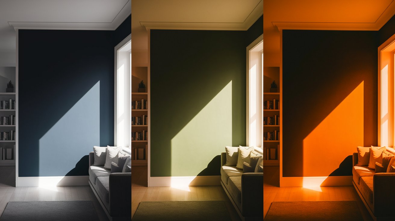
The Hale Navy undertones make this color special. Unlike some navy blues that look purple or too bright, Hale Navy has gentle gray and green undertones. These undertones keep it from feeling too bold or overwhelming.
Think of Hale Navy as a stormy evening sky—deep, grounded, and calm rather than flashy or royal.
How your room’s lighting affects this color:
North-facing rooms: The color looks cooler and slightly darker. The gray undertones show up more.
South-facing rooms: Natural sunlight brings out a warmer, slightly softer blue. You might notice tiny hints of green.
Evening with artificial light: Under warm light bulbs, Hale Navy feels richer and more welcoming. Under cool LED lights, it stays true to its navy tone.
Here’s a helpful tip: Get a large sample board and paint it with Hale Navy. Look at it in your room during morning, afternoon, and evening. This helps you see how it will really look on your walls.
The best part about these undertones? They make Hale Navy reliable. It won’t suddenly look purple or too green like some other navy paints might.
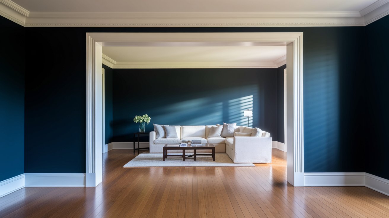
Hale Navy color pairings give you endless options. Let’s look at what works best.
White trim makes Hale Navy pop beautifully. Two favorites are:
Simply White: This clean, crisp white creates strong contrast without feeling too harsh.
White Dove: A softer white with warm undertones that feels gentler next to the deep blue.
For a softer look, try these neutrals:
Pale Oak: A warm, gentle beige that balances Hale Navy’s coolness.
Classic Gray: A perfect light gray that creates a modern, flowing feel between rooms.
Revere Pewter: This popular greige adds warmth without competing with the navy’s depth.
Want to make Hale Navy feel cozy? Add warm colors:
These warm touches balance the cool navy and make your space feel inviting.
For a sleek, contemporary look:
Feeling brave? Hale Navy loves bold friends:
The trick is using these bold colors in small amounts. Let Hale Navy be the star, and add bright colors as fun surprises.
Here are three foolproof Hale Navy color palette combinations that designers love:
Classic Elegance: Hale Navy + Simply White + Brass hardware Perfect for traditional homes and kitchens with timeless appeal.
Warm Coastal: Hale Navy + Sea Salt + Natural Wood accents Brings the ocean indoors with a relaxed, beachy vibe.
Modern Chic: Hale Navy + Gray Owl + Polished Nickel fixtures Clean lines and contemporary style for updated spaces.
Benjamin Moore Hale Navy ideas work in almost every room. Here’s where it shines.

Full room: Painting all walls in a room with Hale Navy creates a cozy, wrapped feeling. This works great in bedrooms, dining rooms, and home offices.
Single accent wall: Not ready for a full room? Try one wall behind your bed or sofa. This gives you the drama without making the room feel smaller.
Tips for success:
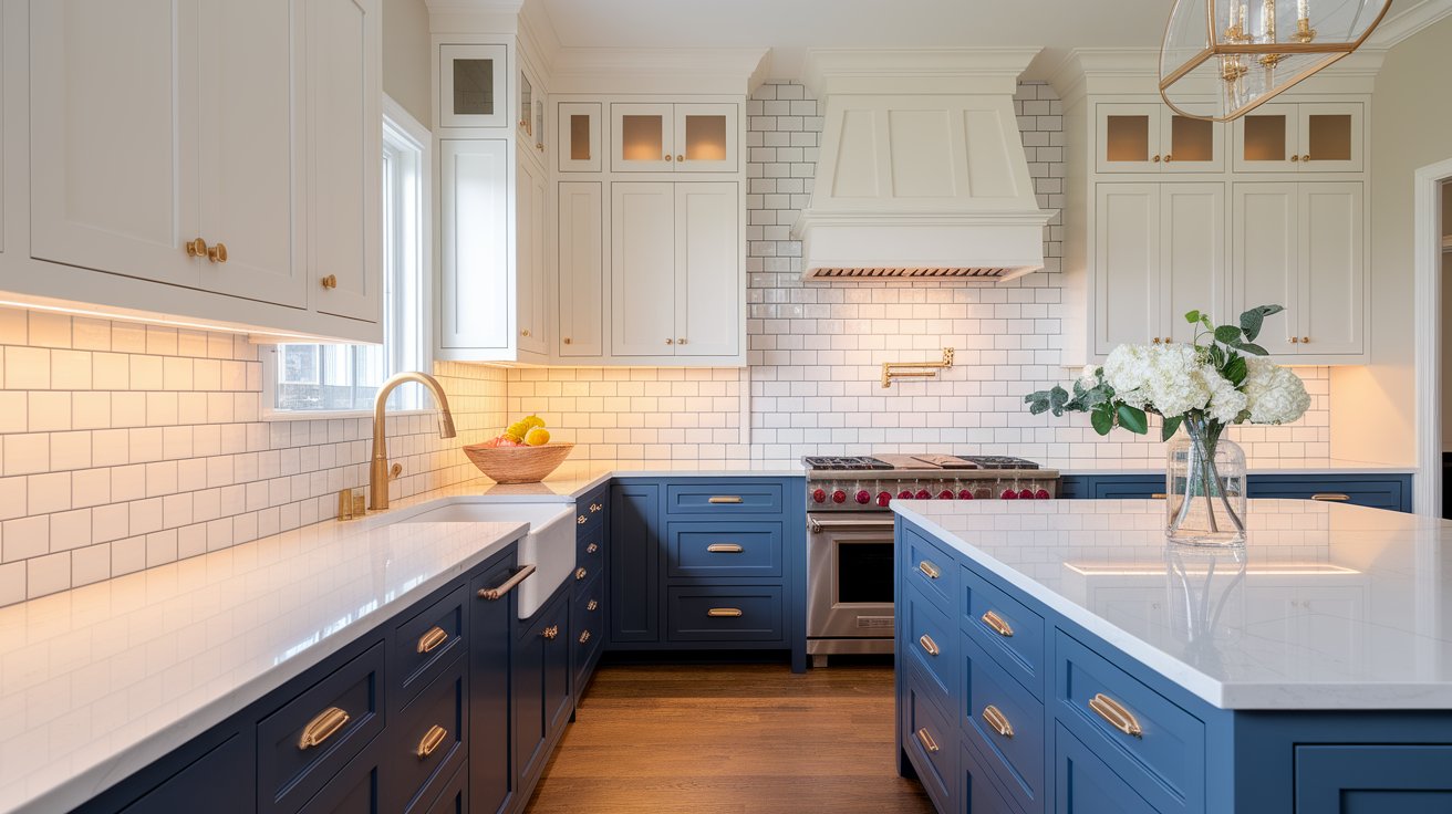
Hale Navy cabinets have become super popular. Here’s why:
The deep blue adds personality without being too trendy. It looks expensive and custom. Plus, it doesn’t show fingerprints and smudges as much as lighter colors.
What works with navy cabinets:
Just painting your kitchen island in Hale Navy while keeping other cabinets white is a popular choice. This gives you that wow factor without overwhelming your kitchen.

Small bathrooms can handle dark colors better than you think. Benjamin Moore Hale Navy makes even tiny powder rooms feel special and dramatic.
For bathroom vanities, Hale Navy looks rich and spa-like. Pair it with:
The dark vanity becomes a beautiful focal point while white surfaces keep things bright.
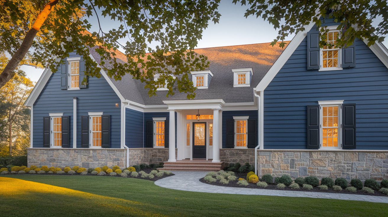
A Hale Navy front door gives instant curb appeal. It’s welcoming without being boring. The color works with:
For full exterior use, Hale Navy looks stunning on shutters, siding, or as an accent color. Just make sure your home gets enough sunlight, as very dark colors can show dirt and fading over time.
Here’s how real homeowners are using this versatile color:
Modern Coastal Living Room: Hale Navy on all four walls with white shiplap ceiling, natural jute rug, and cream sofa. The deep walls make the bright accents pop while keeping the space grounded.
Traditional Kitchen: Navy perimeter cabinets with white island, brass hardware, and marble countertops. The two-tone approach feels both classic and current.
Contemporary Bedroom: Single Hale Navy accent wall behind the bed, paired with light gray on remaining walls. Minimal decor lets the color make the statement.
Farmhouse Bathroom: Hale Navy vanity with white subway tile, matte black fixtures, and wood-framed mirror. The mix of finishes creates that perfect farmhouse-modern blend.
Hale Navy in different styles shows how flexible this color really is.
Coastal Style: Hale Navy brings the deep ocean indoors. Pair it with sandy beiges, crisp whites, and natural rope or jute textures. Add some coral or sea glass green for a fresh coastal vibe.
Traditional Style: This navy works beautifully in classic homes. Use it with rich woods, gold accents, and cream colors. It adds depth while keeping that timeless elegance. If you’re working with other traditional colors, check out how Benjamin Moore’s neutral palette creates cohesive spaces.
Modern Farmhouse: Combine Hale Navy with shiplap, white cabinets, and black hardware. The mix of rustic and refined creates that popular farmhouse look everyone loves.
Contemporary Style: For modern spaces, pair Hale Navy with clean lines, minimal decor, and metallic accents. Gray floors and white walls let the navy make a bold statement.
Eclectic Style: Mix Hale Navy with colorful artwork, vintage pieces, and patterns. The steady blue grounds all your fun, collected items.
Wondering about Hale Navy vs other popular blues? Here’s how it compares.
Paint Color | Brand | LRV | Undertone | Tone | Best For |
Hale Navy | Benjamin Moore | 8.3 | Gray-Green | Cool | Cabinets, Walls, Doors |
Naval | Sherwin-Williams | 4 | Green | Warm | Exteriors, Bold Spaces |
Van Deusen Blue | Benjamin Moore | 12 | Green | Cool-Warm | Brighter Rooms |
Gentleman’s Gray | Benjamin Moore | 10 | Blue-Gray | Neutral | Accent Walls |
Sherwin-Williams Naval: Very similar depth but slightly warmer. Naval has more green undertones while Hale Navy leans cooler.
Benjamin Moore Van Deusen Blue: A bit brighter with an LRV around 12. It has stronger green undertones and feels slightly lighter.
Benjamin Moore Newburyport Blue: Deeper and darker with an LRV around 6. This one feels almost black in low light.
Benjamin Moore Gentleman’s Gray: Actually a very dark blue (not gray!). Similar depth but cooler undertones than Hale Navy.
Most people choose Hale Navy because it hits the sweet spot: dark enough to be dramatic but not so dark that it feels heavy. The balanced undertones work in more lighting situations than similar colors.
Before you commit to Hale Navy, follow this quick checklist:
✅ Test in natural & artificial light – View samples morning, noon, and night
✅ Compare with your trim whites – Hold swatches next to existing trim
✅ Prime with gray base – Use tinted primer for better coverage
✅ Use large sample boards – Paint poster boards, not just tiny swatches
✅ Check in different rooms – Light changes throughout your home
✅ Consider your furniture – Make sure your existing pieces work with navy
Hale Navy paint tips to help you succeed:
Always test first: Buy a sample can and paint a large poster board. Move it around your room and look at it for several days.
Use good primer: Dark colors need proper primer, especially over lighter paint. Use a gray-tinted primer for best coverage.
Choose the right finish:
Plan your trim: White trim looks crisp and classic with Hale Navy. Paint trim first, then cut in the navy carefully.
Two coats minimum: Dark colors usually need two coats for even coverage. Don’t try to save time with just one thick coat.
Keep touch-up paint: Dark colors can show scuffs. Save some paint for easy touch-ups.
Few guides cover this, but Hale Navy finish durability matters for long-term satisfaction.
Touch-Up Tips: Dark paints show touch-ups more than light colors. Always feather edges when touching up spots. Keep your original paint can stored properly (sealed tight, room temperature) for future needs.
Cleaning Hale Navy Cabinets: Use a soft cloth with mild soap and water. Avoid harsh cleaners that can dull the finish. Wipe spills immediately to prevent water marks. For satin or semi-gloss finishes, a slightly damp microfiber cloth works perfectly.
Preventing Outdoor Fading: If using Hale Navy on exteriors, choose Benjamin Moore’s exterior line with UV protection. South and west-facing surfaces fade faster. Clean annually to remove dirt buildup. Consider repainting every 7-10 years depending on sun exposure.
Scuff Protection: High-traffic areas (hallways, kitchens) benefit from satin or semi-gloss finishes. These wipe clean more easily than flat finishes. Keep a small touch-up brush and leftover paint handy for quick fixes.
Benjamin Moore Hale Navy has earned its place as a favorite for good reason. This color brings depth and sophistication to any space without feeling too trendy or risky. The balanced undertones mean it works in different lighting, and it pairs well with so many other colors and styles.
Whether you’re painting one accent wall or doing a whole kitchen makeover, Hale Navy gives you that designer look that lasts. It makes rooms feel intentional and pulled together.
Quick Summary Box: Hale Navy (HC-154) features cool gray-green undertones that stay true in most lighting conditions. It pairs beautifully with crisp whites like Simply White, warm neutrals, and both brass and chrome finishes. Best uses include kitchen cabinets, bedroom accent walls, bathroom vanities, and front doors. With an LRV of 8.3, it creates drama while remaining surprisingly versatile across coastal, traditional, and modern design styles.
Thinking of trying Hale Navy? Order a sample or test it in your space—you’ll see why it’s been a designer favorite for over a decade. The color’s timeless appeal means you can enjoy it for years without worrying about it looking dated.
For more paint color inspiration, check out Benjamin Moore’s official color collections and explore how different colors work together in real homes.
Final Thoughts: Is Hale Navy Right for You?
After exploring everything about Benjamin Moore Hale Navy, you can see why this color has remained a favorite for so many years. It’s not just another trendy paint choice—it’s a thoughtful, versatile color that works hard in any space you choose.
The beauty of Hale Navy lies in its balance. It’s dark enough to create drama and depth, but those subtle gray-green undertones keep it from feeling too heavy or overwhelming. Whether you’re painting a cozy bedroom, upgrading your kitchen cabinets, or giving your front door a fresh look, this navy adapts to your style and lighting.
What makes Hale Navy special is how it grows with you. Unlike colors that feel exciting for a year and then dated, this classic blue remains beautiful through changing trends and evolving tastes. It pairs effortlessly with everything from warm brass hardware to cool chrome fixtures, from crisp whites to earthy wood tones.
If you’re still unsure, remember that testing is key. Grab a sample, paint a large board, and live with it for a few days. Watch how it changes in morning light, afternoon sun, and evening lamplight. You’ll quickly see whether Hale Navy feels right for your space.
The investment in quality paint and proper preparation pays off with Hale Navy. When applied correctly with good primer and the right finish, this color delivers that rich, sophisticated look that makes people stop and ask, “What color is that?”
Ready to transform your space? Start with one room or even just an accent wall. You might find that Hale Navy becomes your new favorite color—and you’ll understand why designers and homeowners have trusted it for decades.
Is Hale Navy too dark for a small or north-facing room?
Not necessarily! Small rooms can handle dark colors when you balance them right. Use plenty of white trim, add light-colored furniture, and make sure you have good lighting. Table lamps, floor lamps, and overhead lights help a lot. In north-facing rooms, expect Hale Navy to look a bit cooler and richer. This can actually make the space feel cozy rather than dark. Try it on just one accent wall first if you’re nervous.
What trim and ceiling colors work best with Hale Navy?
For trim, crisp white creates beautiful contrast. Simply White or Decorator’s White from Benjamin Moore both work perfectly. Some people prefer a softer look with Cloud White or White Dove. For ceilings, most designers recommend keeping them white to reflect light. If your ceilings are very high, you could try a light gray, but white is usually the safest choice. Avoid mid-tone trim colors as they can make the navy look muddy.
Can I use Hale Navy on the outside of my house?
Yes! Hale Navy works beautifully on exterior siding, shutters, and front doors. It looks especially good on wood siding, brick homes, and stone exteriors. Keep these things in mind: dark colors can fade faster in strong sun, so choose quality exterior paint. They also show dirt more easily, so plan for occasional cleaning. Make sure your home has white or light-colored trim to create contrast. Outdoor lighting is important too since the color will look very dark at night.
What cabinet hardware looks best with Hale Navy?
Cabinet hardware can totally change the feel of Hale Navy cabinets. Brass and gold hardware creates a warm, rich look that’s very popular right now. It softens the cool blue and adds elegance. Matte black hardware gives a modern, dramatic feel and makes the navy look even deeper. Chrome or polished nickel creates a clean, classic look that works well in traditional kitchens. Brushed nickel is another safe choice that goes with almost any style. Try getting a few samples to hold against your cabinet doors before deciding.
Does Hale Navy stay popular over time?
Hale Navy is considered a classic rather than a trend. It’s been a popular choice for many years and shows no signs of going away. Unlike some trendy colors that date your home, navy blue has staying power. For resale value, it’s generally safe because it appeals to many buyers. Navy is seen as sophisticated and intentional, not too personal or bold. That said, if you’re painting right before selling, neutral grays and whites are still the safest bet. For your own enjoyment, Hale Navy is a color you can live with happily for years.
Is Hale Navy good for rental properties?
For rental properties, Hale Navy can work but think carefully about your renters. It’s more personality than standard white or beige, which some landlords prefer. However, an accent wall in Hale Navy or a navy front door can make your rental stand out in listings without being too bold. Navy cabinets might appeal to renters looking for upgraded spaces. The color photographs well, which helps in online listings. If you’re unsure, use Hale Navy in small doses like a bathroom vanity or one feature wall rather than painting entire rooms.
What undertones does Hale Navy show next to black or charcoal gray?
When placed next to true black or dark charcoal gray, Hale Navy’s blue tones become more obvious. The gray-green undertones look slightly warmer in comparison. This makes it perfect for creating depth without being too matchy. If you’re doing a dark, moody room, Hale Navy walls with matte black trim or charcoal accents creates beautiful layering. The key is making sure you have enough light sources so the colors don’t blend together.
Is Hale Navy good for two-tone kitchen cabinets?
Absolutely! Hale Navy is one of the best colors for two-tone kitchens. The most popular combination is Hale Navy on lower cabinets with white uppers. This grounds the kitchen while keeping it bright. You can also do Hale Navy on the island with white or light gray perimeter cabinets. Make sure your hardware matches across both colors for a cohesive look. Brass or gold hardware ties everything together beautifully in two-tone designs.
How does Hale Navy compare to Farrow & Ball Hague Blue?
Farrow & Ball Hague Blue is slightly lighter (LRV around 10) and has more green undertones than Hale Navy. Hague Blue can shift between blue and green depending on light, while Hale Navy stays more consistently navy. Hague Blue has that signature Farrow & Ball depth and richness, but comes at a much higher price point. If you love the look of Hague Blue but want better value, Hale Navy is an excellent alternative that behaves more predictably in different lighting.
Daniel Hartman is a color specialist with years of experience helping people make confident and thoughtful design decisions. He provides practical and approachable guidance while balancing creativity and functionality in every project. Daniel enjoys visiting art and design exhibits to study how different environments influence aesthetics, mood, and perception, bringing a rich perspective and insight into his work. His approach makes design decisions both simple and enjoyable.
At Cozy Home Touch, we specialize in transforming your living spaces into cozy, stylish retreats. Whether you’re looking to refresh a single room or undertake a complete home makeover, our expert team is here to bring your vision to life.
Copyright © 2025 Cozy Home Touch.
[…] Looking for a beautiful dark color to pair with Natural Cream? Our detailed review of Benjamin Moore… […]