


Choosing the right interior house colors can feel overwhelming when you’re standing in a paint store surrounded by hundreds of options. You stare at endless paint chips, wondering which shades will transform your space, boost your home’s value, and create the mood you want in every room. Will that beautiful blue turn out too dark? Will the warm white feel too yellow?
You’re not alone in this struggle. Picking the perfect interior house colors is one of the biggest challenges homeowners face during renovation projects. But here’s the good news: with the right approach, you can confidently choose colors that make your home feel beautiful, comfortable, and uniquely yours.
In this guide, you’ll learn simple steps to pick paint colors like a professional, discover the best shades for each room, explore complete color schemes, and avoid expensive mistakes that lead to regret.
Before you grab a paintbrush, let’s cover three important basics that will save you time and money.
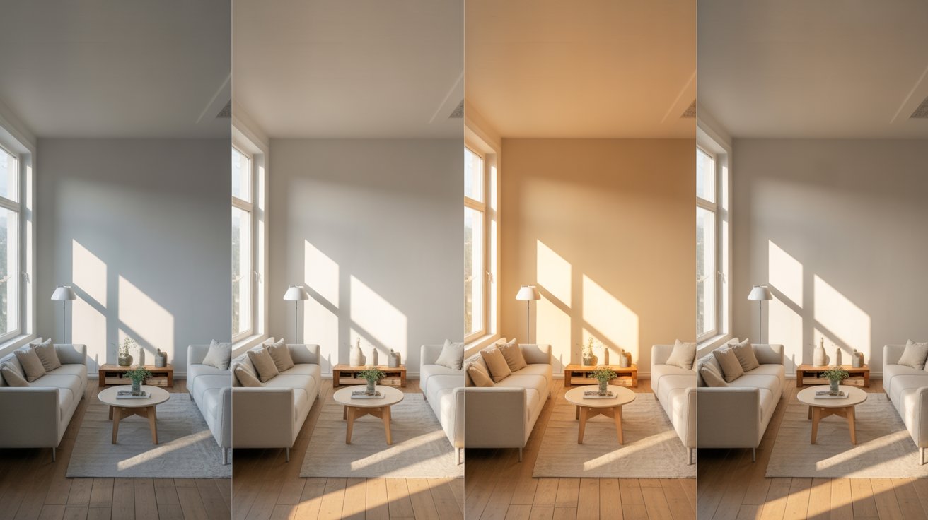
Light plays a huge role in how colors look on your walls. The same paint can appear completely different depending on your lighting.
Natural light from windows changes throughout the day. Morning light tends to be cooler and softer. Afternoon sun brings warm, bright light. Evening light turns golden.
The direction your windows face matters too. North-facing rooms get cooler, softer light all day. South-facing rooms stay bright and warm. East-facing rooms are brightest in the morning. West-facing rooms glow in the afternoon and evening.
Your light bulbs also change how colors look. Warm bulbs make colors appear more yellow or orange. Cool bulbs bring out blue and gray tones.
Every color has an undertone. This is the hidden color beneath the surface that affects how a paint looks in your space.
Undertones fall into three categories:
Your floors, furniture, and existing features have undertones too. When everything works together, your room feels harmonious. When undertones clash, something feels “off” even if you can’t explain why.
A simple trick: place your paint sample next to your flooring or furniture. Do they look good together? If not, they probably have different undertones.
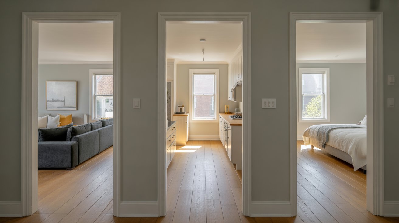
Your home should feel connected, not like a patchwork quilt of random colors. This doesn’t mean every room needs the same color, but they should relate to each other.
Think of your whole house as one big space. Pick a main color palette of three to five colors. Use different shades and combinations in each room, but stick to your core colors.
For example, if your living room is light gray, your kitchen could be a slightly warmer gray or a soft white. Your bedroom might use the same gray with different accent colors.
Follow these five steps to pick colors you’ll love for years.
Start with the elements already in your home. Your hardwood floors, tile backsplash, granite counters, or brick fireplace aren’t going anywhere. These are your starting point.
Take photos of these fixed elements. Bring these photos when you shop for paint. Your wall colors need to work with these pieces.
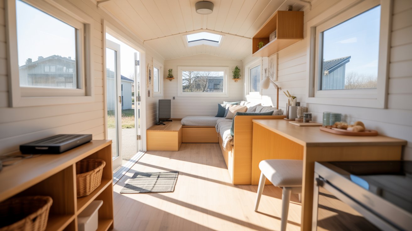
Choose one main neutral color for most of your walls. This becomes your home’s foundation. Popular choices include soft whites, warm beiges, light grays, and greiges (a mix of gray and beige).
This neutral should work in most rooms. It creates that important flow we talked about earlier.
Now pick one or two supporting colors. These can be slightly different neutrals or soft accent colors. You might use these in bedrooms, bathrooms, or one accent wall.
Supporting colors should complement your main neutral without fighting for attention.
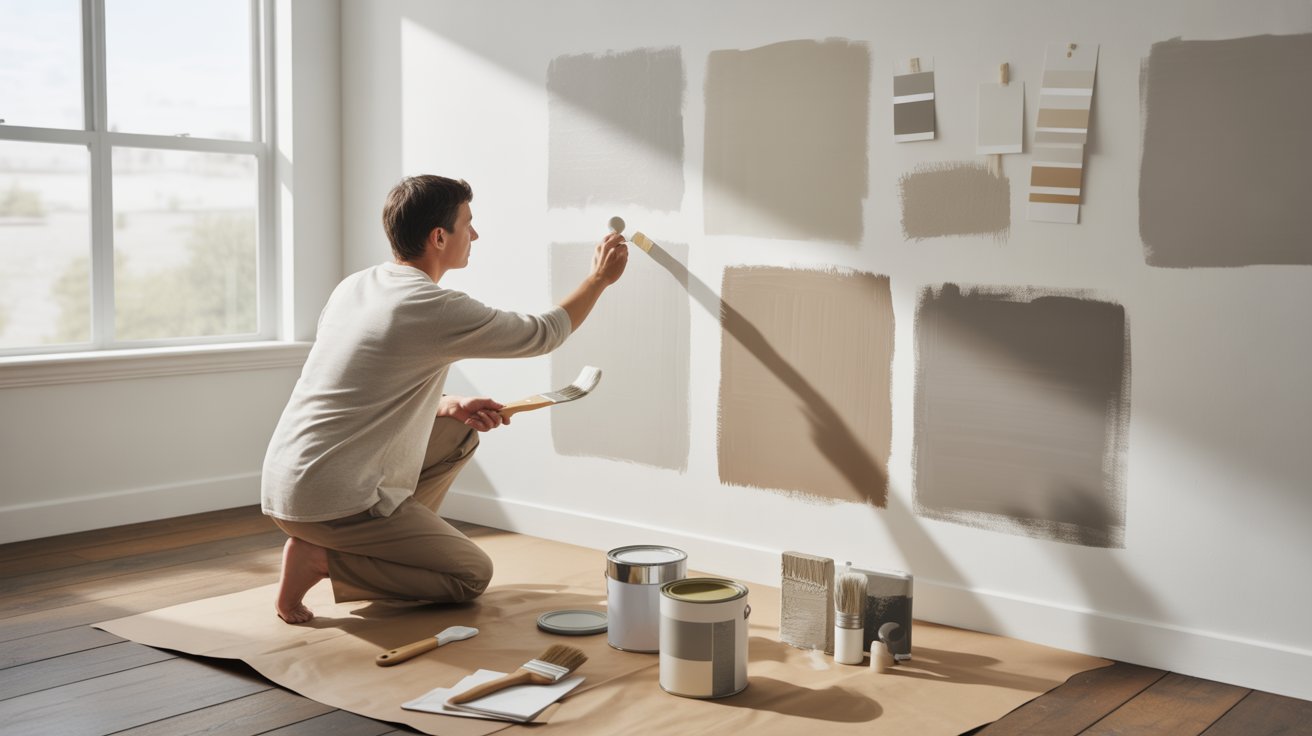
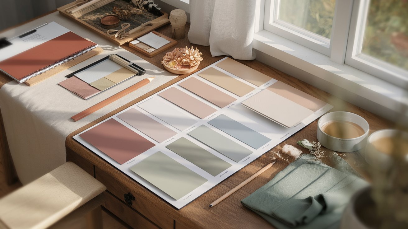
Never pick a color from a tiny paint chip alone. Buy sample pots and paint large squares on your walls. Paint samples on all walls in the room, not just one.
Live with these samples for a few days. Look at them in morning light, afternoon sun, and evening lamplight. You’ll be surprised how different they can look.
This step is so important we’re saying it twice. Set reminders on your phone to look at your samples throughout the day. That gorgeous blue might turn purple at night. That warm white might look yellow in afternoon sun.
Different rooms have different needs. Let’s break down the best color choices room by room.
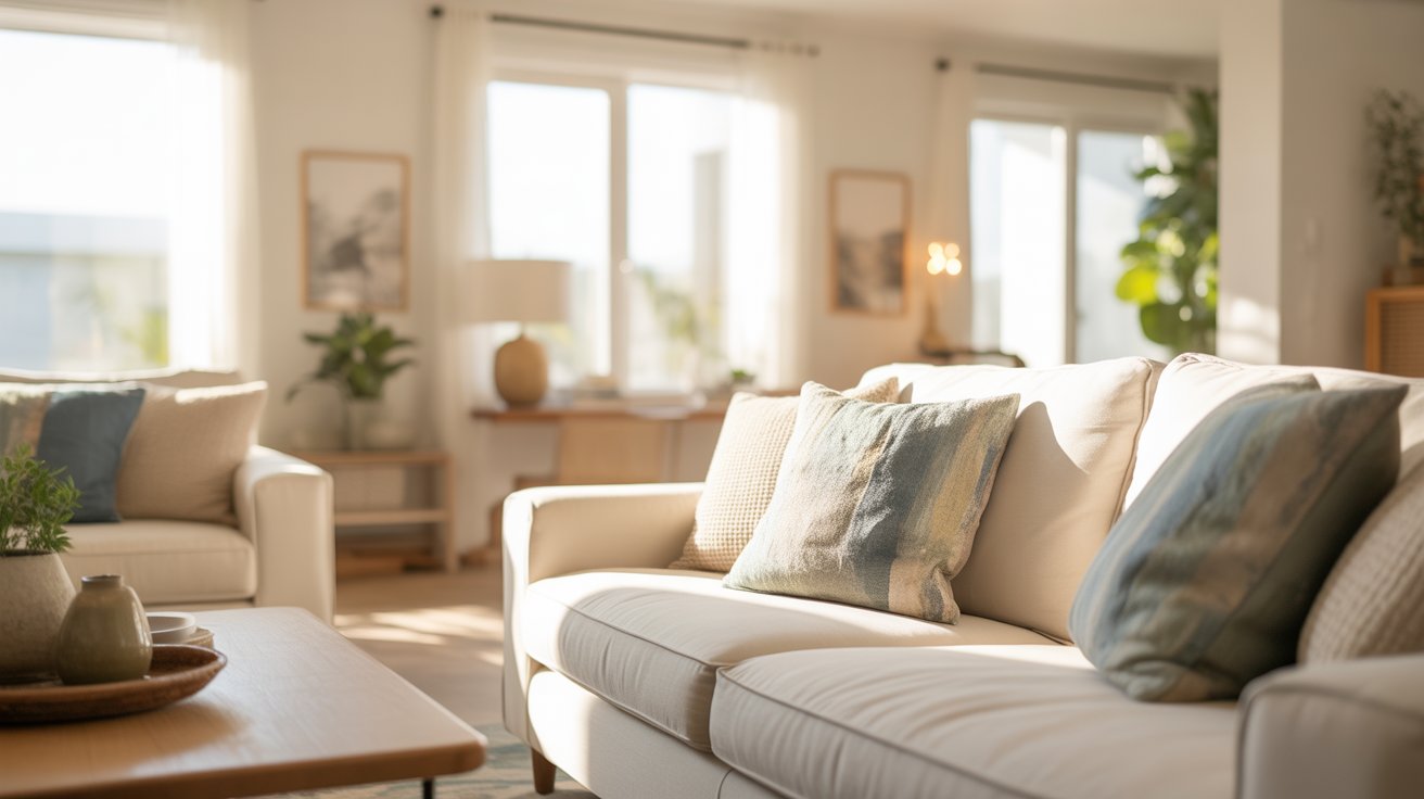
Your living room is where you relax and entertain guests. Colors here should feel welcoming and comfortable.
Popular neutral choices:
For a cozy atmosphere, lean toward warmer tones like beige, tan, or warm gray. For a modern feel, try cooler grays or crisp whites.
Consider an accent wall if you want more color. A deeper shade on one wall adds interest without overwhelming the space. This works great behind a TV, fireplace, or sofa.
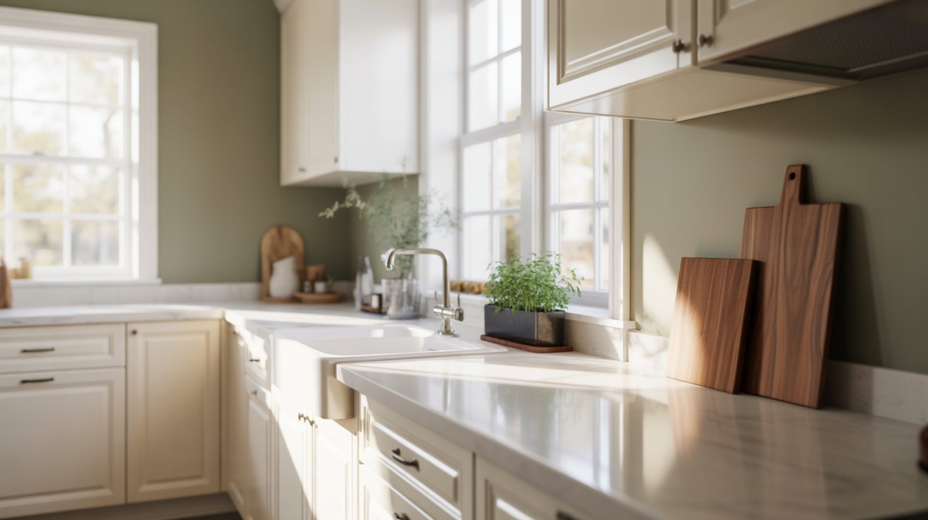
Kitchens work best with colors that feel clean and fresh. Most people choose lighter shades because kitchens can feel closed in with upper cabinets and appliances taking up wall space.
Top kitchen colors:
Think about your cabinets when choosing wall colors. White walls with white cabinets can look amazing with the right hardware and countertops. If your cabinets are wood or colored, pick a wall color that complements them.
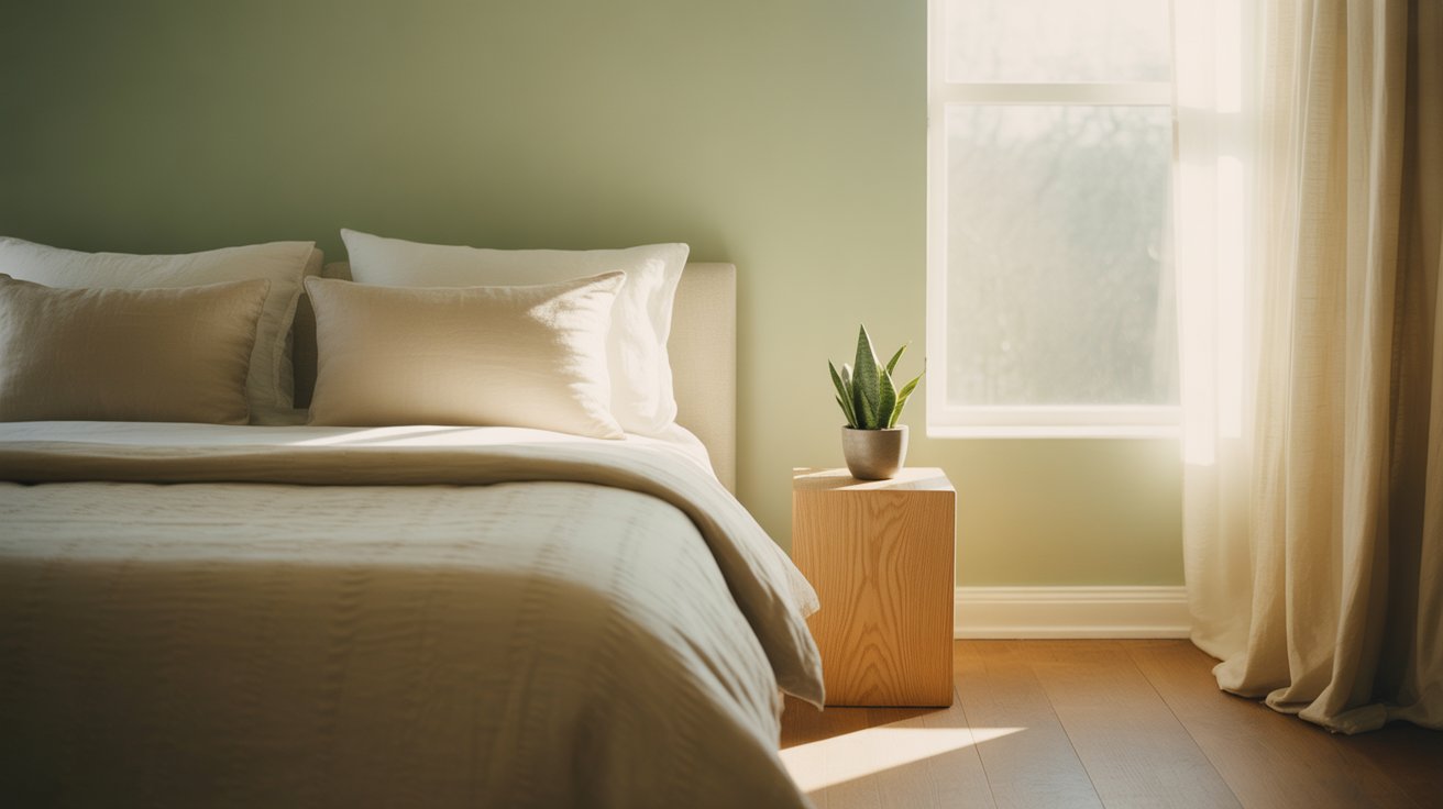
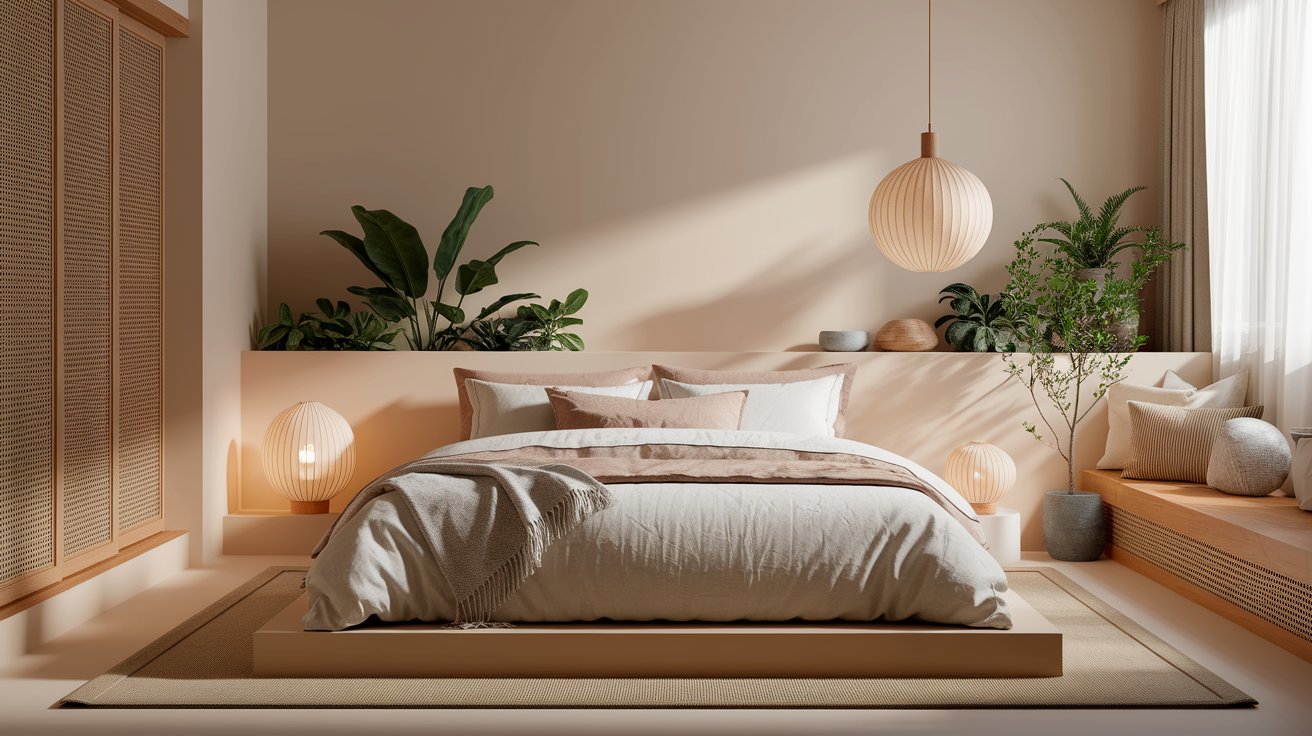
Bedrooms should help you relax and sleep well. Research shows that certain colors promote better rest.
Relaxing bedroom colors:
Avoid bright, energizing colors like red or bright orange in bedrooms. Save those for spaces where you want energy, not rest.
Think about temperature too. Do you sleep hot or cold? Cool colors like blue and green can make a room feel slightly cooler. Warm tones like beige and taupe add psychological warmth.
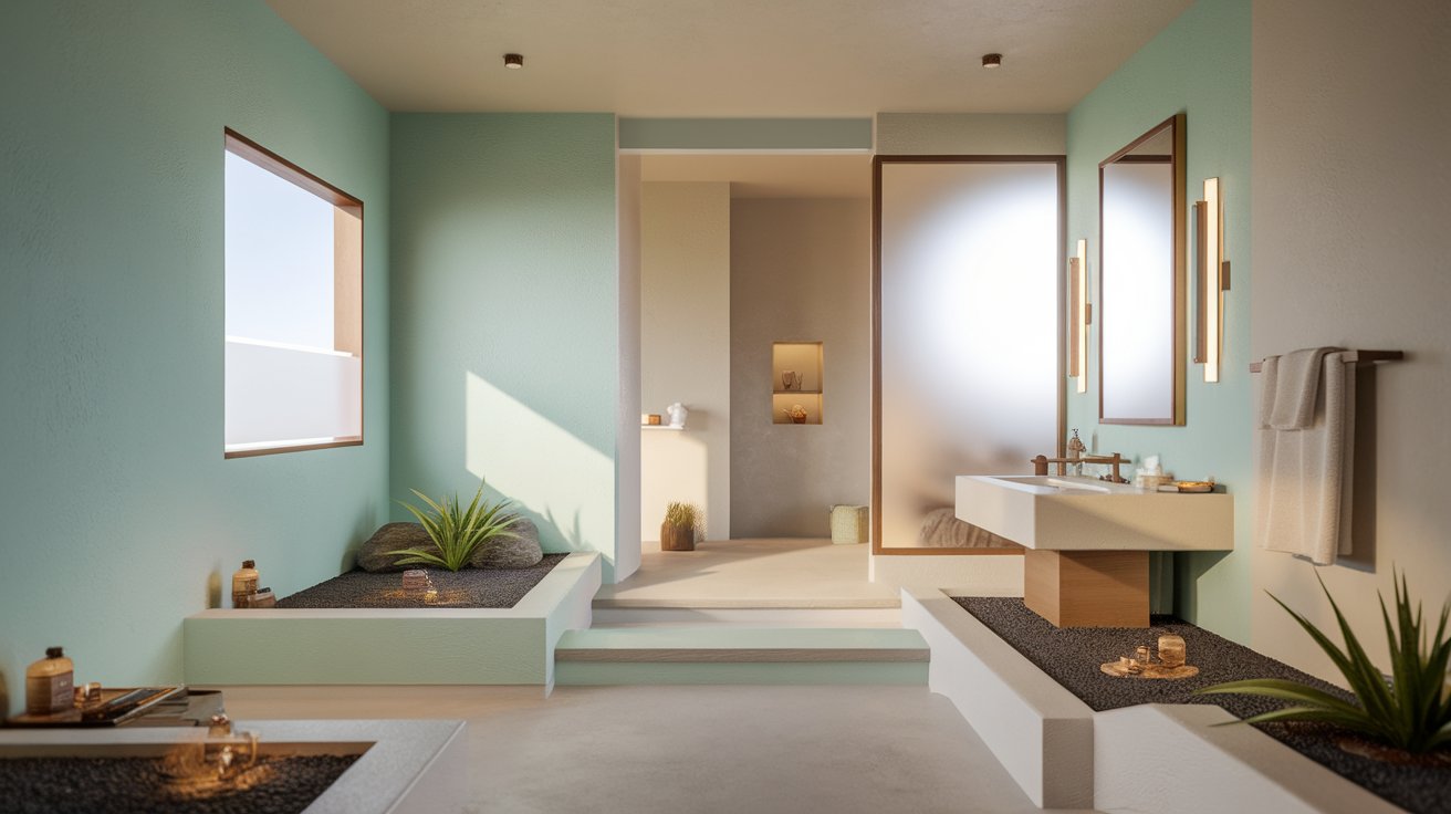
Bathrooms are perfect for experimenting with color because they’re small spaces. You can be a bit bolder here without a huge commitment.
Spa-inspired bathroom colors:
For small bathrooms, lighter colors make the space feel larger. Add interest with colorful towels, artwork, or accessories rather than dark wall colors.
If you have a larger bathroom, you can use deeper colors like navy, forest green, or charcoal for a dramatic, luxurious feel.
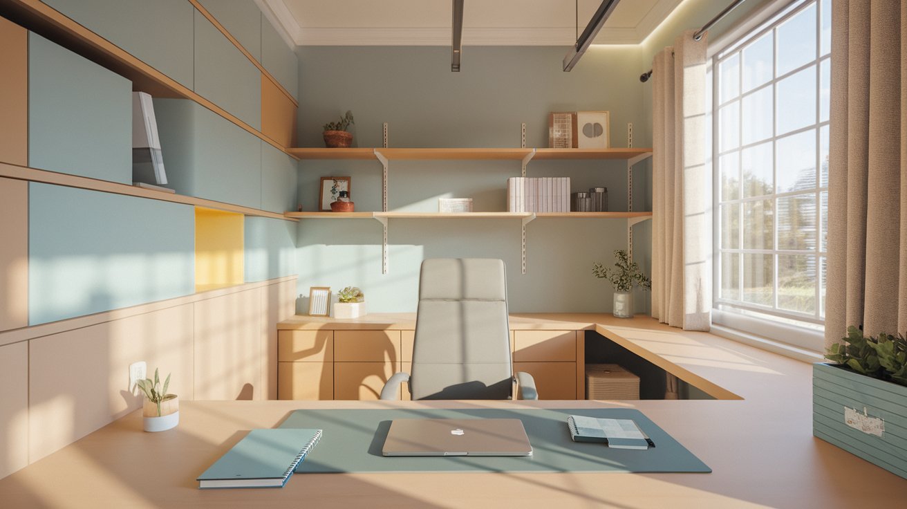
Your home office color should help you focus and feel energized without being distracting.
Productive office colors:
Stay away from colors that are too relaxing (like those bedroom blues) or too energizing (like bright red). You want a balance that keeps you alert but not stressed.
Room | Best Color Choices | Effect | Avoid |
Living Room | Soft white, greige, light gray | Welcoming, versatile | Too many bold colors |
Kitchen | White, greige, pale sage, light blue | Clean, fresh, spacious | Very dark shades |
Bedroom | Soft blue, gentle green, warm neutrals | Calming, restful | Bright red, orange |
Bathroom | Aqua, mint, light gray, warm white | Spa-like, refreshing | Heavy dark colors (small spaces) |
Home Office | Soft blue, light green, warm neutrals | Focused, energizing | Too relaxing or too bright |
Dining Room | Warm neutrals, soft terracotta, sage | Inviting, social | Stark cold colors |
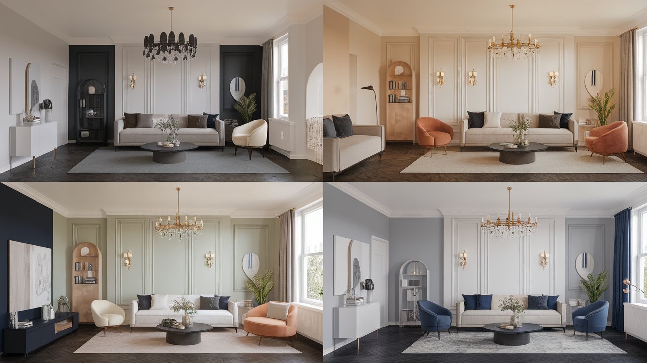
Here are four proven color palettes that work beautifully throughout an entire home.
This scheme feels clean, sophisticated, and timeless.
This palette works with any style of furniture and lets your artwork and decor stand out.
Perfect if you want your home to feel like a welcoming hug.
This scheme pairs beautifully with wood furniture and creates an inviting atmosphere.
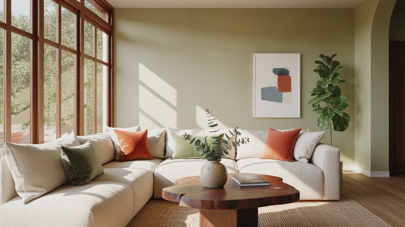
This palette feels current and peaceful.
The nature-inspired colors create a calm, refreshing environment throughout your home.
For a more sophisticated, hotel-like feeling.
This scheme feels elevated and pairs well with metallic accents in lighting and hardware.
Paint trends shift each year, but these colors are having a moment right now.
Earthy, natural tones are everywhere. Think warm terracotta, clay, sand, and stone colors. These shades connect our homes to nature.
Soft greens continue to grow in popularity. From pale sage to muted olive, green creates a peaceful, organic feeling.
Muted blues replace the bright blues of past years. Think dusty blue, slate, and soft powder blue.
Warm whites are replacing stark, cool whites. Look for whites with cream, beige, or even pink undertones for a softer look.
Clay and terracotta bring warmth without going full orange. These reddish-browns feel both earthy and sophisticated.
Remember, trends come and go. Pick colors you genuinely love, not just what’s popular this year.
Learn from others’ mistakes to save yourself time and money.
This is the number one mistake. A gray might look perfect in the store but turn purple or blue on your walls because of its undertones. Always test colors with your existing floors, furniture, and lighting.
Computer and phone screens show colors differently. That perfect beige online might be orange in real life. Always get physical samples to see the true color.
One or two bold accent colors can look great. Five different bright colors create chaos. Stick to a cohesive palette with mostly neutrals and a few pops of color.
When every room is a completely different color with no relationship to each other, your home feels choppy and disconnected. Plan your whole house palette before painting a single wall.
Primer helps paint stick better, covers old colors, and ensures your new color looks true. Skipping this step often leads to needing extra coats or colors that don’t look right.
These insider tricks will help you get professional-looking results.
Paint large pieces of poster board or cardboard instead of your walls. You can move these samples around the room to see how colors look in different spots and lighting.
Paint comes in different finishes that affect how it looks:
Most walls look best in flat, eggshell, or satin finishes.
Where you place lamps and light fixtures affects how your paint looks. Plan your lighting before you finalize colors. A dimly lit room needs lighter colors to feel bright. A room with lots of windows can handle deeper shades.
Not every room needs an accent wall, but when used well, they add interest. The best accent walls are:
Avoid painting random walls just to use multiple colors.
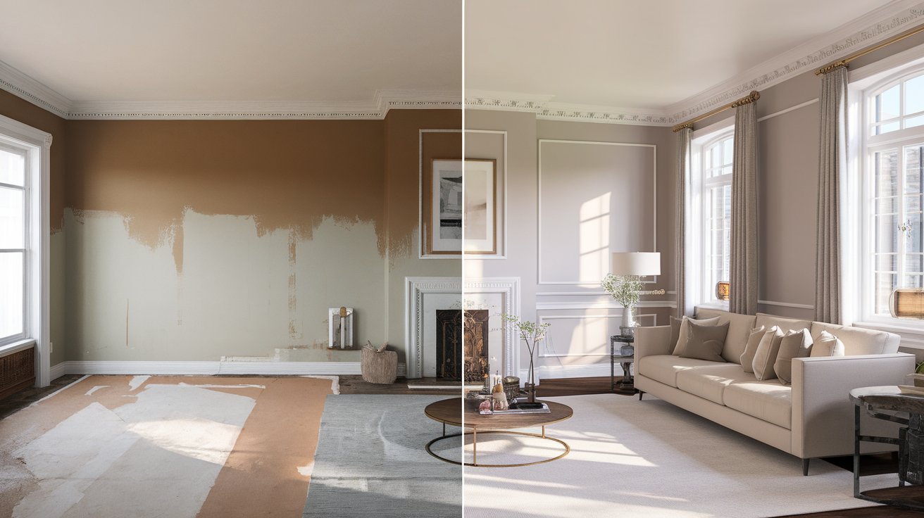
Choosing interior house colors doesn’t have to be stressful. Start with understanding your lighting and undertones. Pick a cohesive palette for your whole house. Test samples before committing. And remember, paint is one of the easiest things to change if you don’t love it.
The best color choices are the ones that make you happy when you walk into your home. Trust your instincts, but use the guidelines in this article to make informed decisions.
Ready to transform your space? Start by testing a few colors this weekend. Share your favorite paint colors or questions in the comments below.
Looking for more home improvement ideas? Check out our guides on choosing the right furniture layout, decorating on a budget, and creating a cozy home atmosphere.
Light colors reflect more light, making spaces feel larger and more open. Soft whites, pale grays, and light beiges work best. Painting the ceiling the same light color as the walls also makes rooms feel taller and more spacious.
A good rule is three to five colors throughout your entire home. This includes your main neutral, one or two supporting colors, and one or two accent colors. This creates variety while maintaining harmony.
Dark colors can work in small rooms, but they make the space feel more intimate and cozy rather than larger. If you love dark colors, use them in small rooms with good lighting, or paint just one accent wall dark while keeping other walls light.
There’s no single best neutral because it depends on your home’s lighting and existing features. Warm greige is currently the most popular because it works with both warm and cool tones. Test several neutrals in your space to find what works best for you.
White ceilings are traditional and make rooms feel taller, but painting your ceiling the same color as your walls creates a cohesive, cozy feeling. This works especially well in rooms with high ceilings or when using light to medium tones.
Take a sample chip or cut a small piece of drywall from a hidden area to a paint store. They can match the color using computer technology. Keep in mind that old paint fades, so the match might look slightly different than the original.
Clara Jameson is an interior design specialist with more than 10 years of experience helping people create stylish and functional spaces. She blends aesthetics with practicality to make sophisticated design approachable and achievable. Clara earned her B.A. in Interior Design from Savannah College of Art and Design. She enjoys traveling, visiting art galleries, and studying architecture to gather fresh inspiration that she brings to every project.


No Comments