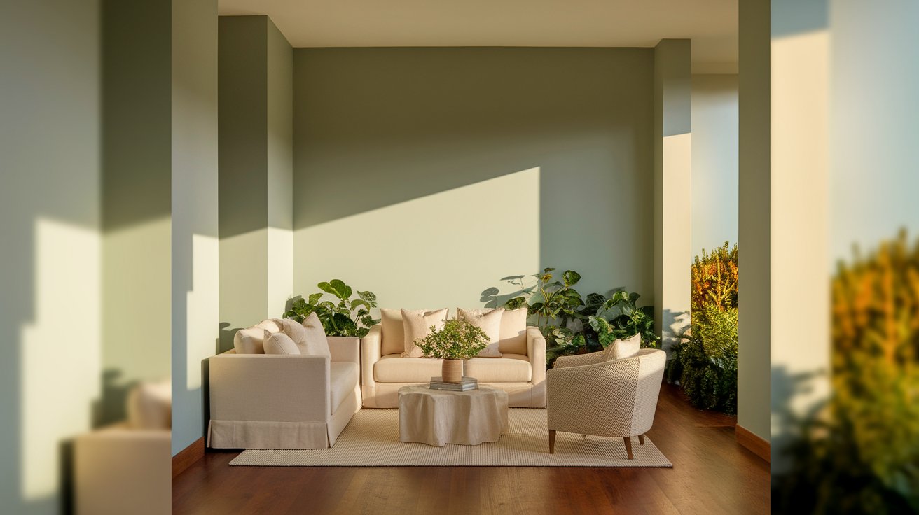
October Mist Benjamin Moore (1495) is a soft sage-green paint that brings a calm, natural feel to any room. This muted green neutral works beautifully in both modern and traditional homes.
October Mist was Benjamin Moore’s 2022 Color of the Year, recognized for its versatility and timeless appeal. Whether you’re painting a bedroom, kitchen cabinets, or an entire open-concept space, this color creates a peaceful backdrop that feels both fresh and inviting.
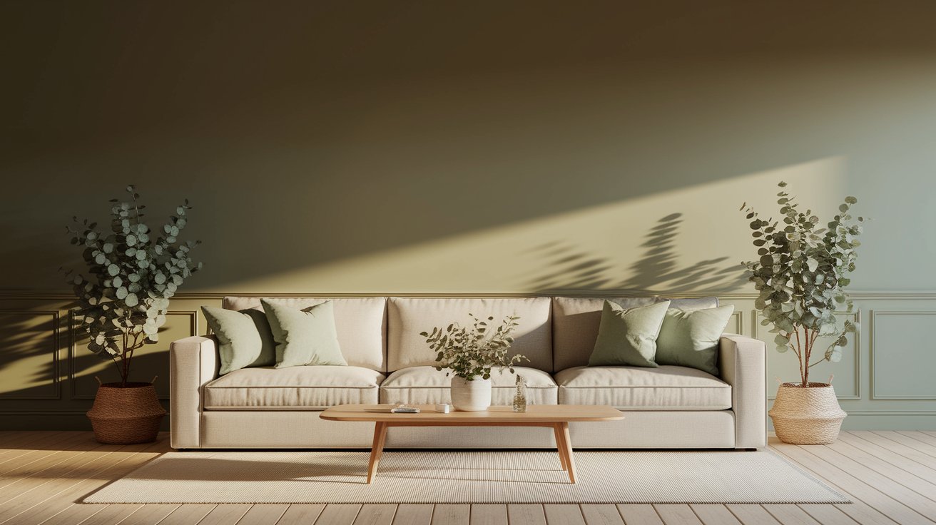
October Mist is a gentle sage green with a whisper of gray mixed in. It’s not bright or bold—instead, it sits quietly on your walls like morning fog over a garden.
In natural daylight, this sage green paint color shows its green side more clearly. The soft herbal tone comes alive, especially in rooms with plenty of windows.
When evening comes and you turn on your lamps, October Mist shifts slightly cooler and the gray undertones become more visible.
This color fits perfectly in the nature-inspired neutral family. It’s the kind of shade that makes you think of eucalyptus leaves, dried herbs, or a misty forest trail. Designers love it because it brings the outdoors inside without feeling too colorful or overwhelming.
The main undertone in October Mist is a soft green with subtle gray woven through it. This combination is what makes the color so easy to live with.
In north-facing rooms, expect this muted green neutral to lean slightly cooler. The gray undertones show up more, and the color can feel a bit more muted and calm.
South-facing rooms with warm, direct sunlight bring out the green more clearly, making the space feel brighter and more nature-connected.
The overall mood this color creates is organic and airy. It doesn’t compete with your furniture or art—it simply wraps your room in a gentle, calming hug.
People often describe spaces painted in this soft green as peaceful, grounded, and surprisingly versatile.
October Mist has an LRV of 46.54.
Here’s what that number means for your home:
This mid-range value makes BM 1495 a safe choice if you’re worried about a color being too bold or too washed out.
Feature | Details |
Color Name | October Mist |
Color Code | 1495 |
Brand | Benjamin Moore |
Color Family | Sage Green / Muted Green Neutral |
LRV | 46.54 (Mid-tone) |
Undertones | Soft green with subtle gray |
Best For | Living rooms, bedrooms, kitchens, bathrooms, whole-house color |
Available Lines | Ben, Regal Select, Aura |
Special Recognition | Benjamin Moore Color of the Year 2022 |
Choosing the right companion colors helps October Mist shine. Here are some tried-and-true Benjamin Moore pairings.
White Dove (OC-17)
This warm, creamy white is perfect for trim, ceilings, and doors. It doesn’t fight with the soft green—instead, it adds a gentle contrast that feels collected and calm.
Simply White (OC-117)
If you prefer a cleaner, crisper look, Simply White works beautifully. It’s slightly cooler than White Dove, which makes the sage green pop just a bit more.
Classic Gray (OC-23)
This is a soft, warm gray that shares a similar calm vibe with October Mist. Use it in adjoining rooms or as an accent wall color. Learn more about Classic Gray here.
Gray Owl (OC-52)
A cooler, lighter gray that works well if you want to create a subtle shift between rooms. It keeps the same peaceful energy without repeating the green.
Kendall Charcoal (HC-166)
This rich, deep gray-green is stunning on an accent wall, fireplace, or built-in shelving. It adds drama without clashing with the softness of October Mist.
Wrought Iron (2124-10)
A true charcoal with slight blue undertones. Use it on exterior doors, cabinetry, or window frames for a bold, grounding contrast.
If you love deep, moody colors, check out Hale Navy for more inspiration.
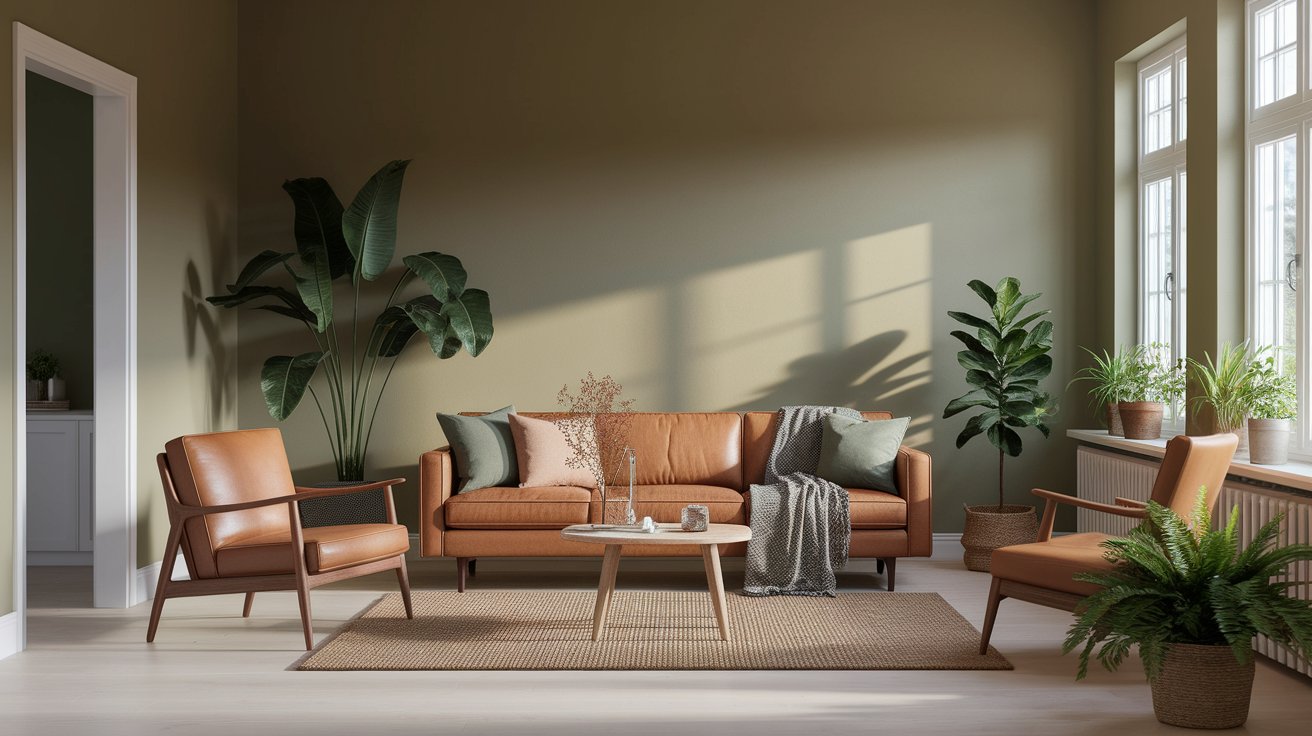
This sage green paint color creates a calming foundation for your main gathering space. It works beautifully with wood furniture, leather sofas, and woven textures.
The color feels collected without being stuffy, making it ideal for both relaxed family time and hosting guests.
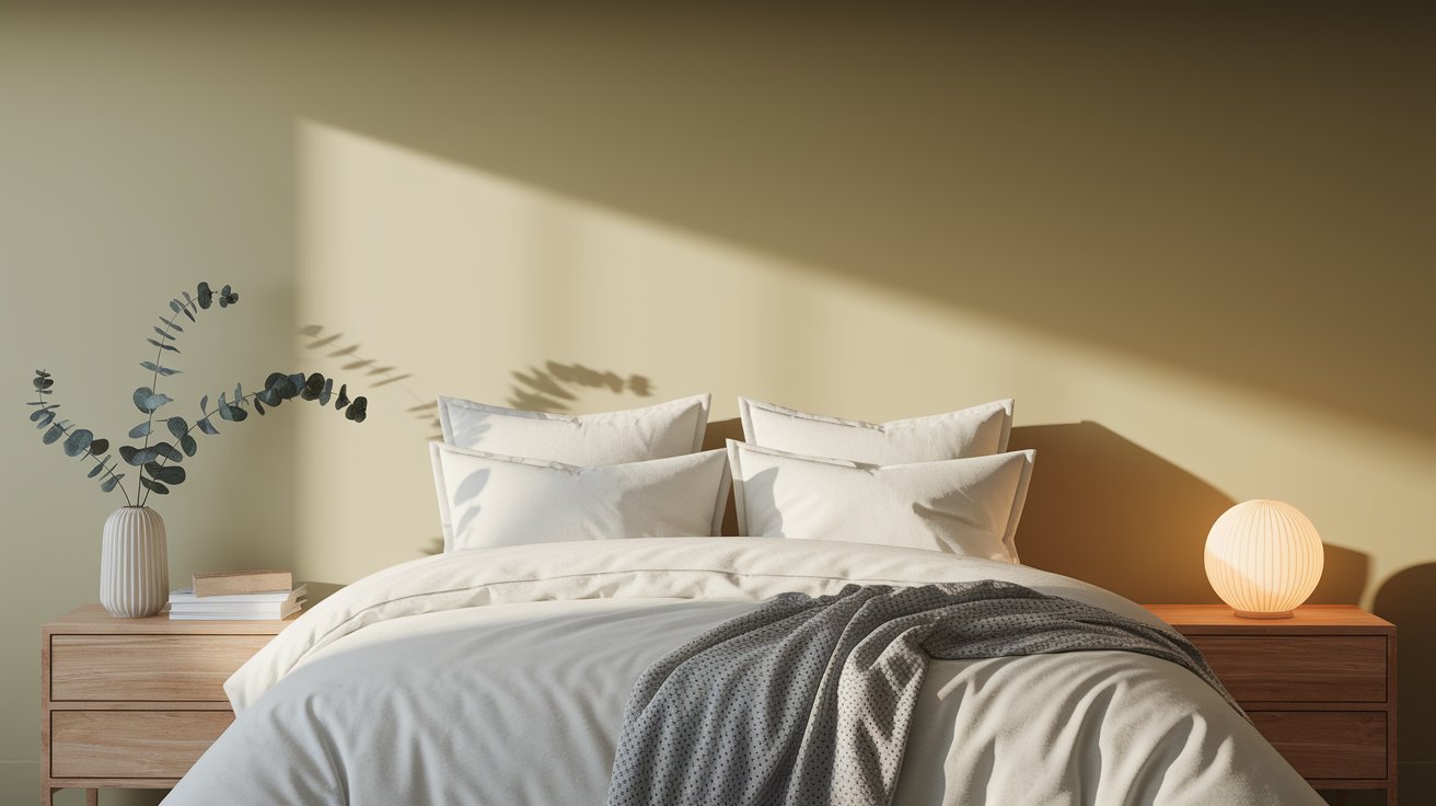
This soft green neutral is a dream for bedrooms. It promotes relaxation and pairs well with white bedding, natural linen, and warm wood nightstands.
The muted tone won’t keep you awake—it actually helps your eyes and mind settle down at the end of the day.
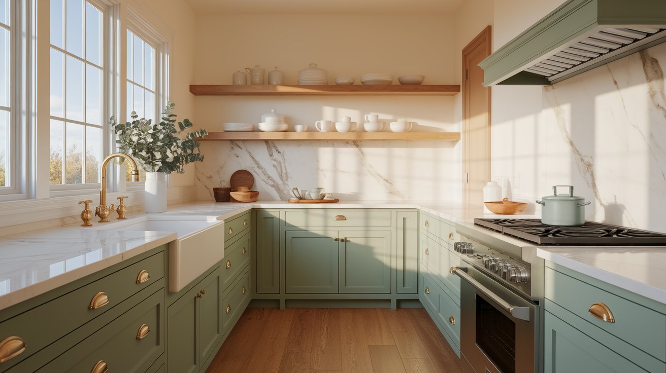
Tired of white cabinets? Benjamin Moore 1495 is a trendy, fresh alternative. It adds personality to your kitchen without overwhelming the space.
Pair it with brass hardware, marble countertops, or open wood shelving for a look that feels current and timeless.
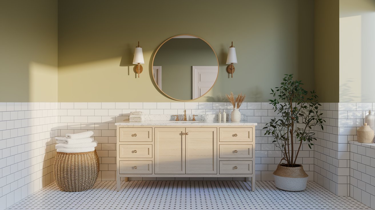
Transform these often-overlooked spaces into spa-like retreats. The herbal, nature-inspired tone brings an organic calm that makes everyday tasks feel a little more special.
It works especially well in rooms with white tile and natural light.
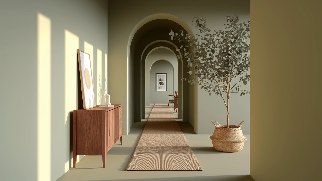
First impressions matter. October Mist in an entryway feels fresh, inviting, and grounded.
It sets a peaceful tone for the rest of your home and looks great with a wooden console table, plants, and simple artwork.
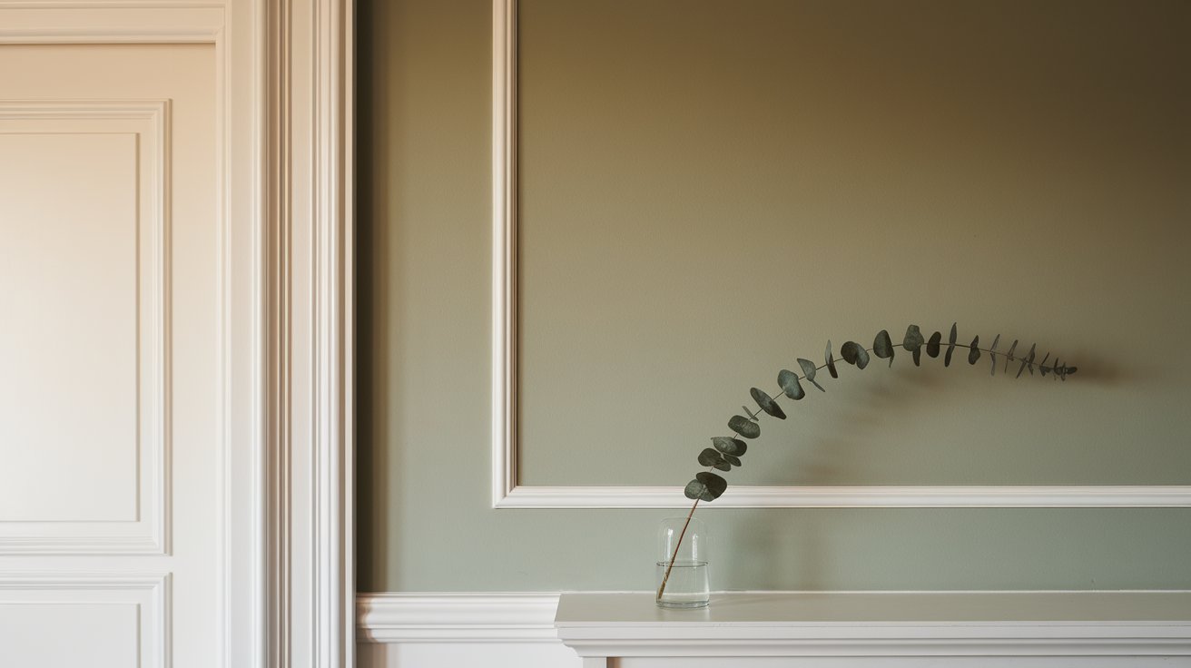
Trim color matters more than you might think. For October Mist walls, stick with warm whites like White Dove or Simply White. Cool whites can make the space feel disjointed.
For paint sheen, use matte or eggshell on walls. These finishes enhance the soft, organic feel of the color.
Save semi-gloss or satin for trim, doors, and cabinets—they’re easier to clean and create a subtle contrast in texture.
If you’re painting cabinets or furniture, consider a satin finish. It’s durable enough for daily use but still soft enough to keep the color looking natural, not plastic-like.
This muted green neutral is available in Benjamin Moore’s Ben, Regal Select, and Aura paint lines. Aura offers the best coverage and durability, while Ben provides excellent value for larger projects.
Never skip the sampling step. Paint colors look different in every home because of lighting, room size, and existing furniture.
Grab a peel-and-stick sample (companies like Samplize make this easy) and place it on different walls. Watch how the color changes throughout the day—morning light, afternoon sun, and evening lamps all tell a different story.
Paint a large poster board with October Mist and move it around the room. Look at it next to your furniture, flooring, and any fixed elements like countertops or tile.
This gives you a real sense of how everything will work together.
For more guidance on testing paint colors the right way, Benjamin Moore’s website offers helpful paint sampling tips.
October Mist Benjamin Moore is a versatile, timeless choice for anyone looking to bring calm and nature into their home. It’s soft enough to feel peaceful but has enough personality to keep rooms from feeling bland.
Whether you’re updating one room or painting your whole house, this sage green neutral adapts beautifully.
Ready to explore more options? Browse our complete paint color guides and find your next favorite shade.
Get peel-and-stick color samples before painting to see how October Mist looks in your specific lighting and with your existing decor. It’s the easiest way to make sure you love your choice before committing.
Yes, it works beautifully throughout an open floor plan. The soft green provides continuity without feeling repetitive, and it transitions smoothly between rooms.
Many homeowners use it as their main neutral and add variety through furniture, artwork, and accent colors.
This color shines in Scandinavian, Japandi, Modern Farmhouse, and Minimalist interiors. It supports clean lines, natural materials, and uncluttered spaces.
The organic tone also fits well in transitional and contemporary homes that lean toward earthy, calm palettes.
Light oak, medium walnut, and warm honey-toned woods all pair beautifully with October Mist. Avoid reddish or orange-toned wood floors, as they can clash with the cool-green undertones.
Light-colored tile, concrete, or even soft gray luxury vinyl also complement this shade nicely.
They’re cousins but not twins. Evergreen Fog leans slightly more gray and has a touch more depth, while October Mist feels lighter and shows more green.
Both are beautiful, but this sage green paint color is airier and works better in smaller or darker rooms.
Absolutely. It’s a stunning choice for accent furniture like dressers, nightstands, or dining chairs. On kitchen or bathroom cabinets, it creates a fresh, modern look that stands out without overwhelming the space.
Just be sure to use a durable paint finish designed for high-use areas.
Daniel Hartman is a color specialist with years of experience helping people make confident and thoughtful design decisions. He provides practical and approachable guidance while balancing creativity and functionality in every project. Daniel enjoys visiting art and design exhibits to study how different environments influence aesthetics, mood, and perception, bringing a rich perspective and insight into his work. His approach makes design decisions both simple and enjoyable.
At Cozy Home Touch, we specialize in transforming your living spaces into cozy, stylish retreats. Whether you’re looking to refresh a single room or undertake a complete home makeover, our expert team is here to bring your vision to life.
Copyright © 2025 Cozy Home Touch.
No Comments