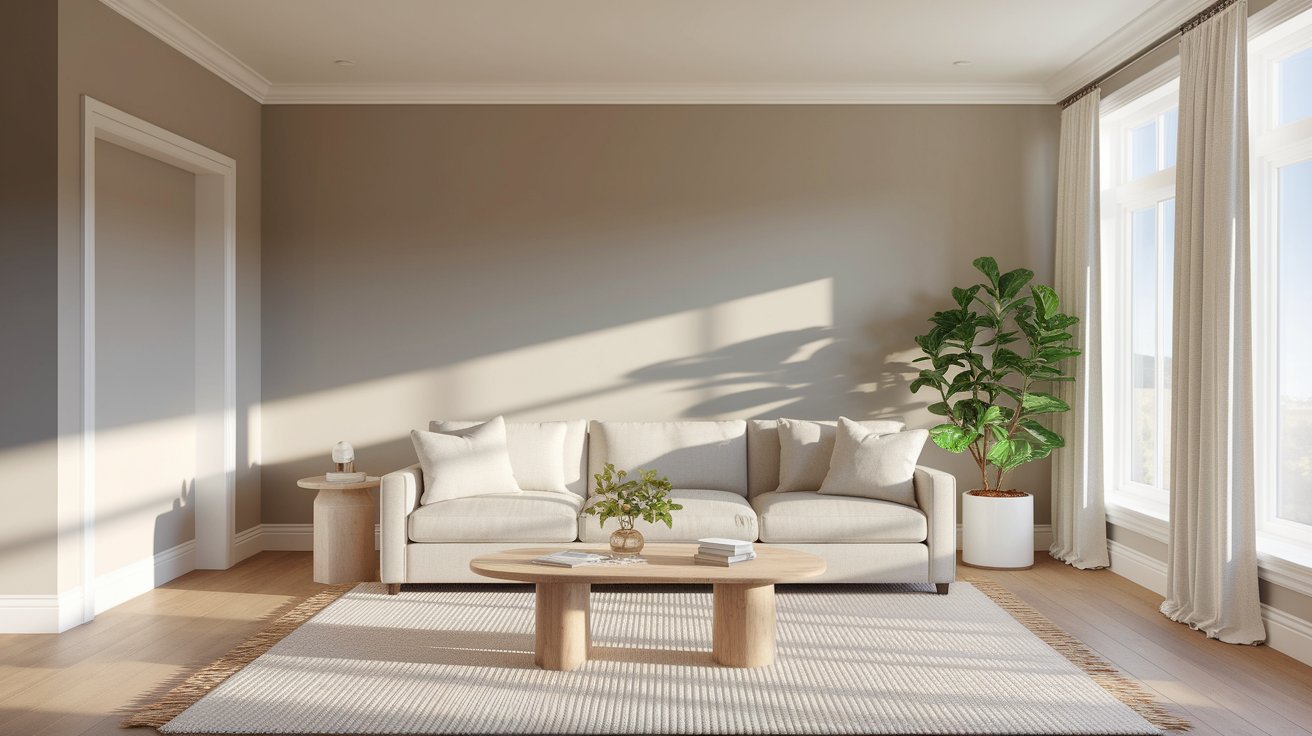
Benjamin Moore Classic Gray is one of the most loved paint colors for homes right now. This soft, warm gray makes any room feel calm and welcoming. Classic Gray OC-23 is a warm gray paint color that works beautifully as a neutral paint color throughout your home. Many people choose it because it fits in almost every space, from bedrooms to living rooms. If you’re looking for a color that feels cozy and modern at the same time, Classic Gray might be perfect for you.
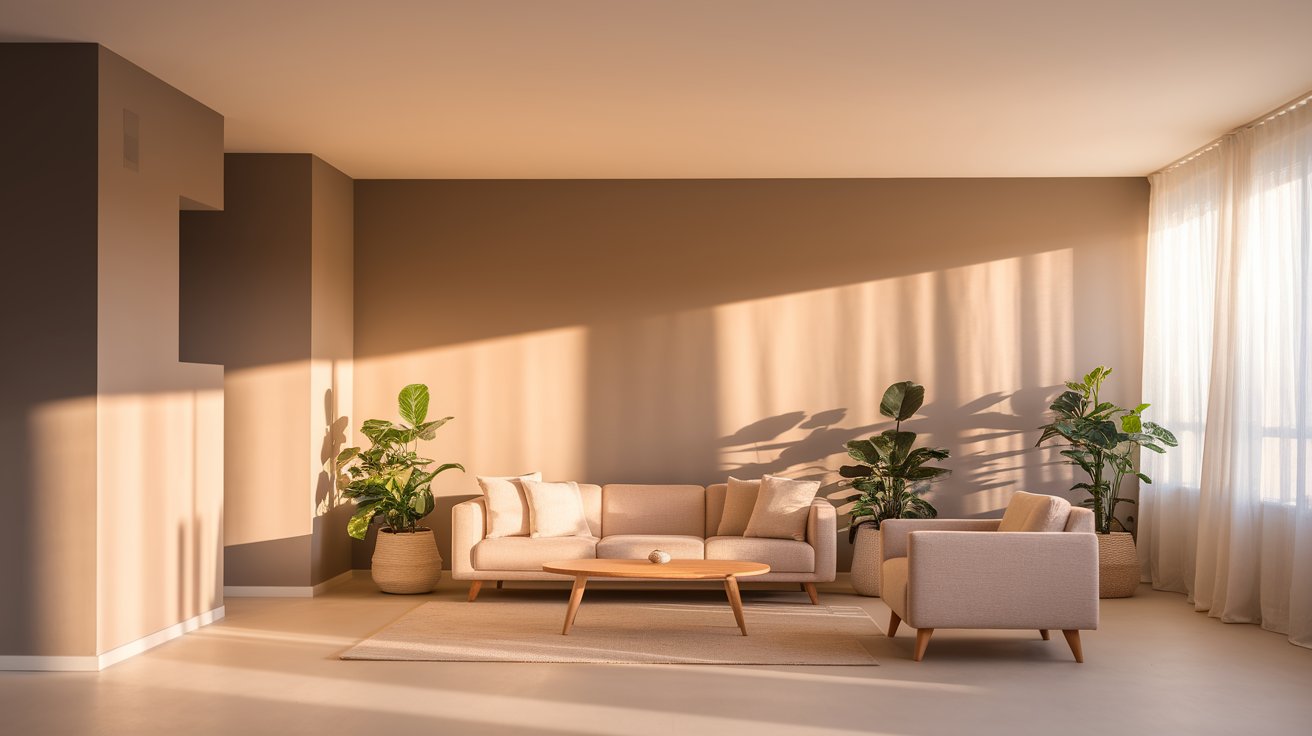
Benjamin Moore Classic Gray is a warm, soft gray paint color. It sits somewhere between gray and beige, which designers call “greige.” This color doesn’t feel cold or boring like some grays do. Instead, it has a gentle warmth that makes rooms feel comfortable.
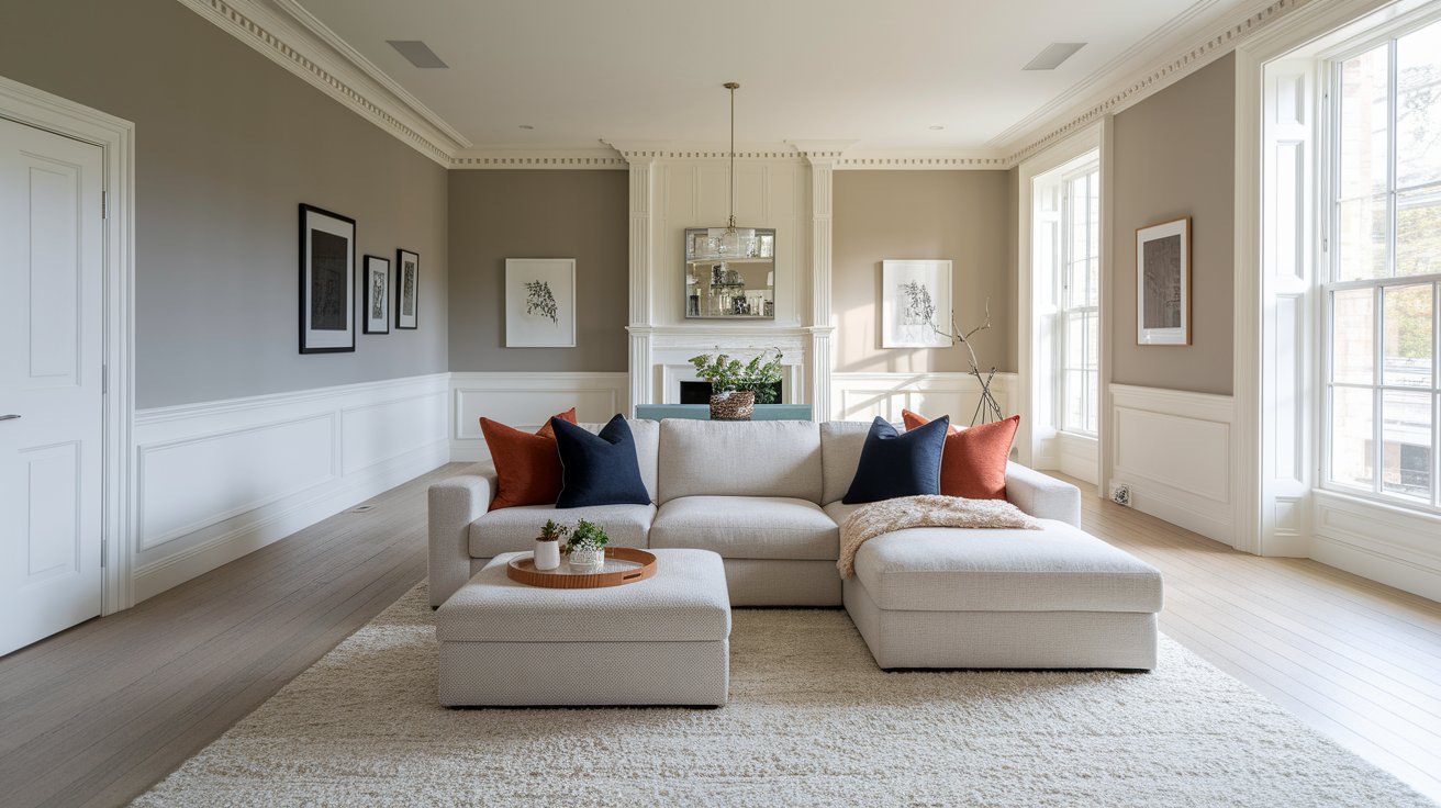
When you look at Classic Gray on the wall, you’ll notice it’s not a true gray. It leans slightly toward beige, especially when natural light hits it. This warmth is what makes it so popular for homes. It’s light enough to make rooms feel bigger, but not so light that it looks like plain white.
The Classic Gray LRV (Light Reflectance Value) is 74. This number tells us how much light the color reflects. The scale goes from 0 (completely black) to 100 (pure white).
With an LRV of 74, Classic Gray reflects a lot of light. This means your rooms will feel bright and open. It’s a great choice if you want a light, airy feeling in your home. Colors with an LRV above 70 work well in rooms that don’t get much natural light because they help bounce light around.
Classic Gray LRV Snapshot
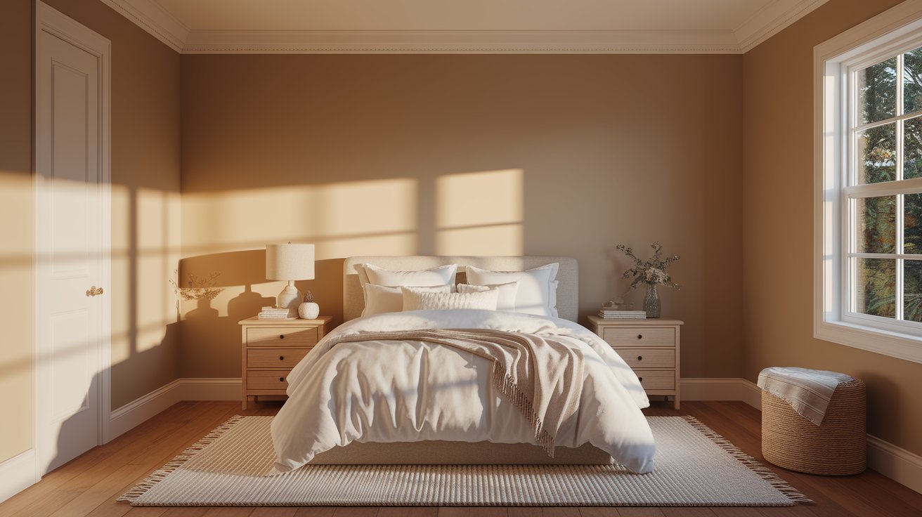
Understanding Classic Gray undertones helps you know how it will look in your home. This paint has soft warm undertones that lean slightly beige. In bright, sunny rooms, it can look almost like an off-white with just a hint of gray.
Here’s what you might notice:
Don’t worry if the color looks different in various rooms. This is normal for all paint colors. The lighting in each space changes how we see the color.
According to The Spruce’s guide to choosing gray paint, warm grays like Classic Gray work better in most homes than cool grays because they feel more welcoming.
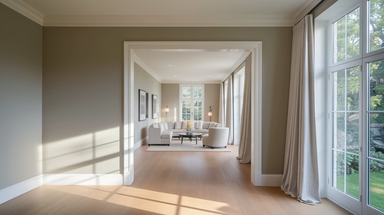
Yes! Benjamin Moore Classic Gray makes a wonderful whole-house paint color. Many designers recommend using one neutral paint color throughout your home to create a smooth, flowing feeling from room to room.
Here’s why it works so well:
When Classic Gray works best:
When to be careful:
Choosing the right trim and ceiling colors makes Classic Gray look even better. Here are the best combinations:
Trim/Ceiling Option | Recommended Color | Why It Works |
Crisp White Trim | BM Chantilly Lace | Creates clean, modern contrast |
Soft Warm Trim | BM White Dove | Blends warmly without harsh contrast |
Ceiling | Same color in flat finish | Modern, seamless look that makes rooms feel taller |
Most people choose bright white trim like Chantilly Lace or Simply White. The contrast makes Classic Gray’s warmth stand out beautifully. If you prefer a softer look, White Dove trim creates a gentle, flowing feeling.
For ceilings, you have two good choices. You can paint them in Classic Gray using a flat finish for a modern look. Or you can use a white ceiling for a more traditional feel.
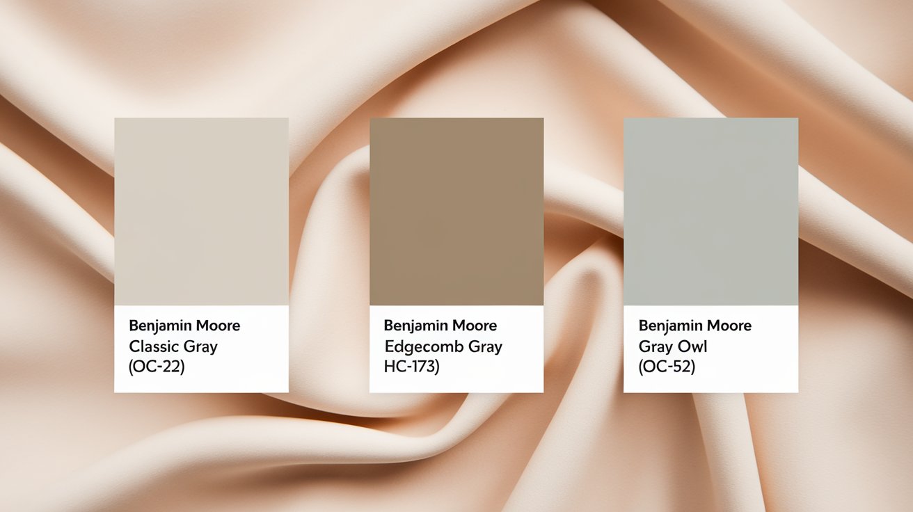
How does Classic Gray compare to other favorite gray paints? Here’s a simple breakdown:
Color | Temperature | Main Difference |
Classic Gray OC-23 | Warm | Soft greige with beige undertones |
BM Edgecomb Gray | Warm | Slightly darker with more beige |
BM Gray Owl | Cool | More noticeable gray with blue notes |
BM Revere Pewter | Warm | Darker, more taupe-like |
Classic Gray vs Edgecomb Gray: Edgecomb Gray is a bit darker and has more beige. If Classic Gray feels too light, try Edgecomb Gray.
Classic Gray vs Gray Owl: Gray Owl is cooler and has subtle blue undertones. Choose Gray Owl if you want a true gray without warmth.
You can learn more about comparing paint colors at Benjamin Moore’s official color gallery.


Pros:
Cons:
Benjamin Moore Classic Gray deserves its place as a designer favorite. This warm gray paint color works beautifully in most homes and with most decor styles. It’s especially perfect if you want a neutral color that doesn’t feel cold or boring.
Choose Classic Gray if you:
Before you paint your whole house, always test the color first. Get peel-and-stick samples or paint a large poster board. Look at it in different rooms and at different times of day. This helps you see the undertones and make sure you love it.
Pro Tip: Order a peel-and-stick sample from Samplize instead of guessing. These removable samples let you test Classic Gray on your actual walls without any mess or commitment. Move them from room to room to see how the color looks in different lighting throughout the day.
Classic Gray is technically a greige color. Greige means a mix of gray and beige. It leans more toward gray than beige, but the warm beige undertones are definitely there. In very bright light, it might look more beige. In normal light, it looks like a soft, warm gray.
Classic Gray works with almost every decor style. It’s perfect for modern farmhouse, traditional, contemporary, coastal, and minimalist styles. Because it’s so neutral, you can easily change your decor style without repainting. It looks great with both warm wood tones and cool metal finishes.
Classic Gray pairs beautifully with many flooring options:
Avoid very yellow-toned or orange wood floors, as they might clash with the gray undertones.
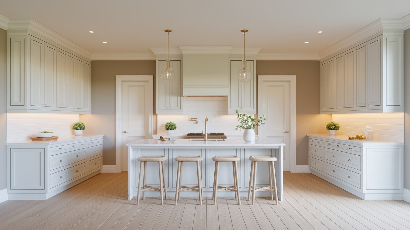
Yes, but it works better on walls than cabinets. Classic Gray is quite light, so cabinets might look almost white instead of gray. If you want gray cabinets, consider going a few shades darker like Chelsea Gray or Kendall Charcoal. Save Classic Gray for your kitchen walls to create a soft, neutral backdrop.
Classic Gray can work on home exteriors, but be careful. As an exterior color, it might look very light or almost white depending on your climate and how much sun your house gets. It works best for:
For exteriors, many people choose slightly darker grays like Stonington Gray or Chelsea Gray for better visibility and contrast. Always test exterior colors with large samples because outdoor light is much stronger than indoor light.
Final Tip: Remember that every home is different. What looks perfect in one house might look different in yours. Always test paint colors before committing. Good luck with your painting project!
Daniel Hartman is a color specialist with years of experience helping people make confident and thoughtful design decisions. He provides practical and approachable guidance while balancing creativity and functionality in every project. Daniel enjoys visiting art and design exhibits to study how different environments influence aesthetics, mood, and perception, bringing a rich perspective and insight into his work. His approach makes design decisions both simple and enjoyable.
At Cozy Home Touch, we specialize in transforming your living spaces into cozy, stylish retreats. Whether you’re looking to refresh a single room or undertake a complete home makeover, our expert team is here to bring your vision to life.
Copyright © 2025 Cozy Home Touch.
[…] For more neutral inspiration: Check out our comprehensive review of Benjamin Moore Classic Gray OC-2… […]
[…] without everything clashing. If you prefer cooler paint colors, you might want to explore ourBenjamin Moore Classic Gray review […]
[…] Classic Gray (OC-23) This is a soft, warm gray that shares a similar calm vibe with October Mist. Use it in adjoining rooms or as an accent wall color. Learn more about Classic Gray here. […]
[…] Classic Gray: A perfect light gray that creates a modern, flowing feel between rooms. […]