

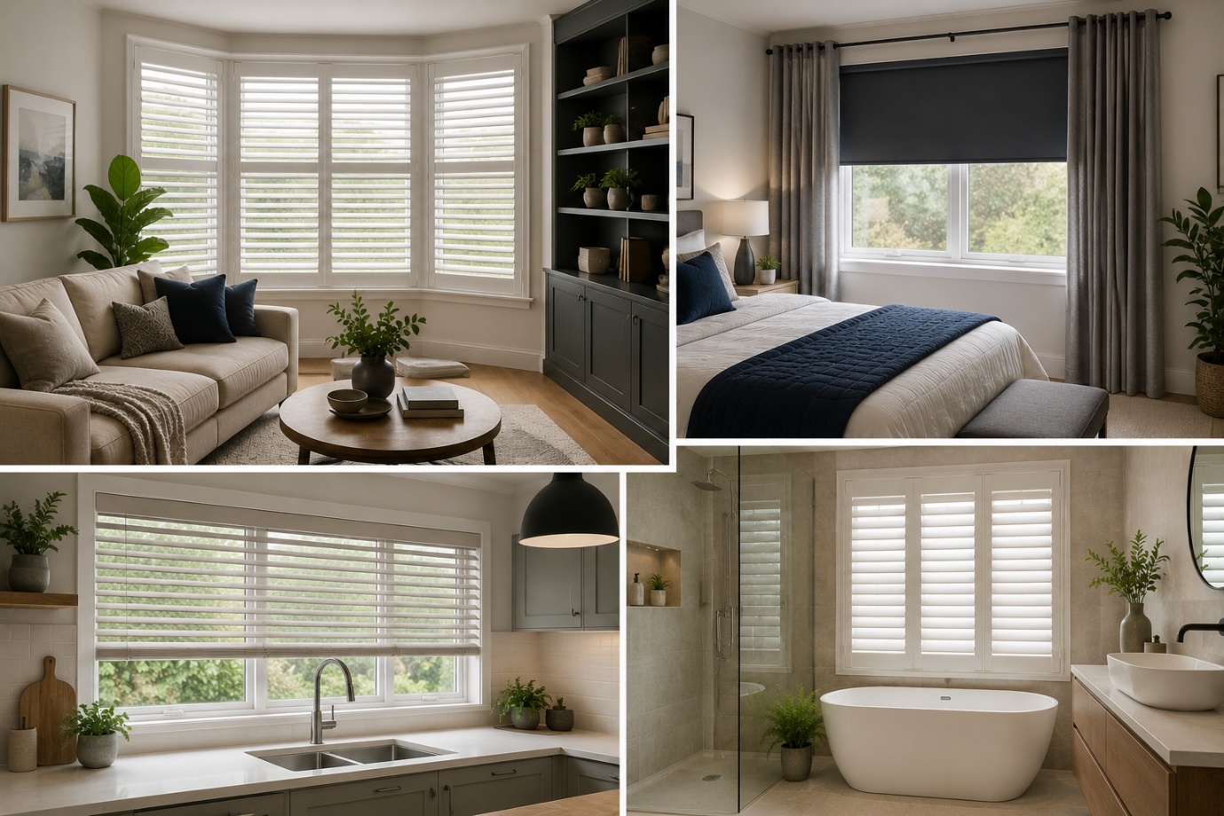
How to Choose the Perfect Window Coverings for Your Home
Window coverings are more than just decorative features. They influence


Sherwin Williams Green Bay SW 6481 can be a great solution to finding a paint color that is calming yet bold enough in case you are in need of such a paint color. This is an attractive blue-green color which has gained popularity among people who would find simple white or beige walls to be dull. It has a rich tone that gives any space a depth and personality without being too overwhelming.
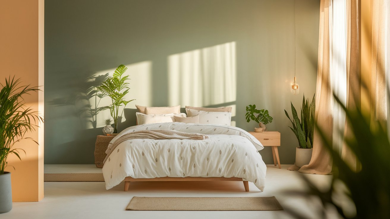
Green Bay will suit well in living rooms, kitchens, bedrooms and even front door. It is flexible enough to make either a domesticated spa like experience in bathrooms or make more of a dramatic impact on accent walls. The combination of blue and green gives it a special look though it is sophisticated.
In case of the rooms where you desire a light and free color, then you can combine the Green Bay with Sherwin Williams Accessible Beige. This warm neutral gives a comfortable backdrop that balances out the boldness of Green Bay and gives a free flow between rooms.
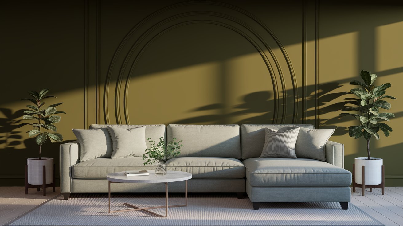
Green Bay is a deep, rich color that sits right between blue and green. Think of it like the color of a peaceful forest lake or deep ocean water. It’s dark enough to make a statement but not so dark that it makes rooms feel small or gloomy.
Here are the basic details:
The low LRV tells you this isn’t a light, airy color. It’s moody and dramatic, which is exactly why people love it.
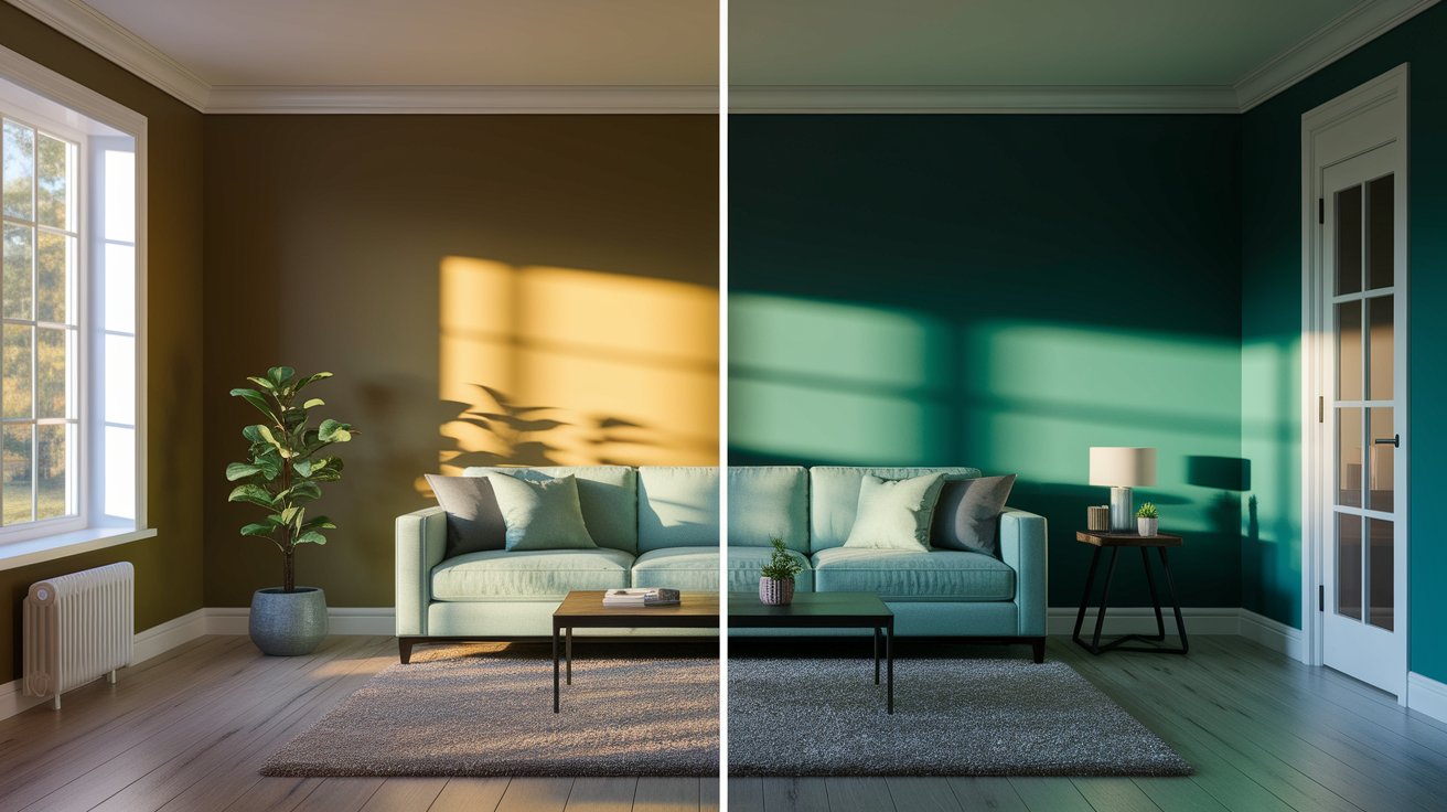
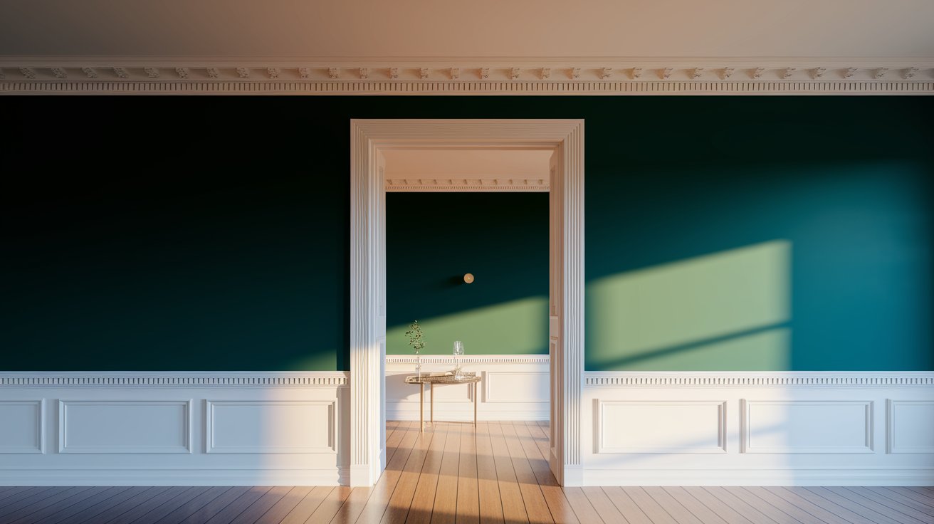
One really important thing about Green Bay is that it looks different depending on your lighting. This happens with all paint colors, but it’s especially true for colors like this one.
In rooms with lots of natural sunlight (like south-facing rooms), Green Bay leans more toward the green side. It feels warmer and cozier.
In rooms that don’t get as much sun (like north-facing rooms), it looks more blue and cool. Some people describe it as teal or peacock blue in these spaces.
At night under warm indoor lights, it gets even richer and deeper.
My advice? Always test a sample on your actual wall before buying gallons of paint. Paint a big square (at least 2 feet by 2 feet) and look at it throughout the day and night.
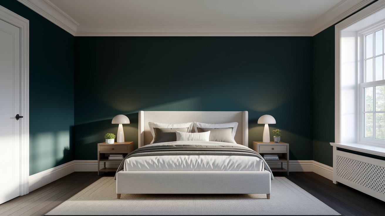
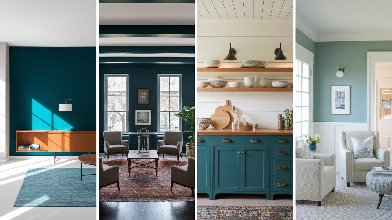
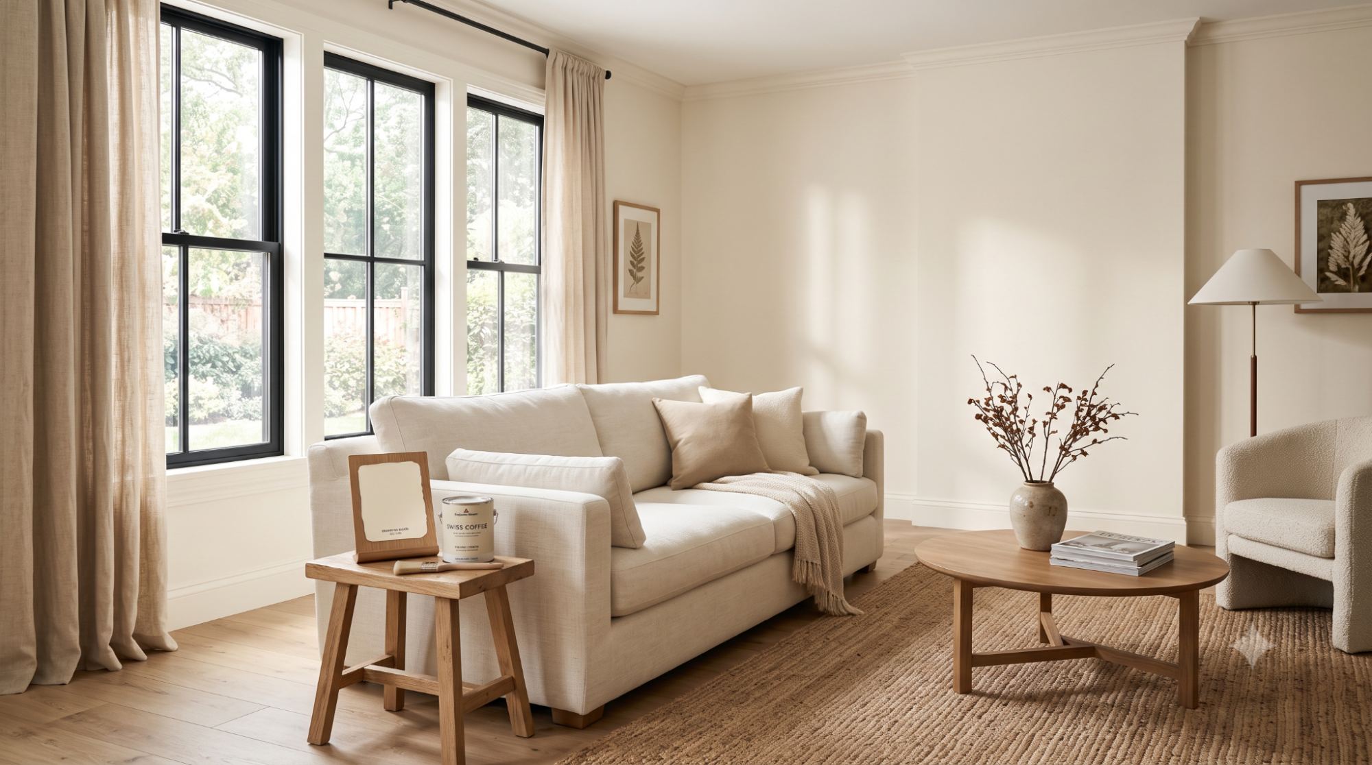
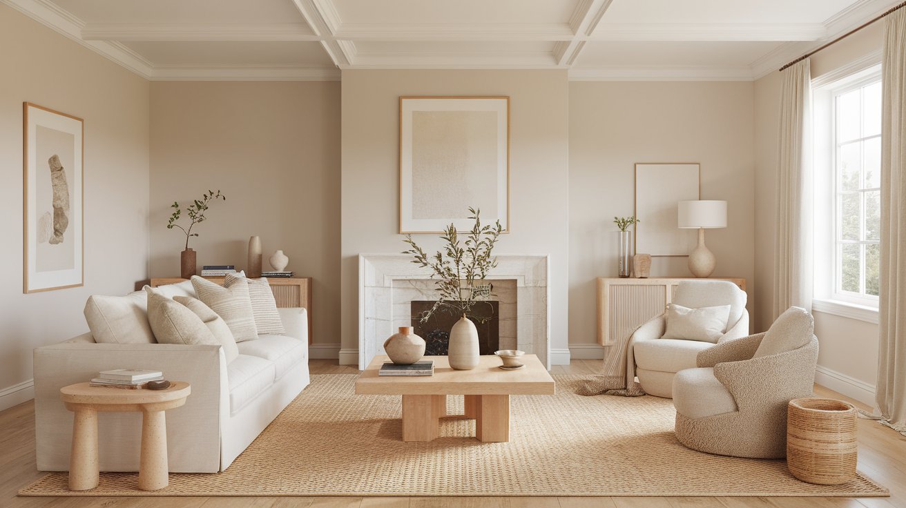
This is probably the most popular way to use Green Bay. Pick one wall in your living room or bedroom and paint just that wall. Leave the other walls white or cream. This gives you drama without making the whole room feel dark.
For the best look, pair your Green Bay accent wall with Sherwin Williams Pure White on the other walls. The contrast is stunning.
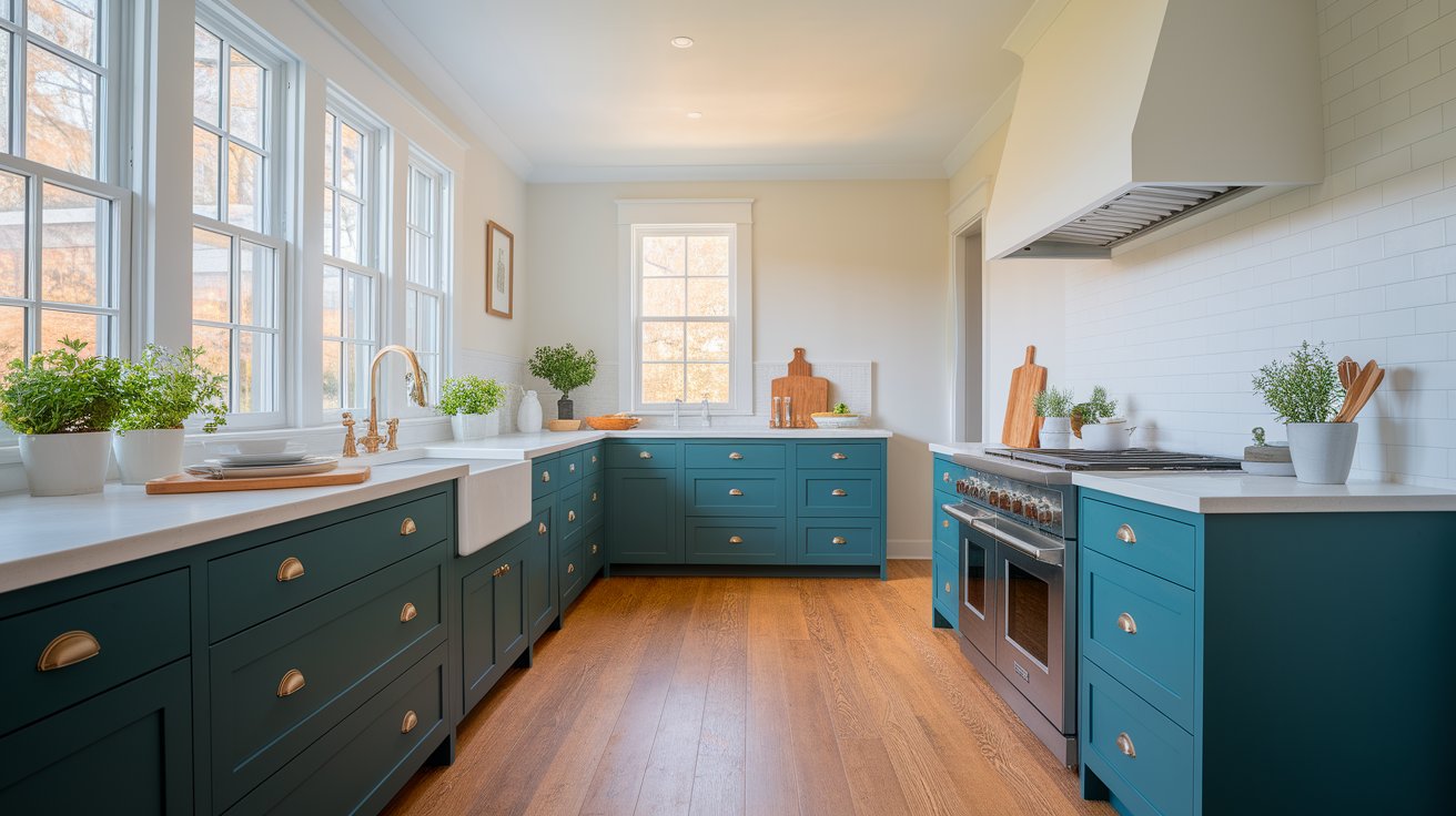
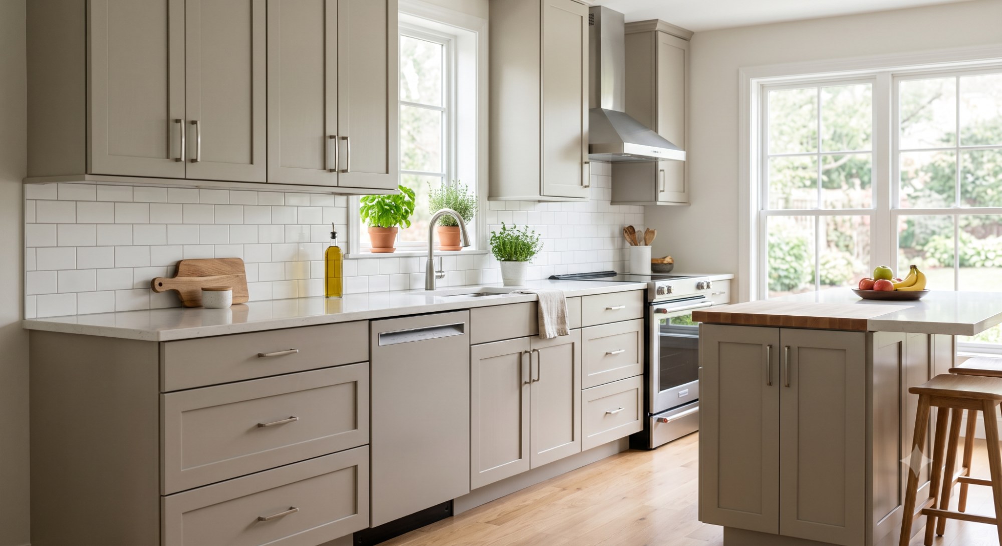
Dark green-blue cabinets are super trendy right now, and Green Bay is perfect for this. It works with both modern and traditional kitchens. Paint your lower cabinets in Green Bay and keep upper cabinets white, or go bold and do all your cabinets in this color.
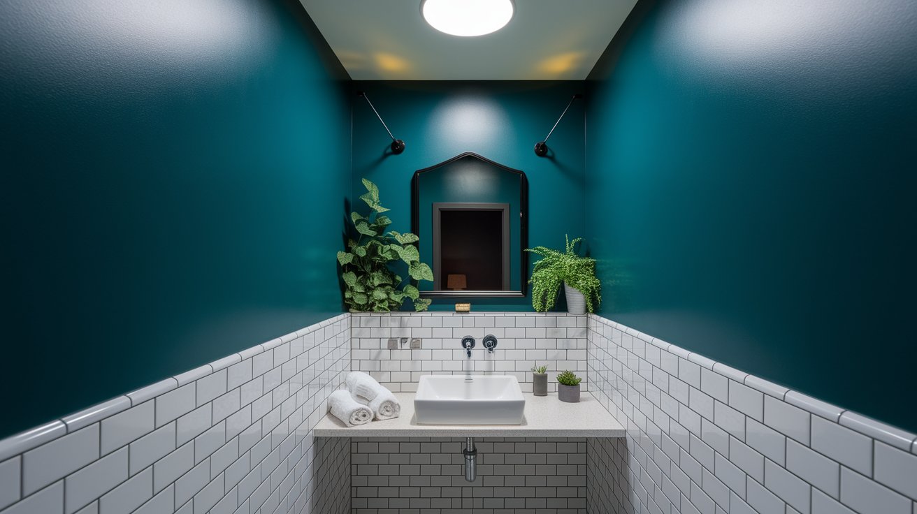
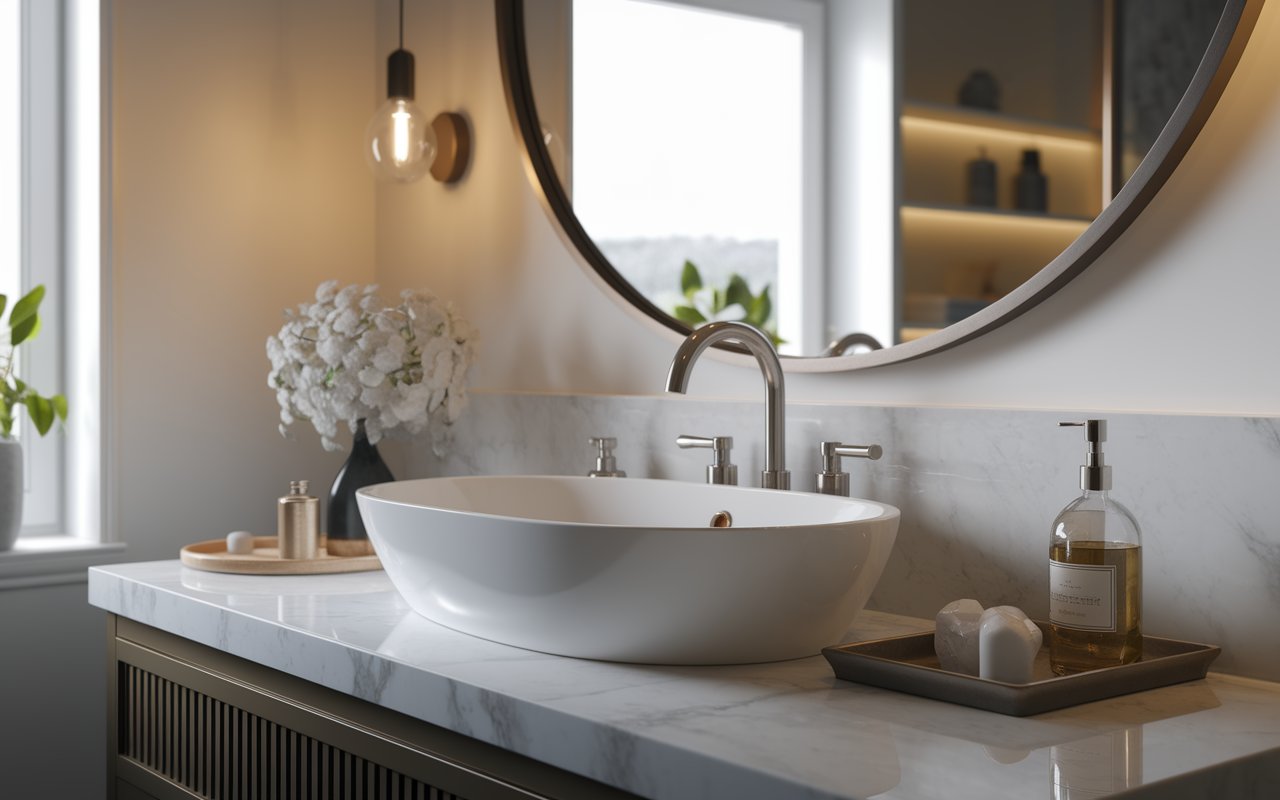
Small bathrooms can actually handle dark colors really well. Green Bay creates a cozy, spa-like feeling. Just make sure you have good lighting and use bright white for your ceiling and trim.
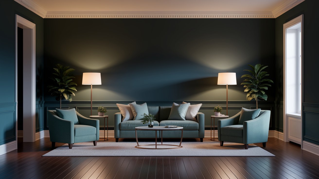
Want a cozy space for movie nights? Green Bay on all four walls creates a den-like atmosphere. Add warm lighting, comfy furniture, and some gold or brass accents.
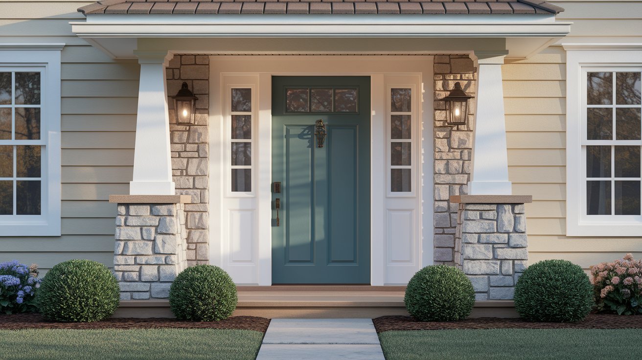
A Green Bay front door gives your home instant personality. It looks amazing with white, gray, or tan house colors. Some people even use it for their entire house exterior, especially with brick or stone.
Green Bay is easy to work with because it pairs well with lots of other colors.
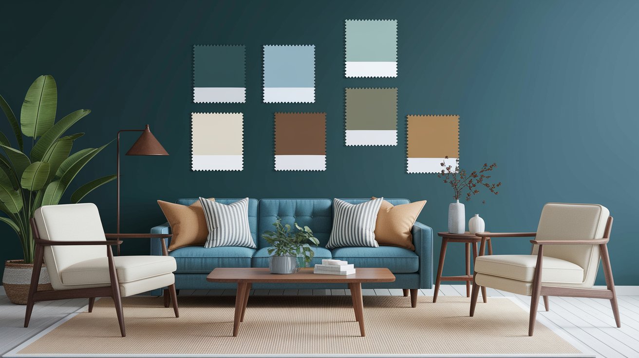
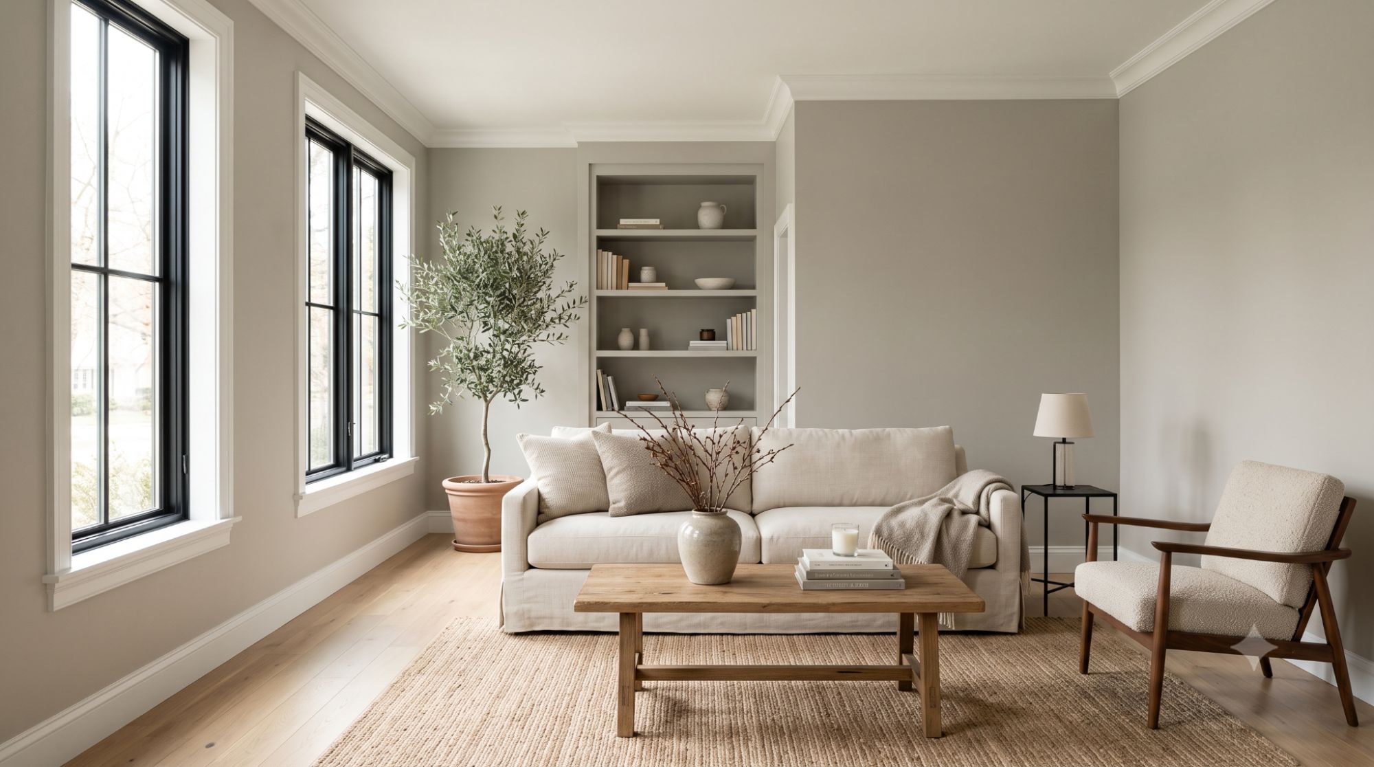
Green Bay loves wood. Light oak, walnut, and natural pine all look beautiful against it. Add wood furniture, floating shelves, or wood frames to warm up the space.
Green Bay works in lots of different home styles:
Modern Homes: Use it with white walls, metal accents, and simple furniture. The contrast between Green Bay and white creates a clean, current look.
Traditional Homes: Pair it with wood furniture, patterned rugs, and Alabaster trim. It gives traditional spaces a fresh update without losing their character.
Farmhouse Style: Green Bay cabinets with white shiplap walls and butcher block counters create a modern farmhouse kitchen.
Coastal Homes: Even though it’s darker than typical beach colors, Green Bay works in coastal homes when you pair it with sandy beiges and white.
Wondering how Green Bay compares to similar colors? Here’s a simple breakdown:
Color | Undertone | Brightness (LRV) | Best Use |
Green Bay (SW 6481) | Blue-green | 11 (Dark) | Accent walls, cabinets, exteriors |
Cascades (SW 7623) | Gray-green | 7 (Darker) | Moody spaces, dramatic rooms |
Evergreen Fog (SW 9130) | Soft green-gray | 46 (Light) | Whole rooms, trending modern style |
Hunt Club (SW 6468) | Rich green | 9 (Dark) | Traditional spaces, libraries |
Green Bay (SW 6481) vs Cascades (SW 7623): Cascades is darker and leans more toward gray. Green Bay is brighter and more colorful.
Green Bay vs Evergreen Fog (SW 9130): Evergreen Fog was the 2022 Color of the Year. It’s much lighter and softer. Think of it as Green Bay’s gentler cousin.
Green Bay vs Hunt Club (SW 6468): Hunt Club is richer and more green, less blue. It feels more traditional and jewel-toned.
If you want the look but need something lighter, try these colors at half-strength (ask your paint store to make it at 50%).
This is simple: use white. Green Bay is dark, so you need bright white trim to create contrast and keep rooms from feeling too heavy.
For Trim:
For Ceilings: Always go white. A dark ceiling makes rooms feel smaller. Use the same white you picked for trim.
Sherwin Williams Green Bay is one of those colors that makes people stop and ask, “What color is that?” It’s different enough to be interesting but not so wild that you’ll get tired of it. The blue-green tone works in almost any room and with lots of different styles.
Remember these key tips:
Whether you’re painting kitchen cabinets, adding an accent wall, or updating your front door, Green Bay gives you that perfect mix of bold and timeless.
Looking for colors to use in the rest of your home? Check out Accessible Beige for a warm neutral or Alabaster for a soft white that works anywhere. Both of these pair beautifully with Green Bay and help create a whole-home color scheme that flows naturally.
Want to see this color in person? Visit your local Sherwin Williams store and ask for a sample of SW 6481. Most stores offer small sample sizes you can test at home. Don’t skip this step—seeing the color on your actual walls in your lighting is the best way to make sure you’ll love it!
Green Bay has blue-green undertones. In bright light, the green shows up more. In dim light, it looks more blue or teal.
It’s mostly cool, but it’s not icy. The green keeps it from feeling too cold. It sits right in the middle of the temperature scale.
Yes, but use it carefully. One accent wall works great in small rooms. Painting all four walls might make a tiny room feel smaller. Make sure you have good lighting.
Bright whites like Pure White (SW 7005) or Alabaster (SW 7008) work best. They create the contrast you need to make Green Bay look its best. These crisp white trims help the deep blue-green walls really stand out.
Absolutely! It’s a popular choice for front doors, shutters, and even whole house exteriors. It holds up well outside and gives homes a sophisticated look.
If you’re covering white or light walls, yes. Use a good quality primer. This helps the true color show up and means you’ll need fewer coats.
Daniel Hartman is a color specialist with years of experience helping people make confident and thoughtful design decisions. He provides practical and approachable guidance while balancing creativity and functionality in every project. Daniel enjoys visiting art and design exhibits to study how different environments influence aesthetics, mood, and perception, bringing a rich perspective and insight into his work. His approach makes design decisions both simple and enjoyable.


No Comments